Sandra Jones
New member
* note to moderators...if this is better suited to another category, please move it. ")
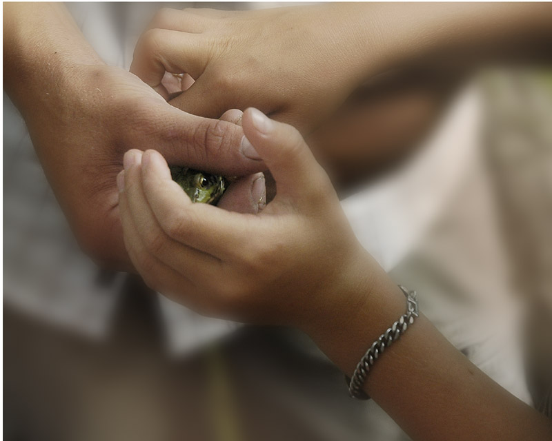
This summer I had family visiting and two nephews went down to the creek to catch frogs. Here is a picture of the older nephew passing a frog to the younger. I really like this image and would like to print it for myself.
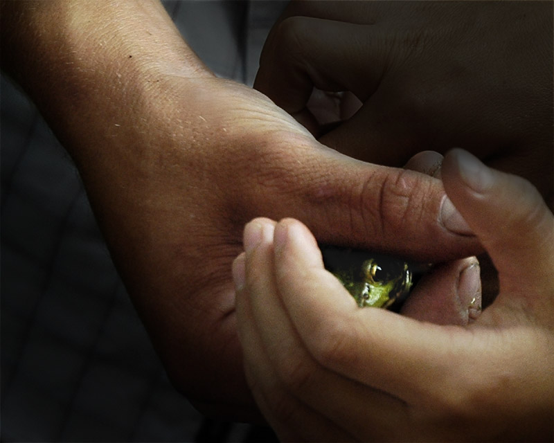
I'd like to have your feedback as to it's potential (as a good image) and invite you to comment on any aspect, most especially my choice of cropping. I will include the original for comparison. A large version of the original is here in case you'd like to crop it, enhance the colour, (or alter in any way) and show me the result. Thanks for looking.
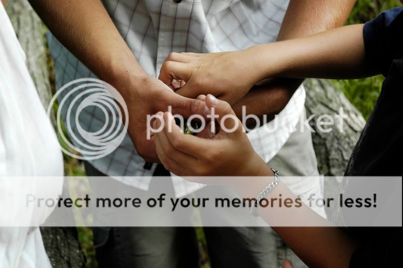
This summer I had family visiting and two nephews went down to the creek to catch frogs. Here is a picture of the older nephew passing a frog to the younger. I really like this image and would like to print it for myself.
I'd like to have your feedback as to it's potential (as a good image) and invite you to comment on any aspect, most especially my choice of cropping. I will include the original for comparison. A large version of the original is here in case you'd like to crop it, enhance the colour, (or alter in any way) and show me the result. Thanks for looking.
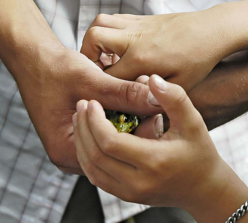
The Handoff
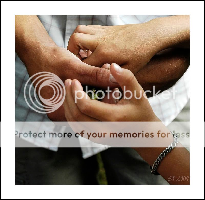
The Handoff_original
The Handoff_original