Mike Nogle
New member
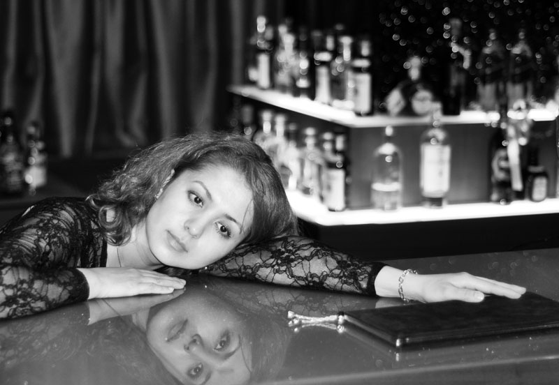
Hi, I would like to know what you think about this portrait, one of my few.
Reflective Eyes - Mike Nogle
Last edited by a moderator:

Hi, I would like to know what you think about this portrait, one of my few.

This does open my eyes to how to better spotlight the most important part of the photo, while still keeping the setting and other motiffs intact. I learned a lot visually here. Now I have to hit the books and get more experience at photoshop.


What was unclear to me, and it still is a bit, is why you dedicated so much of the image's real estate to the OOF bottles. It probably is the result of you trying to include the resting hand. If you would have tried to focus on her reflective state, this would have been a more logical crop/composition:
The viewer inevitably is caught by the dreamy look, because there is little distraction. Toning down the background would only enhance that.
Hi Mike,
Photoshop is a useful tool for postprocessing, but don't get the idea that less effort is needed on the input/capture side.
Mike Nogle: Reflective Eyes
Hi Mike,
Thanks for accepting my offer to try some other presentation. Of course, the test is not whether or not it's impressive, but to the extent it continues your original ideas. The latter can evolve. I'm just offering some ways you might consider in delivering your concept.
Mike Nogle: Reflective Eyes
Edits AK with permission
This does not become any finished piece with these edits but it might give you ideas for isolating her thoughts the next time.
Asher[/QUOTE
Well, we did try a few more shots like this. The next one was cute, she looks like a flapper tending bar at a speak easy. I say this to high light how the moment is also a very important element here. The soft look on her face and the difference in the reflection is a one time thing, especially since she is not an experienced model.
I really like what Asher did with the photo. Nigel's re-angling was a concept that did not cross my mind at all, and I like it. Asher said something interesting to me, "the issues of the distracting and probably unneeded bottles and the major undecided function of her left hand on the menu as if it was her family bible, LOL!" It is interesting that you equate the drink menu to a family bible. That added with the bottles in the background adds so much to the story, rather than simply "pretty girl, intense reflection about whatever the viewer wants to think." I am sticking to Asher's original idea. Highlight the model, while diminishing the rest, yet leaving it there and keeping it recognizable.
Now, for the rest of the story! LOL This girls works in a "Russian" bar in S. Korea. She works 6 nights a week, from 8 pm to 4-6 am. The more drinks she sells, the more money she makes. Her job is to keep customers there and also to have them buy her a drink every time they order. One customer leaves, and another shows up and she keeps on drinking with the next customer. So really, Asher was pretty close with the drink menu being like a family bible. Especially true when you know how close of friends the bartenders are. And the bottles in the background tell where she is and what she does.
I know that minimalism is usually a good approach, especially if there is not a story to be told, or if angles, patterns and depth add to the photo's goals. To me, darkening the rest of the photo achieved the goal of minimalism enough because it draws the viewer to first study the girl and her reflection, and then also gives the viewer more to develop an impression of.
Cheers, and thanks so much for everyone's insight. Any more ideas, corrections to my thoughts of the photo, or simply furthering this discussion would be great. It is one thing to take a photo I like, and quite another to take one that others like. It is kind of like my cooking! LOL
Mike