• Please use real names.

    Greetings to all who have registered to OPF and those guests taking a look around. Please use real names. Registrations with fictitious names will not be processed. REAL NAMES ONLY will be processed

    Firstname Lastname

    Register

    We are a courteous and supportive community. No need to hide behind an alia. If you have a genuine need for privacy/secrecy then let me know!
  • Welcome to the new site. Here's a thread about the update where you can post your feedback, ask questions or spot those nasty bugs!

Light Bubbles

Ruben Alfu

New member
CC welcome, thanks!
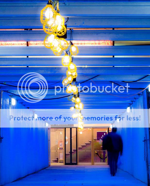


20080207-_MG_1754_nyc2.jpg


Ruben Alfu : Light Bubbles


Asher Kelman

OPF Owner/Editor-in-Chief
I'm impressed, it has razzle-dazzle!

So, tell us about the rich saturated blue. Where did that come from?

Asher
 

Ruben Alfu

New member
I'm impressed, it has razzle-dazzle!

So, tell us about the rich saturated blue. Where did that come from?

Asher

Hi Asher, "razzle-dazzle" sounds good, and even more after googling its meaning hehe. The blue comes from a tungsten WB, the extra saturation from PS. Also, I played with the "clarity" slider in Lightroom to enhance that fuzzy glow around the lights.
 

John Angulat

pro member
Hi Ruben,
I never got the chance to also ask about the blue, you answered Asher befor I could post a question!!!
I absolutely love the effect.
Great job, great image!
 

Asher Kelman

OPF Owner/Editor-in-Chief
CC welcome, thanks!


20080207-_MG_1754_nyc2.jpg


Ruben Alfu : Light Bubbles


So Ruben,

My instincts were correct. You were impressed with sight and the lines of light and dolls house stairs at the end. That was the start of the creative arc. Now unlike what some folk think, an art piece is hardly ever made as conceived. The best art might well be a "Jacob with the Angel struggle" between the original idea and the essence of the picture as it appears initially and progressively in the monitor screen. If the picture is simply what's produced when the shutter is released, then it's likely closer to a picture for a commercial client that for pure expression.

So I'm pleased with your changes to your picture.

Over the top and it works!

Asher
 
So Ruben,

My instincts were correct. You were impressed with sight and the lines of light and dolls house stairs at the end. That was the start of the creative arc. Now unlike what some folk think, an art piece is hardly ever made as conceived. The best art might well be a "Jacob with the Angel struggle" between the original idea and the essence of the picture as it appears initially and progressively in the monitor screen. If the picture is simply what's produced when the shutter is released, then it's likely closer to a picture for a commercial client that for pure expression.

Hi Asher,

Interesting analysis. However, the question remains if the end result is why Ruben's creative intent made him take the image in the first place. When I read Ruben's explanation he altered the image he saw when he took it by changing the White balance and increasing the saturation. I didn't read anything else about the why ...

In fact, IMHO, the image would have been stronger if he had stepped 1 or 2 metres to the right before pressing the shutter, because the line of lights would have sucked the viewer into the tunnel scene more effectively. Now we are stuck with a mostly featureless lefthand side and an image that is detail rich at the righthand side. I don't see any plan/intent, other than trying to capture a bold colored tunnel, which admittedly benefits from the blurred human figure.

This is not to be negative about Ruben's image, but a warning about over-interpreting art. I've heard several respected artists comment that they are frequently amused by interpretations of critics. One artist said, " I never thought about it that way ...". How's that for intent.

I do see Ruben exploring the boldly colored tunnels, and that's an interesting theme to pursue. Keep it up, experiment, try different angles (low / high / from one side/corner / vanishing point at a golden section or deliberately not), and share the best with us. Also remember, a good image doesn't depend on it's postprocessing alone, but may benefit from (subtle) enhancement of the concept that's already there from the get go.

Cheers,
Bart
 

Asher Kelman

OPF Owner/Editor-in-Chief
Hi Asher,

Interesting analysis. However, the question remains if the end result is why Ruben's creative intent made him take the image in the first place. When I read Ruben's explanation he altered the image he saw when he took it by changing the White balance and increasing the saturation. I didn't read anything else about the why ...
Yes, It would have been better to have had disclosure of intent and then what happened along the way.

In fact, IMHO, the image would have been stronger if he had stepped 1 or 2 metres to the right before pressing the shutter, because the line of lights would have sucked the viewer into the tunnel scene more effectively. Now we are stuck with a mostly featureless lefthand side and an image that is detail rich at the righthand side. I don't see any plan/intent, other than trying to capture a bold colored tunnel, which admittedly benefits from the blurred human figure.

Bart,

That's an interesting idea and points to the real need for an iterative approach to art. One needs to be humble enough to go back and restart having learned from the first attempt.

Still, I like to recognize that photography also involves a lot of work with the latent potential image and is not always delivered as originally conceived. It would be great to hear an honest account of how and why changes are made, even if one says, "I moved the slider and as the saturation increased, I thought, "Wow! That's much more impressive!" As mundane as that would be, it would be honest and tell us a little bit about the creative process as opposed to an intent to use a highly saturated color from the outset when taking the picture or when first looking at in the monitor.

So, is this change just the result of random attempts with different filters to see which has more pizzazz or is there some concept driving such changes? Either way, I'd be impressed to know how one gets to the change.

Asher
 

Ruben Alfu

New member
So Ruben,

My instincts were correct. You were impressed with sight and the lines of light and dolls house stairs at the end. That was the start of the creative arc.

Asher


Hi Asher, that´s correct, that was pretty much it.

For anyone interested in the details, here´s the long story. This tunnel was built because of major renovations taking place at Lincoln Center in Manhattan, it had intermitent lights above in the "ceiling", an unusual feature for this kind of structures, but I guess everything in Lincoln Center has to be creative and artistic :). So, there you go, I think, "let´s explore the artistic expression of this thing". In that moment, I was focused on the subject and composition, no special effects of any sort.


Now unlike what some folk think, an art piece is hardly ever made as conceived.

The best art might well be a " Jacob with the Angel struggle" between the original idea and the essence of the picture as it appears initially and progressively in the monitor screen.


What I saw in this scene at the moment of capture was a rigid, solid structure and geometry enclosing the entrance to Mitzi E. Newhouse Theater, and the dancing lightbulbs resembled an effervescent light coming out from the theater, therefore, the title "Light Bubbles". The sliders in the computer helped to polish and fine tune the idea, I modified the vocabulary, not the essence of the message.


So I'm pleased with your changes to your picture.

Over the top and it works!

Asher


Thanks Asher, that´s very kind.
 

Ruben Alfu

New member
Hi Asher,

Interesting analysis. However, the question remains if the end result is why Ruben's creative intent made him take the image in the first place. When I read Ruben's explanation he altered the image he saw when he took it by changing the White balance and increasing the saturation. I didn't read anything else about the why ...

Cheers,
Bart

Hi Bart, thanks for bringing your thoughts to the table. Not sure if it's good manner to get in the way of your conversation with Asher, but I could answer some of your questions. As stated in my post above, I don´t think that any color adjustment made to this photo changed my original intent. Why I did it? Becasue I thought the image, as captured was ok, but it could be taken a step further. I would have done these edits "in camera" if I had thought about it during the capture, but it occurred to me later, that´s all.


In fact, IMHO, the image would have been stronger if he had stepped 1 or 2 metres to the right before pressing the shutter, because the line of lights would have sucked the viewer into the tunnel scene more effectively. Now we are stuck with a mostly featureless lefthand side and an image that is detail rich at the righthand side. I don't see any plan/intent, other than trying to capture a bold colored tunnel, which admittedly benefits from the blurred human figure.

Again, please refer to my post above in relation to what motivated this photo and why I came up with this composition. Anyhow, even capturing a bold colored tunnel qualifies as a plan, or not?.


I do see Ruben exploring the boldly colored tunnels, and that's an interesting theme to pursue. Keep it up, experiment, try different angles (low / high / from one side/corner / vanishing point at a golden section or deliberately not), and share the best with us. Also remember, a good image doesn't depend on it's postprocessing alone, but may benefit from (subtle) enhancement of the concept that's already there from the get go.

I agree that it might be an interesting theme, in fact, I think it´s a great idea, but honestly these couple of images that I have posted with tunnels were taken with a couple of years of difference (I think), they are not the result of any particular concept that I´m pursuing. Regarding the postprocessing, I agree with you, very few of my photos display the degree of color editing (or any other sort of PP) as applied to "Light Bubbles". However, my take on this is that a photographer who can make a great photo "in camera" is a great one, but that don´t necessarily makes him or her a better artist.
 

Asher Kelman

OPF Owner/Editor-in-Chief
Hi Bart, thanks for bringing your thoughts to the table. Not sure if it's good manner to get in the way of your conversation with Asher,

Hi Ruben,

You need to know the messenger! Bart is one of the best angels on the planet! He can join any conversation of mine. It's really valuable to have other folk butting in, (especially on me) and questioning. Otherwise we could be on the wrong track in a mutual admiration pact, LOL! Also it could appear I'm above the fray, and I'm not. It's great that you have the openness to all our points of view and that's what makes OPF work. Thanks!

When I ask about the order of doing things and motivation at each stage, I'm actually trying to learn how people create and not being judgmental. After all, if the work moves me in the end, "so what?" if you just found and repurposed it, we'll still enjoy the experience!

Despite this, I really want to know,

"To what extent do we fiddle in PS and like what we find versus have a set of predictable tools we employ with precision like a craftsman?"

Thanks for adding your answers to this. How did you come up with the intense blue? Did you think of that first?

Asher
 

Ruben Alfu

New member
Hi Ruben,

You need to know the messenger! Bart is one of the best angels on the planet! He can join any conversation of mine. It's really valuable to have other folk butting in, (especially on me) and questioning. Otherwise we could be on the wrong track in a mutual admiration pact, LOL! Also it could appear I'm above the fray, and I'm not. It's great that you have the openness to all our points of view and that's what makes OPF work. Thanks!

When I ask about the order of doing things and motivation at each stage, I'm actually trying to learn how people create and not being judgmental. After all, if the work moves me in the end, "so what?" if you just found and repurposed it, we'll still enjoy the experience!

Despite this, I really want to know,

"To what extent do we fiddle in PS and like what we find versus have a set of predictable tools we employ with precision like a craftsman?"

Thanks for adding your answers to this. How did you come up with the intense blue? Did you think of that first?

Asher


Hi Asher, I see that my words sounded harsh but I really meant what I said, I'll take back that and apologize to Bart, thanks for your always wise advice.

To answer your two questions:

1. To what extent do we fiddle in PS and like what we find versus have a set of predictable tools we employ with precision like a craftsman?

In my case, it works both ways. I do two very different styles of shooting: studio and street. When I work in studio, it is 90% of the time stock or editorial style photography. Here, usually I have the picture in my head before I start shooting. I'm in "execution mode". I can be creative, try different things in terms of lighting, angles, etc., but I know what I'm looking for, I have specific standards or requirements to meet and I have a lot of control of what's going on. When the photo is done, there's little left to post, still needed in most cases, but little (I don't do beauty, or fashion, that relies heavily on retouching).

Walking around with a camera is another story. I'm in "discovering mode", with a strong "freestyle" component. I don't know what I'm gonna find around the corner, I'm relying on my ability to see and react. This mode extends to the computer, I'm still discovering what I brought with my camera. No matter what intention I had when doing the photo, I see no reason to stop the creative process here, I don't know what I'm gonna find at the turn of that slider, and I'm not afraid to experiment. Now, depending on my level of expertise, I may actually know what's gonna happen if I do this or that (at least in theory), and that helps to make creativity a discipline (for good or for bad!). It's all part of a learning process I guess.


2. How did you come up with the intense blue? Did you think of that first?

No, I didn't. I explained that in a previous post above. For me, this photo has never being about the blue tunnel. The star of this photo is the line of light bulbs, but in the RAW file it wasn't that obvious, the photo seemed to be about geometry, shapes, volumes, perhaps that would have worked for BW, but that wasn't my intention. I specifically decided to turn to tungsten WB because I knew what was going to happen: a striking contrast between a cold deep blue and the warm and brilliant yellow of the light bulbs. I didn't think of this at the moment of the capture, but it was consistent with my original intention.
 
Hi Bart, thanks for bringing your thoughts to the table. Not sure if it's good manner to get in the way of your conversation with Asher, but I could answer some of your questions.

Hi Ruben,

No problem, discussions are open to all.

As stated in my post above, I don´t think that any color adjustment made to this photo changed my original intent. Why I did it? Becasue I thought the image, as captured was ok, but it could be taken a step further. I would have done these edits "in camera" if I had thought about it during the capture, but it occurred to me later, that´s all.

That's fine. It is always hard to give good C&C if little is known about the original intent. Lacking some basis guidance, one can only speak of an image in terms of like/dislike, or an even less helpfull "wow". Sure it is nice if others also like the image, but that won't help to improve oneself.

Again, please refer to my post above in relation to what motivated this photo and why I came up with this composition. Anyhow, even capturing a bold colored tunnel qualifies as a plan, or not?.

Absolutely, but there's more to it. You also sought to enhance the things that struck you as interesting, that's good. I tend to think of most of my images in terms of "What effect will my decisions about composition have on a viewer. Then in postprocessing I try to enhance the things that help to get the feeling across, but I'm fond of subtlety (the viewer shouldn't be able to see it but experience it, almost subliminal).

I agree that it might be an interesting theme, in fact, I think it´s a great idea, but honestly these couple of images that I have posted with tunnels were taken with a couple of years of difference (I think), they are not the result of any particular concept that I´m pursuing.

Who knows, maybe subconsciously they are. That would work, e.g. as a 2x2 group of images with different bold/dominant primary colors, perhaps even in a single frame. They would probably need to be all in landscape or portrait orientation or another uniform crop.

Regarding the postprocessing, I agree with you, very few of my photos display the degree of color editing (or any other sort of PP) as applied to "Light Bubbles". However, my take on this is that a photographer who can make a great photo "in camera" is a great one, but that don´t necessarily makes him or her a better artist.

There's no problem with what you did in PP, the lights were enclosed in yellow, and the surrounding were blue, and in the distance there's artificial lighting, so it's all in line with what you were after, but we didn't know so we had to guess.

Hi Asher, I see that my words sounded harsh but I really meant what I said, I'll take back that and apologize to Bart, thanks for your always wise advice.

There's no need to apologize, we are all mature enough to read between the lines and not take things too personal.

Cheers,
Bart
 

Ruben Alfu

New member
Hi Ruben,

It is always hard to give good C&C if little is known about the original intent. Lacking some basis guidance, one can only speak of an image in terms of like/dislike, or an even less helpfull "wow". Sure it is nice if others also like the image, but that won't help to improve oneself.

Cheers,
Bart


Hi Bart, that´s an interesting point to ponder, sometimes testing an image with no explanations might be convenient but for the purposes of this forum, perhaps providing a context for interpretation would be more valuable? How transparent can be this information in order to cause the least influence on the viewer´s reaction to the image?


Another thing, I´m putting that tunnels project in my to do list, it would fall under number 9,456 but I´m gonna move it further up the list.


All the best,

Ruben
 
Top