Cem_Usakligil
Well-known member

The architect and also the interior designer was Leendert van der Vlugt who is resting permanently since 1936...The designer who did that needs a rest!
")
I will switch to using the Arabic numerals from now on, lol.Cem, your titles are now approaching the limits of my Latin numerical reading ability. Hopefully you shall
start with Arabic numbering.
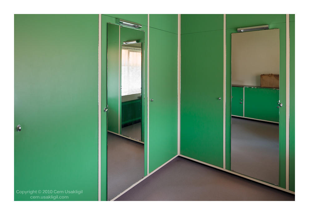
The image is claustrophobic for me. Maybe the color, a shade of green that is too pressing. Do I make any
sense? The mirrors surprisingly do not expand the space but seem to act to constrain the soul.
An interesting take, to say the least.
Regards.
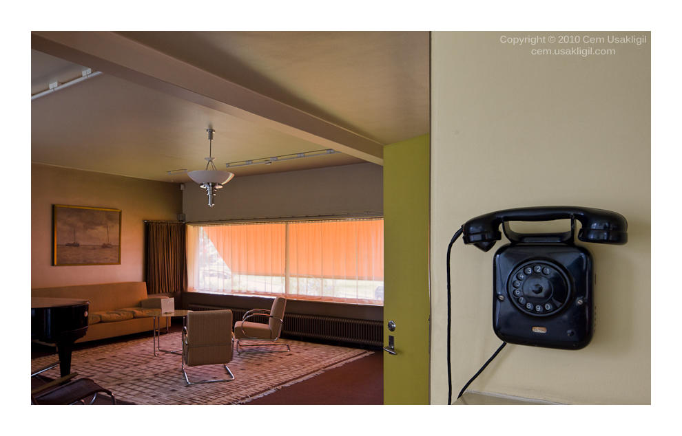
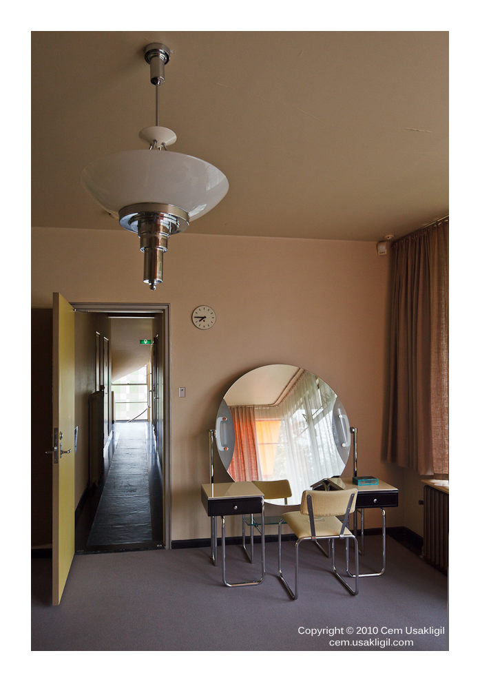
In that case, I will show you some more pictures taken at that location.Love it! So clean, so straight so . . . . . . .er . . . . . green. µThough I am a fan of architecture of the twenties and thirties, avidly watch "Hercule Poirot" just to see lots of examples from that period.
On my head be it then!If I have a nightmare featuring this image, it's all your fault Cem!
? I had to insert spaces between the : and the D to keep my smile otherwise I get this most vulgar green icon, beurk! awful!Hi Cem
another nice one!
I just regret that the lower left corner of the left door is cropped…
Would you have a vertical shot of the same scene?
Ah! those frenchies, they're never happy : D !
PS hey! what are these horrible emoticons here:
I am with you on the cropped corner. But I couldn't back out more than this. It was handheld shooting and I had to rush before somebody walked into the picture. I may have another exposure from which I might transplant the missing corner. We shall see.
Hi Hélène,
In that case, I will show you some more pictures taken at that location.
Cem, cropping this one to the edge of the picture frame on the left strengthens it as an image - is it ok to play and repost ?
Cem,
I have no such regrets! I like the imperfections! I prefer to know that you had a thought, then a need and the picture was recorded. It is what it is and it seems to deliver 100% of what you intended. Therefore it works and is, IMHO, perfect! I only expect perfection in Vogue™ and all that is superficial and false anyway.
Asher
I see what you mean and you might have a point. Please feel free to play around with it.
