PDA

View Full Version : Golden Lion Tamarin


John Harper
April 12th, 2007, 01:40 AM
Hi

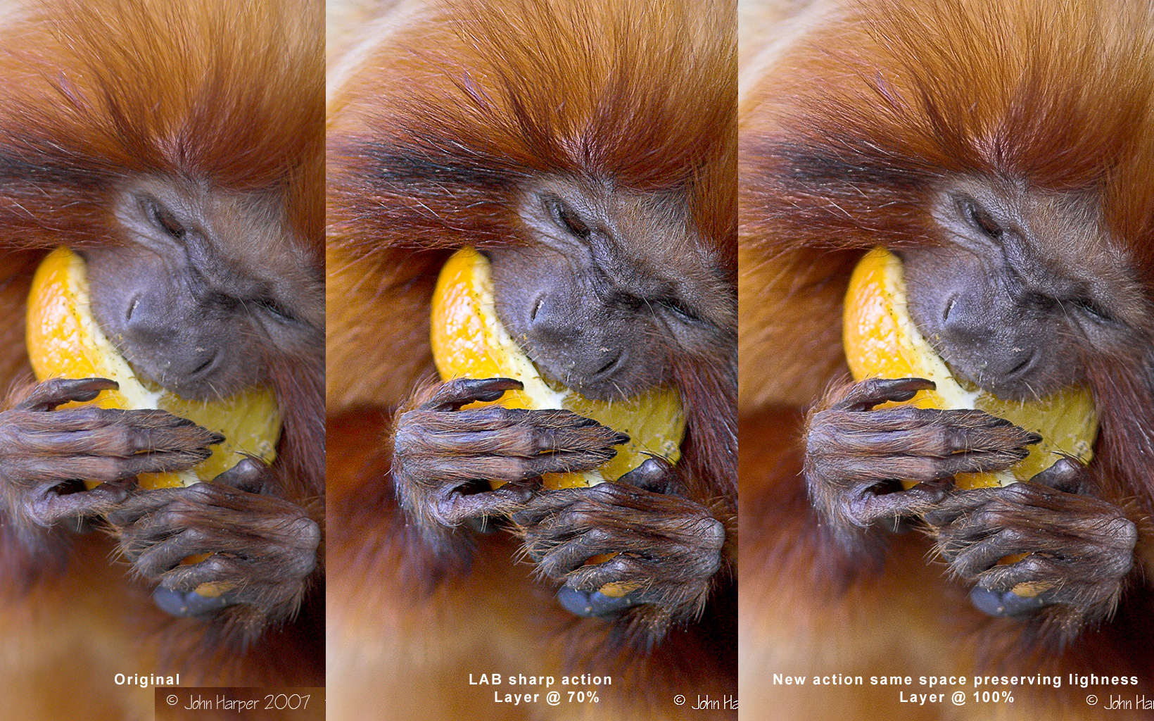
Changing subject from birds for a minute, i thought i would post a picture of a Golden Lion Tamarin having his lunch on a nice piece of fruit. Taken at Marwell Zoo the Tamarins are allowed to run around freely in the enclosure, with no wires or fencing so you can get quite close if they give you the chance.

I like to fill the frame as much as possible but obviously DOF becomes a problem, but again any comments or criticisms welcome

1DMKIIN - 300F4L +1.4TC 1/160 @ 5.6 ISO 800


John


http://www.portviewfitout.co.uk/tamarin.jpg

Bart_van_der_Wolf
April 12th, 2007, 05:08 AM
I like to fill the frame as much as possible but obviously DOF becomes a problem, but again any comments or criticisms welcome

1DMKIIN - 300F4L +1.4TC 1/160 @ 5.6 ISO 800

Hi John,

Nice image. Personally I'd crop it slightly more at the bottom, and it can use a bit more sharpening at this size (I assume it lost some sharpness due to downsizing). Did you shoot with the camera (or rather the lens) handheld, or did you use a tripod/monopod?


One should take care not to sharpen the light hairs into clipping, especially on such subjects. My favorite method to avoid such sharpening artifacts is to add a Photoshop sharpening layer with an adaptive blending such as:

http://www.xs4all.nl/~bvdwolf/main/downloads/Non-clipped-sharpening.png

The benefit of such an approach is that it is not necessary to change from RGB to Lab mode (which is slightly destructive!) just for sharpening, and one can change the layer afterwards (e.g. masking out sky or other smooth surfaces, or tweak the blending). Most changes are non-destructive, and it is easy to make an action that creates such a layer, e.g. in preparation for Web publishing.

What it effectively does is to reduce the sharpening as the tonal edge-contrast gets higher. In my opinion, when the tonal edge-contrast is already very high, it is not necessary (or even desirable) to exaggerate it further. Sharpening high edge-contrast will not make the image look sharper than it already is, and all it does is create a risk for clipping or edge halo. Many of the nasty side-effects from sharpening are avoidable this way, and it fast and flexible.

Bart

John Harper
April 12th, 2007, 05:20 AM
[QUOTE=Bart_van_der_Wolf;23487]Hi John,

Nice image. Personally I'd crop it slightly more at the bottom, and it can use a bit more sharpening at this size (I assume it lost some sharpness due to downsizing). Did you shoot with the camera (or rather the lens) handheld, or did you use a tripod/monopod?


Hi Bart

Thank you for the comments and i hope at some point to have sufficient knowledge of Photoshop to carry out the steps that you mention. Without wishing to appear too dense i have only a very basic knowledge of PS so my sharpening is just done by using "Smart sharpen" and i drag the slider until it "Looks OK"

The shot was handheld and i was quite pleased to get it as sharp as it is, but the IS on the 300 F4 obviously helps.

I will try and get up to speed on layers sharpening etc as it seems i have a way to go, but I am here to learn... So any advice is much appreciated.

It just makes you realise how much there is to learn and think about.


John

Bart_van_der_Wolf
April 12th, 2007, 06:09 AM
Thank you for the comments and i hope at some point to have sufficient knowledge of Photoshop to carry out the steps that you mention. Without wishing to appear too dense i have only a very basic knowledge of PS so my sharpening is just done by using "Smart sharpen" and i drag the slider until it "Looks OK".

Smart Sharpening is a very good first step, and it also allows to tweak the highlight and shadow response in the advanced settings, similar to my layer approach. The benefit of a Layer approach however, is the added flexibility. It also allows to do it in an action without the need to adjust settings, it just works fine e.g. when preparing large amounts of output for the Web.

I will try and get up to speed on layers sharpening etc as it seems i have a way to go, but I am here to learn... So any advice is much appreciated.

It just makes you realise how much there is to learn and think about.

Rarely a day goes by without me learning something new, I love it. The learning only stops when everything else does ...

Bart

John Harper
April 12th, 2007, 04:42 PM
Smart Sharpening is a very good first step, and it also allows to tweak the highlight and shadow response in the advanced settings, similar to my layer approach. The benefit of a Layer approach however, is the added flexibility. It also allows to do it in an action without the need to adjust settings, it just works fine e.g. when preparing large amounts of output for the Web.


Rarely a day goes by without me learning something new, I love it. The learning only stops when everything else does ...

Bart
Bart

I have been pointed in the direction of a sharpening routine that Nicolas Claris has posted in the forums and i have run the pic through that and post the result here. Perhaps if you have 5 mins at some point you could let me know what you think.

Regards

John

http://www.portviewfitout.co.uk/tamarin4.jpg

Asher Kelman
April 12th, 2007, 06:52 PM
Looks pretty realistic to me~!

Why dont you send Bart the file for him to sharpen, then we could see the two together.

Asher

Nicolas Claris
April 13th, 2007, 12:19 PM
Well, quite interesting thread!
I have tried the way described above by Bart.
So I have changed my action so it doesn't change color space to LAB and at the end sets the new layer according to Bart recommendation (do I need a © Bart ?-).

Her is a comparison, quite interesting I have to say... (below images you'll find the new action (though also containing the previous one) to download.

http://mnclaris.free.fr/forum/tamarin_Sharp.jpg

And now here is the action (http://mnclaris.free.fr/forum/Sharpness_Nicolas_Claris-04-2007.atn.zip)

Sharing is improving...

Asher Kelman
April 13th, 2007, 02:03 PM
I prefer the middle on, at least on my MacBook Pro. (My G5 with the Eizo, is going in the hospital today for panic attacks every few minutes!)

I like the reality of the face. It is really alive. The last one looks like a picture of the ape, not a live animal.

For the hair, I would reduce that effect by 25%. After all, it's the face that is most important.

We must not give equal attention to everything. In photography we serve images.

I am gob-stopped by the beaty of the creature and glad it still survives!

Asher

Nicolas Claris
April 13th, 2007, 02:30 PM
I agree with you Asher about the importance of the creature's face, but this could be easily enhanced in the last version.
I think Bart gave a very good advice about preserving light tones, look at the 3rd version how the fingers are more precisely drawn!
I do to hate to have the white burned, this new action, made with Barts comments is for me a real enhancement! Maybe I'll be able to produce another new one that will be more effective in the darks now... and the creature's face will seems better (like Version 2 but still preserving the light tones).

Keeping in the same color space is also a better idea...

Sharing, experiencing, contributing, makes us better every day, this is one of the reason we've created OPF. Didn't we ,-o)

John Harper
April 13th, 2007, 02:43 PM
Hi to everyone

Thanks for all the advice and sharpening tips I am amazed at the quality difference it makes.

This is a full face shot of another Tamarin. Lots of hair and detail, may be better to asses any changes.


John

http://www.portviewfitout.co.uk/tamarinface.jpg

Bart_van_der_Wolf
April 13th, 2007, 06:18 PM
(do I need a © Bart ?-).

Not really, I've posted this to Usenet quite a while ago, so let's consider it Public Domain (although it seems to be a well kept secret http://www.openphotographyforums.com/forums/images/smilies/redface.gif). Again, the whole principle behind it is based on not sharpening the already high edge contrast, and that is hardly Copyright material, just a fast way of doing it in Photoshop.

Here is a comparison, quite interesting I have to say... (below images you'll find the new action (though also containing the previous one) to download.

Yes, interesting in two ways. First, the highlights in the lighter hairs are better protected against harsh clipping, as intended, but second also the larger radius Smart Sharpening steps in your action have slightly less of an effect (I do like the original effect for it's 3D qualities). You may want to exaggerate those tonescaling effects a bit.

And now here is the action (http://mnclaris.free.fr/forum/Sharpness_Nicolas_Claris-04-2007.atn.zip)

Sharing is improving...

Yes, synergy in action. Thanks for sharing your action, it was the sharing that prompted me to share my tweaks.

Bart