
-
Please use real names.
Greetings to all who have registered to OPF and those guests taking a look around. Please use real names. Registrations with fictitious names will not be processed. REAL NAMES ONLY will be processed
Firstname Lastname
Register
We are a courteous and supportive community. No need to hide behind an alia. If you have a genuine need for privacy/secrecy then let me know! -
Welcome to the new site. Here's a thread about the update where you can post your feedback, ask questions or spot those nasty bugs!
You are using an out of date browser. It may not display this or other websites correctly.
You should upgrade or use an alternative browser.
You should upgrade or use an alternative browser.
Old bridge giving way to new
- Thread starter dandill
- Start date
Charles L Webster
pro member
Dan, I like your photos, but your site provides no way to move from photo to photo without closing the image window and going back to the thumbnails. Next and Previous buttons at the bottom of the image window would be helpful.
I like the fogginess and the haunted quality of the images.
I like the fogginess and the haunted quality of the images.
The capability is there (but clearly needs to be advertized---thanks!): Use the left/right arrow keys or hover near the upper left/right margins for the Prev/Next buttons.Dan, I like your photos, but your site provides no way to move from photo to photo without closing the image window and going back to the thumbnails. Next and Previous buttons at the bottom of the image window would be helpful.
Thanks for this feedback.
Asher Kelman
OPF Owner/Editor-in-Chief
Dan,
Could you consider directly linking the images to this thread. That makes it beautiful immediately on reaching the thread and simplifies the viewing experience. In addition, of course, to the current link to your wonderful website.
Asher
Could you consider directly linking the images to this thread. That makes it beautiful immediately on reaching the thread and simplifies the viewing experience. In addition, of course, to the current link to your wonderful website.
Asher
Charles L Webster
pro member
The capability is there (but clearly needs to be advertized---thanks!): Use the left/right arrow keys or hover near the upper left/right margins for the Prev/Next buttons.
Thanks for this feedback.
As my usability guru often says "If the user doesn't know about it, it doesn't exist"
Maybe a note at the bottom of the page or something.
Thanks,
For sure: I have added these instructions---thanks again to you. Also, there is now a portal page.Maybe a note at the bottom of the page or something.
Steve Quattrocchi
New member
Wonderful images. Nice, simple composition and complex tonality. I really like the first and second images.
Sorry for another comment on the presentation but I found the white flash transition between images to be very jarring. It threw my visual comprehension (for lack of a better word) off and it took a few seconds to 'get into' the tonalities and subtlties of the next image.
Sorry for another comment on the presentation but I found the white flash transition between images to be very jarring. It threw my visual comprehension (for lack of a better word) off and it took a few seconds to 'get into' the tonalities and subtlties of the next image.
Thanks very much for this feedback. Jarring is certainly not the effect I would want....I found the white flash transition between images to be very jarring. ...
Could you consider directly linking the images to this thread.
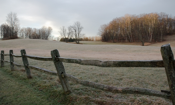
Image from "bridge" series:

Image from "awaiting" series:
The portal is here. Thanks Asher.
Sean DeMerchant
Inactive
The capability is there (but clearly needs to be advertized---thanks!): Use the left/right arrow keys or hover near the upper left/right margins for the Prev/Next buttons.
I agree. While the arrow keys work, having no obvious links for the mouse to use is a poor quality interface paradigm. I personally feel violated when I have to play Where's Waldo to find a link. And if your goal is to use this site to sell, then you really need to make it easy on consumers rather than making it look cool.
Also, dynamic content of this sort sometimes fails to get indexed by search engines which is a negative aspect for commercially oriented sites.
But other than that I like the gallery look and feel.
enjoy your day,
Sean
Steve (or others), a go at softening the transition in the latest version.... I found the white flash transition between images to be very jarring.
Steve Quattrocchi
New member
Thanks very much for this feedback. Jarring is certainly not the effect I would want.
Don't mind me too much...I tend to be pretty old school when it comes to Flash animation. The new animations are far better. THe imges seem to flow more naturally now.
What PP technique(s) did you use. Your colors have a subtle beauty.
Actually, prompted by your observation, I asked colleagues to compare the old white with the new neutral transition, and they used the same word "jarring" for the one with white. I think there must be a physiological basis that makes images easier to process if the intervening fade is neutral and subdued. One person said he thought I had made the colors on the images richer, when in fact no changes to the images were made.Don't mind me too much...I tend to be pretty old school when it comes to Flash animation. The new animations are far better. THe imges seem to flow more naturally now.
For the Pomfret images I think mostly it is a consequence if the pre-dawn light and the that the fields were covered with a heavy frost. Anyhow, these images among my first attempts using Lightroom, having had a lot of experience with RawShooter Professional user. In particular the targeted adjustment tool helps to isolate luminosity color adjustments, and so encourages trial and error.What PP technique(s) did you use. Your colors have a subtle beauty.
For the bridge images, it was a preternaturally foggy day in the middle of Winter. I used Lightroom for the B &W conversion (since I felt what color there was distracted from the fog) and its parametric curve to try to bring out the distant new bridge from the fog, again just fiddling to get things to look as good as possible.
By the way, apropos B & W with Lightroom, see here on the O'Reilly blog.
Last edited:
Sean DeMerchant
Inactive
Steve (or others), a go at softening the transition in the latest version.
A great improvement. The transition is now less visible than the images which is just like not putting a fancy eye catching frame around a simple image. Let the image rule as that is your product (whether your goal is to make money or to share/communicate) and that is what your message is about.
enjoy your day,
Sean