• Please use real names.

    Greetings to all who have registered to OPF and those guests taking a look around. Please use real names. Registrations with fictitious names will not be processed. REAL NAMES ONLY will be processed

    Firstname Lastname

    Register

    We are a courteous and supportive community. No need to hide behind an alia. If you have a genuine need for privacy/secrecy then let me know!
  • Welcome to the new site. Here's a thread about the update where you can post your feedback, ask questions or spot those nasty bugs!

Posted for the message rather than the quality of the photo

Rachel Foster

New member
This portrait, entitled "The Face of Parkinson's," was created to convey the reality of the disease. I know there are execution problems and other things to be corrected, but I decided to post for the message I'm trying to send. A Parky starts out vibrant and gradually fades into the shadows.

Forgive the clumsiness (focus, etc.), please. This photo is more about communication to me than art.

e70a3d30.jpg
 

Ray West

New member
Hi Rachel,,

These sombre portraits are what you are best at creating, imho. This one is excellent, just a little bit of processing could make it perfect. As to conveying the reality of the disease, I think that is impossible, in the same way as taking lollipops from kids can convey nothing about modern warfare.

Best wishes,

Ray
 

Rachel Foster

New member
Thank you, Ray. I'm quite critical of the PHOTOSHOP treatment I did! Yes, I photoshopped it! I used magnetic lasso, removed the background. I tweaked a couple other things on an easier program. But practice makes perfect.
 

janet Smith

pro member
"The Face of Parkinson's," A Parky starts out vibrant and gradually fades into the shadows.

Hello Rachel

What a powerful image you have created, it speaks of the feelings of isolation, loneliness and wanting to hide away that some people with Parkinson's sadly experience.

Well done for creating a thought provoking, striking image, which certainly does convey the message you wanted it to - well done!
 

Rachel Foster

New member
Thank you, Jan. It quite literally was inspired by my own feeling of fading into the shadows. I hope to convey a little of that feeling, along with the humanity that remains untouched. There is also fear involved and I hoped the darkness got that across too. The shadowed eyes were to represent the feeling of not being seen as one fades away.
 

Rachel Foster

New member
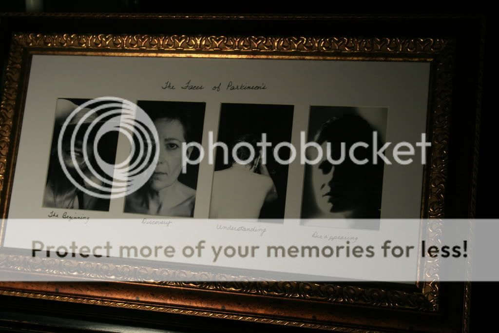
I have been tinkering with this idea and am coming close to the final form. This photograph is of the almost finished product. I decided to label in my own handwriting. The point is the reality, not "pretty," and handwritten labels are consistent with that, I think.

The Faces of Parkinson's

pk001.jpg
 
This is a very effective presentation. I've been experimenting a bit with small albums, of maybe 6 or 8 photos, and a handwritten page, and people seem to like the handwriting quite a bit. It draws attention to the personal investment in the object.

The gilt frame is an interesting choice. A simple black metal frame, for instance, would have been more stark and in the style of the photographs, but this more ornate frame gives it more the character of a family photo--something that might sit on the mantlepiece or the piano. I like it.

Did you cut the mat yourself? I had a friend who did a project that had a mat with something like 25 windows in a grid. He normally cut his own, but this one he gave to a professional framer, because these multiple window mats are tedious to make and easy to mess up without a fairly fancy mat cutting jig.
 

Rachel Foster

New member
Thank you for the feedback, David. I'm finding myself drawn to series more and more.

As to the framing and matting: I'll be brutally honest. I was looking for a plain, unadorned wooden frame when I found this at TJ Maxx. I liked the price and the message. Essentially, the more ornate frame is consistent with my feeling that we are not the disease. We are more than the disease and we deserve ornate as much as anyone else.

The Parkinson's series is aimed at communicating several things. One of the issues is nicely described by sociologist Erving Goffman's brilliant work on stigma almost 50 years ago. He pointed out that diseases or "handicaps" assume a "master status." Everything about the person is seen in terms of that condition. The stigma research also points out that those afflicted with any number of conditions are seen as "damaged goods." That's why we feel awkward when we "blunder" and say something like "Can't you see my point?" to a blind person. There is nothing awkward about being blind. Why do we avoid noting the obvious? Goffman's stigma work explains it.

Forgive my digressing into a lecture. Occupational hazard.

Thanks again for the feedback.
 
Forgive my digressing into a lecture.

Rachel,

You've done well, both on the series/framing of images and on the narrative part. It's not considered a lecture by me at all, but then maybe having an appreciated uncle with Parkinson's helps in understanding a tiny bit of the process/discomforts/prospects/mental issues.

Again, you've done well. Now, for a challenge, try to top your own result!

Bart
 

Rachel Foster

New member
Thank you, Bart, but I'm not entirely satisfied yet. I think photo3 could be better. I'm feeling more satisfied with number 4, though.

And thank you, Asher.

I'm going to be giving a presentation mid-December to the local Parkinson's support group and gifting the group leader with this series. I want it closer to what I envision by then.

Any suggestions as to how to tweak this would be helpful. For example, I 'm thinking all four photos possibly should be head shots, roughly same proportion but expressively different.
 

Rachel Foster

New member
That was the intent when I chose that photo. Perhaps I 'll let it sit and percolate. My perfectionistic tendencies sometimes get the better of me.
 

janet Smith

pro member
The humanity that remains untouched........

Hello Rachel

I am so impressed with what you have achieved here, both in photographic terms (your skills have developed enormously) and that you have managed to convey very eloquently, via your words and photographs, something of what it is like to have Parkinsons..... IMHO your own words quoted above, would make a very suitable title for this piece of work.

Very well done!
 

Rachel Foster

New member
Janet, thank you for the kind words.

The support on this forum is particularly valued as I believe people pretty much mean what they say. Thank you.
 

Rachel Foster

New member
I hesitated to post this because, while I know it's connected to "Faces" I don't yet know how it fits in. I know what the intent is, I should say, but I don't have the presentation worked out yet. This photo is entitled "Self-Portrait: Silent Music." It speaks to a feeling of not being heard, but at the same time knowing we are making music. It speaks to anyone who has felt silenced whether it is due to illness or other circumstance. It is not a cry for help or a complaint. It's intent is to show we live in a world of beauty, and we can contribute to that, whether anyone else knows it or not.

It speaks to making music for the sake of making music, for oneself, not for others.

Feedback is welcome, although I haven't completed Asher's four Ps for posting. Because of this, no feedback is expected. I'm hoping that by putting it out there, the act of exposing it to public view in itself will stimulate and guide my thinking on presentation.

25ed2.jpg
 

Greg Rogers

New member
If I may, four p's or no four p's....... I see purpose (even without your missing p and 1/2 or whatever), as well as (photographically speaking) clarity, focus, detail, good composition, pleasing lighting.

If I had taken this, I would be happy with me.

Good job.

Cheers,
Greg

PS; not sure about the subtle reflection above and slightly left of the left (back) of the keyboard. I think cloning that out would be a good thing. And that's only to make a great shot greater. Just my 2 cents....since you said you're not done fiddling with it anyway.
 

Asher Kelman

OPF Owner/Editor-in-Chief
I would like to see another hand otherwise the music is limited and is that the message?

Otherwise another good step! :)

Asher
 

Ray West

New member
Sorry Rachel,

I just don't see that in this image..... which may well exactly prove you point.

Best wishes,

Ray
 

Rachel Foster

New member
Greg, thank you. Your opinion means a lot to me.

Asher, I was quite determined it should only have one hand but I cannot say why. I don't know if communicating that we can make music in spite of our limitations was the reason or not. Whatever it is/was, it is still lurking in the unconscious. It certainly could be a very trivial reason, but I don't want to force a reason onto it til I'm sure I know what it was. I am set on it being one hand, though.

Ray, I would be interested if the image says anything at all to you. I don't believe an image must say what the shooter intends it to say. In fact, I don't think any image carries a consistent message since we all perceive our world in terms of our own histories and needs/wants/emotions. There are certain things the image might say that would trouble me greatly, though ("What a piece of nonsense!" is one of them. If that's what it says, I need to know.)
 

Asher Kelman

OPF Owner/Editor-in-Chief
Greg, thank you. Your opinion means a lot to me.

Asher, I was quite determined it should only have one hand but I cannot say why. I don't know if communicating that we can make music in spite of our limitations was the reason or not. Whatever it is/was, it is still lurking in the unconscious. It certainly could be a very trivial reason, but I don't want to force a reason onto it til I'm sure I know what it was. I am set on it being one hand, though.

Ray, I would be interested if the image says anything at all to you. I don't believe an image must say what the shooter intends it to say. In fact, I don't think any image carries a consistent message since we all perceive our world in terms of our own histories and needs/wants/emotions. There are certain things the image might say that would trouble me greatly, though ("What a piece of nonsense!" is one of them. If that's what it says, I need to know.)

Humans have evolved with visual signals along with speech, each reinforcing the other. It's these transcultural signals starting with caring, devotion, friendliness, anxiety, fear, dread, annoyance, anger, hate, fury, comfort, pleasure, enjoyment, celebration, loss, gireving, resentment and much more.

These basic feelings are mostly erruptive and require no thought and we learn to conceal them but the thoughts going with them are still there.

Now the "Cathedral of the Mind" assembles all these basic signals into an infinite symphony of visual signals expressed by muscles of the face which all cultures can understand.

Part of the sophisticated person's "socialization" is to hide one's own reactions while reading everone else's, hence the "poker" face conceals one's advantage or misery at one's hand of cards!

So pictures transmit much of our ideas whether we realize this or not!

Asher
 

Rachel Foster

New member
Oh, I completely agree that we have culturally conditioned responses as well as "preprogrammed" physiological ones (I'd go back to Darwin even on that one). I won't go as far as Jung and his collective unconscious, though. I was more thinking of idiosyncratic variances due to past history. For example, someone whose hand was accidentally caught in a piano lid closing with great force resulting in a broken finger or two would have an idiosyncratic response to this photo.

I do love the level of discussion that pops up here on OPF.
 

Ray West

New member
Hi Rachel,

I think you posted this image elsewhere, and iirc I commented then. To actually portray 'silent music' is not easy, I don't think you mentioned that concept in the other thread.

So, knowing a little about the piano, no notes are actually being pressed, but looks as if it may be an a+d, without counting the notes, looks as if its the octave below middle C, with left hand - where's the right one? The finger shadows look odd, so on & so forth.

Silent music - guitar without strings, guitar player with no hands, listener with no ears, piano with lid down, maybe music staves with no notes, a silk scarf draped over the keys, I don't know. That's your job.

I see this more as someone about to play, expectation, not silence. I can not relate it to your descriptive paragraph.

But, as I implied earlier, it is sort of catch 22, if you are not meant to be heard, how do you know I'm not hearing you - do you shout louder?

Best wishes,

Ray

PS, I have an image in my mind of a gnarled old hand, whittling a piano key into something else, maybe a flute, or perhaps a splint for a broken finger as a result of the lid falling - revenge is a dish best served cold..... even to pianos.
 

Rachel Foster

New member
Good catch Ray. The photo you are referring to is what inspired this one. That was a friend of mine who is professional level in his skills. While listening to him play (and shooting his hands) it occurred to me that while I have none of his skill or dexterity, I still make the attempt and it pleases me. I may be the only one to hear it as music, or hear it at all, but it is there and that in itself is important.

I also was struck by the different shape of hands in that photo and this one. His hands, while magic on the keyboard, are not as pleasing in shape (in my opinion, which is terribly biased) as is my hand. My hand doesn't look like that, actually; the camera angle and lighting transformed it into something that (to me) is beautiful in its own way.

That, to me, symbolized the different abilities we all have. His hands produce beautiful sounds, while mine produced a pleasing visual element.

P.S. Your revenge on the piano made me laugh.
 

Rachel Foster

New member
As I think about the keys not pressed, that also has meaning to me. Whether it did BEFORE I shot it, I cannot say. While the goal I posted was there, all of the nuances were not consciously explicit. As I reviewed it afterward, I noted several elements and saw they were consistent with what I tried to convey. Were they there but unconscious? Are my explanations post hoc forcing the image to the vision? Who can say, really? I firmly believe that much of what goes into an image is processed at a subawareness level. I also know we (all of us) will force a situation into the niche we created for it.

The keys not pressed represent several things. Currently, it's a pause, a resting point. Easily exhausted, I rest (and strive to do so patiently) before resuming what I have decided are the things I will continue doing. After a point, nothing comes easily anymore and conscious decisions are made as to how one will spend one's remaining energy. The actual music being made is -- in my case -- images that attempt to be visually pleasing and meaningful. To me, this symbolizes the need for beauty in my life, the commitment to include it in whatever degree I can manage, a recognition of the need for rest, and acceptance.

It also represents that point in the future when the music stops entirely. Acceptance of this, too, is part of it.
 

Rachel Foster

New member
Still thinking about the feedback. I like this image but maybe it doesn't convey what I meant to. Question for Asher spefically and others generally:

Re the arc of intent. What happens when the image doesn't say what you wanted it to but you like it anyway? Still good? Yes? No?
 

Greg Rogers

New member
Sure it is, Rachel. What can be more important than one liking ones own creation? Room for improvement (for all of us, I mean, not you or just you)......? Of course. But if we're not enjoying our own creations how can we possibly be having fun with the learning process? Anyone here stopped learning yet? Show me anyone thinking "yes" and I'll show you someone who is no longer having any fun with photography.

That was my point above. I'm never said (but perhaps mistakenly implied (or is that inferred???) that you nailed your intent perfectly with your photograph. I'm just pleased to see a well composed and interesting photograph and the one-handed piano pic is just peachy.

That said, I'm not a very creative or 'artsy' personality type, so it shall be interesting to read advice from those who are, which is what you asked to begin with.

Cheers,
Greg
 

Rachel Foster

New member
I didn't read it that way Greg, but then you and I both know neither of us will be completely satisfied with our own work. "Good" is wonderful...but if I ever reach "perfect" looking at my own work, I'm inclined to think I need to take a break from photography. Maybe I can't figure out how to improve something, but the openness to the possibility of improvement is vital, I think, for continued learning. Just like you said.

Now, I'm off to check out a beginning photog class at the local community college. They want a copy of my high school diploma, though. Where is that thing??????
 
Top