My understanding is that coloured filters were designed originally to get special effects, wrt the types of film available, in particular B&W. More gentle ones were to 'warm up' coloured images, and so on.
I am pretty jaded wrt creamy waterfalls, sunsets, flowers and the like. However I applaud Arun for experimenting. There are many things to be learnt by experimenting, even more if shown for others to give input.
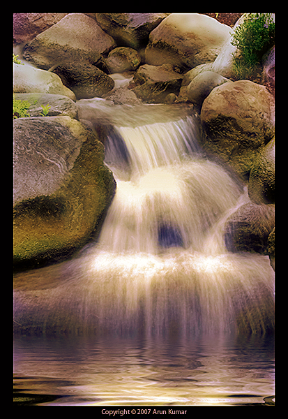
Now, if the filter was not used at the point of taking the photo, then can _exactly_ the same effect be achieved in photo shop? The highlights seem blown out, is that the result of using the filter - i.e. does the exposure setting of the camera get fooled, too much light getting towards uv because of the filter? There will be technical aspects.
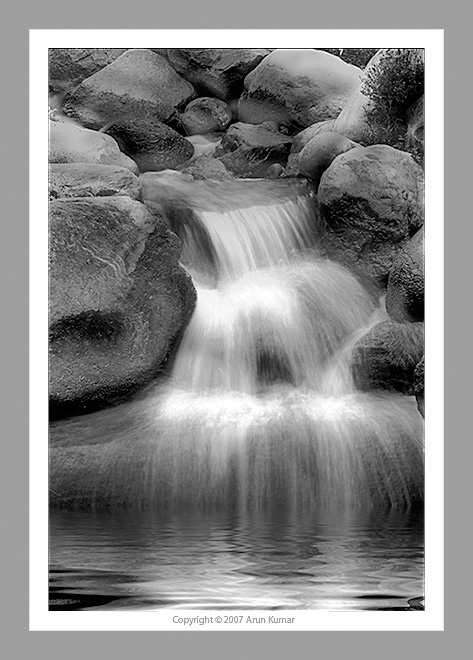
wrt the artistic side, (if there is a distinction) then more or less monochrome with shades of blue, stirs other connotations, for example blue == cold, red == warm, sepia == old, etc. Pure black and white, for me, probably == journalism.
The coloured image, tends towards sepia, sort of looks old and dirty. The blue, or at least a different shade of blue could look 'bathroomy', I'm not sure about the shade for 'serenity' (traditionally green) as working in this case. The problem with waterfalls, is that they are active. I think they need the same treatment as for the sports photos of Nil, for example - thick and creamy - not.
Best wishes,
Ray


")