• Please use real names.

    Greetings to all who have registered to OPF and those guests taking a look around. Please use real names. Registrations with fictitious names will not be processed. REAL NAMES ONLY will be processed

    Firstname Lastname

    Register

    We are a courteous and supportive community. No need to hide behind an alia. If you have a genuine need for privacy/secrecy then let me know!
  • Welcome to the new site. Here's a thread about the update where you can post your feedback, ask questions or spot those nasty bugs!

Musing upon skewed horisons

Hello everybody,

I was wondering today about the mantra of always having to have perfectly level horisons in your photographs - to such an extent that some cameras even have a feature of warning the photographer if it is being tilted.

However, I am interested in seeing images from fellow photographers here where the horison is not level, yet the image is acceptable, or even interesting.

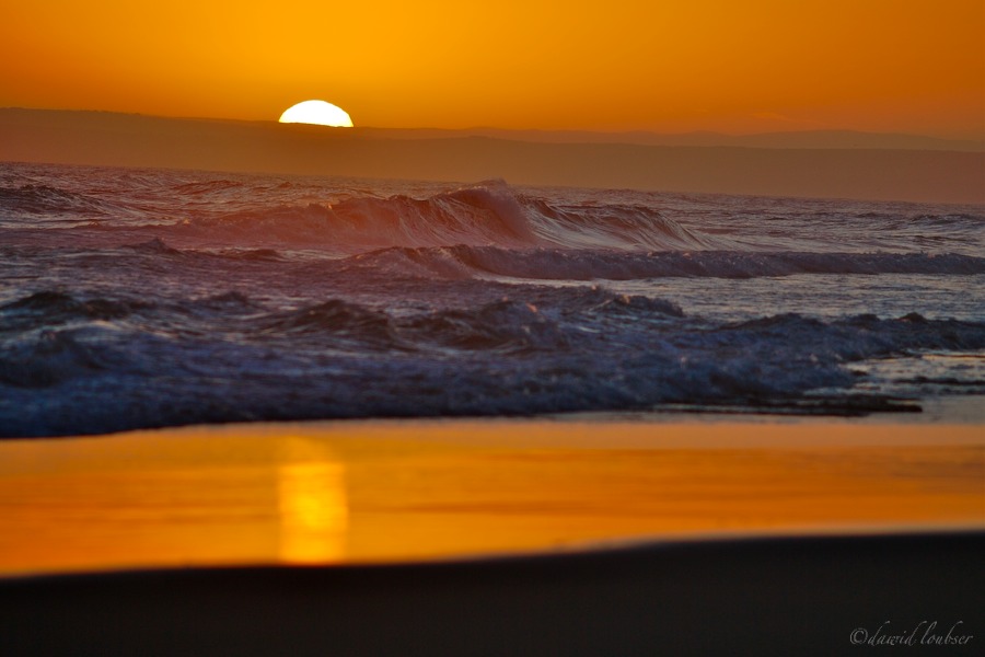
The only photograph I can personally think of in my work is this one, "Divisions of faith", where I purposefully skewed the horison ever so slightly to create a horisontally symmetrical image. I am still not yet sure whether the image "works" or not, but it was an experiment I was happy with. Since a tilt usually "leads" the eye (usually rather uncomfortably), an interesting effect leads the eye in the same direction as the rolling waves, to give a more dynamic sense of motion to them.

Divisions_of_faith_by_philosomatographer.jpg


I am always interested in whether one's disregard of deeply entrenched
photographic conventions have merit, or whether it just appears as a poor
image. What are your thoughts?

Technical: Shot with 1D MkIIN and EF 200 f/2.8L wide open - to
blur the foreground sky reflection on the course sand so as to appear
as smooth as the sky.
 

Asher Kelman

OPF Owner/Editor-in-Chief
Dawid,

Try cropping away the lower 3/4 inch starting on the R with the black and just cut horizontaly to the left without any rotation of the image.

No black!! It's too much. Then the gold balances the gold in the sky and it works!

Asher
 
I like the tilt with the waves - I think it emphasizes the movement. I don't think I would like it if the sea was calm. I agree with Asher about the crop.

-Colleen
 

nicolas claris

OPF Co-founder/Administrator
I like the composition, lhe light, the colors, but sorry, no, I can't see the horizon not to be straight! but it is a pro habit for me!
 

Asher Kelman

OPF Owner/Editor-in-Chief
I like the composition, lhe light, the colors, but sorry, no, I can't see the horizon not to be straight! but it is a pro habit for me!
I'm delighted to disagree here, Nicolas!

Here, this is art and what's expressed is the disorientation in the choppy water. Straightening the horizon would be great for something peaceful, but this is wild and beautiful, an entirely different esthetic.

Great to differ!

Asher
 

nicolas claris

OPF Co-founder/Administrator
I'm delighted to disagree here, Nicolas!

Here, this is art and what's expressed is the disorientation in the choppy water. Straightening the horizon would be great for something peaceful, but this is wild and beautiful, an entirely different esthetic.

Great to differ!

Asher

Desesperate LoL
 

Dierk Haasis

pro member
a) If you do it wrong, do it really wrong. Slightly skewed looks like a mistake, strongly tilted has a message.

b) If Dawid hadn't notified us about the skewed horizon I wouldn't have seen it. The sun dips into clouds, the water's angle does not indicate the typical 'it's running out of the frame'. If we define the width of a photo as the x-axis, the hight as the y-axis, this leaves us the z-axis, which is in the scene but can only be reproduced onto a 2-D picture by tilting it. Now, standing at an angle towards the z-axis when taking the photo can lead to curious, often hard to correct angles within the pic. This could be an example of that.

I found water can make it very hard for the photographer, particularly with smaller bodies of water like rivers and lakes. With peninsulas and islets oceans can be as difficult since the flat line of the water assumed at the horizon is anything but.
 

Cem_Usakligil

Well-known member
Hi All,

I am with Dierk on this one. Here is a possible version, for example:

Divisions_of_faith_by_philosomatographer%20copy.jpg


Regards,

Cem

PS: Very glad to see you around Dierk, welcome :)
 

Asher Kelman

OPF Owner/Editor-in-Chief
I admit that I myself didn't think of increasing the angle so much, but "Hey!" that's the benefit of open and creative discussion. Yes, Dierk, the increased angle is definitive. I like it, (but the gentle angle is still captivating).

Here, if the angle is going to be increased, and I can see that, I'd consider adding an extra sliver of gold sky at the top, maybe 0.25 to 0.4 inch just to place more on top to balance the power of the waves.

asher
 
a) If you do it wrong, do it really wrong. Slightly skewed looks like a mistake, strongly tilted has a message.

I don't agree - I think you should tilt it just enough, and not more than that :) Too strongly tilted makes it feel (to me) too manufactured. For this one, the less dramatic tilt works for me. Too much counteracts the, erm, I'm not sure of the word I want here but I'll use "serenity" of the scene by making me feel like the photographer was diving as he was shooting. It works for PJ where there is often a good reason for shooting while diving for cover, but doesn't (for me) really add much more to the image than the subtle tilt. Maybe because it's a sunset and the ocean and I wouldn't mind it if it were Times Square, or maybe it's just because all of my images are purported to be slightly tilted and that's just how I see the world so it looks perfectly natural that way :)

-Colleen
 
Wow, some interesting responses here :) First of all, I usually agree with the sentiment "if you do it wrong, do it really wrong". However, with this image I was going for a completely different aesthetic - "calmer", yes, and the main reason was still the gently symmetry on the x-axis.

Cem, even though I like your version (and the added drama) it is then a very different image.

Asher, I must say I could agree with cropping off the black at the bottom totally, although even then it somewhat changes my image - it certainly makes it more minimalist, less cluttered. Thank you for the other kind comments though.

This is by no means am image I am incredibly proud of, but I thought it interesting because of the subtle differences from the norm, and it's great discussing it with you guys.

P.S. Dierk, those are not clouds the sun is dipping into, it's the opposite side of Dana bay (Western Cape, South Africa).
 

Dierk Haasis

pro member
I don't agree - I think you should tilt it just enough, and not more than that

Agreed, but then I never wrote [or said], 'over-tilt'. Obviously the true artist or handyman is noticeable by having done it 'just right'. Otherwise his work becomes cheesy.


Dawid Loubser said:
Dierk, those are not clouds the sun is dipping into, it's the opposite side of Dana bay (Western Cape, South Africa).

Corroborating my notion on never really level water. In this case the hilly countryside in conjunction with haze, dust and waterspray obscures the horizon.

BTW, I am not saying that this particular image should be tilted more or less, I actually find the original quite alright. I was just answering Nicolas Claris' idea of always levelling the horizon.

It's quite interesting how landscape photography is the most traditional and conservative branch. Just look at how reportage/street photography, portrait, sports or architectre photography has changed, how they have become more dynamic, less interested in classical do's-and-don'ts, more imaginary than documentary. Sharpness, right angles, skew correction et al. do not play a role anymore.
 

Asher Kelman

OPF Owner/Editor-in-Chief
AIt's quite interesting how landscape photography is the most traditional and conservative branch. Just look at how reportage/street photography, portrait, sports or architectre photography has changed, how they have become more dynamic, less interested in classical do's-and-don'ts, more imaginary than documentary. Sharpness, right angles, skew correction et al. do not play a role anymore.
Dierk,

Would you agree that the more dynamic street style adds "presence and real time", an extra dimension of personal experience?

Asher
 

Dierk Haasis

pro member
I guess you are talking about skewed horizons and blur, so, sure. I'd add a qualifier: personal. And that is probably the operational term for several discussions on photography. Is photography characterised [more] as documentary or interpretative of the world*?


*Please, don't forget that this is a continuum, not a versus [= Bushite] state.
 
Top