• Please use real names.

    Greetings to all who have registered to OPF and those guests taking a look around. Please use real names. Registrations with fictitious names will not be processed. REAL NAMES ONLY will be processed

    Firstname Lastname

    Register

    We are a courteous and supportive community. No need to hide behind an alia. If you have a genuine need for privacy/secrecy then let me know!
  • Welcome to the new site. Here's a thread about the update where you can post your feedback, ask questions or spot those nasty bugs!

At the church door, Leeds

Mike Shimwell

New member
I took this yesterday lunchtime. I walk past this church building fairly regularly and yesterday the sunlight was illuminating the spring blossom brillantly. As I framed the shot I was pleased that the couple of people stopped to talk by the church door - a few moments later and they had parted ways and the composition was then lacking in my view.

For the record shot with a ricoh gx100 at 35mm equivalent and f4.6.

Please comment as I'm increasingly interested in what makes some 'street' photography work whilst some simply fails to come to life.

Mike

2458319682_a158e135d1_o.jpg
 

Asher Kelman

OPF Owner/Editor-in-Chief
Hi Mike,

Really glad to see this photograph! The stone of the church, the soft shower of blossom and their showed pattern on the sidewalk are great compositional elements. The three sandwich board signs add interest leading one to the shaded entrance and several people casually chatting. Now I'll stick my neck out. This is not coming from Mount Sinai, just my view. If this clashes with your concepts then, hey, I'm wrong, plain wrong. IMHO your own feelings about the image are the only parameter which is truly important in art.

However, let me take your art away from your feelings to my own.

So where does it miss? Well that's not fair, who says it lacks anything.

I sense that this image is imprisoned by aggressively close-framing and or cropping. As much as I am going against all the sure confidence that very accomplished photographers have at the moment of pressing the button, more images are robbed of potential by tight framing than almost every other factor.

Imagine that we see the base of the tree too, the foreground is anchored well with something itself magnificent. There is only a small amount of real estate in the frame, why not take two steps backward. There would be more blossom, shadow patten, sidewalk and tree. Now, perhaps this current framing is what serves your intent best, you can still deliver this very same final print. However I'd bet that on some occasions like this, that extra leeway could make you happier.
 
Hi Mike,

I like this picture, it has a lot going for it. Asher has given his analysis and who am I to disagree? But I do disagree. I think the framing with the tree trunk is just right. But I am more concerned that the car distracts from the mood. Unfortunate that it had to be there, just one of those unavoidable things.

Good work, anyway.
 

janet Smith

pro member
I took this yesterday lunchtime. I walk past this church building fairly regularly

Hello Mike

Firstly can I apologise for not welcoming you to OPF sooner, I've had a really hectic few weeks and missed your first post, how nice to have another member from my neck of the woods!

I don't know the church in question, I think I would have moved slightly to the LHS so that the church window wasn't covered so much by the blossom, just a small point, but street photography isn't really my thing....
 

Mike Shimwell

New member
Thanks

Asher, Nat and Janet

Thanks for your comments, and sorry I've been away for a couple of days.

Janet, I had noticed that you are (relatively) local. I saw your site and am really impressed with you flowers. Your love of your garden shinse through.


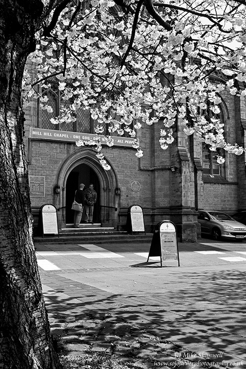
Nat, thanks for your comment. I agree with you about the car. As you say, a part of the untidiness of life I'm afraid, and I'm not up to cloning it out!!

Asher, thanks for you thoughts. This is the full frame, and I got only two with the same basic framing. Interestingly on this occasion I stepped forward in order to remove a low wall and gatepost on the right side of the frame, which I felt had the same 'imprisoning effect on the image. Also, I did not want there to be any space to the left of the tree trunk - again decided in the viewfinder.

However, I have been thinking about the need for wider or looser framing in some of my work and your comment is entirely consistent with that. In my case, I have reached a view that some photography needs more context that we often give and the difficulty is often how to provide that in a compelling image. An example of mine form a couple of years ago (I've lost the file at present...) is a photo I took of my brother, and actor, and a friend who is a writer. They were sat together in a fairly untidy living room in front of a wall of very full bookshelves. My initial crop removed most of the clutter and focused on them and their immediate relationship, but I later came to prefer a wider view, including the books and reflecting their relationship with language and how it impacted on their own human relationship.


Once again, thank you to all for your comments,

Mike
 

Asher Kelman

OPF Owner/Editor-in-Chief
Mike,

Your example is poignant! I do hope you find the original file. Do you have at least a print to scan?

I'm glad to find one more photographer who can concede to the value of adding some more room in their photography, as the clock cannot be returned to what it was.

Asher
 
Last edited:

Mike Shimwell

New member
Hi Asher,

Here's another from a Leeds lunchtime. I was walking to see a photo exhibition and as I approached the open area with the 'legs' sculpture saw the lady in the wheelchair being pushed across the space. I was struck by the irony of the scene.

This is the full frame (you usually only get one shot using the GX100 in raw mode) and may have too much space(?) but I've played with a few crops and keep coming back to the whole of the piece. Any thoughts would be appreciated.

Mike

2487105815_fb51722e70_o.jpg


GX100, 35mm equiv, iso80, f4.1, 1/1000
 

Asher Kelman

OPF Owner/Editor-in-Chief
Mike, this is pretty perfect in width as is. Wide allows you to also have the tree shodow which I'd bring out as it decorates the roadway and adds a sense of time. (Shadows can do that). With your choice of position and focal length you have placed your subject in context. Some lesser eye would have judged differently and this would not work The large space provides a grand stage for the necessary narrative of you quick choice of subject.

I might consider cropping a 1/2 inch or so (~ 1.5cm) from the botton. That way we open with the shadow which brings one to the wheelchair. After I took this (if I was as lucky and alert as you were) I'd have taken an overlapping shot of the building so that you could choose later, whether or not include the totality of the building. The more the wheelchair person is made small in comparison to the entire scene, the more power it has paradoxically in this picture. Being small emphasizes our fragility.

The lower right hand side's fenced in area is far to detail rich and delays movement inwards to the subject of the picture. That, as you have pointed, is the ironic interplay between the legs with no bodies and the person without good legs been wheeled by a helper.

This picture is valuable to you portfolio and is worthy of you spending a lot more time with it if you rank it as high as I do.

Thanks for sharing.

Asher

I would have no conscience nor suffer pangs of guilt if I'd clone out the inside contents of the wooden fence on the lower right, or else remove it entirely. Another possibility which less ruthless people might accept, would be to slightly defocus and vignette the lower right.
 

janet Smith

pro member
Hi Mike

I like this very much, the irony of the person in the wheelchair by the leg sculpture works really well. Where abouts in Leeds is it, is it in central Leeds near the canal? I hardly ever go into Leeds so I'm out of touch with the area.
 

Jeff Donovan

New member
Hi Mike,

I like this picture, it has a lot going for it. Asher has given his analysis and who am I to disagree? But I do disagree. I think the framing with the tree trunk is just right. But I am more concerned that the car distracts from the mood. Unfortunate that it had to be there, just one of those unavoidable things.

Good work, anyway.

I agree. Without the car the photo might have a more timeless look, or at least you'd be less able to place it. Unfortunately I think cropping the car out would detract more than it would add.
 

Mike Shimwell

New member
Thank you for all your comments.

Asher, I've started working this a bit and tried cropping out the foreground a bit, but my current feeling is that it somehow contracts the 'stage' and robs the people of the sense of smallness and fragility that you so clearly articulated. I have also worked on buring in the tree shadow, which is a great improvement and am now playing with very slightly blurring the fenced area to allow the eye to flow over it, as you suggested. I may also try the vignette.

Interestingly, I struggle with wielding the clone tool:) At the risk of starting the TIP debate, i am usually more comfortable not cloning (though I can't make this a rule) and accepting that the image may be less powerful at first glance. I say this in spite of the fact that one of the more freeing conversation I had was with a friend who turned a landscape picture through 90 degrees observing that 'artists exagerate, intensify and change in order to reveal or emphasise a truth', which somehow is important to what I try to do whether landscape or PSD. This underpinning is important to me, perhaps in a similar fashion to Chris Kressers comments on significant work regardless of commercial success. Hence I probably wouldn't make a very good fashion/advertising photographer:) I also still like making nice pictures.

Janet, Yes, this is taken just along the riverside as you walk parallel with whitehall road, behind the railway station. Until last week I worked down there. The building is a new building, 2 Whitehall Quays I think, and the PSL sign is 'Project Space Leeds' which currently ha a photographic exhibition on, though I'm not sure when it ends.

Jeff, thanks. I agree that lsoing teh car would take away too much.

Mike
 
Top