• Please use real names.

    Greetings to all who have registered to OPF and those guests taking a look around. Please use real names. Registrations with fictitious names will not be processed. REAL NAMES ONLY will be processed

    Firstname Lastname

    Register

    We are a courteous and supportive community. No need to hide behind an alia. If you have a genuine need for privacy/secrecy then let me know!
  • Welcome to the new site. Here's a thread about the update where you can post your feedback, ask questions or spot those nasty bugs!

Lilly Pad

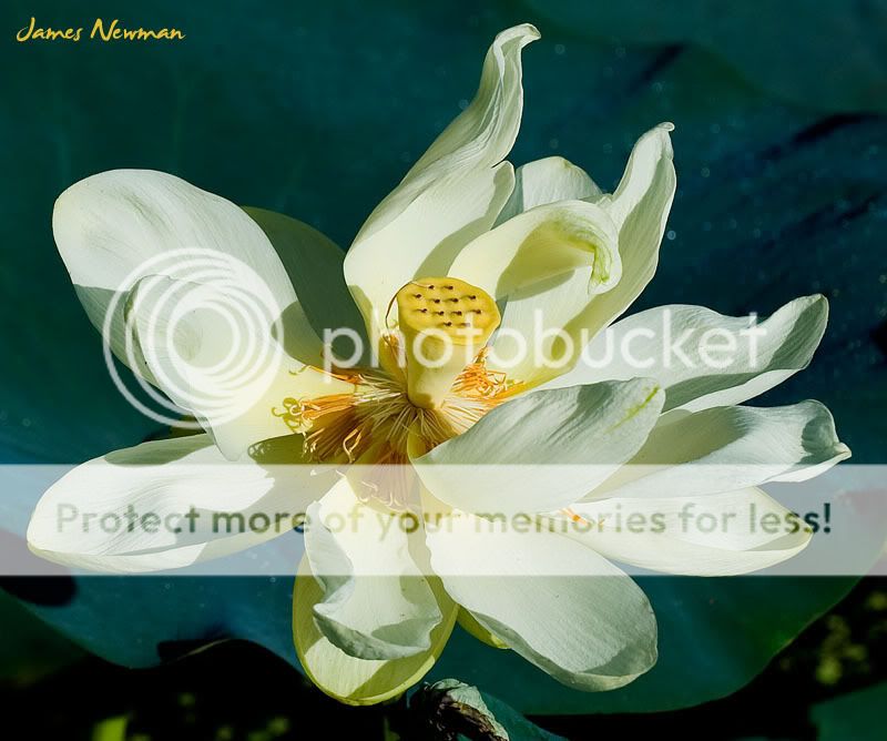
I visited a park this morning not too far from my home. It is another of the many "wildlife" parks or refuges that we have around the Houston area. I have been here before when the bird activity was extreme. This morning it was not. I saw a few herons, Coots, and Moorehens, but that's about it. So, I spent an hour looking at other photographic opportunities. There is a really nice wooden boardwalk that goes out over the water and takes you to a tall observation tower and also a fishing pier. The water right now is covered with giant lilly pads and they are in bloom. I am not sure what kind they are actually but they are beautiful. I took a number of different shots with the Nikon D3 and my 70-200mm lens. The B&W is something of a change for me. I usually don't do much in B&W but with these flowers I was able to find one that was fairly pleasing. I am posting one in color as well so you can make up your own mind which you like better. Myself, I like them both together.
0607_CullinanPark_4208.jpg


0607_CullinanPark_4227.jpg
 

Rachel Foster

New member
I like the top one...and don't like it.

The flower is lovely! The shadowing and capture of the texture are exquisite. The blossom's shape and proportions are wonderful, and it has a feel of movement, due at least in part to the petals that seem to fly away, reaching for the sun.

The blue background works...I wouldn't change a thing. What I don't like is the bottom of the image. It feels cluttered and distracting.

Ok, my second attempt at substantive critique. Please feel free to critique my critique!
 
Hi James,

#1 is nice, it does seem to lose some detail in the petals due to the exposure.
#2 seems to keep more of the detail in the petals and thus lets us see what we think we should see. (hope that makes sense)

Marshall
 
Rachel, thank you. I would not dare to critique your critique. You did a fine job. The first image was taken from about 50 feet away, looking down out over the water. It is a bit cluttered at the bottom but that was just the way it was. I think it is more accentuated because of my poor cropping job.

Thank you too Marshall. Personally I like the B&W more also. It's just newer or younger in its life cycle and not quite as spent as the other. I think I will revisit the color one however and see what I can do to try and pull more detail from it. Thanks again.
 

Rachel Foster

New member
Ah but...if you critique my critique, I can learn from that!

All is fair game when I post. I have a great deal to learn and that is one way. We're all learning from each other, yes?
 

Kathryn Beaule

New member
Hi James,
I'm new here to this forum and when I saw your pictures I had to tell you I love the colors in the first one but I like the crisp feeling and neatness in the black and white. Either way I think they are both beautiful.
 
Top