View Full Version : Expression in Photography Series by Charlotte Thompson
charlotte thompson
March 26th, 2008, 12:39 PM
http://i246.photobucket.com/albums/gg115/luluwind/Peanut-1-1.jpg
Martin Kuivenhoven
March 26th, 2008, 03:32 PM
Claudia, i am on shaky ground here but I like the look of the shot with the contrast of the sharp right eye versus the softness of the overall picture. I am a bit uncertain about the light patch on the right side, are you aiming for a certain style?
Martin
charlotte thompson
March 26th, 2008, 04:27 PM
Martin
yes definetly developing a certain style I am
mostly with coloring
this was original black and white I enhanced
I do electric stuff-this is more subded
thank you appreciate your comments
Charlotte
James Newman
March 26th, 2008, 04:36 PM
I like the effect too Charlotte and even the big patch of light on the right I can live with. It is definitely different and in a style that I enjoy looking at. The small patch of light however, that is coming out of her left cheek is a little distracting to my eye.
James
charlotte thompson
March 26th, 2008, 07:13 PM
James
I really didn't see that small patch of light-damn-thanks for drawing my attention to that!
you have a good eye sir*
I work in what I call electrix- my voice/style- I am going to post something tonight of it
I see you are from Houston so am I but a bit west-Katy
appreciate your feedback so very much next time my eye will try to train itself better*
Charlotte
charlotte thompson
March 26th, 2008, 07:48 PM
http://i246.photobucket.com/albums/gg115/luluwind/DSC_0181-1.jpg
Asher Kelman
March 26th, 2008, 10:33 PM
Hi Charlotte, I restrained myself from commenting on the previous two pictures you posted. Here however I decided, not commenting would be plain wrong.
I'm a cynic when it comes to "making art" using photoshop filters. I remember someone here say that he dislikes failed color photographs "drained of color" and being resurrected s B&W, "Art". So we all have our prejudices.
So I watched your work and now I can say I do like what you are doing. It would be worthwhile for you to write an introduction to what's on your mind.
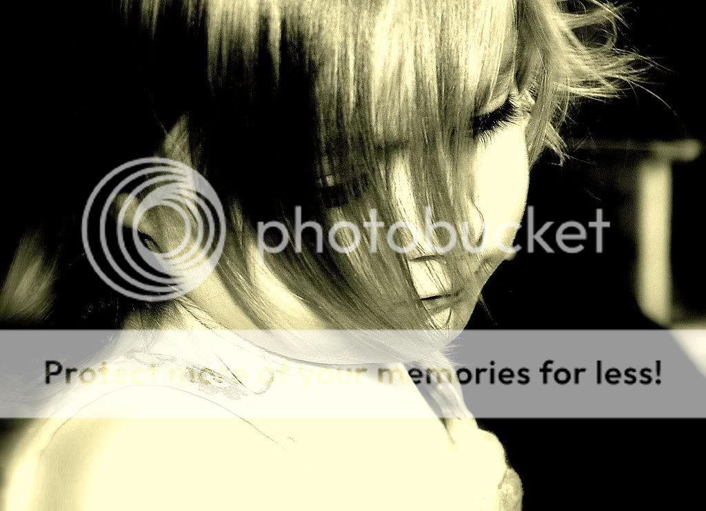
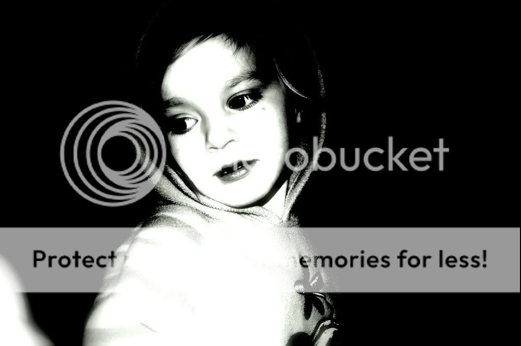
Still, I'm impressed with the form of this photograph of "Claudia interviews the time machine". I do have a particular view that that when Art is compelling, it also "interviews" us.
This photograph has a powerful triangular composition. The improper ignoring if the "rules of thirds" placement of the head, adds some tension and awkwardness to the picture, but that's positive.
The angle of her head and here pensive attitude is engaging. The blue shapes covers all the 3 axes of a cube and give balance and stability to the composition.
This should be printed 6 foot wide!
Asher
BTW, are you embedding your © Charlotte Thompson in the IPTC code in the image? You should. also place that under the image!
janet Smith
March 27th, 2008, 01:36 AM
Beautiful Charlotte, seems to me that you have a distinctive style - and I like it!
charlotte thompson
March 27th, 2008, 07:13 AM
Asher
I do so appreciate your crit- I have just started working with this kind of style-my own electrix if you will and I love how it screams *out of the box* but that is me
I am a writer/poet of contempt/modern poetry and have been published etc. and I paint on canvas as well*
a friend of mine bought me a Nikon d40 and this is what I am showing with it
although I do traditional as well but really like this new thing I am developing for myself-
I always most always in art ignore rules- instead I go for freedom of self expression as such
as me-personal thing
I have no idea where I am going with this but it feels right-
again your insight is so valuable to me-my many thanks and I am sure I will be posting more work
thank you so very much
Charlotte
charlotte thompson
March 27th, 2008, 07:18 AM
Janet
thank you-I am working on it-
it's a blast-
my best,
Charlotte
charlotte thompson
March 29th, 2008, 05:30 AM
I shot these in color and changed the mood and tone in dark sepia- what I call my electrix colors. I think she says much more in these graduated hues- I always use a Nikon D40 35 mm with a flash-
http://i246.photobucket.com/albums/gg115/luluwind/DSC_0481.jpg
http://i246.photobucket.com/albums/gg115/luluwind/DSC_0527.jpg
janet Smith
March 30th, 2008, 01:50 AM
Hello Charlotte
I found myself covering up the RHS of the first one with a piece of paper to crop out the bubble bucket, I find it very distracting..... but maybe it's one of Claudia's favourite things, is this why you've included it?
Then I found myself doing the same with the second image, covering up the empty seat to the rhs, and preferred the look, IMHO they would both be improved by cropping the area to the right, but maybe you like them just the way they are......
charlotte thompson
March 30th, 2008, 05:42 AM
Janet
thanks for the look see and your ideas
what I am doing is a photo shoot of this stunning child for the parents-a client
they want all sepia tones and hues the way I use color
also they want parts of what the child is doing-her toys etc-
I am going to to present what I have soon but I am not finished
all of the shots will be mounted on this huge wall in an entry way with same color frames
I enjoy her so much I can't tell you- btw I have cropped some of the others dunno if you have seen them-not all shots of course will be chosen by the client but I will show all of them
thank you again for coming by-appreciated
Charlotte
charlotte thompson
March 30th, 2008, 02:04 PM
mostly black and white intermixed with a tad of sepia-
http://i246.photobucket.com/albums/gg115/luluwind/DSC_0071.jpg
http://i246.photobucket.com/albums/gg115/luluwind/DSC_0532-1.jpg
Martin Kuivenhoven
March 31st, 2008, 01:35 PM
The longer I look the more I find these picture very different.
The fist picture has a soft look and makes me curious whats behind her shoulder. The chair on the right hand side of the right shoulder does not neccesairely need to be there.
The second has a harsh feel with the very bright face and the arm and body on the right side are reduce to one flat area.
Like the first one best.
Again, any specific C&C you are looking for?
Martin
charlotte thompson
March 31st, 2008, 02:21 PM
Martin
thanks
working with colors and of course the true spirit behind the eyes-
this is a portfolio of this child
I couldnt really get all the noise out-grrrrrr but at least the attitude is right
thanks again for coming by and letting me know what you think
appreciated
Charlotte
Rachel Foster
March 31st, 2008, 02:28 PM
I can't help but wonder what they looked like before processing. Stunning child, pose is enchanting.
charlotte thompson
March 31st, 2008, 02:59 PM
The before shots- and appreciate your interest-
http://i246.photobucket.com/albums/gg115/luluwind/DSC_0532-3.jpg
http://i246.photobucket.com/albums/gg115/luluwind/DSC_0072.jpg
Rachel Foster
March 31st, 2008, 03:07 PM
My opinion...and I'm a RAW beginner with an undeveloped eye...is that the girl is exquisite. Focus might be a little soft, though. I would want to lose the background though.
I would -- again, please note: BEGINNER here myserf -- I would try black and white, hit the contrast a bit which can sharpen it, and then perhaps try to blur the background.
ETA: Neither of these are better (or even as good) as yours, but this is what I tried.
http://i183.photobucket.com/albums/x153/annieblues/DSC_0532-3.jpg
http://i183.photobucket.com/albums/x153/annieblues/girl2.jpg
charlotte thompson
March 31st, 2008, 04:02 PM
Jacob
what an excellent muse you are
very interesting what you did with the shots-very- I am challenged then* thank you
I will try to see what I can do again- I do like very much what you did
and it inspires me- I have just started with this camera thing- I am working with a Nikon d40 and do like playing with colors other than traditional photos-I can see that you do too- if you care to look at my enhanched female you can see what I have done with my color attitudes- thanks again so much!
Charlotte
charlotte thompson
April 1st, 2008, 05:26 AM
For Jacob= another try- a bit of a mixture- soft and shadings- I couldn't get out the left color grrrrr-
http://i246.photobucket.com/albums/gg115/luluwind/DSC_0072-1.jpg
Cem_Usakligil
April 1st, 2008, 05:40 AM
For Jacob= another try....
Hi Charlotte,
FWIW, the "Jacob" you have been communicating with is actually called Rachel (LOL).
Jacob Eliana is the name of the photography operation she has established in order to raise funds for the Foster Lifson Undiscovered Artists fund. The links are in her signature.
Cheers,
Cem
charlotte thompson
April 1st, 2008, 05:48 AM
names names LOL ok Rachel then* thanks Cem*
charlotte thompson
April 1st, 2008, 05:59 AM
color enhanced- what are your thoughts on this photo-
http://i246.photobucket.com/albums/gg115/luluwind/DSC_0630.jpg
Doug Kerr
April 1st, 2008, 07:05 AM
Hi, Charlotte,
color enhanced- what are your thoughts on this photo
It makes me wonder about the meaning of "enhanced".
charlotte thompson
April 1st, 2008, 07:13 AM
Doug
thank you for looking at this photo and your wonderings-
I color enhance with photoshop-picasa
I lovelovelove to do this with traditional photography
for me it is becoming my own sytle-still developing of course
she is a portfolio I am working with now- a stunning model for sure
Charlotte
Rachel Foster
April 1st, 2008, 08:41 AM
I rather like the "Jacob," myself! Those are the names of my children, and Jacob is indeed an excellent muse!
I am enjoying seeing what you're doing with the editing, Charlotte. It can be wonderful fun and the creativity is energizing.
charlotte thompson
April 1st, 2008, 08:55 AM
Then Jacob it is * and indeed he is an excellent muse!
thank you for coming back for the look see and your kindness
Charlotte
charlotte thompson
April 1st, 2008, 11:23 AM
could I get any feedback on this type of coloring enhancement-this is a style I am working on
opinions either way are appreciated-
http://i246.photobucket.com/albums/gg115/luluwind/DSC_0486.jpg
Rachel Foster
April 1st, 2008, 12:06 PM
Charlotte, it's my pleasure. I have only been shooting since August and I know how very, very helpful feedback can be. It can be intimidating posting on a board like OPF where most members are so extremely talented and knowledgeable. My input is the least-informed you'll get here, but I do understand the new photographer's dilemmas! And your instincts look very, very good to me. Your model is incredibly beautiful and the poses you're posting have a great deal of charm.
For what it's worth, the people at OPF have given me a great deal of time and feedback. And I think it shows in my photos.
Rachel Foster
April 1st, 2008, 12:19 PM
Honestly? This child is so beautiful I'd rather see the unenhanced versions. Perhaps black and white, maybe boost contrast, but I want to see that lovely child as clearly as possible.
Just one opinion.
Charlotte, would you mind sending me an email? The website link on my posts has an email capacity.
charlotte thompson
April 1st, 2008, 12:23 PM
Jacob
of course of course
I am experimenting with her beauty and what she is saying via-life and circumstances
I will try to find the original and post in black and white as I can do it in this thread asap
thank you so much
love the feedback dear Jacob* winks*
Charlotte
Jacob-
I am so so sorry but the other image you wanted in b and w is all screwed up and I can't work with it anymore
but I sent another of her in B and W for you to see-
http://i246.photobucket.com/albums/gg115/luluwind/DSC_0570.jpg
charlotte thompson
April 1st, 2008, 01:02 PM
Jacob
thank you my dear
I havent been into shooting in many many many years a friend of mine gave me a nikon d40 and this is what I am doing with it
I am a writer and artists on canvas though I dont paint any more - AND NOW BACK
again after so long away from photograhpy-
the child I must admit is my grandchild- claudia is not her real name I want to keep that private-
she is named after the child claudia in* interview with a vampire-ann rice-who the girl child and a writer friend of mine adored in the story so we call her our *claudia-
where do you post your photos-
Charlotte
charlotte thompson
April 1st, 2008, 01:16 PM
also Rachel
look at *Claudia* in this forum on down the page it is one of the best shots in b and w that I have done so far- I couldnt believe the catch I got-
Charlotte
Rachel Foster
April 1st, 2008, 01:18 PM
I can suggest a couple of other fora you might be interested in. One is a very small board but is run by another canvas artist. A lot of my photos are on a flickr site (http://www.flickr.com/photos/jacobelianaphotography/). Flickr allows you to choose settings that prevent unauthorized downloads.
My profile here links to a scholarship fund I'm sponsoring (here) (http://www.mpacf.org/scholarship_center/scholarship_pages/foster_lifson_undiscovered_artist_fund.html). I only toss that out because I'm quite proud of the fund (and am NOT soliciting donations; as Asher pointed out to me some months ago, that will take care of itself). This fund is named in honor of my children.
Rachel Foster
April 1st, 2008, 01:21 PM
You are indeed lucky to have such an enchanting model.
charlotte thompson
April 1st, 2008, 01:23 PM
Oh yes I am
and thank you so much
I will email soon-
Charlotte
charlotte thompson
April 1st, 2008, 01:26 PM
Jacob
I am looking at your site now and think the photos you have done are Amazing*
especially I liked the piano and hand shot
beautiful beautiful-thank you for the site info-I will for sure look it up-you have been a blessing-
Charlotte
Asher Kelman
April 2nd, 2008, 01:27 PM
[QUOTE=Rachel Foster;45219]My opinion...and I'm a RAW beginner with an undeveloped eye...is that the girl is exquisite. Focus might be a little soft, though. I would want to lose the background though.
I would -- again, please note: BEGINNER here myserf -- I would try black and white, hit the contrast a bit which can sharpen it, and then perhaps try to blur the background.
ETA: Neither of these are better (or even as good) as yours, but this is what I tried.
http://i183.photobucket.com/albums/x153/annieblues/DSC_0532-3.jpg
Rachel,
Good work! You have demonstrated that an "Arc of Intent" can start at any point in an expected chain of creativity. Your first image is creative and I like it. The softness around her allows one to focus on the girl thinking. It works. Chalotte's work is harsher but itself also effective. Two totally different and worthwhile results from the same image.
This demonstrates our responsibility to ourselves to invest more effort to have the picture express what we might think not just what the engineers in Japan build into the personality of the camera.
Asher
BTW, what blur did you use? Could you post your photoshop layers?
Rachel Foster
April 2nd, 2008, 01:50 PM
Ooops, Asher just busted me!
I didn't use photoshop at all. I cheated with an extremely easy, free editing package put out by Google: Picasa (http://picasa.google.com/index-new.html). Open Picasa, click on the 3rd tab (effects), go to "soft focus." You use two sliders to adjust the size and amount of blur.
For what it's worth, I don't think the version I posted is "better" than Charlotte's in any way, just different.
charlotte thompson
April 2nd, 2008, 02:02 PM
Jacob and Asher
ahahaaaa man I just love being with other artists
how we love the art
our intent foucsed on art and for creativity-
Jacob*
I love what you did-I do work with picasa2 so I know how to work with it
absolutely out of control with colors really I have posted in this forum-
the soft effect is beautiful indeed- I am really working on all kinds of light and dark etc. to change the meaning a bit so
Asher-
thank you for seeing me- I so appreciate that*
Charlotte
Rachel Foster
April 2nd, 2008, 03:12 PM
I tend toward hitting the contrast pretty heavily. That and stark backgrounds are my biases.
A lesson I learned the hard way is that your computer monitor can be friend or foe. I did my early work on a laptop. What looked fine there was atrocious on a good monitor.
Keep shooting!
charlotte thompson
April 8th, 2008, 12:02 PM
the baby in white may become a seires to start with-yes I think so-
her strongest features brought out- as a white-out series
http://i246.photobucket.com/albums/gg115/luluwind/DSC_0647.jpg
Rachel Foster
April 8th, 2008, 12:13 PM
Charlotte, your style is very different from mine but one I'm finding enchanting. It is creative, no question.
charlotte thompson
April 8th, 2008, 12:24 PM
Rachel
thank you so much. Yes artists are different-but that thank god I am thinking of doing a white series with some of the best shots of her. Always taking pictures of her and have a lot saved as well.
Thanks for dropping in-I appreciate always what you think
Charlotte
charlotte thompson
April 10th, 2008, 07:33 AM
claudia profile- added colors
http://i246.photobucket.com/albums/gg115/luluwind/DSC_0630.jpg
charlotte thompson
April 10th, 2008, 04:30 PM
we all of us have different colors
this is what I want to develope- to show something more than the usual.
Charlotte
Jörgen Nyberg
April 10th, 2008, 06:04 PM
Charlotte , re the first picture.
I think that type of coloration, would work better with a cleaner background, and less saturation on her lips and eyes, looks like she´s wearing makeup.
charlotte thompson
April 10th, 2008, 06:17 PM
cool ok-
thank you- so much
I am working on a style
and I do appreciate any feedback I can get-
Kathy Rappaport
April 10th, 2008, 06:26 PM
I read about a photographer today in the local paper. She was called a Photographic Digital Artist. I think that describes this kind of work.
charlotte thompson
April 11th, 2008, 05:04 AM
Kathy
would have loved to have read the article-do you remember the name
Charlotte
charlotte thompson
April 17th, 2008, 08:06 PM
http://i246.photobucket.com/albums/gg115/luluwind/DSC_0739NEF.jpg
what we see-
Charlotte
Kathy Rappaport
April 18th, 2008, 06:24 AM
No - I just saw the title Digital Photographic Artist.
I also have select images that I have used curves and modified the coloration beyond what is accepted as normal. Some things become beyond interesting. What you have done reminds me more of an Andy Warhol type of piece.
charlotte thompson
April 18th, 2008, 02:54 PM
thank you Kathy-I have been told that before-that is about the warhol connection-
lately I have been pulled this way and that way with artistic projects-
thank you for seeing thisin such a connected way
Charlotte
Georg R. Baumann
April 18th, 2008, 08:26 PM
http://i246.photobucket.com/albums/gg115/luluwind/DSC_0739NEF.jpg
what we see-
Charlotte
Not sure whether it is only me and my eyesight, which at 46 is not in it's prime anymore of course, but I can not look at this picture for longer than 2 seconds, it makes me uncomfortably dizzy and I find it extremly irritating.
This is not a critizism Charlotte, just an observatioin.
charlotte thompson
April 19th, 2008, 06:12 AM
wow then I achieved a certain dizzy quality to this work
interesting
thanks for your comment- do the other pictures in this thread have the same effect?
Charlotte
Ray West
April 19th, 2008, 06:28 AM
I think it is because you have messed with the eyes. Normal portraits have sharp eyes, because, generally that is what others look at, if stood in front of a person. We are tuned to look for human like features, in particular the pug like baby, puppy, lamb faces, etc, which turn us into a protective mode. So, we look at a chubby face, and there are no eyes to focus on. The eyes are almost double exposed - as if in camera shake, not just out of focus blur. I do not want to look at the image for long either, but for other reasons. I wonder if Georg can stand flashing lights?
Best wishes,
Ray
Bart_van_der_Wolf
April 19th, 2008, 09:32 AM
but I can not look at this picture for longer than 2 seconds, it makes me uncomfortably dizzy and I find it extremly irritating.
I'd call it camera shake or poor technique, others call it art ...
Bart
charlotte thompson
April 19th, 2008, 11:06 AM
art to one is not the same for another guys-
Charlotte
Asher Kelman
April 19th, 2008, 11:13 AM
Impressive but requires a different taste. To me it has life. I'm not sure it would work in B&W or unaltered as shown. Why not post the original prepared as best as possible in color and B&W. I wonder whether anything I find valuable is there in the original classic representation.
I doubt whether Ansel Adams or Henri Bresson would have liked or appreciated this, but I do not know their attitude to such weird or strange development of images! Would they show disdain or be interested? Anyone know?
Asher
Rachel Foster
April 19th, 2008, 11:16 AM
I find it interesting but not my style. Is it art? I'm not qualified to answer. I do like the fact that it's unusual and not something I would have thought of trying.
Art? Bad technique? I don't know. But it is different and that has some value in itself.
Georg R. Baumann
April 19th, 2008, 11:19 AM
wow then I achieved a certain dizzy quality to this work
interesting
thanks for your comment- do the other pictures in this thread have the same effect?
Charlotte
My apologies that I did not pay the same amount of attention to the others that I spend on this one, hence no, I can not say I gave them the attention required. I have a lot on my plate currently and can not spend the time here that I would like to.
Well, to my eyes you achieved a certain quality in deed, I can not look at it without getting a feeling of nausea. But as I said, it could pretty well have its roots in an inadaequate condition of my eyesight.
art to one is not the same for another
...an Insight I would most definately share.
Here is an idea, you could show Claudia your work and film her reaction to it.
;)
charlotte thompson
April 19th, 2008, 04:01 PM
she has seen the work- and she says prettttttttty that's Claudia* and smiles more beautifully than any light you have ever seen
Charlotte
Kathy Rappaport
April 19th, 2008, 04:28 PM
I do agree that the eyes always need to be crisp to have any commerical or value - eyes always do need to be sharp. But I do like the process of coloration - even out of the norm. A little development of this could be really interesting.
Asher Kelman
April 19th, 2008, 05:42 PM
I find post # 52 disturbing but it grabs attention becasue of those eyes perhaps. I think it's worth holding on to. I have, as I have said before mixed feelings on these photoshop alterations but in balance I come down in favor of some artistic worth that I should follow.
I think it would be good to see the original of each new image together with the derived version. I would like to examinie my own reactions to each and see in what way they are different and how the changes contribute to the final result.
Charlotte could you do that in future to help us? BTW, the size of the image in post # 52 is perfect. In fact you could have the original shown side by side.
In this forum, "Photography as Art" we want to examine different forms of artistic expression with photography that might constitute art. So I would like look at you photograph from that standpoint.
Asher
charlotte thompson
April 21st, 2008, 06:57 AM
Thank you Asher for your input-in the future I will try to have both-
Charlotte
Asher Kelman
April 21st, 2008, 11:38 AM
Thanks Charlotte for accepting the idea of limited coherent threads to see your work. We appreciate your efforts and look for growth. So heres you space. Good luck.
To those who are puzzled: It's easy to dismiss such pictures as mere photoshop manipulations and twiddles of the curves. It's also simple to say "Wonderful" when we mean the opposite or be quietly impressed and leave it to everyone else to take the risk in expressing opinions.
I personally see artistic expression.
Asher
charlotte thompson
April 21st, 2008, 12:08 PM
Asher
Thank you for coming back. What ever I bring to the table of art is definetly through my eyes
not a just a photo shop for sure.
Expressions of art for me has always been very evocative-I tend toward what one might define as abstract or new age but I can't say for sure or really define art- I have said it is seduction-perhaps the art of seducing emotions might be a better way that defines what I do with photography and color enhancements to treat the eye in another unexpected way.
Thank you my friend
Charlotte
charlotte thompson
April 22nd, 2008, 05:46 AM
I lost the original shot- so you cannot compare
sorry Asher I shall try to keep the original and the new looks together but this is my newest art of Claudia
especially I like to enhance the eyes if at all possible as well as the whole of the subject
as if a special light or brilliance surrounded her/the subject
http://i246.photobucket.com/albums/gg115/luluwind/DSC_0666.jpg
charlotte thompson
April 22nd, 2008, 12:11 PM
a before and after to show what I am doing with the photo-
before-
http://i246.photobucket.com/albums/gg115/luluwind/DSC02351.jpg
after-
http://i246.photobucket.com/albums/gg115/luluwind/DSC02351-1.jpg
Asher Kelman
April 27th, 2008, 05:30 PM
Charlotte,
Thanks for sharing a before and after of your portrait.
First you have started with what appears to be snapshot, framing even wider than I would cajole people to do, given the final presentation.
There is no suggestion that the original picture was intended for the final ending. Not bad point.
Your transformation with photoshop puts a floodlight on her face and wipes out detail yet leaves a fragment sufficient for us to imagine. In that way we are drawn more to the eyes and through that to the child! I'm not sure how your brain works or whther or not you get the feelings I do becasue you do not describe what the original misses that you seek to obtain or you just like the look after fiddling and that's fine too.
http://i246.photobucket.com/albums/gg115/luluwind/DSC02351-1.jpg
I would like then to learn is this presentation attractive to you
Because it.................................... fill in please or else
Just it's prettier and, I think, more impressive.
Asher
charlotte thompson
April 28th, 2008, 05:33 AM
Asher
I crop the shot to engage in the eye and expression of the child- I like to take ordinary photos of natural color and enhance to an other worldly look of sorts
some are more extreme than others
yes most definetly this presentation is more more appealing to me
it begs you to look doesn't it and also holds your attention and asks questions-makes you feel alive-have you ever seen a portrait presented like this-and that is what makes it my art-a voice if you will-I have another to post that is even more ethereal- and definetly different but I adore it because of the uniqueness and expression- here it is I will post this one in this reply* finding the creature in all of us* is my title and thus expression
Charlotte
http://i246.photobucket.com/albums/gg115/luluwind/DSC_0822.jpg
charlotte thompson
May 3rd, 2008, 08:57 AM
http://i246.photobucket.com/albums/gg115/luluwind/DSC_0979.jpg
charlotte thompson
May 10th, 2008, 08:28 AM
I found this scene sitting on a table-untouched -it spoke to me in many many ways
for me it says there is a kind of death in art however the balance is the light
my musings-
http://i246.photobucket.com/albums/gg115/luluwind/DSC_0957-1.jpg
Asher Kelman
May 10th, 2008, 11:07 AM
Everyone,
We only need to use up bandwidth as required to show the essential of photographs you are sharing. Most pictures can be just 400 pixels wide although 500-600 may be preferred.
Charlotte,
1024 pixels wide is not needed for a picture which is not detail rich. I'd resize it if you can. :)
Asher
charlotte thompson
May 10th, 2008, 12:06 PM
yikes
I will find out how dunno how but will see about help tonight from a genius I know-
Charlotte
charlotte thompson
May 21st, 2008, 11:41 AM
after the pool and a summer smile in colors-
http://i283.photobucket.com/albums/kk288/redfiregold/DSC_1128-2-2.jpg
http://i283.photobucket.com/albums/kk288/redfiregold/DSC_1133-2-1.jpg
http://i283.photobucket.com/albums/kk288/redfiregold/DSC_1134-1-2-1.jpg
http://i283.photobucket.com/albums/kk288/redfiregold/DSC_1108.jpg
Cem_Usakligil
May 21st, 2008, 12:45 PM
Hi Charlotte,
It is always interesting to wait and see what you'll come up with next. You have been developing your own style and these images definitely communicate your own signature.
If you don't mind me saying so; #3, and to a lesser extent #2, do not work for me. Sorry.
#1 is an image with potential. But #4 is my favorite. The pose and the eyes are great. I really like it.
Thanks for showing.
charlotte thompson
May 21st, 2008, 01:25 PM
Cem
thanks for coming by and your honest expressions of my work
it was hard to pick which one to enhance with my signature I have so many
but we are only allowed so many to display-I may add on more later
the dark of her skin tone was a bit hard to work with-a challenge if you will
a model for sure she will be, actually she is now
Charlotte
Asher Kelman
May 21st, 2008, 05:13 PM
Charlotte,
Here's the first time I have not been able to get resonance with your vision in any of these pictures. The pictures are all different in style. You must pick one style that is your mark of Charlotte. Look back at the pictures posted here. Then look again at these.
If # 4 is going to be your style, so be it! But is it what you want compared to the low contrast picture# 3.
How are you arriving at these choice. Are you recording what you are doing so you can do that again or do you just experiment with each picture? In any case, what is the common thread?
In any case, I'd pick #2 :) Thanks for sharing.
Asher
charlotte thompson
May 22nd, 2008, 12:38 AM
Asher
if the client wants different looks and colors it is what I will do- it is my style or art to look at the shots this way- all the shots were done at their pool-they have seen what I have done and wanted to see just this different shades with the child-I will then find similar colors when they choose and run the series for them in that color, that's all, sketches in color if you will
they loved no 1 and 2 so I am running the series and then they pick, there will be a huge framed display in her room which they are re-doing for her-the pictures will help define her aura
Charlotte
charlotte thompson
May 23rd, 2008, 06:46 AM
I want to sart a summer series with just boys and my color style-I would love any sort of comments-this will continue as I go through the summer
May 23 2008-#1
http://i283.photobucket.com/albums/kk288/redfiregold/DSC_1164.jpg
Let me add this (from Charlottes post #7 below) concerning a variety of modulations of her developing style. This was in answer to my questioning that variation. Asher
Working with a group business I am trying different looks- I would call it expansion of my work-I am learning a lot but trying new colors and different schemes- thats all
one would think as a enhancement artist it would behoove one to expand and learn more
I cant stick to one style now as I am experimenting with this art and photos
most artists grow into a style/voice I am still growing
the concept now and here is merely a tune of color enhancements all are not alike true
speculation on taking a chance- I am merely submitting a diffrence in the series.
charlotte thompson
May 24th, 2008, 11:49 AM
May 24 2008 summer series boyz two-
http://i283.photobucket.com/albums/kk288/redfiregold/DSC02927.jpg
charlotte thompson
May 25th, 2008, 04:44 AM
http://i283.photobucket.com/albums/kk288/redfiregold/DSC02927-2.jpg
charlotte thompson
May 25th, 2008, 04:55 AM
http://i283.photobucket.com/albums/kk288/redfiregold/DSC_0798.jpg
charlotte thompson
May 27th, 2008, 10:47 AM
http://i283.photobucket.com/albums/kk288/redfiregold/DSC_0812-1.jpg
Asher Kelman
May 27th, 2008, 01:53 PM
Hi Charlotte,
Just when I retune my brain to your abstractions, then we get more realistic images. Why the wobble of style? I am not saying it's wrong but is there some idea behind it? Frankly I would expect all the images to fit into your hallmark style or else it does appear haphazard!
Each collection should be related in style.
If the abstraction of say post# 1 (which I happen to find interesting at the very least) is not the master style, then give us the concept that you are using to tie this together.
Asher
charlotte thompson
May 27th, 2008, 02:36 PM
Asher
working with a group business I am trying different looks- I would call it expansion of my work-I am learning a lot but trying new colors and different schemes- thats all
one would think as a enhancement artist it would behoove one to expand and learn more
I cant stick to one style now as I am experimenting with this art and photos
most artists grow into a style/voice I am still growing
the concept now and here is merely a tune of color enhancements all are not alike true
speculation on taking a chance- I am merely submitting a diffrence in the series
Charlotte
charlotte thompson
May 29th, 2008, 06:02 AM
I am just starting to mix collage with my color style-another form of expression in photography
I find this enhancement very beautiful in its scope for the viewer in particular-
http://i283.photobucket.com/albums/kk288/redfiregold/collage19.jpg
http://i283.photobucket.com/albums/kk288/redfiregold/collage8.jpg
Asher Kelman
May 29th, 2008, 10:17 AM
Charlotte,
I like this as its all together as a believable unit. I see it as a growth stage. Could you try to keep this essence and stay on this track? No more complicated/colored than this is. Keep the throttle of the various imagination engines and fiddle hands set no more than used here until you have made say 20 such pictures in coherent collection.
Also, stop and think. Print this picture large and then write about it. Just strong single words. Then on another day, write concisely what this might mean to you or if you think it is trite and a doodle and not important.
By doing his, you are interviewing yourself and making an investment in your own artistic capability with this medium. If this is not important to you, then it doesn't belong in here, but in Layback Café as humor. Then we'll move it there. If it is indeed important to you, then you will do the work. This forum is for work in doing or making Photographic Art.
Thanks for sharing this new work!
Asher
It's so important to get one identity per series.
janet Smith
May 29th, 2008, 10:31 AM
Hi Charlotte
Well done! no time to say anymore (sorry), except I love it!!
charlotte thompson
May 29th, 2008, 10:46 AM
Asher
sigh- "this work is for doing or making photographic art"
I thought that was what I was doing! (doing and making)
my definition of art any art is "An act of seduction"
I believe there are many ways to seduce- because I use different ways of coloring a photo
doesn't mean I need to (stick) to any one way of coloring
all ways ARE my style
and if this was not important to me as an artists I wouldn't have invested my efforts in this forum
I am an artists type that loves any thing out of the box I consider my art as such
but the colorinGS are my style-
Charlotte
charlotte thompson
May 29th, 2008, 10:48 AM
Janet
thank you so much!
Charlotte
Asher Kelman
May 29th, 2008, 11:15 AM
Asher
sigh- "this work is for doing or making photographic art"
I thought that was what I was doing! (doing and making)
my definition of art any art is "An act of seduction"
I believe there are many ways to seduce- because I use different ways of coloring a photo
doesn't mean I need to (stick) to any one way of coloring
all ways ARE my style
For sure, you have a style of coloring, but for presentation, one related palette and set of esthetics links together that particular series. For the next exhibition, another color palette and design or emotional thrust for that month's seduction can be redefined. You can change whatever you like. However, it makes it easier to follow one collection at a time, so the idea is to keep the thread here for images that would fit into a collection that a museum or gallery would put on of your work for one month.
So in this partcular thread, if you keep to the same set of imagination elements, then the reader is blessed with a seductive path to follow that works not wiggles away!
Asher
charlotte thompson
May 29th, 2008, 11:45 AM
Asher
well I sure wouldn't want any one wiggle away from the point of it all-
I will try my best-mantra...one color-one theme- no wiggle-
one color-one theme- now how's that?
Charlotte
Kathy Rappaport
May 29th, 2008, 11:16 PM
Charlotte
These are the nicest pieces from your work. They are incredible. Print and Frame them. Sell them if you like.
They are unique, balanced in the color and style. Beautiful. I like there a lot!
Asher Kelman
May 29th, 2008, 11:27 PM
Now Kathy,
Do I have an eye for a great gal, or not?
Asher
Cem_Usakligil
May 30th, 2008, 01:09 AM
Charlotte
These are the nicest pieces from your work. They are incredible. Print and Frame them. Sell them if you like.
They are unique, balanced in the color and style. Beautiful. I like there a lot!
I agree with Kathy, this is your best work (which I have seen) yet. Now that you've raised the bar, the challenge is to keep on raising it higher.
Cheers,
charlotte thompson
May 30th, 2008, 08:48 AM
Kathy Asher and Cem
Thank you all so much!
this genre is new -a lot of possibilities for sure
the fragile beauty of life and light is my thought with these 2 enhanced collage pictures
more work for sure to do- I am currently working on a horror series for a book cover -author and publisher overseas so I am going between light and dark these days in my work
I am here and then there going on a mind trip as it were- in this medium
again thank you all-
Charlotte
charlotte thompson
May 30th, 2008, 01:38 PM
more of the collage Fairys as I see them at midnight in my garden-the color scheme is close to the same as is the theme-due to the natural light at the time of the shot my coloring is a bit affected
however the theme I think still works as the colors
http://i283.photobucket.com/albums/kk288/redfiregold/collage57.jpg
http://i283.photobucket.com/albums/kk288/redfiregold/collage31.jpg
http://i283.photobucket.com/albums/kk288/redfiregold/collage42.jpg
janet Smith
May 30th, 2008, 02:59 PM
the theme I think still works as the colors....
Definitely does Charlotte, you've really hit on something here, I love them, what a progression in your work, wonderful, well done you!!!!
charlotte thompson
May 31st, 2008, 06:48 AM
Janet
thank you so much! I do appreciate your encourgement, it means a lot
this series has brought about so many ideas for this kind of art
it is stimulating to say the least and challenging as well
but I love where it is pushing me now-
Charlotte
charlotte thompson
May 31st, 2008, 11:05 AM
This is a beautiful Lation boy who has a darker skin color so in working with the colors and collage I used warmer tones- Can you find this midnight garden fairy child?
http://i283.photobucket.com/albums/kk288/redfiregold/collage71.jpg
charlotte thompson
June 3rd, 2008, 12:46 PM
still another baby with blue eyes and wings nesting in the flowers
http://i283.photobucket.com/albums/kk288/redfiregold/collage149.jpg
charlotte thompson
June 4th, 2008, 09:17 AM
in addition another in blue fairy innocence- collage series
http://i283.photobucket.com/albums/kk288/redfiregold/collage154.jpg
Ken Tanaka
June 4th, 2008, 10:03 AM
Hello Charlotte,
I very much enjoyed walking through this thread and watching you explore this concept. (It's actually not "collage"; it's transparency overlays.)
May I offer two comments for you to consider as you move forward with this work?
1. The late, great German artist (and visual theorist) Josef Albers (http://en.wikipedia.org/wiki/Josef_Albers) was fond of saying something to the effect of, "Shape trumps color". That was a short-hand way of stating that our brains react more swiftly and strongly to the identification of shapes than to colors. That also extends to patterns. For example, people find faces in shadows on the Moon, in rust stains, in burnt toast.
The reason I offer this remark is to perhaps heighten your awareness of the shapes and patterns you create when you overlay two or more images. This can be a very powerful tool for creating imagery that carries many levels of visual meaning and information.
2. May I also suggest that you explore the use of non-sentimental elements? The combination of children and flowers immediately invokes (per #1) a certain saccharine feeling. Perhaps explore the use of elements that, in themselves, do not induce any particular feeling. Combine, arrange, and tone them in ways that draw upon Albers' observation to create a subtle feeling or an image that could only be achieved through such an arrangement of neutrals.
Keep 'er going, Charlotte. These types of personal explorations are like strength exercises for your creative mind.
Asher Kelman
June 4th, 2008, 10:39 AM
Hi Ken,
There are several things going on here. There's the creative process and technical skills to be mastered. Here, there is a close relationship between Charlotte's erotic poetry and her extraordinary fascination with hyper sensation. I call this "sensotic". Yes it might approach getting over the top, but Charlotte is that way, if I may say that :) in a positive sense. It does fit in.
Asher
In some of my own work, I myself do combine inanimate objects to create emotional scenes. I call this "Images Élémentaires" It's a fascinating approach.
charlotte thompson
June 5th, 2008, 05:56 AM
Ken
yes we have discussed the use of neutrals in my work- I enjoy shooting children and exploring that genre and am also exploring horror as well- I will indeed expand my work as I go along
and will do so. I do understand the power neutral colors have in combinations of a non subject- just haven't jumped on that horse yet-and good ideas you give me. Thank you for your interest
-art is such a big soul-
Charlotte
charlotte thompson
June 5th, 2008, 05:58 AM
Asher
sensotic* what a great word!
how about sensotica*
Charlotte
Asher Kelman
June 5th, 2008, 09:47 AM
Asher
sensotic* what a great word!
how about sensotica*
Yes, Charlotte,
I have sensotic and sensotica as opposed to erotic and erotica, since we want to enclude a broader sense of the beautiful in which we can walk.
Asher
charlotte thompson
June 10th, 2008, 09:23 AM
Asher
yes of course
such a broad sense of what is "art in erotica"
Charlotte
Rachel Foster
June 10th, 2008, 10:47 AM
Wow......Just....huh.
Excellent.
charlotte thompson
June 10th, 2008, 11:45 AM
Thank you so very much Rachel*
Charlotte
charlotte thompson
June 27th, 2008, 09:29 PM
still more- alas-
http://i283.photobucket.com/albums/kk288/redfiregold/collage37.jpg
http://i283.photobucket.com/albums/kk288/redfiregold/collage36.jpg
http://i283.photobucket.com/albums/kk288/redfiregold/collage34.jpg
David Sommars
June 28th, 2008, 11:21 AM
I like that first one, something I havent seen anything quite like before.
charlotte thompson
June 29th, 2008, 05:39 AM
David
thanks- I am working on a book cover to come out in 2009
appreciate the feedback-
Charlotte
charlotte thompson
July 1st, 2008, 01:08 PM
to find the color of real blue-the blue eyes, the look the child has in his eyes-the towel color
all come together as blue-as I see as true blue
http://i283.photobucket.com/albums/kk288/redfiregold/DSC_13422.jpg
Rachel Foster
July 1st, 2008, 01:57 PM
Two thoughts, Charlotte:
You find the most AMAZING child models (jealous here) and your techniques are very, very creative.
charlotte thompson
July 1st, 2008, 02:18 PM
Rachel
these children are parts of me- they are grandchildren I often shoot and use
I did a little overlay to show you- I appreciate your support
http://i283.photobucket.com/albums/kk288/redfiregold/collage96.jpg
Rachel Foster
July 1st, 2008, 03:46 PM
That's "freaky" and yet compelling and beautiful.
You pull me out of my comfort zone. Well done!
charlotte thompson
July 2nd, 2008, 10:45 AM
thank you Rachel
sometimes taking risks can be a good thing
Charlotte
charlotte thompson
August 3rd, 2008, 11:35 AM
expression, color enhanced photography- a new series of head shots-nikon d40 af-s micro nikkor105mm
http://i283.photobucket.com/albums/kk288/redfiregold/DSC_0782.jpg
http://i283.photobucket.com/albums/kk288/redfiregold/DSC_11082.jpg
http://i283.photobucket.com/albums/kk288/redfiregold/DSC_0788.jpg
charlotte thompson
August 11th, 2008, 10:39 AM
after chalking each others faces on the Summer patio-
http://i283.photobucket.com/albums/kk288/redfiregold/DSC_0781.jpg
Asher Kelman
August 11th, 2008, 11:39 AM
This thread is part of a journey on a goal to new work. So it belongs here ( http://openphotographyforums.com/forums/showthread.php?t=6547). This way we can consolidate this broad category you work in and people can follow as your expression of your imagination works and progresses.
So comment in the moved thread, here ( http://openphotographyforums.com/forums/showthread.php?t=6547).
Asher
Asher Kelman
August 11th, 2008, 11:56 AM
Hi Charlotte,
As you know, I'm always intrigued by your art work. It ranges from mundane to fabulous and you post them mixed together. So can we segregate the pictures so that only like things are put together?
Help us by posting one picture (or even several really, really related pictures) at a time and introduce it and please, please give your own guide to what you have intended and expressed. Gradually, we'll learn your own esthetics. The 4 pictures you have shown all have color changes. However I'm disorientated since I see different styles and no common esthetic that I can relate too.
I do like the first two pictures. They both depart from what's expected. Still they don't appear to belong together at all. The first is complex, constructed from disparate elements. That alone is worthy of explanation and then our response. It would be fascinating for me to know your own thoughts. Then we can also have our own, as I have said, "We bring our own booze to your party!"
However, when we see the second noticeable picture, it terminates thought on the first. It's like meeting two different people! You start a conversation with one fascinating person and then the second attractive person takes your arm and pulls you to the dance floor. We need to spend time with our first conversation. We need to linger and do it justice. Otherwise it's just a peep show of no consequence.
The last two pictures are nice, but hardly related to the first.
So can we now deal with one picture at a time so we can be educated and get to really know your ways of expression? We could start with the first together with the other version you made and posted previously. You do have a unique approach. Let's look at that expression. That's where the fun is!
Asher
Maris Rusis
August 11th, 2008, 06:17 PM
Colour "enhanced" is a challenging description. Certainly "colour changed" is valid but the question remains; is the change an enhancement or a detriment?
Colour, of itself, is a difficult medium in which to convey meaning, metaphor, or connotation. Beyond the standard "red" is warm, "blue" is cold conventions what message do colours carry? Photoshop can generate a landscape with cyan or magenta skies, blue trees, orange grass but I cannot think how to interpret such a thing. In black and white photography a black sky signifies "drama" and a white sky signifies "heat, light", that's easy; but false colours everywhere, too hard!
It could be that playing with colours could be like playing music. Music is complex, non random, "information" packed, often mood influencing, but no one can consistently unpack its meaning.
Asher Kelman
August 11th, 2008, 06:38 PM
Genius in art can allow an artist to assemble esthetic signals. However, the artist should be able to guide us. We can be safely lead through a blinding snowstorm. Alone we get lost.
So, Charlotte, can we look at this one first?
http://i283.photobucket.com/albums/kk288/redfiregold/DSC_0782.jpg
© 2008 Doug Anderson
We want to walk with you so you have to tell us what this means.
Asher
charlotte thompson
August 12th, 2008, 10:16 AM
Asher
the first shot is akin to the last(which was not touched from the photo at all)
I had thought to name the first enhanced color shot " Moulin Rouge"
Lautrec drawings and paintings-colors which I have always admired- so in a way it is my effort through this medium to do so-
the expression are not only of color but of the spirit captured in the shot which in children is so very honest as you know-one of my favorite expressions is through a childs vision
the reds and blue-warm and cool are pronounced from the chalk paintings we did one evening on both our faces I enhanced the first with the before Moulin Rouge" idea - the last shot as I have said was not touched and also a chalk painting done on each other-I wanted to show both which were taken within less than a second-
Quote Asher*
However, when we see the second noticeable picture, it terminates thought on the first. It's like meeting two different people! You start a conversation with one fascinating person and then the second attractive person takes your arm and pulls you to the dance floor. We need to spend time with our first conversation. We need to linger and do it justice. Otherwise it's just a peep show of no consequence.
And you know it's funny I am just that person who enjoys one different thing to another"
it shows in my work-you have hit upon my very personality- but it was this intention to show many expressions" albeit personalities-
so thank you for your excellent response and I will come back to see what say you
if I have not answered all of your questions
Charlotte
Maris
enhanced color" for me the color is there as original photo I merely enhance" that color
Change is another idea of course
I appreciate all color and it plays a huge part in art-music to me has color- its very natural passion brings it forth-
Asher Kelman
August 12th, 2008, 10:37 AM
So your technique, Charlotte, is to use a distinct color and then exaggerate it and then take an eye or lips, enlarge and overlay.
charlotte thompson
August 12th, 2008, 10:47 AM
Asher
not exactly my friend
what I did not do here at all was overlay -only enhance color-
I do not use one distinct color-I blend to find the right combination as pleasing to my eye
not all photos can be done this way- because of the light or lack of it- and of course the shot must be imperative in nature-it must show a kind of "je nes ce qui"
then I deal with it in My Approach"
Charlotte
Asher Kelman
August 12th, 2008, 11:06 AM
and why the enlarge eyes etc?
Asher
charlotte thompson
August 12th, 2008, 11:19 AM
Asher
the eyes are large by birth-I did nothing to enlarge them "God given" my friend
beautiful beyond belief aren't they-
Charlotte
Asher Kelman
August 12th, 2008, 11:54 AM
Yes, Charlotte,
But in a previous version you did add enlarged lips and nose and maybe eyes too. Were they of the child or and adult like you?
Asher
charlotte thompson
August 12th, 2008, 12:13 PM
Asher
they may have looked enlarged because of an overlay background-however I have never enlarged eyes lips etc.
I dont change the body part sizes, just color enhance or do the overlays-
the photos I shoot are the subjects as they are plus my added either color or when I do overlays
it seems you see a 3 dimension effect here that was not artificially produced my me-I just don't do that kind of art-
Charlotte
Jim Galli
August 12th, 2008, 01:42 PM
Charlotte, take this for what it's worth.
Years ago I walked into Galen Rowell's gallery in Bishop, California. First reaction, breathless wow, these are the most gorgeous pictures I've seen in quite a while. 45 minutes later, I'm thinking to myself "hell, I know where the saturation slider is in photoshop too". My question: Is your wild color effect going to make the long haul. Would you want it on your wall day in day out for 15 years?
charlotte thompson
August 12th, 2008, 02:02 PM
Jim
what a great question! for that I may say I hope so for the art itself is a part of me and there are some parts I love more than others as we all do naturally-
my color is more than sliding a saturation point in photoshop- it is about balance in colors and dealing with original light in the original photo untouched- its about knowing IMO what works what doesn't-
what I do is a sort of color consideration that equals the ultimate expression of the newly born shot-
if it were so easy as just to slide saturation then I would be in Heaven, Easy Street
but I adore what I do and how I do it
and think that alot of my work I would be happy to see at 100 years of age
I am learning more -evolve with each experiment I come up with-some may work-some may not
"art is the act of seduction" Charlotte Thompson
thanks for coming by-much enjoyed
Asher Kelman
August 12th, 2008, 05:12 PM
Charlotte, take this for what it's worth.
Years ago I walked into Galen Rowell's gallery in Bishop, California. First reaction, breathless wow, these are the most gorgeous pictures I've seen in quite a while. 45 minutes later, I'm thinking to myself "hell, I know where the saturation slider is in photoshop too". My question: Is your wild color effect going to make the long haul. Would you want it on your wall day in day out for 15 years?
I have the same questions as you, Jim.
Here's why. When I see technically excellent landscape that's simply splendid, we have everything classical to admire: the ideal landscape, form and technical wonder.
Here, with Charlottes work, intent seems utterly different from that used in classical art. Then, the artist has sufficient skill to use tools and deliver a form of beauty that was mostly pre-imagined. Here, the work is the result of an intent to use an image to make art by unpredictably altering the realistic limitations of color and lighting and of a unity of things, so we cannot see the original subject as if we were there. Far less technical skill is required and almost no apprenticeship or even knowledge of the great works preceding us. That's what makes it so easy to be dismissive.
With forms like Charlotte shows here, there's no security. The artist might claim genius, spontaneity and originality. But is it art? You ask will it last? "I ask does it live now?” even before your question!
Jim
what a great question! for that I may say I hope so for the art itself is a part of me and there are some parts I love more than others as we all do naturally-
my color is more than sliding a saturation point in photoshop- it is about balance in colors and dealing with original light in the original photo untouched- its about knowing IMO what works what doesn't-
what I do is a sort of color consideration that equals the ultimate expression of the newly born shot-
if it were so easy as just to slide saturation then I would be in Heaven, Easy Street
but I adore what I do and how I do it
I am learning more -evolve with each experiment I come up with-some may work-some may not
"art is the act of seduction"
Charlotte,
One of the reasons why I did not reject your picture originally is that I had reactions akin that Jim described when he was confronted years ago, with gorgeous pictures in Rowell's* Gallery in Bishop California. I was also confused and uncertain.
Was it indeed art and expression of the mind or just fiddling with sliders" as some did argue? I felt I should sit on the fence and observe. There's a danger in doing that since familiarity does not always breed contempt but also acceptance and re-evaluation beyond the contempt.
I must disclose that one major part of my own art is indeed dependent on exploitation of endless exploration of possibilities in Photoshop. I hate the word photo-manipulation, because of the sinister connotation of manipulation, however, that is an easy way to get the idea across with the least fanfare. So I'm quite familiar with the process.
The idea is of experimenting with sliders and overlays to get effects that evolve. When some effect is exciting it's kept. Then one might or might not go further.
However, where is the expression? Since there was no idea in the brain that had been formulated, how can the "art" be an execution of what the artist intended. There is in fact, little in the artist's imagination that is anything close to what would finally appear. It's more like: lets pour yellow paint over the child and over-expose the picture. We know something yellow would appear, for sure! One might have an idea that it would be original. That's an easy assumption. Then one can select which ones are the most unique and call that art and declare it worthwhile. However, unlike the painter or sculpture of classic art, there is no matching of intent to final art form. Worse, the changes lack in predictable and willful change. It seems to have more in common with found art on a walk in the woods. One know that old wood, odd stones, special leaves or even a skull will be there. One just has to find and assemble them as a collage.
That art is very different from the photographic genius of Ansel Adams or the other great masters. They observed, selected, excluded, position, left, returned until the light was right. They used intelligence, experience and knowledge (as well as genius) to embed esthetic coding into a scene. Then they worked thescene back, albeit, with their own artistic fingerprints fingerprints. They might well choose to deliver it "better" than seen in nature! That we accept. Here, however, you are showing it not better but distorted in color, form and instances. Your work, (and some of mine, I must admit includes), in not just designing but just finding an odd or wonderful effect in delivering your picture, will be questioned. After all, is in the end merely a non-serious gimmick? Isn't it an empty pretty vessel holding no real beauty?
Besides that, "getting there" will be trivialized as lacking the real effort and technical qualities of admired photography.
My response is as follows. It's indeed possible to create worthwhile art by departing from realistic photographic representation. Still, it needs time and revisiting for me to finally know what it is that's being delivered. (I apply the same questions to my own work for the last 5 years.) Is it a lucky mess or a result directed by the brains genius and talent.
Ultimately the work can only be judged by what happens to the observer.
Asher
*Tragically, in 2002, Galen Rowell and his wife, Barbara, died in a small plane which crashed approaching Bishop in 2002.Source (http://news.nationalgeographic.com/news/2002/08/0814_020814_rowell1.html).
charlotte thompson
August 12th, 2008, 05:43 PM
quote Asher-
Ultimately the work can only be judged by what happens to the observer.
Asher- a good def. of art and artists- "art and the observer"
my
work is me- I do! understand the nonconformity I have here-I do
but in my poetry it rends so far out of the box-
it is who I am
I do NOT wish to change any person in their beliefs of photography but only let them see what I do
and whatever "real admired photograhpy is I have no idea
because that seems a "in the box statement"
if art is to continue -like life in all forms
we need not be so discriminatory-
Charlotte
Asher Kelman
August 12th, 2008, 08:19 PM
I do NOT wish to change any person in their beliefs of photography but only let them see what I do
Why would we even imagine that! Art is not (generally) meant to teach anything!
and whatever "real admired photograhpy is I have no idea
because that seems a "in the box statement"
Hi Charlotte,
Concerning "real admired photography", there was no term "real" in the original. That does make an important difference.
That art is very different from the photographic genius of Ansel Adams or the other great masters. They observed, selected, excluded, position, left, returned until the light was right. They used intelligence, experience and knowledge (as well as genius) to embed esthetic coding into a scene. Then they worked thescene back, albeit, with their own artistic fingerprints fingerprints. They might well choose to deliver it "better" than seen in nature! That we accept. Here, however, you are showing it not better but distorted in color, form and instances. Your work, (and some of mine, I must admit includes), in not just designing but just finding an odd or wonderful effect in delivering your picture, will be questioned. After all, is in the end merely a non-serious gimmick? Isn't it an empty pretty vessel holding no real beauty?
Besides that, "getting there" will be trivialized as lacking the real effort and technical qualities of admired photography.
My response is as follows. It's indeed possible to create worthwhile art by departing from realistic photographic representation. Still, it needs time and revisiting for me to finally know what it is that's being delivered. (I apply the same questions to my own work for the last 5 years.) Is it a lucky mess or a result directed by the brains genius and talent.
Ultimately the work can only be judged by what happens to the observer.
Rather I referred to "the real effort and technical qualities" that the masters of photography put into their work. "Masters", you might ask? My response is that they had the genius and physical technique to apply together in harmony to direct exactly what they intended to be engraved in the final work of art.
Still, I'm not belittling your photographic approach with layers and photoshop exaggerations and the like. After all, I do the same and maybe far more aggressively. I'm just declaring the obvious. Work is compared to what we already admire.
Asher
Jim Galli
August 12th, 2008, 08:27 PM
Charlotte, I think you're on a good track here perhaps. I of course am the original curmudgeon. Or am I. I love what I love just as you do. At my home among the staid black and white prints in my den resides one of Huntington Witherills "Photo Synthesis" pieces. At his site (http://www.huntingtonwitherill.com/) click on the color 'photo synthesis' block. On about page 6 I am the proud owner of a signed copy of Gerbera Daisies #1. It's an astonishingly beautiful photograph. My only complaint is that at gunpoint and given a choice my lovely bride would forego all of my B&W pieces and keep this one. They are wonderful to look at and well within the range of this discussion.
charlotte thompson
August 13th, 2008, 12:14 AM
Asher
art for me does teach so very much
I think sometimes in the typing we tend to misunderstand what the other is saying-no you are not trying to belittle my work I am not saying such at all-I only meant whatever "real admired photography is" every person will admire this persons work or another persons to me its all the same-everything changes-
Jim
yes I understand very well about the traditional photography and admire those that execute such as I do from time to time- it seems though I a being pushed in another direction by something far larger than I am-thank you for the link I have saved it and will study later
charlotte thompson
August 14th, 2008, 05:13 PM
this child is a natural beauty-he most always gives expression naturally-
http://i283.photobucket.com/albums/kk288/redfiregold/DSC_1343.jpg
charlotte thompson
August 22nd, 2008, 07:21 PM
Anne Rice has always inspired my art- for me-this is Louis's Claudia-
His story ebbs and flows through the streets of New Orleans, defining crucial moments such as his discovery of the exquisite lost young child Claudia, wanting not to hurt but to comfort her with the last breaths of humanity he has inside. Yet, he makes Claudia a vampire, trapping her womanly passion, will, and intelligence inside the body of a small child
http://i283.photobucket.com/albums/kk288/redfiregold/DSC_0637.jpg
http://i283.photobucket.com/albums/kk288/redfiregold/DSC_0633.jpg
Asher Kelman
August 22nd, 2008, 08:07 PM
Charlotte,
I'm not comfortable with seeing children as evil. However, if that what you were trying to convey, it works! I prefer beauty!
Asher
charlotte thompson
August 23rd, 2008, 02:17 AM
Asher
yes it works and thank you- I never saw Claudia as evil only as interesting in Rice's novel
fascinating actually
so I apply my own idea in a visual for such a child
"Evil is always possible. Goodness is a difficulty." Anne Rice-
it is great fiction and in that story these vampires "are living according to their nature"
Charlotte-
charlotte thompson
August 29th, 2008, 11:40 AM
My interpetation of woman and girl- as we are veiled in our female selves-that we are both woman and girl- I think the poem I wrote explains the 2 overlays-
The Veil
deguiser-
ruin of night
lifted woman, what she is
blended homecoming
threads of stockings
a stroll of death
a kiss of lightning
storm-
http://i283.photobucket.com/albums/kk288/redfiregold/collage202.jpg
http://i283.photobucket.com/albums/kk288/redfiregold/collage188.jpg
charlotte thompson
September 6th, 2008, 02:31 PM
This boy loves U of T and skateboarding so I did 2 posters for him- all of this was taken in his room and I did the overlay for him- whatcha think?
http://i283.photobucket.com/albums/kk288/redfiregold/collage1-1.jpg
http://i283.photobucket.com/albums/kk288/redfiregold/collage-5.jpg
Asher Kelman
September 6th, 2008, 03:15 PM
Charlotte,
The first is entertaining. To make a sense, I need to know if there's a purpose. With no introduction I cannot bring the rulers out of my pocket that might apply! So help me with an introduction,
Asher
charlotte thompson
September 6th, 2008, 04:17 PM
Asher-
exactly what I did was two posters for this child in his bedroom- I went in and took a character shot of all what was going on that night with the child
and simply made a transparency overlay for his room-poster size- the parents love it!
the boy absolutely adored them
simple as that-
Charlotte-
charlotte thompson
September 6th, 2008, 07:51 PM
where we became and what we shall become, and what we are-
http://i283.photobucket.com/albums/kk288/redfiregold/collage3-1.jpg
Asher Kelman
September 6th, 2008, 08:22 PM
Hi Charlotte,
Of course the concept and the picture catches out attention. The title and introduction are helpful. This is about what an infant is and might become. The flowers being some sort of talisman , curtain, barrier and crystal bowl with all sorts of relationships to other places and times. The title says, "Dangerous" indicating perhaps that the girl might, like Maurice chevalier's "Thank Heaven for Little Girls", flash her eyes one day and send us "crashing through the ceiling".[http=http://www.youtube.com/watch?v=fyBffCiGr8c]Cick here[/url] for video!
Thank heaven for little girls
for little girls get bigger every day!
Thank heaven for little girls
they grow up in the most delightful way!
Those little eyes so helpless and appealing
one day will flash and send you crashin' thru the ceilin'
Thank heaven for little girls
thank heaven for them all,
no matter where no matter who
for without them, what would little boys do?
Thank heaven... thank heaven...
Thank heaven for little girls!
All lyrics are property and copyright of their owners.
All lyrics provided for educational purposes only
Having said this, I find the execution so far just a beginning. The girls eyes are not sharp and the stems of the flowers to no obvious purpose are untidy over her face. I'd love to see more of this as it progresses. IOW, I like the concept and the sketch, but would demand more of you in the execution: composition, technical care with here face and so forth.
Keep it up, it's just my thoughts only!
Asher
Asher Kelman
September 6th, 2008, 09:34 PM
Well then, Charlotte, the first poster grabs me and will outlast the kids childhood. You did a great job. The two pictures of the lad work very well together in that composition. He's a cute child and you have placed the right hand image in a great position. He appears to be charming, independent and inquisitive. you might want to follow up with a new poster each year!
Thanks for sharing!
Asher
charlotte thompson
September 7th, 2008, 08:33 AM
Asher
in the forum Photograhy as Art on the second page is a series I did titled "Collage Series"
the same idea basically-would you want to add those picture overlays in this thread especially there are a few I really love* I love my art LOL but god I do*
I will come back later and see what say you- thanks for knowing this part of my expression
and btw
I loved Chevalier
Charlotte-
charlotte thompson
September 7th, 2008, 11:34 AM
a few more of my Dangerous Flower Children-they wear flower masks in a hidden garden-
http://i283.photobucket.com/albums/kk288/redfiregold/collage87.jpg
http://i283.photobucket.com/albums/kk288/redfiregold/collage174.jpg
Rachel Foster
September 19th, 2008, 07:46 AM
Charlotte, you challenge me and amaze me. I think your name should be "Creative Thompson." Wow.
Maris Rusis
September 19th, 2008, 04:48 PM
Try as I might I cannot elicit any sense of danger from your flower children. Frankly, I'm bold enough to conjecture they're not dangerous even in a symbolic or metaphoric sense.
It looks like you are using the title to try to drive the picture where it does not want to go. Maybe I've been hanging around photographic galleries too long but I have become allergic to picture titles that "preach" or "explain" what the picture itself fails to convey. A title, if it is to be a guideline, could suggest which "mental machine" the viewer may care to engage but the picture has to do the rest.
As for the your images I see artifice and experiment rewarded with some nice formal effects in shape, line , tone, and colour. As for the connotations perhaps there is a sweet sad musing on the evanescence of flowers and childhood but I still think your pictures reward the eye more than the mind.
charlotte thompson
September 19th, 2008, 06:22 PM
Maris
yes I do understand titles-I am a writer
what I find so interesting is the idea and title may or may not complete itself-
so have you
excellent- I am just another artist on a journey as are we all-
I am so very pleased to have your ideas on my work- as I am still learning where to go-
thank you so much-
Charlotte-
charlotte thompson
October 6th, 2008, 12:18 PM
I haven't done any more of my transparency overlays in a bit so I thought I would put a few new together-I missed my flower children* comments are welcome as are crits-
http://i283.photobucket.com/albums/kk288/redfiregold/collage199.jpg
http://i283.photobucket.com/albums/kk288/redfiregold/collage191.jpg
Cem_Usakligil
October 6th, 2008, 12:27 PM
Hi Charlotte,
I actually like these although it is not my 'genre" as it is.
Just an idea for #1, maybe you can fade her mouth a little bit more so that it almost disappears leaving the heart of the flower more visible in that area of the picture. The darker patch at the LHS is something which can be cloned out easily.
The 2nd one is quite intriguing. The eye looks like the dark patch of the flower's petal. Neat!
Both are way too small for us to judge properly, can you not make them a bit bigger please?
Cheers,
charlotte thompson
October 6th, 2008, 01:02 PM
Cem
these are as large as I can get them because of the cropping done sorry-I have tried but can't seem to make any larger-thank you for your input-I miss my little urchin flower children__ I'll see to try to not crop so deeply in my next flurry of these little sweet munchkins"
http://i283.photobucket.com/albums/kk288/redfiregold/collage199-3.jpg
charlotte thompson
October 6th, 2008, 02:43 PM
more nympkins
http://i283.photobucket.com/albums/kk288/redfiregold/collage3-2.jpg
http://i283.photobucket.com/albums/kk288/redfiregold/collage182-2.jpg
janet Smith
October 7th, 2008, 12:46 AM
Hi Charlotte
I do enjoy your flower fairies and nymphs, nice to see both your development of this work and something so different, I would always be able to say if I saw one of these "that has to be Charlotte's"
I'm fascinated by the second one you posted very small with the pansies, any chance of posting that one a bit larger?
I also like the third one with her peeping through the mesh with her lovely mischievious eyes, looks like a forest fairy, very well done....
Cem_Usakligil
October 7th, 2008, 12:52 AM
...these are as large as I can get them because of the cropping done sorry-I have tried but can't seem to make any larger-thank you for your input-I miss my little urchin flower children__ I'll see to try to not crop so deeply in my next flurry of these little sweet munchkins"
...I'm fascinated by the second one you posted very small with the pansies, any chance of posting that one a bit larger?
..
Hi Jan,
As Charlotte has answered this request before, I'm afraid a larger version is not possible for this one.
Cheers,
janet Smith
October 7th, 2008, 02:43 AM
Hi Jan,
As Charlotte has answered this request before, I'm afraid a larger version is not possible for this one.
Cheers,
Oops missed that....
charlotte thompson
October 7th, 2008, 08:34 AM
Janet
how nice to see you again- and I remember from your own beautiful flower photos how much you enjoy flowers and thank you for coming to my thread
I am so sorry but the image you wanted larger I can't enlarge because of the tight cropping I did-
I did send a few more and one copy of the one you liked so much-it's not exactly because they are almost imosssible to duplicate-
http://i283.photobucket.com/albums/kk288/redfiregold/collage193.jpg
http://i283.photobucket.com/albums/kk288/redfiregold/collage16.jpg
our little halloween pixie-
http://i283.photobucket.com/albums/kk288/redfiregold/collage11.jpg
janet Smith
October 7th, 2008, 11:21 AM
I am so sorry but the image you wanted larger I can't enlarge because of the tight cropping I did- I did send a few more and one copy of the one you liked so much-it's not exactly because they are almost imosssible to duplicate-
Hi Charlotte
Thanks for your comments, yes I have several obsessions in life, one of which is flowers, particularly small, delicate, preferably wild flowers, and I do like your theme of flower fairies....
Of the one's you've just posted I think the second one is enchanting, thanks for your trouble in re-posting these. BTW what do the children in your photographs think about the resulting fairy images?
charlotte thompson
October 7th, 2008, 12:57 PM
Janet
thank you so much* Oh the children giggle- go wowwwww- giggle- ya know kids- but they really really love them....
Charlotte-
Ivan Garcia
October 7th, 2008, 05:23 PM
Hi Charlotte.
Like Asher, I have an ongoing interest in the arch of intent, and the creative processes. Do you begin with an specific idea/vision and work on it?
I have many questions, as I just can't figure out what it is that you are trying to convey here, and consequently I can't make up my mind as to their purpose.
For now I'll just enjoy looking at them... Thank you for sharing
charlotte thompson
October 8th, 2008, 06:02 AM
Ivan
in creating these Flower Children or Children of the flowers my intent is to give another look (portrait) of what I think children really are- little hidden scamps of the forrest- I love flowers and children, I try to take great portraits shots first with excellent expression in the eyes and combine them with flowers or vines etc. an idea much like Anne Geddes but a different turn in my work- sort of another voice/signature-
hope this helps in your understanding-these overlays are difficult and cannot be reproduced as they are one of a kind each-
Charlotte-
Ken Tanaka
October 8th, 2008, 10:05 AM
Charlotte,
After reading many of your comments and looking at your images over time I recommend that make an effort to look at the work of Sheila Metzner. You'll find a brief video on her (and many other photographers) at PixChannel (http://www.pixchannel.com/flash/index.html) and a simple Google search will reveal many other references. Her philosophy, and perhaps even her background, might ring as somewhat congruous with yours.
charlotte thompson
October 8th, 2008, 02:15 PM
Ken
hi and thank you for coming to my thread-
I did look up your link and how uncanny this woman and I are-her way about her-silver bracelets and cigs-sunglasses and even her hair and age match-
I did see me alot-
and her ideas on the mystical way to look is uncompromising IMO-
much again the same way- you are extremely intuitive my friend-
I must admit I didnt know of her work but gives me such insipiration!!!-I thank you for that!
I am into costume-mystical and colors out of the norm-
I did read everything I could- she is something indeed!
whatever tendencies I have that even come close to such a talent I am humbled-
I try to follow my own beauty as did she- thank you again so very much- there is much still to learn-
Charlotte-
charlotte thompson
October 11th, 2008, 10:33 AM
all comments and crits are very welcome-sepia and color-
http://i283.photobucket.com/albums/kk288/redfiregold/DSC_1471.jpg
http://i283.photobucket.com/albums/kk288/redfiregold/DSC_1472.jpg
http://i283.photobucket.com/albums/kk288/redfiregold/DSC_1477-1.jpg
http://i283.photobucket.com/albums/kk288/redfiregold/DSC_1468.jpg
Asher Kelman
October 11th, 2008, 03:42 PM
Hi Charlotte,
Before one shows a selection to the world ask "Is there a unity of each picture and of the series." We shouldn't make it hard for the viewer to get into your world. Don't provide two different styles or themes as one series.
The first two belong together. The third does not make it beyond a snap shot and the 4th should be dealt with on its own as a separate study. S we have two subjects, the first two and then the last. For now, just the 2 sepia pictures.
http://i283.photobucket.com/albums/kk288/redfiregold/DSC_1471.jpg http://i283.photobucket.com/albums/kk288/redfiregold/DSC_1472.jpg
This would make a good idea for a vertical triptych. The transparent plastic and sense of exploration projects the idea of learning about the world. This holds our intention and we want to explore the contents and find out about the girl and what she is doing. A 3rd carefully chosen image from this series would complete the idea.
The last image could be examined later. It's to difficult to discuss different topics in the same thread. So let's work for now on the first two related images. Would that be O.K?
Asher
charlotte thompson
October 11th, 2008, 10:54 PM
Asher
ok
let us talk!
you know I fly
all over the
place-
charlotte thompson
October 12th, 2008, 10:20 AM
I love the look of sepia and have been using this tone lately in much of my work-the warm tones speak to me-"comfort"comes to mind
a child grows through many stages in their lives- fantasy play is a big part Tinker Belle was and still is a favorite of mine as well as Peter Pan-the whole idea is so very wonderful- never growing up*
Charlotte-
this is the other shot that may or may not go with the others-hard to catch Tink-she was running all over the place-
http://i283.photobucket.com/albums/kk288/redfiregold/DSC_1466.jpg
Trudy Montgomery
October 14th, 2008, 01:29 AM
did Pearl join just to advertise her skate store? .... that's not really a question.
Charlotte,
Nice posters. I really like the second one. It has an edgy-ness to it that goes well with skateboarding. I would even like to see the second one grunged up a bit more with some inky edges and ink spots splattered tastefully on it.... using the back of the skateboard as inspiration.
Cem_Usakligil
October 14th, 2008, 02:45 AM
did Pearl join just to advertise her skate store? .... that's not really a question.
....
Hi,
I have soft deleted Pearl's message until we can verify her intentions. As it was, it contained a repetition of URLs and keywords which makes the message an advert as well as spam which targeted the search engines.
Cheers,
charlotte thompson
October 14th, 2008, 10:41 AM
Trudy
thank you for your feeedback- but I think the boy has too much of an all american clean cut look to grunge it up- the poster is a definite him! thats what I was aiming for-
Pearl
hmmmmmmmm well guess I should say thank you though I can't see your reply-
Cem_Usakligil
October 14th, 2008, 11:23 AM
...Pearl
hmmmmmmmm well guess I should say thank you though I can't see your reply-
Hi Charlotte,
Did you miss my message above this one?
charlotte thompson
October 14th, 2008, 03:11 PM
Cem
yes I saw your reply but I didnt know exactly what Pearl had said*
Charlotte-
charlotte thompson
October 22nd, 2008, 06:07 AM
these shots so reminded me of Brahms Lullaby- the innocent sweet baby and the music within each child in repose photshop for an art look and balaned in the right crop colors showing for the art look- like for a book cover or pictures inside a childs story or for poetry-
http://i283.photobucket.com/albums/kk288/redfiregold/DSC_1117.jpg
http://i283.photobucket.com/albums/kk288/redfiregold/DSC_1118.jpg
charlotte thompson
October 22nd, 2008, 03:26 PM
also I must say that I am working with a publisher on poetry shots/visuals for a poetry book to come out in the Winter 2008- sorry forgot that detail- whoopsee-
oh and not just these-
Charlotte-
charlotte thompson
October 23rd, 2008, 10:46 AM
This idea I have done before with ps and after looking up Loretta Lux and also I found this incredible artist Peter G Balazsy who seems to have similar ideas of art photography that I also love to do- I again went back to this again- because I so love the seduction of the color of the subect- Asher thank you for the Lux info- amazing art! all coments are welcome as crits-this is from the Tinker Belle series-
http://i283.photobucket.com/albums/kk288/redfiregold/DSC_1468-1.jpg
http://i283.photobucket.com/albums/kk288/redfiregold/DSC_1471-1.jpg
Jim Galli
October 23rd, 2008, 04:13 PM
Woof! Step away from those sliders Charlotte.
charlotte thompson
October 23rd, 2008, 05:51 PM
Jim
sliders ??
Charlotte-
Kasandra Rossiter
October 24th, 2008, 07:06 PM
like most all of your work charlotte, i love it!!! it does seem a bit bright on the first look, but i think that would be totally different with a black frame.... the background of the forum here is pretty light, so i think that adds to the brightness of the picture...
like i said, a thick black frame and it would be PERFECT hanging on a wall.... i absolutely love it!!!
Asher Kelman
October 24th, 2008, 07:29 PM
like most all of your work charlotte, i love it!!! it does seem a bit bright on the first look, but i think that would be totally different with a black frame.... the background of the forum here is pretty light, so i think that adds to the brightness of the picture...
like i said, a thick black frame and it would be PERFECT hanging on a wall.... i absolutely love it!!!
Kassandra,
I like the fact that you have an opinion so strong. However, a thick black frame would be set how? Close to the print?
Asher
Kasandra Rossiter
October 25th, 2008, 05:48 AM
no, what i am picturing, (and i dont know if i can describe it perfectly....) are these boxy type frames ive seen used by photographers at what we call riverboat days here in the town i live in... (it is a festival where people bring their art/craft for sale and display)
the photo would be matted and then framed in this frame.... the edge of the frame is about 3/4 - 1 inch... and that is what the black would be....
does that make sense?
maybe what you thought i was talking about was a frame in ps? that is not what i was refering too... (maybe i should try to be a little clearer... sorry)
charlotte thompson
October 25th, 2008, 07:36 AM
Kasandra
thank you so much for your kindness to my work, makes me believe that all the hard work is paying off-I like the idea of the black frame-it certainly would set the picture off- I do this kind of art from time to time and love it** I am going to put up more of this only in much lighter shades which I like the look of because for me" it has a fine art painting look to it-
I'll do that on Monday ok- would love your opinion- thats again always lovely to see you in my thread- and would love to see your work as well!
Charlotte-
charlotte thompson
October 28th, 2008, 04:13 PM
Ok I know most will back off of this kind of photography/art- but I have been working on a certain artistic style-painting/photography
these are original shots enhanced in my own way of seeing them- a kind of exploration of what might be/what else could be- I love this-I do very well understand most may not see a painting but I do- I do welcome all thoughts very much! and trust me as an artist will respect whatever you see- I am learning the art of this- welcome-
http://i283.photobucket.com/albums/kk288/redfiregold/DSC_1195.jpg
http://i283.photobucket.com/albums/kk288/redfiregold/DSC_1188.jpg
http://i283.photobucket.com/albums/kk288/redfiregold/DSC_1190.jpg
http://i283.photobucket.com/albums/kk288/redfiregold/DSC_1208.jpg
Maris Rusis
October 28th, 2008, 07:55 PM
I see lots of pictures put up on web sites attended by questions like "Are these good or what?" Do the seekers of critiques know how formal criticism of photography, and indeed art, actually works?
It's been twenty years since I used to write critiques, reviews, commentaries, cultural analyses, and outright polemics on photography. I'm not going back to it because actually making photographs has become much more fulfilling. But I have some original notes and working patterns that Charlotte Thompson and maybe other viewers might find interesting, challenging, or objectionable. Who knows?
1. The success of a photograph does not depend on what it is of or what it looks like. One would like to think the photographer has chosen the subject matter appropriately and made the photograph so it has come out exactly how they want. The purpose of critical review is to discover the detail of this.
2. Pictures from beginners, experimenters, students, or dilettantes should not be reviewed. A photographer unwilling to personally commit themselves to the worth of their photograph should not expect a reviewer to go to the personal effort of a critical response.
3. What is being critiqued? Is it a photograph; what medium, what size? Or is it an illustration of an actual photograph being displayed on a monitor? Or is it just a display of an electronic file? A bare picture of unknown substance is a shallow thing to critique.
4. Does the picture presenter offer themselves as an artist. If so, the stakes are high, the critique is severe, success is meritorious, failure is abysmal.
5. Does the picture show an affection for the photographic medium or a struggle against it? Trivial examples include positively accepting real grain as inherently photographic or conversely rushing to bleach or hand colouring because straight photography does not deliver. Hand work on photographs might be simultaneously successful art and photographic failure.
6. Is the photograph illustrative rather than being a conscious art object? Quite a bit of photography is concerned with recording the surface appearance of art executed in other media.
7. Is the photograph a plain one showing a "good" subject or a "good" photograph showing a plain subject? Good subjects do not guarantee good photographs. Ugly photographs of beautiful faces, beautiful photographs of ugly faces are both common tropes to attract attention.
8. Looking at a photograph can uncover evidence of the picture maker's thought process. For example:
Is there a projection of a mood?
Is the photographer making an Equivalent (Stieglitz style) of a spiritual experience?
Is making the photograph therapy for a troubled mind?
Maybe the photograph is a journey into enlightenment...photographic Zen.
Perhaps the photograph is evidence for irrational obsession...a photogeist.
Does the photographer celebrate beauty for its own sake?
Is the photograph intended for activism, propaganda, or social engineering?
Is the photographer an egotist seeking acclaim from a duped audience?
Does the photograph serve to memorialise a worthy idea?
9. Does the photograph incorporate enigmatic elements? If so, is this because the photographer wants to give the spectator's imagination scope for free play in the picture space? Or is it because the photograph is not fully thought through by the maker?
10. Is the photograph about the photographer; a biography in pictorial form?
11. Should the photograph be praised for technical competence or is this to be assumed as a basic minimum standard for any picture shown in public? Is technical virtuosity relevant in an art context? Is the photograph just a certificate that a praiseworthy conceptual journey has been taken?
12. Spectators give up a little bit of their lives, time that they do not get over, to look at photographs. Does the photographer, via their photograph, acknowledge an obligation to the viewer for calling attention to themselves and their work? Or is it all about the picture maker and the audience can shift for themselves as best they can?
13. In the end, does the photograph create something new? Does it open doors of perception previously closed? Is it a well-spring of new appreciations or new vision? In the very old world of visual art an evocative idea is most precious and worth sincere praise.
Anyway, that is the sort of interrogation I used to give a photograph or a photographer (hopefully both) before writing a critical article. It would have been a privilege years ago to do the same with Charlotte Thompson's "The Desire of Life" pictures at the front of this thread but my commitment to this process is over.
I though I would post this screed in an attempt to show that there is lot lot more to be wrung from a photograph than merely what it looks like under casual inspection.
charlotte thompson
October 28th, 2008, 11:55 PM
Thank you Maris-
your note is well recieved indeed- myself and others will gain insight from so much information-
what I work on in these pieces is indeed art for me= its a fairly new process and I am still working on it-
I love the pale colors of the skin contrast with hair and eyes-each has its on details
each its own Life" sort of a Blow up of life-Explosion of color and energy in the palest tints of "delicate" just as Life is"
as life is a Desire to be More"
Charlotte-
Asher Kelman
October 29th, 2008, 01:56 AM
Anyway, that is the sort of interrogation I used to give a photograph or a photographer (hopefully both) before writing a critical article. It would have been a privilege years ago to do the same with Charlotte Thompson's "The Desire of Life" pictures at the front of this thread but my commitment to this process is over.
I though I would post this screed in an attempt to show that there is lot lot more to be wrung from a photograph than merely what it looks like under casual inspection.
Maris,
Your post is one to be bookmarked! Yes, it is an interrogation!
The picture is likely not to get enlightenment or to overthrow a government of get closer to God. Likely it's a dream to make some child's look last long enough to get some connection with eternity. That might be an essence of art.
If charlotte would say it means this or should do that, then she gives me a ruler by which to take measurements. To me, I am not concerned as to where the colors or shadows come from, rather whether it says something of the artist or provides me something to say.
As an observer or critic, I must look to the title and then "What's there?" and "How it's made?" and "Does it evoke anything at all and why? I then can go back and look at the artwork, its edges and shapes, balances and contradictions. Since only then is form important. If I have nor been brought into the work, it's not important to me anyway.
When it does work, one can dissect and say why? When it fails, one might find there was no controlling idea to start with.
Asher
charlotte thompson
October 29th, 2008, 06:19 AM
Asher
I have indeed bookmarked Maris's critique form-hopefully not an interrogation-
since this is a new process for me and very experimental- but I adore as I have said the delicate and fine look of a painting of a photograph- now that said:
in my response to Maris regarding thoughts of the work- "
I love the pale colors of the skin contrast with hair and eyes-each has its on details
each its own Life" sort of a Blow up of life-Explosion of color and energy in the palest tints of "delicate" just as Life is"
as life is a Desire to be More"
Charlotte-
maybe better said "The very delicate Nature of Life" shown in its most translucent of beings "children"
since this idea is very new to me and so in the exploration I dig and find more of myself
I know there is more to be found-more to understand in the many layers
so I take my tools and dig some more-the finding out of something new isn't easy to uncover
but this explanation so far is my understanding so I give it up to others to see-
Charlotte-
Peter MacColeman
October 31st, 2008, 10:22 AM
Charlotte,
Very interesting photo. It reminds me of the fairies in the trees, very luminous in quality.
Daniel Buck
October 31st, 2008, 10:25 AM
to me, the odd green cast looks a bit strange. I think these might work better as monotone/B&W, particularly the first shot, great expression on that shot!
charlotte thompson
October 31st, 2008, 11:12 AM
Peter
thank you- yes it does look fairy like- but this child has that quality inside-it's something new I am trying and I like a lot-thanks again for coming in with your comment, appreciated!
Charlotte-
Daniel
Oh defintely these could go b and w with no problem- I am experimenting with the light scale in ps- I have a new one just installed it's- NX2 ps made for Nikon- as soon as I can learn it the light will be a better light I have no doubt! thank you for your comments on this experimental thing, she does have the looks doesn't she- I love shooting her-my little diva*
Charlotte-
Georg R. Baumann
November 2nd, 2008, 01:55 AM
Dear Charlotte,
The president of magnum photography, Stuart Franklin, once told me that it is Magnums view that photographers can be categorized by the way they perfrom photography. One of these categories was "The obsessive Photographer".
I believe, by the very best possible meaning, you belong into this category.
To my perception, your choice of blowing out highlights where you might feel the information is not needed, or in my understanding, the reduction to certain aspects of the human expression appears to be part of your current style.
charlotte thompson
November 2nd, 2008, 06:16 AM
Georg
thank you for your insight into this exploration series- life can be told through many mediums as I see it- this is one medium- I am passionate about art and life and discover every day its beauty
its changes- I would so love to understand what" obsessive photographer" in Stuart Franlin's idea of defining a photographer actually means- it seems to me to be part of a "passion" that's what I understand from what you are saying- I hope that you come back and help me understand-thank you again -
Charlotte-
Georg R. Baumann
November 3rd, 2008, 01:15 AM
Hi Charlotte,
simply the case of a person being drawn to photograph the same or similiar subjects over and over again.
Personally, I did not bother too much with his attempt to categorise photographers.
Your choice of a title is interesting. I intend to think that a title is narrowing down or extending the meaning of a picture for the possible observer.
Different people will see pictures with different eyes, as we all are individuals, so is our perception. In my view a title leads the observer to a certain interpretation, in some cases the intend of the photographer. Then of course, there is psychology at play at the same time.
charlotte thompson
November 11th, 2008, 01:04 PM
This is a shot I took at Halloween of a young woman who seemed to me exceptional in beauty- some how some way the shot got botched up very strangely- so I took another look today and tried to make something out of the botch-an experiment-in ps work but I love the look of it-it has a strange art look to it-as the title" heaven waits for you" -She seems to be saying to me as I redid the photo to find its life-
http://i283.photobucket.com/albums/kk288/redfiregold/DSC_1142-3.jpg
http://i283.photobucket.com/albums/kk288/redfiregold/DSC_1142-4.jpg
Cem_Usakligil
December 16th, 2008, 06:33 AM
This thread has been created on behalf of Charlotte Thompson. Recently, we have realized that her Expression in Photography threads can better be consolidated into one main topic so that we can follow the progress of Charlotte without searching back and forth between various threads. So now, we have combined all her previous threads into this one to make a longer term record of her body of work. This consolidation of related threads is imperfect but should still to allow the reader to follow progress of one artist-photographer on a chosen art-form style of expression in their on going work. This therefore will cover related but not identical subjects and ideas as the project develops.
All the original threads are still present and can be read (for historical and linking purposes) but it is not possible to react to them from their original locations any longer. All new discussions should be conducted here in this thread.
charlotte thompson
January 13th, 2009, 03:27 PM
transparency overlay- just a winter poetics
http://i283.photobucket.com/albums/kk288/redfiregold/eyes2.jpg
Rachel Foster
January 13th, 2009, 04:05 PM
Charlotte, you do this technique better than any I've seen.
William Blackford
January 13th, 2009, 04:10 PM
Wickedly composed! You don't see the knife, but you know its there. The title sets the mood perfectly but you still sense some sort of evil warmth in this character...probably the warmth of your own spilling blood.. (grins) But seriously this is jolly macabre well done!
charlotte thompson
January 14th, 2009, 11:12 AM
Rachel
you are very kind-thank you* I love doings this kind of thing
Blackford
only you and you alone know me and my work better than I do!
this was a play around thing on a tooooooo cold day to be out but to my surprise it looked pretty cool
another way to look at Cold
charlotte thompson
January 27th, 2009, 11:16 AM
I have come up with an idea for a series on the title "The Distortions of Life or may be "The Distortations of A Life"
in either case I think it may present some interesting ideas-the idea of blur and distortaions have always interested me in photography as well as overlays- and to find the right shots for the series with "everyday life" in mind will be a challenge for me
the first photo is a self portrait I deliberately did last Summer with this idea but of course like any thing else the idea lost itself inside my mind but has resurfaced again
I moved the camera as I shot to get the distortion and blur -I was working at the time and smoking a cig-blurred smoke from the lips when the sense of the idea came to mind so I quickly took hold and tried to get with the thought-
http://i283.photobucket.com/albums/kk288/redfiregold/DSC_06302.jpg
Ken Tanaka
January 27th, 2009, 12:54 PM
... I was working at the time and smoking a cig-blurred smoke from the lips when the sense of the idea came to mind so I quickly took hold and tried to get with the thought-
Perhaps "The Destruction of Life" might be a more fitting title.
With the very recent premature death of a cousin from lung cancer this is all that came to my mind for "critique".
doug anderson
January 27th, 2009, 02:00 PM
Charlotte: I like this very much, especially the smokey quality. It doesn't seem to be a gimmick at all.
Below is one of my own. I like rear curtain flash, as long as I can make it original.
http://doctorlumiere.smugmug.com/photos/343695949_GRVqF-L.jpg
charlotte thompson
January 27th, 2009, 02:33 PM
Ken
First of may I send you my sincere condolences-
I wanted this to be a crit on the idea and the certain aspects of the shot
I do realize many have opinions of smoking eating drinking drugs etc etc...
however this was not my intent for the series and photography
Charlotte-
Doug
You and that dog are so handsome
I love the movement and strength shown- like Being One" hope thats not too cliched-
neato! and thank you for understanding and seeing my efforts
into that Great Unknown/Photography experimenting brings about a new life and energy
doesn't it!
Charlotte-
doug anderson
January 27th, 2009, 03:01 PM
Hey, Charlotte: I took the picture, but it's not me with the dog: it's my friend Tim. I guess we both have shaved heads!
D
charlotte thompson
January 27th, 2009, 03:05 PM
Doug
LOL well he is still very handsome but looks like you a bit-very cool shot!!
A New Distortion-
"Waiting for Warmth"
http://i283.photobucket.com/albums/kk288/redfiregold/DSC_0322-1-1.jpg
doug anderson
January 27th, 2009, 09:18 PM
I like this one too. I don't get the drug associations from these images: I see a lot of formal coherence within the innovation -- one the hardest things to do artistically. Look at how much formal skill is involved in Midsummer Night's Dream. Sure the dream is there, but so is the whole gestalt that holds it together.
charlotte thompson
January 28th, 2009, 05:16 AM
Doug
yes this is a new innovation for me- and you are right this doesn't have anything to do with drugs at all. I think you need to read my response to Ken's crit may be that is why you got confused"
your idea of dream like is spot on as if "Life is a Distortion of what we really think it is" is another way of explanation into the series- and thank you for seeing into this so totally it makes the idea want to grow and endure-for ome reason it makes me think of Alice in Wonderland"
Charlotte-
Inside the Abstract Dream Cat of Alice
http://i283.photobucket.com/albums/kk288/redfiregold/DSC_0331-1.jpg
http://i283.photobucket.com/albums/kk288/redfiregold/DSC_0333-1.jpg
John Angulat
January 28th, 2009, 07:14 AM
Hi Charlotte,
I have to admit that the last few images didn't do much for me. However, and I say that as a big "however!" I really like what you've done with "Waiting for Warmth".
Some of the other other images were (to me) a bit too distorted. The "warmth" image is nicely done. There's an surrealistic effect, but it still allows the base image to shine.
I think you're on to something here!
Well done!
charlotte thompson
January 28th, 2009, 11:30 AM
John
yes the last 2 are very abstract indeed- I needed to test the waters abit-go out on a limb and I must confess "Waiting for Warmth" is what I want to achieve in other pictures
thank you for your crit-I admire your work and I do appreciate what you have say-
My Cruel Tiger-
http://i283.photobucket.com/albums/kk288/redfiregold/DSC_0331-2.jpg
John Angulat
January 28th, 2009, 12:33 PM
Hey you,
Thanks for being in my corner!
Are you using Photoshop for the"after effects"?
If so, there's a book series by Tim Shelbourne (mostly), O'Reilly Press called Photoshop Cookbooks.
I have them, and although not all of the techniques are to my liking, all are intriguing. They might make for further inspiration.
Photoshop Digital Studio Cookbooks From O'Reilly
http://www.photoshopsupport.com/photoshop-blog/05/10/ib/books-stack.jpg (http://www.amazon.com/exec/obidos/ASIN/0596100302/futura-20/)
Photoshop is the digital artist and photographer's premier choice for editing and manipulating digital photos. And with the mounting interest in digital photography, the demand for practical guidance, expert techniques, tips and solutions — recipes for success if you will — continues to grow. It's exactly all of this and more that O'Reilly delivers in its beautifully designed and visually stunning new series, the "Photoshop Digital Studio Cookbooks."
Packed with hundreds of full color images, inspiring digital imagery, and authoritative information and advice, the books provide everything the reader needs to retouch, create effects, use blending modes, and filter effects, with professional results. With the books in this collection, the digital artist or photographer doesn't need to be a Photoshop expert to succeed. The "Photoshop Digital Studio Cookbook Series" includes the following:
Photoshop Retouching Cookbook for Digital Photographers (http://www.amazon.com/exec/obidos/ASIN/0596100302/futura-20/) (Amazon.com - save 34%)
Photoshop Photo Effects Cookbook (http://www.amazon.com/exec/obidos/ASIN/0596100221/futura-20/) (Amazon.com - save 34%)
Photoshop Filter Effects Encyclopedia Cookbook (http://www.amazon.com/exec/obidos/ASIN/0596100213/futura-20/) (Amazon.com - save 34%)
Photoshop Blending Modes Cookbook (http://www.amazon.com/exec/obidos/ASIN/0596100205/futura-20/) (Amazon.com - save 34%)
(http://www.amazon.com/exec/obidos/ASIN/0596100205/futura-20/)Photoshop Fine Art Effects Cookbook (http://www.amazon.com/exec/obidos/ASIN/0596100620/futura-20/) (Amazon.com - save 34%)
charlotte thompson
January 29th, 2009, 05:39 AM
Hi John
yes actually am working back and forth on 2 different kinds of ps for this kind of work-
it's amazing how creative you can be
yet I have just opened the door!
Thanks for all the info on ps Cookboks
I am going to check them out and see which best fits me
some more learning tools-love it! thanks again, that is kind of you*
Charlotte-
Peter Pan's Wings
http://i283.photobucket.com/albums/kk288/redfiregold/DSC_0067-1.jpg
charlotte thompson
January 29th, 2009, 08:25 AM
The Image of Self as Humanity Distorted
http://i283.photobucket.com/albums/kk288/redfiregold/DSC_0239-1-2.jpg
Bill Miller
January 29th, 2009, 12:26 PM
Charlotte, you are truly a child of the 60's still seeing the world on a 'trip'. BTW did you attend Berkley??
charlotte thompson
January 29th, 2009, 12:52 PM
Bill
ahahaaa- well my friend the world is a trip!! no I attended Bellaire hgih school in Houston before that Catholic Schools and then Sam Houston in Huntsville
a party college for hippies- actually studied debate for a while but mostly art-
CAN YOU TELL???????????
thanks for the laugh!
Charlotte-
charlotte thompson
January 30th, 2009, 08:29 AM
working with shadows and soft blur for a new slightly distorted feel-
http://i283.photobucket.com/albums/kk288/redfiregold/DSC_0239-22.jpg
charlotte thompson
January 30th, 2009, 02:32 PM
turned into b and w with heavy shadow/shading- and a sort of white out
subtle distortion-kind of looks like a sketch-
http://i283.photobucket.com/albums/kk288/redfiregold/DSC_06982-2.jpg
charlotte thompson
February 2nd, 2009, 11:40 AM
Transparency Overlay-
the theme being the title-
http://i283.photobucket.com/albums/kk288/redfiregold/two.jpg
charlotte thompson
February 7th, 2009, 05:58 PM
the light was horrible-over head and large but I managed to try to save the best
of
what I could!
Ginny The Manager-
http://i283.photobucket.com/albums/kk288/redfiregold/DSC_0021-3.jpg
Girl Talk-
http://i283.photobucket.com/albums/kk288/redfiregold/DSC_0032.jpg
http://i283.photobucket.com/albums/kk288/redfiregold/DSC_0034.jpg
Other People-
http://i283.photobucket.com/albums/kk288/redfiregold/DSC_0019-1.jpg
charlotte thompson
February 9th, 2009, 08:53 AM
Transparency Overlay to go with the rest of the party children-thought the birthday boy should
stand out! comments welcome-
http://i283.photobucket.com/albums/kk288/redfiregold/birthday1.jpg
charlotte thompson
February 9th, 2009, 03:22 PM
after too much sugar and skating-
http://i283.photobucket.com/albums/kk288/redfiregold/DSC_0012-1.jpg
charlotte thompson
March 20th, 2009, 04:32 PM
the shot reminds me of Easter and all its soft color- of course ps work-
for crit but for art or maybe fun- all comments welcome-
Charlotte-
http://i283.photobucket.com/albums/kk288/redfiregold/DSC_0012-2.jpg
Asher Kelman
March 20th, 2009, 04:42 PM
Hi Charlotte,
I wish there was more. The strongest part and most interesting is in the right lower corner.
Asher
charlotte thompson
March 20th, 2009, 06:43 PM
Asher
interesting! your reply
can you show me!
Charlotte-
charlotte thompson
March 23rd, 2009, 02:06 PM
I am continuing to work with my horror auther in Denmark for a new series of horror short stories to come out after or late Summer
I have really struggled with the images of horror in overlay but I am beginning to understand the idea of it-
here are some -
I haven't sent the first 2 but the third he saved for the series-he likes -it may fit for the stories-
critque and comments are very welcome-
Charlotte-
http://i283.photobucket.com/albums/kk288/redfiregold/Collages32.jpg
http://i283.photobucket.com/albums/kk288/redfiregold/charlottesWeb4.jpg
http://i283.photobucket.com/albums/kk288/redfiregold/eyes2.jpg
charlotte thompson
April 2nd, 2009, 08:13 AM
This is an overlay of Chad who is my son- I really like Krumins work and tried to capture the "shadow effect" dark beautiful he does
of course there is my style inside this work as well-I love the idea of dark portraits rather than color or bandw traditional-for me it gives another dimension to the shot and person in the shot-
comments and crits are welcome-
http://i283.photobucket.com/albums/kk288/redfiregold/parker.jpg
Rachel Foster
April 2nd, 2009, 08:53 AM
Charlotte, as you know, this genre is not "my" sort of thing, but I'm impressed with you you've developed it and "owned" it. It's extremely creative and I can't think of any I've seen done better.
charlotte thompson
April 3rd, 2009, 03:40 PM
Rachel
thank you so much for coming by and your friendship-
thank you
as you know I love the "other" creative way to show
always an experiment with me
always a challenge and study-
Charlotte-
charlotte thompson
April 7th, 2009, 08:57 AM
another overlay done in the manner of the portrait above-
I am looking at a series of portraits with just these precise procedures in overlay
shadow work and compositions/subjects
crits and comments are very welcome
Charlotte-
http://i283.photobucket.com/albums/kk288/redfiregold/Desktop4.jpg
charlotte thompson
April 7th, 2009, 11:09 AM
Please play music while viewing last shot-
http://www.youtube.com/watch?v=wxBO28j3vug
charlotte thompson
April 24th, 2009, 11:25 AM
Just some candids before bedtime- she certainly had something in mind
was fun to catch-
comments are welcome
thanks
Charlotte-
http://i283.photobucket.com/albums/kk288/redfiregold/DSC_0110-1.jpg
http://i283.photobucket.com/albums/kk288/redfiregold/DSC_0113.jpg