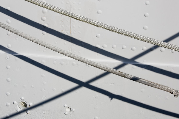
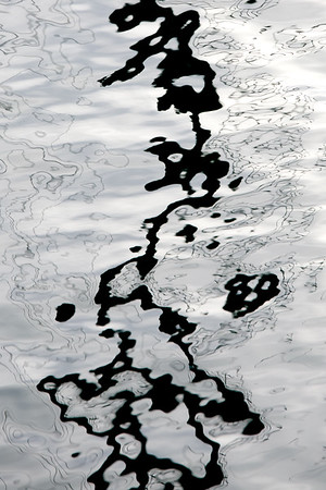
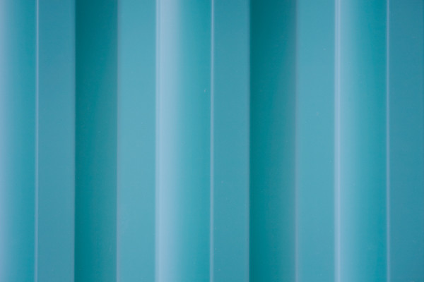
Your images may seem like a "study in lines" but, in fact, they're studies in mass and figure ground. The lines create visual masses which interact with each other. The images, as a whole, represent a nice demonstration of how many potentially interesting elemental scenes are actually embedded in otherwise dull, cliché travel-snap scenes.
Restraint, rather than excess, is a key to captivating photography. Nicely done.
Thank you very much for the kind words, Ken! I easily gets distracted in life and have trouble focusing my mind. I use my photography to slow things down and break up the chaos of my surroundings. This tends to result in simple, uncomplicated elements and compositions. Glad you enjoy them.
David
Ken,
It always harder to comment after you, Ken as you draw lines in the sand which I mostly agree with. You candor is important to OPF and your comments are valuable. Yes we do like the pictures, but is that as far as they can go? A photographer must develop a vision. That means seeing with many choices of eyes and attitudes.
David,
I found it even harder to look at each of the pictures together, even though you call this a "Study in Lines". I still need a personal interview with each photograph, unless they
really have to work together exactly as shown.
So first of all I added white space between each of your photographs to give each some "wall space" they deserve. If I'm terribly mistaken, I'll remove the white space. Immediately I respond to the pictures with interest. So that to me is a great start.
Cropping: too tight? Not tight enough? I find the close crops, which are so popular, are often far too wide for the most interesting challenges of studies I see in the photograph. More commonly, they are the opposite, too small for allowing some conflict, balance or exchange with adjacent or distant objects, lines, masses or living things excluded. It's the latter case which, in my opinion condemns most photographs to being only "nice" and not competing for something more distinguished. Since photography is about choosing and excluding, here you are working at the junction of success and failure.
What is it unique that's being captured? What goes beyond "the postcard beautiful sunset" or "bambi" that we might often see. Any one of these
are great subjects to work on. When I use the word
"work" I use that in the hardest meaning. If the picture is obviously pretty, unless you are Bresson with one camera and one mind day after day, that sudden snap will likely not be more than nice.
The 4 pictures to me demonstrate that you see in these subjects a wealth of possibilities. That is where Ken and I, I think, agree.
Is this one work, "A Study in Lines" or examples of ongoing work, a study in lines? I think the latter as I don't immediately see the connection between each of the pictures shown together. Maybe, shown horizontally on a wall, they'd come alive. There may then be a dynamic in the room more powerful and valuable than with each one shown as a "list". The setting we allow art can modulate reactions they might evoke.
Are these, in fact,
meant to be shown together or you happened to do that? If you do indeed think of these as one joined set, then explore the idea of using elements in one composition. Now, that's my way of thinking and while I don't want to intrude on you own creative authorship, it's offered as an approach for you also to consider
if these elements are intended to work off each other. If they are grouped as you have presented them by happenstance, then please ignore my suggestion.
Where to post? Since this is really about the form and potential studies, choose what you will do with this. For a long term project, it would go to "Riskit". For finished art to "Photography as Art" or else, for discussion of the design and structure of such pictures, "Still Photo". The latter seems to be most appropriate.
Thanks for sharing and challenging us.
Asher