• Please use real names.

    Greetings to all who have registered to OPF and those guests taking a look around. Please use real names. Registrations with fictitious names will not be processed. REAL NAMES ONLY will be processed

    Firstname Lastname

    Register

    We are a courteous and supportive community. No need to hide behind an alia. If you have a genuine need for privacy/secrecy then let me know!
  • Welcome to the new site. Here's a thread about the update where you can post your feedback, ask questions or spot those nasty bugs!

First Impression revisited...

Bill Graham

New member
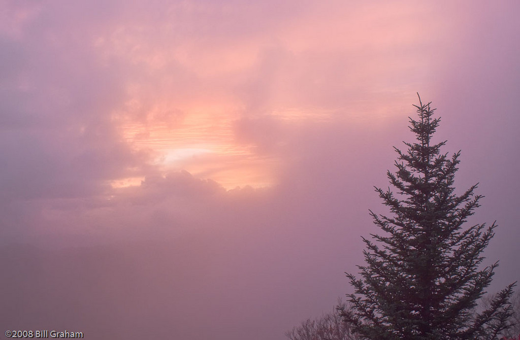
This image was made on a trip up on the Blue Ridge Parkway in North Carolina last Fall. It was the last shot on the first day of the trip, we had driven through rain and dense fog most of the day but late in the afternoon the fog lifted and we had a pretty decent sunset.

When I got home, I downloaded the photos from the trip into Lightroom and did my selects, this photo didn't even make the first cut. Last week I was getting ready to upload some to my Smugmug gallery and it caught my eye. I did a little PP and this is what I came up with:

_DSC3687.jpg

Nikon D300, 1/10 sec.@f8, ISO800, 70-200 f2.8VR@70mm

Looking back at the photo again, I was mainly attracted to the warm tones and then the graduation of contrast, starting with the immediacy of the tree in the foreground, softening to the trees on the hill in the middle and another gradation or two before fading out into ultimate softness at the top center.

Please forgive me, I'm not very skilled at the language of photo critique and I'm a mostly left-brained personality so I'm not expressing myself very well. I do my work mainly for myself so I'm not used to soliciting opinions, but I figure if I'm to advance my skills/art, I need feedback from others and this forum is the best place I've found on the web for honest and articulate critique.

So I would appreciate any comments and suggestions you'd care to offer.

TIA,
Bill

more from this trip here:http://billg71.smugmug.com/gallery/8629295_a5NW9#569274895_5RoBG
 

Ken Tanaka

pro member
Hello Bill,
Second first impressions were the topic of a thread that Rachel Foster started last week. It's a good topic as it instructs us that our mind's eye can be fickle and nearly always becomes more refined and discriminating over time. As I noted in that thread I prefer to walk away from images for a period of time when possible.

Your rediscovery of an image that did not catch your initial memory is certainly not unusual or undesirable. Easily reviewing, re-evaluating, and reprocessing is one of the most wonderful aspects of todays digital photography. Of course photographers have done this for a very long time. The Art Institute of Chicago (my neighborhood museum), for example, has two prints of Ansel Adams' "Moonrise Hernandez"; one that he made over 20 years after the original, and most famous, version. They are very different interpretations of the same scene (which only vaguely resembled either print). But the sheer inconvenience of diving back into a film archive is far too daunting for most film snappers to do often or broadly. (One of the many significant disadvantages of the film medium.)

Honestly, this image leaves me a little flat. Yes, the colors are warm and "pretty". But that's about it. That foreground tree, with its strong graphical shapes, is a distraction particularly as the branches of a second tree overlap it and draw lines that lead out of the frame. Remember, strong shapes are generally the most powerful elements in an image. Place them carefully and purposefully. I would have suggested choosing a position that excluded those strong shapes and just let the soft, warm colors and shapes of the autumn hills be the image. They form a nice, nearly abstract, image.

Just my thoughts, Bill.I recognize that the pic represents, first and foremost, a sensory and experiential memory for you.
 

Asher Kelman

OPF Owner/Editor-in-Chief
Bill,

I could start with a discourse. For now I just thank you for reminding us about the need to look again at what we do. Art is an iterative process. Here, for sure, the work spoke to you at the second time around. Still, what was done in the first instance, as Ken points out, limits the picture from reaching its potential.

The array of tones and hues in one small part of the spectrum around sienna is always a natural and well trodden path to creating affinity for a picture. However, the inability to allow the mind to see one whole tree and the intrusion of untidy branches from another tree, takes us away from any simple balancing of the individual against the multitude or any other scale of values or esthetics one might want to bring to the picture.

So, here's a questions I often ask. "Did you shoot more?". If there are adjacent pictures, then maybe two trees might be there or one could get the rest of the first tree. Maybe there is more in your shoot that you might look at "in one go" to see if the scene can be presented in alternative ways?

Asher
 

Bill Graham

New member
Thanks Ken and Asher for the comments. I have to agree with both of you about the foreground tree. It's definitely a distraction, too many lines going too many ways, very discordant. I tried a couple of different crops but either there's not enough tree or there's too much, there doesn't seem to be a happy middle ground. Mother Nature is inherently messy and sometimes there's just no hiding it, I guess.

Looking back at the original file I discovered two things: first, it's very flat, almost no contrast although the colors are pretty close to my edit. I guess that's what motivated me to take it in the first place, the warmth of the light and the color on the hillside.

Secondly, I found it was the only shot on the three-day trip made with the D200. This really has no relevance except for the fact I don't think I had the time in the two cameras synced so I really have no idea exactly when the shot was made. I can't remember even making the shot, for that matter.

All that to say it wasn't a memorable shot when it was made or reviewed, I've played with it a little and it'll now go back to the bottomless Lightroom dungeon, never to be heard from again... ;)

If it's permissible, I'd like to offer another from the same shoot and I'm sure this WAS the last of the day:

_D3C2019.jpg

Nikon D300, 1/15 sec. @ f8, ISO1600, 28-70 f2.8@ 42mm

Pure photographer's luck here, it was getting close to dark and we were pushing to get to the motel when the clouds opened up just as we were approaching a pull-off with a view. And the little, spruce standing somewhat separated from the rest, just made the composition for me. All I had to do was set up the tripod and press the shutter....

The tree was what really made me notice this image, the sunset was gorgeous and the darker clouds surrounding it really set it off with their hue, but the lone tree in the foreground witnessing the majesty and taking it all in was what prompted me to capture this image.

Your thoughts are welcome(as always)

Bill
 

Asher Kelman

OPF Owner/Editor-in-Chief
Thanks Ken and Asher for the comments. I have to agree with both of you about the foreground tree. It's definitely a distraction, too many lines going too many ways, very discordant.

That tree was not the distraction. Rather it's that you took a portion of it and then a scrap of another making a mess. There was nothing wrong with the tree except you mistakenly didn't get it all!

Looking back at the original file I discovered two things: first, it's very flat, almost no contrast although the colors are pretty close to my edit. I guess that's what motivated me to take it in the first place, the warmth of the light and the color on the hillside.

Bill, if you like the light, then it was not flat. If everything is really flat, then the light is even. I doubt that. Rather it's at 1/10 sec and in the distance and there's probably some haze too. What got you moved is likely what you could see 360 degrees around you and what you could hear, breath in the scents in your nostrils and feel. When you take just a very tiny arc of the scene, you do not easily imprint on the image the sensations that gave you the rich experience. The savvy photographer, (when he's made that mistake 1-2 times,) learns to hunt for a position where one can get a whole tree and enough of the background to recreate some of the atmosphere.


_D3C2019.jpg

Nikon D300, 1/15 sec. @ f8, ISO1600, 28-70 f2.8@ 42mm

Right now, the tree is not whole and there is no interesting subject. Skies alone rarely can make a picture. Magic sunsets are common as field mice and even when done well merely make good stock pictures for travel brochures or postcards. For photography that is going to enhance your portfolio, this is a very hard motif to use successfully.

Still, you are blessed with a memory of that wonderful evening. However the sky is not making my juices flow. It could be that the image needs to be seen from a less compressed file and larger to get the beauty that you testify too.

Thanks for sharing. I do hope you accept my $0.02 with the idea that we try to be honest or else we are of no value.

Asher
 

Ken Tanaka

pro member
Hello Again, Bill,
My opinion of your second image is rather different than Asher's. The whole image is actually -the- subject. This second image would serve as a terrific illustration to reply to a potential follow-up question to my primary objection to your first image. Specifically, someone might ask, "When could a foreground tree be a meaningful element in an image?".

In the case of your second image the tree is an establishing element. In fact it's the sole establishing element. Its clean, symmetric, familiar geometry strongly suggests a wooded / wilderness setting without showing us woods. For all we know there could be a "Wild Man Sam's Chicken Shack" and a sleeping wino just below frame bottom. But all's peaceful and serene in the frame. I am not at all bothered by the sunset impression (although, like Asher, I also dislike such clichés). I do, however, wish that that hot spot was lower or nonexistent.

Look at this image and consider my remarks. Learning when and how to place impression-casting elements in a frame is an absolutely essential skill for achieving a high level of photographic, and artistic, competence. But it's a learned cognizance skill that you'll only rarely find in amateur photography, one reason why it's sometimes so inexplicably obvious to sort amateurs from pros. "Hmm...something's missing."
 

Asher Kelman

OPF Owner/Editor-in-Chief
Seeing individual photographs in the context of a body of work!

......................
Specifically, someone might ask, "When could a foreground tree be a meaningful element in an image?".

In the case of your second image the tree is an establishing element. In fact it's the sole establishing element. Its clean, symmetric, familiar geometry strongly suggests a wooded / wilderness setting without showing us woods. ............
Now if this were shown first, Ken, we'd have established your point.

Then, when we would see the other picture, second we could see the similarities in design, but register issues with the untidy extra tree branches. Well that could be repaired. Still, in both cases, I'm not that happy to see the sliced off trees! I am proposing no rules or standards that "All of a key trees be seen in toto. However, in this basic composition, unless there is some other metaphor or esthetic that escapes me, the picture does not reach it's full potential, in part, because of just this this incompleteness.

Now let's say Bill continues on a steadfast path with this unique general format and so manages to create his new pathway for us to follow, then it could well be that I too would come to appreciate this new idea. However, I do not feel I'm willing to vest my enthusiasm in this just yet. If I had to decide now, I'd venture to guess that having only part of the tree is an error of esthetic judgment!

However, whether it is indeed so depends on other work that he'll share. Each artist probably has to create his/her own syntax eventually, (at least that's what I feel about this), so such unclean works, (in the sense of the scraps of other things included that don't belong) may turn out to be signposts on the way to important work. Alternatively, this structure may be just clumsiness that can be avoided!

Asher
 

Bill Graham

New member
Again guys, thanks for taking the time to comment! Asher, I can't tell you how refreshing it is to get honest, serious critique instead of the cyber-equivalent of an "Atta-Boy!" and a pat on the back. I know it takes a lot of effort and I really appreciate the time you and Ken have spent with me on this thread.

I could have gotten more of the foreground but it was all dead bushes and random sticks and I wanted an anchor point to set off the mostly blank(but colorful) sky. Ken's term "establishing element" is exactly what I was going for. I don't particularly care for the fact that the bottom of the tree is missing, but to include it would have filled the foreground all across the bottom and taken away from my idea, which was the solitary tree facing the sunset and the night to come. If you look at the lower left corner, I already have some random branches intruding although they're hard to see behind the copyright info. My choice was between chopping off the tree or including random elements in the foreground, I cut the tree... ;)

I'll willingly admit to being lazy about choosing my shooting position, looking at this photo I think I should have lowered the tripod which would have shifted the position of the hot spot in the sky and allowed me to get lower on the tree. In the image I posted, the sky is a bit flat, it doesn't convey the impact of the photo like the print does. This is something I struggle with in my workflow: I'll get an image to a point in Lightroom, send it off to CS4 for soft-proofing and proofing and, in the printing process, make edits that I never go back to the original and duplicate. So I often wind up in the bass-ackwards position of having prints that look better than my original files. I don't post a lot on the Web, or sit in front of the computer staring at my photos, so it's something that hasn't bothered me, but I'll have to be more careful when I post photos for critique.

This particular photo is a good example: I shot it in a bracketed sequence intending it for HDR, but there was just enough wind that the tree moved a little, making it impossible to register. The photo I posted was a single file with some pretty significant edits in Lightroom. I revisited it this morning, keeping Ken's suggestion about positioning in mind and did a little crop from the upper left to shift the hot spot slightly off-center up and to the left. I added a layer from a shot taken a stop down and masked off all but the center, which brought out some more detail in the hot spot. I'll not clutter up the thread with more of the same image, but you can see it here: http://billg71.smugmug.com/photos/582392395_wjfdH-XL.jpg

Thank you both again for the critique, I'm here because I want to improve my skills and my art and this forum is a great resource!

Bill
 

Ken Tanaka

pro member
I'll willingly admit to being lazy about choosing my shooting position, ...

Bill
I think most of us are. But you may often be closer to a good shot than you realize. Try this. Instead of taking time bracketing your exposure try bracketing your position with "Ken Tanaka's Two-Step". Take your initial impulse snap. Then take one or two small steps to your left and snap. Now one or two steps to the right and snap. For extra credit, if your physical condition permits, take snaps at each position with the camera at a -much lower- position than head height, even for distant scenics. I think you'll be amazed at how much better most of these "Two Step" shots are compared to your original impulse snap.

With much practice and determined self-evaluation you will be able to get that impulse snap much closer to a better first shot...which is the true objective. But you should continue to snap slightly different POV's whenever possible. After all, with digital it's free.

Regarding the tree...
A conifer (such as the one in the second image) is perhaps the most predictable and familiar tree form on the planet. A five year old can draw one reasonably well proportioned. So showing more of this tree would not only have been unnecessary it would have degenerated the scene into a completely dull experience by eliminating all mystery.

Remember, a key to good photography is deciding what to exclude from the frame, not just what to include. Even an apparently self-contained image invites the viewer to imagine what's outside the frame. Skilled, imaginative photographers, particularly art photographers, know how to use this phenomenon to effectively expand their images far beyond their borders. Your 2nd image represents a good, albeit an inadvertent and casual, example. I guarantee that many viewers, if asked to describe it months from now, would describe a much wider scene.
 

Asher Kelman

OPF Owner/Editor-in-Chief
"The Ken Tanaka Two-Step": foreground and background in scenics photography!

I think most of us are. But you may often be closer to a good shot than you realize. Try this. Instead of taking time bracketing your exposure try bracketing your position with "Ken Tanaka's Two-Step". Take your initial impulse snap. Then take one or two small steps to your left and snap. Now one or two steps to the right and snap. For extra credit, if your physical condition permits, take snaps at each position with the camera at a -much lower- position than head height, even for distant scenics. I think you'll be amazed at how much better most of these "Two Step" shots are compared to your original impulse snap.

With much practice and determined self-evaluation you will be able to get that impulse snap much closer to a better first shot...which is the true objective. But you should continue to snap slightly different POV's whenever possible. After all, with digital it's free.[/quote]

Ken,

This is a most valuable advice. Allowing choice in POV and mileux is one of the great advances in picture design that digital has brought us. We get choice at the time of actually making the photograph as opposed to recording. Often, the new position/angle/content defines what we really hope for or didn't yet appreciate.

Regarding the tree...
A conifer (such as the one in the second image) is perhaps the most predictable and familiar tree form on the planet. A five year old can draw one reasonably well proportioned. So showing more of this tree would not only have been unnecessary it would have degenerated the scene into a completely dull experience by eliminating all mystery.


582392395_wjfdH-XL.jpg


Bill,

The quality of the sky, (with gradual edges of the clouds), is so much better. Kudos! This does raise the image to one of interest to me. The extra work makes a huge difference. The size also allows detail in the clouds to be perceived. No doubt I'd like the print even better. I'd have still preferred more of the tree, notwithstanding the shorthand that can be used.

Remember, a key to good photography is deciding what to exclude from the frame, not just what to include. Even an apparently self-contained image invites the viewer to imagine what's outside the frame.

Agreed. Still, even with the entire tree, the imagination has a universe of possibilities to explore.


Skilled, imaginative photographers, particularly art photographers, know how to use this phenomenon to effectively expand their images far beyond their borders. Your 2nd image represents a good, albeit an inadvertent and casual, example. I guarantee that many viewers, if asked to describe it months from now, would describe a much wider scene.

With the new sky presentation, I too won't forget it!

Asher
 

Bill Graham

New member
Hate to resurrect an old thread, but the first image I posted kept haunting me.... I played around with it some and had all but given up on it when a friend and fellow photographer looked at the 8.5x11 test print and said "You really should reverse this..." So I did, cropping it some in the process:

_DSC3687-1.jpg


This is from an Ultrasmooth Fine Art print file, so it's a little jazzier than the final print, but it prints really well! Everyone who's seen it loves it, I have four printed 7x10 mounted 11x14 and two 10x14/16x20 in my portfolio. I just framed one of the 10x14's today, which brought it back to mind.

Anyway, thanks to all for the feedback, I just wanted to share the finished product....

Bill
 

ErikJonas

Banned
Bill this is awesome!!! I dont think theres any reasonable critique that can be done here.Note i say reasonable.Someone can always pull something out of their ass to say about a image.But this is just a wondeful shot....Can you take a picture of it framed and post?I bet it looks amazing with a double matt and frame....Hopefully you used conservation glass,i always prefer conservation reflective control glass....
 
Top