• Please use real names.

    Greetings to all who have registered to OPF and those guests taking a look around. Please use real names. Registrations with fictitious names will not be processed. REAL NAMES ONLY will be processed

    Firstname Lastname

    Register

    We are a courteous and supportive community. No need to hide behind an alia. If you have a genuine need for privacy/secrecy then let me know!
  • Welcome to the new site. Here's a thread about the update where you can post your feedback, ask questions or spot those nasty bugs!

A nice B&W shot i took in my backyard

Francisco Lefs

New member
Hi folks i am new to this forum and have been wanting to participate for a while, I am a beginner at photography compared to some of the work i have seen here.

So i would like to learn some more about this interesting art and maybe get some help in the process.

Here is a black and white picture i took and would like to know what you folks think.

The camera and settings where :Sony a200 1/500 f4 iso 100 with a minolta maxxum af 70-210

3753257581_9c284db9d4_b.jpg
 
Last edited:

Asher Kelman

OPF Owner/Editor-in-Chief
Hi folks i am new to this forum and have been wanting to participate for a while, I am a beginner at photography compared to some of the work i have seen here.

So i would like to learn some more about this interesting art and maybe get some help in the process.

Here is a black and white picture i took and would like to know what you folks think.

The camera and settings where :Sony a200 1/500 f4 iso 100 with a minolta maxxum af 70-210

3753257581_9c284db9d4_b.jpg

Hi Francisco,

B&W photography is the most historically important and well trodden path for experienced and technically competent photographers. We see shapes, tones, texture and composition devoid of the emotional qualities of color.

So, Francisco, when going to B&W, it can be a solution to poor, clashing or distracting colors. But then what will be seen? With B&W we need a fundamentally sound structure underneath that color. Remember our standards are high because of what's been done so well before. So, this picture, to me at least, seems to suffer from a heaviness in composition. We don't see enough of the plant to get an overall feeling of a pleasing shape. Furthermore, the large leaves hide the structure of the blooms. It's likely that the original color was attractive to you and that made you take the picture in the first place, so let's look at that perhaps. Also do you have wider pictures or taken from another viewpoint?

Asher
 

Francisco Lefs

New member
A nice B&W shot i took in my backyard ( i thought)

No, Asher, unfortunately i only took one picture of it and I shot it in RAW, I was trying to achieve a nice B@W shot, but as you see, i still need to learn when to apply it and when not, in my next posts i will try to show you guys some more pictures and see what i have done a little better (or not lol) .

Thank you for the critique.
 

nicolas claris

OPF Co-founder/Administrator
Bonjour Francisco
Well, at first seeing when posted, your picture did not invite me for comments.
Old OPFers do know that I'm not a fan of modern B&W pictures…
But reading Asher's comments, went to me the idea that, despite that foreground leaves, your picture may get much more powerfull with some edit…
So I gave a try… If you don't like the fact that I took permission to edit your picture, just PM me and I'll remove it asap…
But, what do you think?

3753257581_9c284db9d4_b_NCEDIT.jpg


Isn't it more vibrant?
IMO it was too "muddy" so I worked a bit on light, shadows and contrasts and at the end a very small amount of sharpening…

BTW your picture was a B&W but RGB. It let me think that you just desaturate to the max your color pictures. Haven't you?
If yes, this is not the way to go for converting colors to B&W, there are some tricks with contrasts curves and even some filters that you may find on the web. As said B&W ain't my thing so I can't help, but some guys here may share some of their receipies…
 

Asher Kelman

OPF Owner/Editor-in-Chief
Isn't it more vibrant?
IMO it was too "muddy" so I worked a bit on light, shadows and contrasts and at the end a very small amount of sharpening…

3753257581_9c284db9d4_b_NCEDIT.jpg


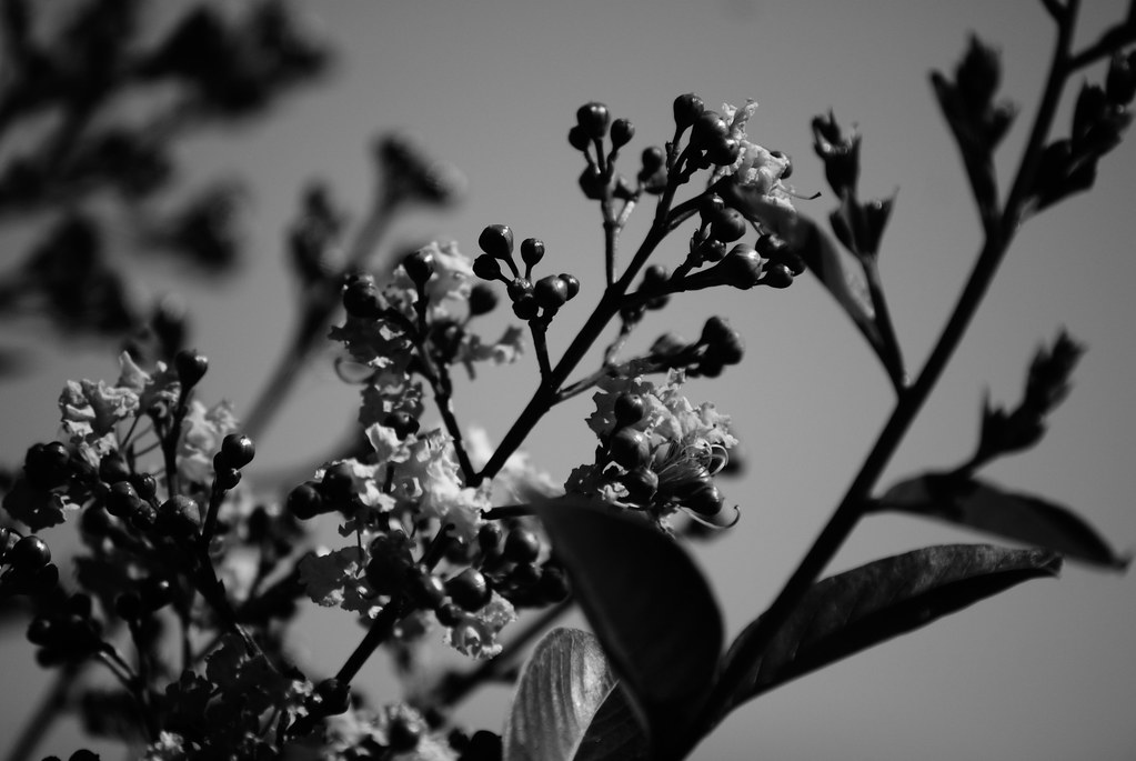
Francisco Edited and cropped by Nicolas Claris

Francisco,

Let me tell you that getting Nicolas to comment on someone else's art is hard as he is reserved about another artist's work. This reticence is not selfish or lazy but out of the greatest respect for individuality. So when he gives his view on a pictures build, I take notice!

Yes, he's so right that the process of converting to B&W is way more deserving than just to desaturate. What we do in B&W photography with film is use emulsions that have a particular way of translating tonality and color hues. In real life, we go further than that by adding red, yellow or green filters, for example to bring out certain features preferentially.

We need to do this also when in the digital darkroom starting with the RGB file which tried to be unbiased. Remember the camera has all the smarts of teams of Japanese engineers. They know nothing of your own artistic preference and their job is to please most of the folk out there and with great faithful and saturated pleasing colors. But that's not necessarily right for getting to great B&W!

You however might want to render a brightness of sat 130 on the histogram differently for various. colors. Otherwise, stripes of different colors but the same luminosity might look the same and you would then loose the pattern of a sweater or the markings on a rock. So in Photoshop™, (yes, blow the trumpets and celebrate), you can do this after the fact with photoshop using two layers Hue Sat then Channels (selecting "monochrome") and go back to H/S and assign RGB to different sat, color and brightness. Or else there's a tool in PS CS 4 (probably CS3 too) to allow you to assign CMYK and RGB as you wish to different levels of gray. There are a number of commercially available plugins that claim to do the same or better, emulating the characteristics of many different B&W emulsions. Then you can alter the contrast with curves and mask local areas and really get creative.

Believe it or not, that's what the masters did, spending months sometimes on a single B&W picture many different masks and hand etching or inking of the film! When you go to a museum or a fine art Gallery and become enthralled with a fine B&W silver gelatin or platinum print, there's likely an immense amount of craftsmanship in that one print that stops you in your tracks. Now with the digital medium, why should the needs for reassignment of colors to tonality ranges be any less critical?

So, if one merely removes the color data, one has lost one's leverage over the possibility of reassignment of hues to preferences in tone.

This is why some folk get a film camera and some filters and others get a mistress!

Asher

Jim Galli chose a film camera and I copied him! Check Jim's work! He has one on an angry Chevrolet that you should visit!
 

Asher Kelman

OPF Owner/Editor-in-Chief
Just a side not to Asher's last post:
I haven't cropped one pixel of Francisco's picture!
Well not the XY dimensions, but certainly wiped out the importance of the heavy shadows by enhancing the dimensionality of the leaves and flowers!

Asher

PS, I got your humor, just there's sometimes an unwillingness to acknowledge such a joke! That's my protectiveness of both Ben and Leo. I guess I'm too serious sometimes!
 
Top