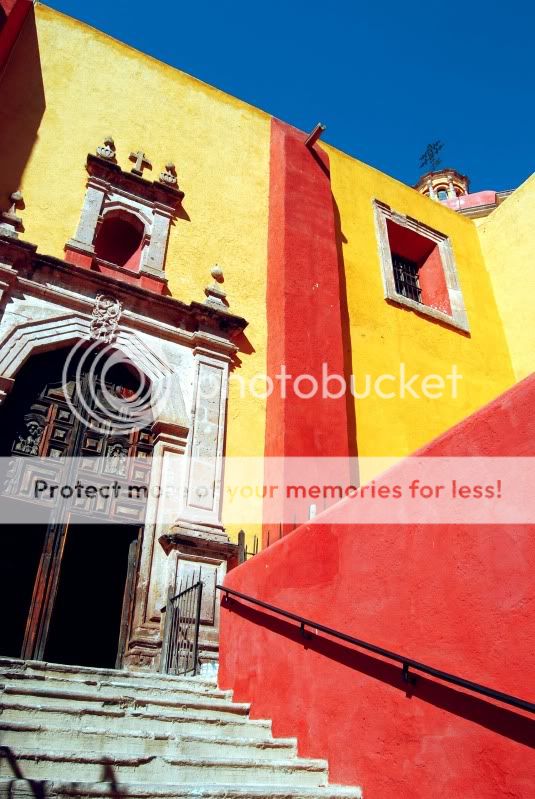
Cutting off an important structure: An apparent mistake in composition or an insight?
Hi Brenna,
The colors create a good compositional contrast. The yellows and reds already claim the foreground, while blue tends to signify background tones. However, I'm wondering why didn't you get the entire door?
Bart
Hi Bart,
I was wondering about that and also whether or not it would look better corrected to be orthogonal. I spent quite some time with this and came to the conclusion that the energy of this is derived from the decisive inclusion of the bold "Red L" of flat plaster against the yellow walls and windows and their own portion of sky.
Brenna Gates Enter Color
All that is vivid, simply designed, immediately impressive and accessable to the senses.
By contrast, the partly excluded double church doors are sufficiently shown as heavy, detailed, obscure with darkness beyond, requiring explanations, but with less sky. This is the intricate old established mystery of religion with well-worn steps, now falling apart! To the right it's bright, liberated, with many different openings and a sky, free for anyone to wonder above.
The title, "Enter Color" could be a reference to Benna'a previous cactus picture in B&W,
here. Or, can we perhaps infer a new age with various alternative lighting bringing new meaning to ancient ways of thinking? A cynic might say the bright colors are just to seduce the folk. I'd like to think of it as a continuing struggle of the conquistadors v. the native peoples of South America swamped by the arrogance of European greed for gold and places in heaven. A helpful source for some perspective can be found
here.
What was caught in an instant aportioned significance and rank. Now "correcting" that and giving new importance the the entrance to the church would destroy what the impulse managed to capture.
Brenna,
In summary, I like your photograph, it's impressive to me and find it worth returning to often. I wonder whether you or anyone else feels any concurrence with my reactions?
Asher