• Please use real names.

    Greetings to all who have registered to OPF and those guests taking a look around. Please use real names. Registrations with fictitious names will not be processed. REAL NAMES ONLY will be processed

    Firstname Lastname

    Register

    We are a courteous and supportive community. No need to hide behind an alia. If you have a genuine need for privacy/secrecy then let me know!
  • Welcome to the new site. Here's a thread about the update where you can post your feedback, ask questions or spot those nasty bugs!

Still that calibration problem

nicolas claris

OPF Co-founder/Administrator
I'll be simple and in telegraphic style:
Computer: Power Mac 2x2.3
Video card: Radeon 9600
Monitor: Nec 2180UX
Puck: Eye-one display 2
Calibration software: Basiccilor 4.0 and Eye-One Match 3.6

I know it is quite complicated, I have of course search the Internet but cannot find a real and simple guidance that would simply tell me do this and this and that... for example:
for the configuration above
hardware or software calibration (within Basiccolor)
gamma 1.8 or 2.2 or L, contrast, black luminance etc...
and the rest of all this settings that make me never happy.
We have gurus there, I know, please let recognize that I'm calbration stupid and tell me what you would do with my system.
I use PS CS2, DXo DNG/ACR 3.4, Capture One pro (latest)

I'm sure you will help a lot that are to shy to post on this subject!

Thank you
 

Asher Kelman

OPF Owner/Editor-in-Chief
Nicolas Claris said:
I'll be simple and in telegraphic style:
Computer: Power Mac 2x2.3
Video card: Radeon 9600
Monitor: Nec 2180UX
Puck: Eye-one display 2
Calibration software: Basiccilor 4.0 and Eye-One Match 3.6

I know it is quite complicated, I have of course search the Internet but cannot find a real and simple guidance that would simply tell me do this and this and that... for example:
for the configuration above
hardware or software calibration (within Basiccolor)
gamma 1.8 or 2.2 or L, contrast, black luminance etc...
and the rest of all this settings that make me never happy.
We have gurus there, I know, please let recognize that I'm calbration stupid and tell me what you would do with my system.
I use PS CS2, DXo DNG/ACR 3.4, Capture One pro (latest)

I'm sure you will help a lot that are to shy to post on this subject!

Thank you

I am not sure about basiccolor differences. However, Coloreyesdisplay, which I have used does give ability to re-measure after calibration.

Several start of points which no doubt you have covered. The lights in the room cannot be yelloe tungsten or blue fluorescent but should be daylight 5000 degrees Kelvin or some other standard you vill be using.

You cannot have a red sweater, bright pictures on the walls etc. The walls should be a Munsel neutral grey or black.

The monitor and Puck should be warmed up an hour before use.

The Spectrophotometer versions are best. However you colorimeter should suffice.

You need to use the GM software to check the function of the puck.

Then do the calibration of the monitor with no colored light reach the monitor.

I do that 5 minutes, one hour, 5 hours a day a week and so forth to see if there is repeatability and drift.

The software will give an accurate idea of delta E for luminence as well as the RGB values.

Also, you must not use the outer edges of the LCD display as they will be way off!

Hope that's of some use.

Probably you know all that already. So excuse me repeatinmg the obvious,

Asher :)
 

nicolas claris

OPF Co-founder/Administrator
Thanks Asher
of course 'm aware of all this, I forgot to say the important (to me!):
I don't have color shift, colors are OK.
I use either native or 5000°K and this is very fine.

I have a lightness problem, for now If I correct my file following the monitor aspect of them, I get prints that are too light, and, gurus tell me if I'm wrong, this means that my monitor is too bright.
This is confirmed doing the very usefull test: http://www.drycreekphoto.com/Learn/Calibration/monitor_black.htm I can see the 1st changement of black with step 3 or 4 (depending of room light)
and http://www.drycreekphoto.com/Learn/Calibration/monitor_gradient.htm confirms that the black parts are too wide, the gradient is smooth but not until the end...
I have a grey desktop backgriound that comes from eci.org:
"ECI Monitortest Mac" downloaded from there: http://www.eci.org/eci/en/060_downloads.php no profile embedded there.
The funny thing is that I can see now that viewed in Safari the file is correctly seened (both ECI logos can be seen on right and left), as the same file seen in PSC2 won't show the ECI logo on left (dark grey on black background)
I've tried all gamas from 1,6 to 2.2 without noticable difference.
What am I missing there?
 
Last edited:
BasICColor: If your monitor supports hardware calibration, give it a shot (won't hurt anything). Hardware calibration lets basiccolor speak directly to the monitor and make the adjustments for you. If using software calibration, you'll be reaching for the monitor controls to raise and lower the brightness manually. I'll admit, I'm not sure how to tell whether or not you'll be able to use hardware calibration. I'm familiar with the Lacie Blue CRTs that could use a dongle/pass-through type connector between the monitor 15-pin cable and the videocard. This connector then has a USB connection on it that lets the software speak to the monitor. Not sure how this is done with the LCDs of today.

For gamma, I'd suggest "L". This is one of basiccolor's key selling features. It'll re-iterate and balance your blacks/whites based on the Lightness channel of LAB. Basically, it helps ensure you get smooth and accurate tonal transitions.

As far as black point/contrast etc. I'd like to hear from other basiccolor users for their suggestions. I gravitate towards lowest black, best contrast but I'm not sure how this differs from the other options. Some users want to set their luminance specifically to prolong monitor life... or just for visual preference. I've been happy with the luminance result I get from darkest black/best contrast options
 

nicolas claris

OPF Co-founder/Administrator
Bonjour Scott
thanks for your answer. You're right (well I guess!)
This is the tuning I use: Hardware calibration, gamma L.
but what about luminance? 120, 140 native? (about 170 on my NEC LCD)

I have smooth gradient but it "stops" too early toward the black!
 

John_Luke

New member
Nicholas- if your prints are too light, that means your display is too dark. (assuming a profiled printer worflow). A dark display means you are lightening up a perhaps perfect file so it look good on your display, but now the file has been edited to be too light. I use a luminance value of 130cd/m2, gamma 1.8, and D50 on my Eizo CG21 LCD display. I use Eizo ColorNavigator and a GMB i1 Pro, but I get very similar results with Match 3.

LCDs grayscales will stop too a bit early before the black, they are just not as detailed in the black compared to the Sony Artisan. When you do the grey scale test from DCP, make sure you "assign" your monitor profile to the file.
 

Edmund Ronald

New member
John_Luke said:
Nicholas- if your prints are too light, that means your display is too dark.

The logic here escapes me. Unfortunately this semi-fake thread confirms what I keep telling the guys at Xrite/GMB , namely that ICC color management is impossible to debug and too complex for most people.

The original poster is welcome to pay me to solve his problem, I charge $30 an hour, which I believe is far less than a plummer. And far less than a prestigious photographer like Nicolas ;)

On the other hand, there are a few good books on Color management (Rodney, Fraser, Sharma) which should vaccinate against the present aggravating state if you have the patience to gnaw your way through them.

Edmund
 
Last edited:

Asher Kelman

OPF Owner/Editor-in-Chief
"Originally Posted by John_Luke
Nicholas- if your prints are too light, that means your display is too dark."
"...the logic ecapes me"


Hi Edmund,

Delighted to hear your voice again! Well, Nicolas as we speak may well be leaning out of a helicopter or off the side of a chase boat shooting one of his pet yachts.

I know he wants my Eizo monitor, but I need it. I have no experience with his monitor and have sufficient disatisfaction with lack of testable tolerence criteria with the Eizo that I cartainly cannot help Nicolas with his NEC 2180UX.

What is it about ICC that makes it so difficult for non-experts to calibrate to? Remember, Nicolas is a photographer and a designer and makes no pretences to being a color scientist. Sebastien, in that design group, probably is more comfortable with this subject.

John Lukes statement above I believe refers to the fact that if your monitor is not bright compared to the brightness of light in the room, then one may boost the luminence of the image using curves to make the image brighter when it wasn't actually needed and so render a prefectly normal file to get adjusted to print as overbright.

In any case, you did not see that or I may have misunderstood what you referred to.

My hunch is that that you may indeed have to fix it yourself, anyway, and I'd gladly pay the $30 an hour. Nicolas deserves it! If you succeeed, it would be more than a bargain! In fact I'm quite looking forward to it!

While we're at it the Bordeaux wines from 2003 are beyond excellent and and from my last testing, the reds, for sure do not need color management.

I just hope that monitor is worth calibrating. I have never seen one so I don't know!

Asher
 

Christen Hansen

New member
12 years old

12 years old.

When I entered the computerworld in 1994, my first monitor happened to be a Hitachi 17 inches. In all these years I have upgraded everything, computers, software, cameras, a never ending stream of money have been spend.

But among other monitors, I am still working on this old Hitachi, not only for reading this exellent forum , but also for my imagework in RSP and CS2.

Is this normal? How long will a monitor last? I am calibrating it every 2 weeks with Eye-One 2. After 12 years still going strong, like Chivas.
 

nicolas claris

OPF Co-founder/Administrator
I'm so sorry!
Sorry
John Luke, Edmund, Asher and Christen.
These last days I've been so busy, shoots in location, working on this forum and preparing my next exposition which deals with large size print (up to 9 feet wide...) that I completely forgot to check out this tread.

Please forgive me... asking a question and not checking answers isn't fair and polite.

So, some more info on my case:
I agree with John about brigthness, but I also agree with Edmund (about the complicated thing).
- when I prepare (Capture One + some edit in PSCS2 with lab's profiles) may files for frontier or Lambda prints, they are just fine and look very equal (if one can say so) than on the monitor.
- when I prepare them, with the same workflow, with Adobe CMYK profile, they look (close to) the same as the ones for frontier/lambda. And yes I know that cmyk space is much much smaller than frontier's one (close to Srgb) and Lambda (close to Adobe RGB)

Finnaly, I found that changing my workflow from C1 to DXo and then PSCS2 thru DNG/ACR seems to provide much better results than C1.
Certainely a question of contrasts in the middle range...

I'll work on this very soon, and post the results, good or bad.

Cheers
 

Asher Kelman

OPF Owner/Editor-in-Chief
A critical point is this question is to what extent one alters the colors on the screen. If essentially one uses a grey card and then allows software to the rest, the monitor only plays a passive role.

You are seeing through a relatively clean or dirty peep-hole at what your image might look like.

The key with lesser monitors, IMHO, is to limit color adjustments until the prints are in front of you.

Often, there is surpisingy little to do if the color temp is correct and the grey card was used.

Even the very best monitors, don't show exactly what is to be printed since the printer cannot print all the colors visible and the mon itor cant show all the colors printable.

Best is to start off color calibrated but see what you have got. It may be fine!

Asher :)
 

Asher Kelman

OPF Owner/Editor-in-Chief
See what happens, Nicolas, when you are away!

Glad your color is fine. Contrast and brightness is perhaps more difficult. What are your appproaches to this now?

Asher
 

nicolas claris

OPF Co-founder/Administrator
Asher Kelman said:
See what happens, Nicolas, when you are away!

Glad your color is fine. Contrast and brightness is perhaps more difficult. What are your appproaches to this now?

Asher
Trust my monitor when I work for RGB prints, "over darken" the medium range when I work in cmyk...
 

Frank Werner

New member
Hi Nicolas,

5 cents of ideas of mine for your problem....

1. You need two profiles not one if you want to work correctly in RGB and CMYK.

As if you work in CMYK you need your monitor set to a color temperature of 5000K as with (s)RGB you need a color temperature of 6500K to achieve the best results. As 5000k is much warmer then 6500k that might be the reason that your printed CMYK files appear darker then the printed RGB Files.

Luminosity settings are also a little bit different for RGB and CMYK, here a the experts (at least what I've seen and read) also not clear but from what I have seen and read a luminosity of 80/100 for a Screen that is calibrated for the CMYK process is common and one of 120/140 is recommended for (s)RGB. There are further variations depending on if you use a LCD or CRT Screen but to shorten it:

I would suggest a luminosity of 100 for CMYK and of 120 for (s)RGB.

Gamma Setting is a system wide standard that is different for MAC or PC, Mac 1.8, PC 2.2

So my CMYK settings I would suggest for calibration:
Color Temperature: 5000K, luminosity 100, Gamma 1.8 for the MAC, 2.2 for PC
and the RGB settings:
6500K, 120, 1.8/2.2

Gretag Mac Beth once had a Profile Switcher tool(if interested I can search for it), but the problem might be to adjust the monitor each time.... A hardware calibratable monitor who can save different settings might be a solution here... but as I work very few in CMYK I haven't experimented enought with my CG210 if he really remembers these settings. In the few cases I have to work with CMYK I calibrate him new from the scratch for the Job.

Maybe you could ask Andrew Rodney he should be able to clear this up some more....

Frank
 
Last edited:

nicolas claris

OPF Co-founder/Administrator
Thank you Frank for your clear answer, your idea of 2 different profiles for RGb and CMYK seems to be wise. However I switch many times a day from a space to the other one, so this wouldn't be very easy.
Also Why PS have softproofing to see how an RGB file looks with cmyk profile selected in color pref if we should have to change screen profile?
In fact my screen is calibrated 5000° for L space thru Basiccolor.
My workflow was from raw to tiff/AdobeRGB, thru Capture one then in PSCS2, editing file ad libitum and convert to 16bit cmyk at the latest moment and downsize to 8bit.
I have just received the cmyk proofs for a new brochure and they are just great!
What did I do?
Change my workflow from raw/capture One to raw/DXO->DNG->ACR
And yes the prefs in C1 were well tuned with right profiles...

Maybe a question of curve there...

Will dig that more precisely

By the way DXO does, not on all pics, wonderfull job, long processing but worth the wait!

I'll send an email to them, I'd like they check OPF and give advices and tricks...
 

Andrew Rodney

New member
Frank Werner said:
As if you work in CMYK you need your monitor set to a color temperature of 5000K as with (s)RGB you need a color temperature of 6500K to achieve the best results. As 5000k is much warmer then 6500k that might be the reason that your printed CMYK files appear darker then the printed RGB Files.

Whats the correlated color temperature of the display white point have to do with a screen to print matching that's too dark?

If you're working with a proof (CMYK or otherwise) with a very warm substrate, you'll probably find CCT 5000K is a better option at least on an LCD where you can produce a decent luminance. CRTs set at 5000K produce a dingy yellow soft proof due mostly to their inability to produce high luminance when you actually adjust the electronics for 5000K (something you can't do on an LCD). But there are plenty of CMYK contract proofs (Kodak Matchprint on SuperWhite) that soft proof far better at CCT 6500K.

Luminosity settings are also a little bit different for RGB and CMYK, here a the experts (at least what I've seen and read) also not clear but from what I have seen and read a luminosity of 80/100 for a Screen that is calibrated for the CMYK process is common and one of 120/140 is recommended for (s)RGB.

That should have nothing to do with the color model you're editing.

Gamma Setting is a system wide standard that is different for MAC or PC, Mac 1.8, PC 2.2

You can and should calibrate your Mac to a gamma 2.2 target calibration. Even better if your software supports it, native gamma.
 

Asher Kelman

OPF Owner/Editor-in-Chief
Again Rodney, a quick rescue!

Here's my advice to everyone: simplistic, yet important to emphasize:

Beware of urban legend or stuff that belonged to the early Mac year, especially concerning gamma choice. We are not trying to be loyal to early Apple architects, but to get the best use of the current display!

Everyone, should, IMHO, stop, check how you have been setting the gamma, the luminance as well as color temperature.

Remember, the monitor is the only window you have to your image before the print. If it's not as correct as possible, i.e., a "clear" window, one makes PS adjustments that degrade our intent.

So, Rodney, again thanks,

Asher
 

Frank Werner

New member
Andrew Rodney said:
Whats the correlated color temperature of the display white point have to do with a screen to print matching that's too dark?
If you're working with a proof (CMYK or otherwise) with a very warm substrate, you'll probably find CCT 5000K is a better option at least on an LCD where you can produce a decent luminance. CRTs set at 5000K produce a dingy yellow soft proof due mostly to their inability to produce high luminance when you actually adjust the electronics for 5000K (something you can't do on an LCD). But there are plenty of CMYK contract proofs (Kodak Matchprint on SuperWhite) that soft proof far better at CCT 6500K.


That should have nothing to do with the color model you're editing.


You can and should calibrate your Mac to a gamma 2.2 target calibration. Even better if your software supports it, native gamma.

[/QUOTE]

The problem of Nicolas is / but now judging from his last mail hopefully was, as I understood, that it seems that his RGB prints come out fine luminosity wise but the CMYK not. For a lot of people including me a 5000K calibrated screen looks much darker, and more yellowish then a 6500K screen that runs more into the blue and looks therefore subjectively brighter to the human eye, even if both are set to the same luniosity. So if you have calibrated your montitor in another way then your printer who prints the CMYK for you, you will get bad results.

As i have seen over the years there are plenty of different suggestions from the different manufacturers of calibrating devices.

You are right the luminosity settings and the color space have in principal nothing to do with each other. In reality, sadly, the different manufacturers of calibration devices have here different standards.

If I only take the three one I know (Gretag Mac Beth, Color Vision and Eizo) I have the following recommended standard settings:

Gretag Mac Beth: a luminosity of 80/100/120 depending on Monitor Type and version of the program. Gretag Mac Beth suggestions leans more to a calibration of 5000K as standard and a lower luminosity.

From Eizo I have seen different suggestions between 120 and 140 for the luminosity settings.

Colorvision also suggest luminosities between 120 and 170(early version of their software and LCD suggestion) and are more fond of calbirating to 6500K then GMB.

In principal I made the observation that Color calibrating device manufacturers that lean more to the 5000K standard have a lower lumnosity standard setting then a manufacturer who has accepted 6500K as a viable option (some years ago the only option was to calibrate for 5000k) these tend to have higher luminosity suggestions/settings.

The problem in my eyes is here that a real standard which luminosity setting is right is missing and as Nicolas problem is/was the luminosity, I wanted to point out that the problem might be here.

It would be very nice if you could tell me which settings therefore are "right" or accepted standards for the luminosity.(5000K/6500K/LCD/CRT...) And since when the 1.8 Mac / 2.2 PC Gamma Settings are outdated? I believe you without a doubt, but I have read this so often in different books and sources that I wonder how this, as Asher has said, Urban legend, has become so popular?

Btw. is there a german translation from your book?
Thanks
Frank
P.S. I'm not a native english speaker and this theme is relatively complicated for a not native speaker so please read everything with a grain of salt and in dubio pro reo please :)
 
Last edited:

Andrew Rodney

New member
The problem of Nicolas is / but now judging from his last mail hopefully was, as I understood, that it seems that his RGB prints come out fine luminosity wise but the CMYK not.


99 times out of 100, that's due to the incorrect CMYK output profile for the process.

For a lot of people including me a 5000K calibrated screen looks much darker, and more yellowish then a 6500K screen that runs more into the blue and looks therefore subjectively brighter to the human eye, even if both are set to the same luniosity.

On most CRTs 5000K does look darker and most certainly warmer. The reason it looks dingy is due to the fact it can't crank out the required luminance when physically set to something close to 5000K. LCDs don't suffer the issue with luminance but you can't set them to 5000K (you can't set them to anything but the native white point and then apply a correction via a look up table). The only adjustment you have on a CCFL(Fluorescent) LCD is the intensity of the backlit lighting.

So if you have calibrated your montitor in another way then your printer who prints the CMYK for you, you will get bad results.

Depends on the display type, the output profile and how you view your prints. Is everyone using a 5000K Fluorescent light box? Do they have dimmers that control the intensity while maintaining the CCT 5000K?

As i have seen over the years there are plenty of different suggestions from the different manufacturers of calibrating devices. Gretag Mac Beth: a luminosity of 80/100/120 depending on Monitor Type and version of the program. Gretag Mac Beth suggestions leans more to a calibration of 5000K as standard and a lower luminosity.

The luminosity of all displays should be set based on the ambient lighting around the display. The display should be the brightest and darkest item you view while editing the image. Unfortunately the ISO 3664 spec is in serious need of updating otherwise you can start to use it as a guide.

From Eizo I have seen different suggestions between 120 and 140 for the luminosity settings.

Which you should ask them and when would you use 120 cd/m2 versus 140?

In principal I made the observation that Color calibrating device manufacturers that lean more to the 5000K standard have a lower lumnosity standard setting then a manufacturer who has accepted 6500K as a viable option (some years ago the only option was to calibrate for 5000k)these tend to have higher luminosity suggestions/settings.

Again, it's nearly impossible to get a CRT to CCT 5000K and get a luminance anywhere above 95 cd/m2. Maybe new out of the box (if you can even find any). But they will certainly not last very long when you crank up the luminance to the maximum. An LCD can do 120 cd/m2 without getting up a sweat.

The problem in my eyes is here that a real standard which luminosity setting is right is missing and as Nicolas problem is/was the luminosity, I wanted to point out that the problem might be here.

He should investigate the CMYK profile first. His print to screen matching sounds effective with RGB (is that ALL RGB profiles?). As soon as a CMYK file come into the mix and doesn't soft proof correctly, I suspect the output profile first.

It would be very nice if you could tell me which settings therefore are
"right" or accepted standards for the luminosity.(5000K/6500K/LCD/CRT...) And since when the 1.8 Mac / 2.2 PC Gamma Settings are outdated? I believe you without a doubt, but I have read this so often in different books and sources that I wonder how this, as Asher has said, Urban legend, has become so popular?

For White Point, there is no correct setting although on a CRT I'd start with 6500K and see how it goes based on the papers used. As I said, with some substrates, you may need 5000K or even something between the two and you may need to switch based on the job. On an LCD, I'd use Native White Point as it's usually closer to 6500K and there's nothing to adjust anyway. Let the adjustment happen in the profile within ICC aware applications.

For Gamma, 2.2 is better for both Mac and PC users because this is much closer to the native TRC gamma of all displays (well actually LCDs don't have a true gamma but they are made to mimic the behavior of CRTs so 2.2 is fine). The 1.8 assumption by the Mac dates back to 1984 and the LaswerWriter and that is still the assumption with a Mac you buy today. But the gamma of a display is a physical attribute of the unit, not the OS and again, since the native behavior is far, far closer to 2.2 than 1.8, 1.8 isn't a good target value. Outside of ICC aware applications, on the Mac, a 2.2 gamma will produce somewhat dark appearing previews. You have to live with that. The best gamma target is native gamma. Now you apply NO adjustments in the LUT and just measure and record the exact gamma of your display.

Luminance is totally dependant on the environmental conditions under which your display lives and how you view your prints. The better products allow you to measure both the color of light of a viewing booth and the intensity to set all this in the target calibration.

Frankly I'm not sure what languages besides English the book is published in. I know it's about to go into a 2nd printing.
 

nicolas claris

OPF Co-founder/Administrator
Thanks Rodney and Franck
Some more infos:
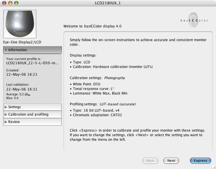
here are my settings for now:
LCD2180UX.gif

My screen is 6 months old NEC 2180UX LCD.
I do not have any prob (color wise as well as lightness) with sRGB or Adobe RGB printers. NONE.
I did have problems while using C1 to Tif 16 bits/AdobeRGB/PS edit->EuroscaleCoatedV2 (Adobe cmyk for Europe)
It seems from proofs that now it is OK with files processed:
using DXO/DNG->ACR to Tif 16 bits/AdobeRGB/PS edit->EuroscaleCoatedV2 (Adobe cmyk for Europe)
The only thing that I do not have really tested is the lighting at the printers display close to the printer... They say it is calibrated, but what temp?

I always go to the print shop to sign the sheet before they run (I mean for brochures and other prints, not for editorials in magazines...)

Am I correct if they say they are 6500 or whatever to calibrate my screen to that same temp?

Thanks again for your patience
 

Frank Werner

New member
Hi Andrew,

thank you very much for your long and detailed answer. I have now understood some more of Color Managment and why some things are as they are. I'm working with an Eizo CG 210 at the moment and thought they were able to be hardware calibrated Luminosity, Contrast and Gamma Wise. At least Eizo claims so and ask 900$ more for the CG210 then for the L997 who has the same panel. As i understood it, they change the internal LUT of the display instead of using the LUT of the graphics card. Do you know if this is correct as you are saying that LCD's are not able to be hardware calibrated? I know that this is correct for about 99% of all LCD's out there but thought the CG Line was different.

The second conclusion I draw out of your statement is :) that I guess I was right with my assumption 5 years ago when I bought my first calibration device and still am as of 2006 that i had the feeling now and then that Color Managment has still a long way to go to an exact and well defined sience. I guess if we could switch of the ambient light... :)

And to Nicolas, yes if your printer says he uses 6500 use it to. If I have to print a large order I always ask the printer how they are setup, if the can give me their! ICC profiles they are using and try to make the same setup here as they have.

Thanks again Andrew!
Frank
 

nicolas claris

OPF Co-founder/Administrator
Thanks Andrew and Frank, I'll have to go for 2 brochures prints next week and I'll check that before.

I'll post for any improvement!
 

nicolas claris

OPF Co-founder/Administrator
OK
I guess I've figured it out....
My screen calibration wasn't that bad.
1- Using both DXo (relatively new to me) and C1 on the same file, I discovered that I got used to C1 which is a little "soft" in the midrange when using "Film standard curve". With the brightness and contrasts of LCD screen (always looking better than image printed in offset) this was not obvious until I saw the same image developped with DXo.
2- for various reason we have change of main printer (we print dozens of # brochures/year) and suddenly the print was nearly as good and close to what I have on screen. They use the same Heidelberg machine, but.........
not the same ink! nor the same screening (the new one uses hybrid screening) bingo!
3-conclusion, as we say in French, I'll bring some water to the mill of the profile maker people, just have to figure out what system to use:
should I buy the expensive Greta system or use the service of some gurus that are around...
I'll come back later on this subject with some questions for the second solution (that's a kind of answer eh?)

Cheers to all
 

Alan T. Price

New member
If you are still working on a 12 year old CRT monitor then either...
1. you are practically blind
2. you hardly ever used it
3. it has a set a new miraculously high mark for monitor longevity.

CRT monitors are only good for so many hours - I think about 8,000 - typically corresponding to 3 to 5 years of usage. After that the brightness has diminished to the point where you can't get good image contrast on the screen, the whites are not bright enough (about 120 Cd/m2) and the focus has degenerated to the point that it's unusable - or it would seem so if you compared it with a new monitor.

Some people have amazing tolerance for crappy monitors but I'm not one of them. The computer is nothing without a good monitor (and mouse and keyboard), so that is not where you should be saving the dollars.

Good new monitors are able to produce the brightness and contrast needed as well as sharp, clearly defined text and lines that are straight where they are meant to be straight (no obvious distortion).

It's almost too late to buy a new CRT now, you'll have to get an LCD instead. Mine is built into a Sony laptop. It has 133 pixels per inch and that is much higher than the usual 100 pixels per inch, making text and lines razor sharp. 1920x1200 dpi is very user friendly too. So far I have been satisfied with the colours but the viewing angle is very tight - nothing like the 170 degrees that most manufacturers claim. Sure you can see their screens from the side, but the colours and contrast change as soon as you drift more than a couple of degrees off perpendicular.
 
Top