• Please use real names.

    Greetings to all who have registered to OPF and those guests taking a look around. Please use real names. Registrations with fictitious names will not be processed. REAL NAMES ONLY will be processed

    Firstname Lastname

    Register

    We are a courteous and supportive community. No need to hide behind an alia. If you have a genuine need for privacy/secrecy then let me know!
  • Welcome to the new site. Here's a thread about the update where you can post your feedback, ask questions or spot those nasty bugs!

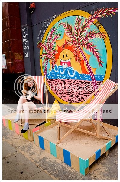
Deckchairs, East London - Colour Street Photography

Paul Abbott

New member
I had to make my way over to Printspace on Kingsland Rd. in east London this late afternoon to pick up my finished Giclee print of 'Banyan Tree & Idol'. I was happy that I took my GR along for the ride too, it never leaves my side really...and so I snapped this.
London has had such warm weather these past two weeks and the city is in a heatwave, and so deckchairs line the pavement on various streets...It's great. :)


Deckchairs, East London '13 - Paul Abbott
 

Cem_Usakligil

Well-known member
Hi Paul,

The weather over here is similar. For months the Dutch have been complaining how cold and wet the summer has been. Now that it's warm and dry, they complain that it's too hot. As long as they can complain about something, they're happy.

This is a great moment captured, the dog begging for food, the guy on the left phoning while opening a can and the other guy eating something. Thanks for sharing.
 

Asher Kelman

OPF Owner/Editor-in-Chief
I had to make my way over to Printspace on Kingsland Rd. in east London this late afternoon to pick up my finished Giclee print of 'Banyan Tree & Idol'. I was happy that I took my GR along for the ride too, it never leaves my side really...and so I snapped this.
London has had such warm weather these past two weeks and the city is in a heatwave, and so deckchairs line the pavement on various streets...It's great. :)


Deckchairs, East London '13 - Paul Abbott


Paul,

I've always admired your immensely well crafted images of London's monuments and buildings. However, the Ricoh GR has added a lot more spontaneity and plain fun that shows a much more colorful and more lively window of what deserves attention.

So what is it about this camera that, to me, seems to reveal as much about you and your tastes as the subjects you are drawn to photograph?

Asher
 

Paul Abbott

New member
Hey Cem', ain't it always the way. I find a lot of people complaining about superficial things like this too...:) There's a lot to be said for living in the moment, without having any comparisons. :)
Thanks for the comment...

Hey Asher, thanks for your kind comment...
This camera can never ever miss a moment I feel, it'll only be me whose fallible in that way. This camera allows me to be more lighter on my feet, faster in my approach and more discreet of course. I can just wait for something to happen or a scene to present itself, and to never ever be concerned over focusing. It can be a hostile environment on these streets and so it helps to have these abilities I guess.
I have always had a huge interest and respect for 'street' photography and it's in this genre that this camera really excels, and I am so interested and eager to start fulfilling myself this way.
I have a big heart for this subject and in the evenings I am always looking at and digesting images from the great proponents of the subject, from the likes of Andre Kertesz, Richard Kalvar, Garry Winogrand, Joel Meyerowitz etc. right through to Martin Parr, David Solomans, David Gibson, Matt Stuart, Nick Turpin and Paul Russell.
From they're images I try to get my 'eye in' so to speak and to get a feeling of the genre's breadth and what works.

Just lately I have had a serious change of heart in shooting street photography in B&W. I wonder about B&W being a little too anachronistic for this day and age...is it a state of mind, I don't know.
Anyway, it's certainly a feeling...and for me B&W is still far more erotic than colour. :)
 

Paul Abbott

New member
Hey James, thanks so much for the head's up on FH. I hadn't any insight into this fella's work but now with this link you've given, that's changed, great stuff, James.
 

Asher Kelman

OPF Owner/Editor-in-Chief
I have a big heart for this subject and in the evenings I am always looking at and digesting images from the great proponents of the subject, from the likes of Andre Kertesz, Richard Kalvar, Garry Winogrand, Joel Meyerowitz etc. right through to Martin Parr, David Solomans, David Gibson, Matt Stuart, Nick Turpin and Paul Russell.

Great list - wonderful inspirational work!

From they're images I try to get my 'eye in' so to speak and to get a feeling of the genre's breadth and what works.

Just lately I have had a serious change of heart in shooting street photography in B&W. I wonder about B&W being a little too anachronistic for this day and age...is it a state of mind, I don't know.
Anyway, it's certainly a feeling...and for me B&W is still far more erotic than colour. :)

Paul,

I love color too. It's needed for yellow things that need to be yellow and the like. It's needed to show the bizarre distractions and claim to attention fashion paints our worlds.

However, for pure form, monochrome works best. B&W imaging is demanding just as color is demanding, but each is a different art form, like opera and ballet, cricket and soccer, ice-skating and skiing. we don't need to have to choose

Sometimes color is needed for the essence is in that. Other times color hides form, texture and what's behind the superficial. We just need to develop each art form separately according to it's needs and our own esthetic interpretations.

I'm celebrating your wading into color imaging! Still, we'd lose a lot if you walked away from your B&W work.

Besides, it's the B&W form that is the fabric on which the color paint works. I'm pretty sure that an accomplished B&W photographer is likely to make better color images too.

Asher
 

Paul Abbott

New member
Oh yeah, I couldn't agree with you more Asher, it's a customary thing.

We have the best of both worlds now in shooting digital images, we have options as to what we choose to suit our images. In this way, I sometimes wonder whether we lose a sense of discipline in what we look for and shoot knowing that, but I don't think it matters really, we get the image no matter what, and that's all that matters...

I genuinely had this thought in my mind last night - 'Colour is the 'make-up' over B&W', and now I see it's your very same thought too. :)
 

Cem_Usakligil

Well-known member
Guys, guys! I can't actually believe you're having this discussion using such words. Where have you been in the past 60 years? This is not the 50's anymore. If you haven't noticed, colour has been the main mode of shooting for quite a while. Lol! :)
 

Asher Kelman

OPF Owner/Editor-in-Chief
Guys, guys! I can't actually believe you're having this discussion using such words. Where have you been in the past 60 years? This is not the 50's anymore. If you haven't noticed, colour has been the main mode of shooting for quite a while. Lol! :)

For sure Cem! But often color is just like flashy neon lights and a distracting overlay designed to seduce and peal one away from what would normally get our attention.

Natural color is one thing.

In a street however, the colors don't necessarily work well at all. Each scene can be like mixing together 12 operas sung simultaneously in the same hall. Other times color is really important and used well. So it should be evaluated for each situation and then one has to insert one's preferences.

A Catholic Crucifixion scene must generally have some blue sky in the b.g. Greek or Russian Orthodox would have gold. It wouldn't be the same in B&W.

Madonna and child work very well in color as the artists work harmoniously with every element.

However, when we snap a picture, we have no control of what color umbrellas, raincoats, shops signs and passing cars are, all ruining what otherwise could be interesting just for the shapes.

But each of us has to be true to our feelings. Color is not ing just another prince next to B&W!

Asher
 
Top