
-
Please use real names.
Greetings to all who have registered to OPF and those guests taking a look around. Please use real names. Registrations with fictitious names will not be processed. REAL NAMES ONLY will be processed
Firstname Lastname
Register
We are a courteous and supportive community. No need to hide behind an alia. If you have a genuine need for privacy/secrecy then let me know! -
Welcome to the new site. Here's a thread about the update where you can post your feedback, ask questions or spot those nasty bugs!
You are using an out of date browser. It may not display this or other websites correctly.
You should upgrade or use an alternative browser.
You should upgrade or use an alternative browser.
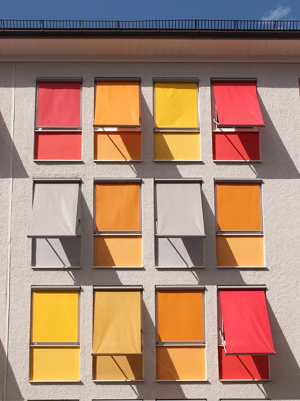
Simple Pleasures: Geometry and Colours
- Thread starter Michael Nagel
- Start date
Chris Calohan
Well-known member
Cropping it just below the eave line and just above the window line at the bottom makes it a far stronger image as per the pure geometrics.
Michael Nagel
Well-known member
Maybe, but I have seen too many of those.Cropping it just below the eave line and just above the window line at the bottom makes it a far stronger image as per the pure geometrics.
From my point of view - leaving the context with the rest was more interesting.
Best regards,
Michael
Asher Kelman
OPF Owner/Editor-in-Chief
The interesting thing is the choices made by the building occupants. Was this accidental or by design? Next, I find the first layer with the sky even more impressive. Less is more!
Asher
Asher
Michael Nagel
Well-known member
This would be a different picture - the pattern would be replaced by a line and the main orientation becomes horizontal.... Next, I find the first layer with the sky even more impressive. Less is more!
The picture above is a small part of a long building, this is why I did not remove the parts suggesting this.
Best regards,
Michael
Asher Kelman
OPF Owner/Editor-in-Chief
This would be a different picture - the pattern would be replaced by a line and the main orientation becomes horizontal.
The picture above is a small part of a long building, this is why I did not remove the parts suggesting this.
Best regards,
Michael
But I wouldn't want it ever changed. I like your vision! It's always well defined, simple and trustworthy.
Asher
Rachel Foster
New member
I've been spoiled by Facebook. I immediately looked for the "like" button.
Still, it's a lovely photo.
Still, it's a lovely photo.
fahim mohammed
Well-known member
Michael, but it is simply wonderful. The design and the colors. And your eye for spotting it.
Regards.
Michael Nagel
Well-known member
Rachel,I've been spoiled by Facebook. I immediately looked for the "like" button.
Still, it's a lovely photo.
Thank you!
Best regards,
Michael
Michael Nagel
Well-known member
Fahim,Michael, but it is simply wonderful. The design and the colors. And your eye for spotting it.
Regards.
Thank you! Yes - I was looking for beauty in a simple way.
Best regards,
Michael
Maggie Terlecki
Moderator
Hi Michael,
I actually really like it with the blue sky and bit of black that looks like some kind of railing. When I scroll at look at it without the blue, I find it more interesting the way you shot it.
I actually really like it with the blue sky and bit of black that looks like some kind of railing. When I scroll at look at it without the blue, I find it more interesting the way you shot it.
Michael Nagel
Well-known member
Hi Maggie,
Thanks. Having more than hint of the building this belongs to was important for me.
Best regards,
Michael
Thanks. Having more than hint of the building this belongs to was important for me.
Best regards,
Michael