doug anderson
New member

St. Marks Bookstore, NY

St. Marks Bookstore, NY
Hi Doug,
It's almost surreal, great catch.
Bart
P.S. If you don't mind my mentioning it, maybe it's intentional, but your most recent (yesterday's) images involving human skin have a very yellow/green color balance/cast. Maybe something has changed in your setup? In this particular image it might add to the surreal quality, but I'm not sure if it was intentional.

Either way, Doug, this picture is exceptional!
It's a very special thing you have done. So, what makes its so?
Asher
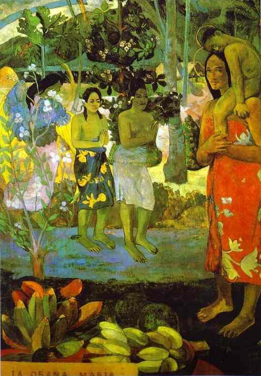
Your pictures reminds me of Gauguin's works. A sort of imagined primitive innocence, "sauvage" The color shift helps direct that notion!
Print image absgallery.com Paul Gauguin. Ia Orana Maria (Hail Mary). 1891.
Oil on canvas. The Metropolitan Museum of Art, New York, USA.
"One whole branch of modern art has glorified primitivism as an attribute imported to Western culture. Artists from Picasso to Henry Moore have explored the mirage of a nonwhite primitivism. Gauguin contributed much to the origin of this idea. His artistic fantasy about the natural and uninhibited primitivism of other people -- whether he meant it as a compliment or not -- was racist, since neither the Tahitians nor any other people portrayed in his art were the source of his vision." Source: is from an Essay by Keith Morrison, Perspectives on the Art of Gauguin; For Nonwhites, It's Racist Propaganda.
Asher


modulate feelings and directions for what is seen. In each of your two versions of your photograph, the color works to present a coherent enjoyable picture. "Correct" color is really a scientific concept applicable to quality control for printing the best representations of things described such as a painting, garment or interior of a well-crafted boat.
In the real world, however, mostly it's over-rated. Quite often we do not need accuracy since we hardly ever have an environment where that is usable. That's because our impression of even that accurate color varies with changes in the make up of illuminating light! Therefore, what we perceive depends on the time of the day. Also the presence of other colored objects. These reflect an added hue, even a bush or tree nearby or a red dress. That effect is two-fold. First the light from the colored object contaminates the existing primary light illuminating the object being viewed and next the proximity of one color or shade to another alters our perception of what hue or tonal value it might actually possess.
So the way I'd look at it is in the impression given by the picture. I'd ask, "To what extent it invokes and evokes the totality of the picture's (i.e.. the photographer's) intent!" On the reception end, I had no issues with color at all, in fact, it's part of the charm!
Frankly, Doug, the first image is perfect as is your second version. Color is only job is to add or modulate feelings and directions for what is seen. In each of your two versions of your photograph, the color works to present a coherent enjoyable picture. "Correct" color is really a scientific concept applicable to quality control for printing the best representations of things described such as a painting, garment or interior of a well-crafted boat.
In the real world, however, mostly it's over-rated. Quite often we do not need accuracy since we hardly ever have an environment where that is usable. That's because our impression of even that accurate color varies with changes in the make up of illuminating light! Therefore, what we perceive depends on the time of the day. Also the presence of other colored objects. These reflect an added hue, even a bush or tree nearby or a red dress. That effect is two-fold. First the light from the colored object contaminates the existing primary light illuminating the object being viewed and next the proximity of one color or shade to another alters our perception of what hue or tonal value it might actually possess.
So the way I'd look at it is in the impression given by the picture. I'd ask, "To what extent it invokes and evokes the totality of the picture's (i.e.. the photographer's) intent!" On the reception end, I had no issues with color at all, in fact, it's part of the charm!
Asher
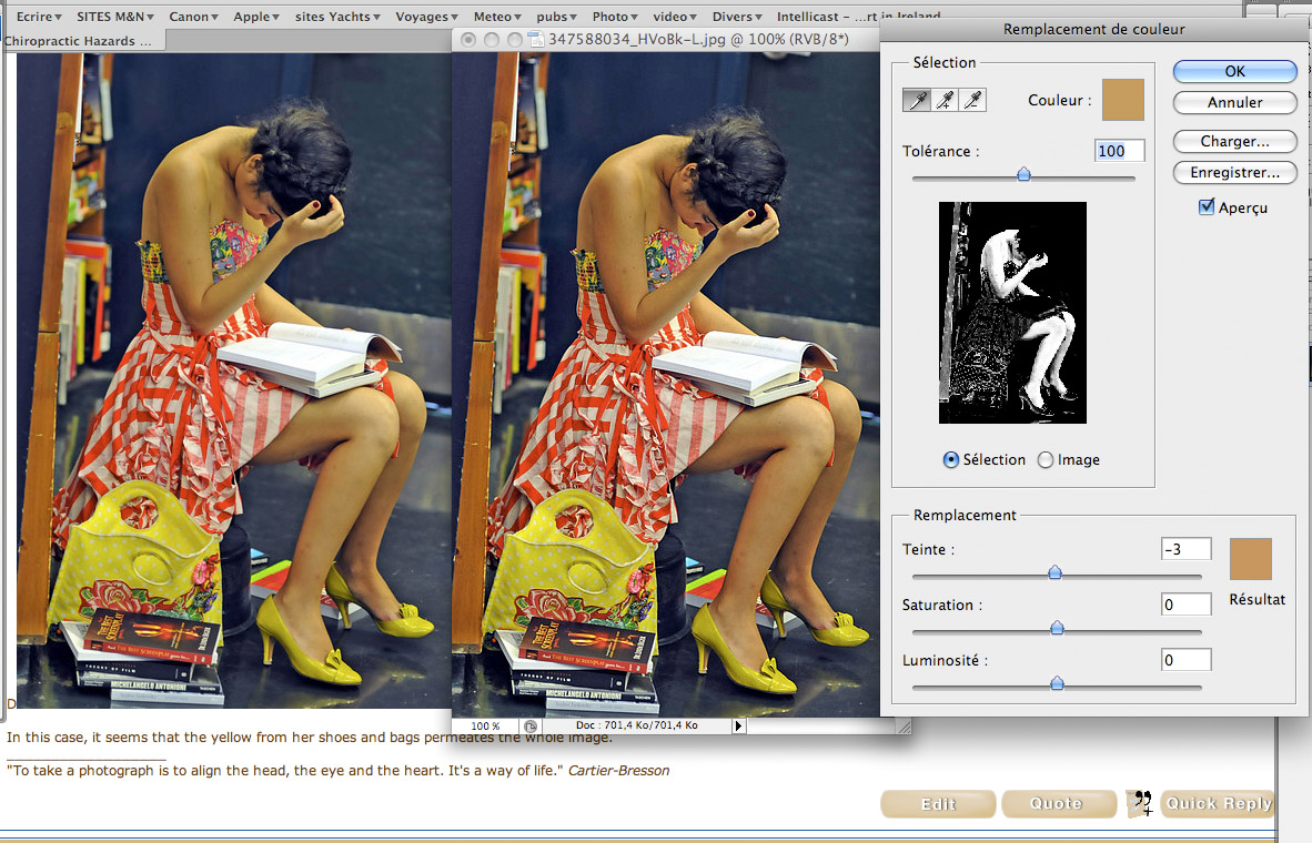
But, my dear friend, she if not Gaugin sienna colors, then Matisse blue, je vous en prie!Heureusement, PS since long time gives the power to change selective colors (much better to do this when converting raw files).
Below is an example of an exactly 30 seconds try (the intent there, was to bring the skin color more "correct" if I may say…)
on the left is the image posted by Doug viewed in Safari in background
on the right is the image retouched after a very slight USM (couldn't resist!)
But, my dear friend, she if not Gauguin sienna colors, then Matisse blue, je vous en prie!
Asher
Bart, you are right. I can't figure it out. It may be the tungsten lighting and my camera's inability to process it. When I gave it a quick fix in elements 6, it got worse, and I was unable to undo it. I guess I'm going to have to go deeper into Photoshop and learn how to modulate color.
... to reveal his REAL intent, an artist have to rely on his skills and must control every single things that make the picture.
An artist cannot rely on any auto settings that HE has not under control, should the artist wish to perform his own auto action, this is fine, but relying on auto feature provided by the industry will take the risk for the artist to rely on luck.
Bart,When a color balance is 'off', it should be the deliberate choice of the photographer as a means to underline his/her previsualized intent.
Agreed!Sometimes(!), in post-processing, one may discover other/different ways of augmenting the intent, which is fine if it becomes a technique to be used repeatedly to achieve a goal.
Luck has little to do with intent.
Postprocessing to create an intent which wasn't there to begin with, has more to do with photo manipulation than with photography, and is a different artform.
Bart