Asher Kelman
OPF Owner/Editor-in-Chief
Well, Ben are you going to do it? Or just an idea?
Asher
Asher

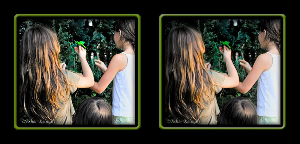
Asher Kelman said:Can you increase the "magic" in this resized as shot AR non-corrected snapshot "Girls Choosing Leaves for Magic"?
Asher


")
Hi Sean,Sean DeMerchant said:The blown out details can tackled via a mixture of calculations and curves to get a mask of the blown out areas (multiply the red and green channels to get an alpha channel and then use curves to shift the midtones close to black).
...
I can post a PSD for those who want to see the process (top to bottom progressive layer tweaks).

No worries Tim. As I often say, "all things happen in good time" and I do not worry about it past that. And online, I often delay responses by huge time frames due to other constraints on my time.Tim Armes said:Sorry for the reviving your post a little late, I've been on holiday and I'm trying to catch up...
This technique is an extrapolation/interpretation of some of Dan Margulis' ideas. Go to http://www.ledet.com/margulis/articles.html and scroll down and read Plate Blending As Poetry to get an idea of where this comes from. Dan is the only writer on Photoshop who actually teaches the behavior of color in his writing as he actually talks about the mathematics of the color spaces and how to work with them. In mathematical terms, an ICC profile is basically equivalent to the field axioms while Dan writes about Fourier Analysis.Tim Armes said:You did a great job with those blown highlights, and I've not seen this particular technique before.
http://www.envisagement.com/opf/GirlsChoosingLeaves_crop.psdTim Armes said:Personally I'd really appreciate having a peek at the PSD file.
Calculations and Apply Image are simply ways of applying ill-defined* mathematical operations to image channels. Calculations takes two channels and a mathematical operation (multiply, lighten, darken, ...) as input and does a pixel wise mathematical operation to generate a new channel (i.e., multiply the red and green channels to yield a new alpha channel). Apply Image takes a channel and an operation as input and applies it to the currently selected channel/s.Tim Armes said:Could you explain the how the application of the calculation works.
Tim Armes said:Why the red and green channels in particular?