• Please use real names.

    Greetings to all who have registered to OPF and those guests taking a look around. Please use real names. Registrations with fictitious names will not be processed. REAL NAMES ONLY will be processed

    Firstname Lastname

    Register

    We are a courteous and supportive community. No need to hide behind an alia. If you have a genuine need for privacy/secrecy then let me know!
  • Welcome to the new site. Here's a thread about the update where you can post your feedback, ask questions or spot those nasty bugs!

Critique for skin tone adjustment

Bev Sampson

New member
Stuart, you have pointed out some things that I was not aware of. I am a serious amateur and not a pro. So I appreciate your knowledge.

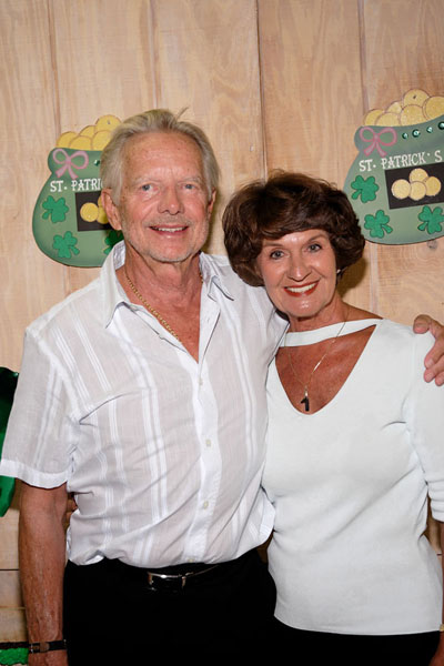
""1. I believe that there is some blue in the man's shirt. WB on the white of the eye seems to give the best overall colour. WB on the lady's top makes the pale green background of the St. Patrick's plaque too yellow. The top looks blue in parts because of reflection from the shirt.""

I must admit that I have never been very successful using the WB pointer. I had never thought to use the white of the eye. Thank you.

""3. The ugly part of the picture is the reflection on the lady's forehead and chin. Nothing I can do gets rid of it completely.""

This really helped. Being an amateur, I could not figure out why there was so much shine. My shooting technique (or lack of it) was the culprit. I had a stofen omnibounce on the flash with the flash position in the normal 90 degree angle. The shine was caused by that setup. If bouncing from the ceiling or nearby wall is not feasible, I am wondering if my small Lumiquest Big Bounce softbox mounted on the flash would have been better. The Omnibounce was on to help spread the light later during the dancing. I did manually remove some of the shine in PS. See photo above in response to Don.

""4. Sharpening doesn't do any favours to the skin texture, but I applied Focus Magic with a radius of 1 just to help with the softness introduced by downsampling.""

This looks very nice. I personally am not a fan of deep taning. But that is my preference and I always try to make my photos as close to real life as possible, understanding that those that have deep tans personally like the look.

In this rec. hall, there is never enough room to set up an umbrella or larger softbox. I do not like to be too conspicuous so I use just the camera with IS lens and whatever deflector will mount on the flash.

Thank you again and if you have any more comments, I will appreciate reading them. Bev
 

StuartRae

New member
I am a serious amateur and not a pro. So I appreciate your knowledge.

Bev,

No-one here is more of an amateur than I am :) And as I pointed out earlier, I very rarely make portrait shots, so this was a great opportunity for me to try out a few things I've seen mentioned, like the RSP Sat/Vib for skin tones.

One thing I've learned though is that it's best to do WB as early as possible in the Raw Converter. Once you've 'set' the wrong colours it's very difficult to get them right again. I believe that PP is much easier if you've got an accurate starting point.

The white of the eye tip was something I picked up in the RS forums. Preferably for digital photos it's best to have a light neutral grey rather than white, but if all else fails.......... BTW, the grey in the man's hair gave a very similar WB to the eye.

I'm hardly in a position to preach advice, but have you considered using something like a WhiBal grey card? If you just shoot the card under the lighting conditions prevalent at the time you'll at least have a fairly reliable reference for WB.

................ and I always try to make my photos as close to real life as possible

That's the problem I'm having - I wasn't there, so I'm guessing about the true colours. I would imagine the tan was deeper than I've made it. That's fixed by upping the sat. in RSP.

Regards,

Stuart
 

Dierk Haasis

pro member
Bev Sampson said:
The sweater was white.

Interesting, particularly when you look at those parts in the image - see my rendition and what I describe - that can be pinned down, like white of the eye or teeth's colour, are alright while the jumper is still blue [enhanced though]. Either the lighting was very mixed oryour memory, perhaps perception, plays tricks?!*

It doesn't really matter since a colour-true rendition [whatever that is] would render people ... unflatteringly.


*Do you wash your jumper with brighteners?
 

Don Lashier

New member
Bev Sampson said:
Don, thank you. Here is the correction that I originally made back in March. Originally converted as tiff and I just reduced to jpg to show here. I think your rendition and mine are sort of similar.
Yes, they are nearly identical wrt color and tonality, especially if you desaturate mine a bit more. For portrait type shots I generally prefer a little warmer WB than "true" as in this example (not my image). I agree with Stuart that it's much easier to get the basic look in the RC via WB/saturation and tonality controls than it is to fixup later in PS.

- DL
 
Last edited:
Dierk Haasis said:
*Do you wash your jumper with brighteners?

I did some washing of the jumper and the shirt for my above DxO version:
PS -> LightMachine plugin -> pre set color filter, blue to white

249259049_23719ccae8_o.jpg


LightMachine has a number of pre set filter for cleaning up surfaces that are close to white, very usefull sometimes. The color of the shirt is now a lie but the jumper I guess is close to the truth.

/Stefan Hellstrom
 

Asher Kelman

OPF Owner/Editor-in-Chief
What is it about these pictures that makes the skin look metallic?

Stuart seems to have escaped it to a fair degree.

But what is the cause?

If anyone can get rid of it I'll be impressed!

Asher
 

Dierk Haasis

pro member
How about this:

bevsampson2.jpg


He jumper is now white as asked for [not becoming], the teint has been adjusted to dampen the harsh reflections and make it less natural looking [in a technique I call flat ironing].
 

Asher Kelman

OPF Owner/Editor-in-Chief
Tim, I'm referring to the look of the skin like oil floating on water giving iridescant colors or a blow torch on a piece of brass simialr colors. It is like a lot of pseudo colors are in the file, perhaps from the mixed lighting.

For all the effort, as good as they are, this file is proving difficult.

Probably the thing to do in this circumstance is to have a poweful flash and overwhelm everything.

I haven't as yet had time to spend on the file, but apart from Stuart's pictures the people do not look very healthy and there is to my mind no easy solution to Bev's question yet.

This is a tough job!
 

Tim Armes

New member
Asher Kelman said:
Tim, I'm referring to the look of the skin like oil floating on water giving iridescant colors or a blow torch on a piece of brass simialr colors. It is like a lot of pseudo colors are in the file, perhaps from the mixed lighting.

For all the effort, as good as they are, this file is proving difficult.

Probably the thing to do in this circumstance is to have a poweful flash and overwhelm everything.

I haven't as yet had time to spend on the file, but apart from Stuart's pictures the people do not look very healthy and there is to my mind no easy solution to Bev's question yet.

This is a tough job!
Yes. There's a reason that it's hard to remove, and you've already stated it.

This photo contains mixed lighting. The ambient light is florescent and the flash is dalylight balanced. The flash isn't overpowering the ambient, and the result is a odd mix of light that's proving impossible to remove in Photoshop.

The proof of this lies on her jumper. If we use that to determine he white point then we find that the white point changes considerable depending on the point chosen. The flash has had more effect in the middle of the photo than at the bottom.

Furthermore, the direct flash is making the problem worse since it's causing unsightly highlights on their faces.

Here's my attempt:

BevSampson1.jpg


Note that I've only worked on the lady's face. I similar process would need to be done on the gentleman since the colour balance isn't even across the two faces.

Workflow:

1) From the RAW file, I chose a white balance based on the middle of the jumper.

2) I converted the result to CYMK and analysed a few points on the womans face. There was more yellow than magenta than cyan, which is correct, but there was far too much of each, resulting in very red faces. I reduced them to more normal values using a curves adjustment layer.

3) I created a mask to only appy this layer to the skin

4)I converted the result back to RGB.

5) I created another layer and painted over the overexposed areas using colours from just outside each area. I then changed the blend-if mode for this layer to only apply the "paint" over the highlights. Then I reduced the opacity of this layer and added a little noise to it.

5) I lightened the eyes and teeth a little.

For better results, Bev, you should do the following:

1) Use a coloured gel over your flash to convert the daylight flash colour to that of the ambient light.

2) Don't use a direct flash. Bounce it off a wall to give a better modelling light.

Here's a couple of sites that explains it all:

http://www.planetneil.com/faq/flash-techniques.html
http://strobist.blogspot.com/2006/03/lighting-101.html

Tim
 

Dierk Haasis

pro member
Asher Kelman said:
[...] but apart from Stuart's pictures the people do not look very healthy [...]

I disagree. Either we have very different monitors, totally out of sync with any colour profile ....

Both subjects have a very tanned look, not easily photographed, particularly towards white [or very light-coloured] attire; the rather dark wood panelling and trousers further complicate lighting. Nevertheless, bleaching may be alright for Michael Jackson but not for these two - they don't look very good, for instance, in Stuarts work-out [I've tried it myself]. Changing the brightness of the skin too much simply blows out highlight and even moderately light skin patches, as can be seen in several tries to render the couple rosier than they are.

Look at the hair in Stuart's image, it is far from anything I see in the original; the trousers are very light [they may even have been that light but my venture is they were a very dark grey].

Although the lighting may not be optimal, I don't see that much difficulties in the photo proper. Looks to me as if we fall into the trap anybody falls in when portraits of himself are discussed - only we substitute them for us in this case. Hence one of my original questions: Resembling reality or looking good.
 

Bev Sampson

New member
"""Hence one of my original questions: Resembling reality or looking good."""
Dierk, that is exactly my question. I don't like the look of the skin tone. It is too tan on the lady but that is my preference. She must not agree or she would not have allowed her skin to become this tan. Then the genteman is far more fair and both are in the same picture. In situations like this previously, I have masked in PS and worked on them separately. The other objection I have with digital is that if there is the least bit of natural red in the skin, it is magnified in the digital and with some RAW converters as well. That is why I am looking for a Kodak Portra profile. My own husband has very red skin and he does not photograph well with digital.

I am really glad someone pointed out that the shiny on the skin was flash reflection because I did use a Stofen on the flash and did not consider that explanation . But because the flash was in the 90 degree position even with Stofan and the camera was relatively close, about 10 feet, lens at 75mm, I now know I should have bounced or used a bigger deflector.

I just wonder if these folks who spend hours on the beach coloring their skin know when they look at their photograph, this is not a natural thing to do.

Tim, thank you for the links. I just got out of bed this morning, it is 7:30 am here and I will, in an hour or so read your links.

Also, Asher, I purchased the Studio WhiBal yesterday and will try that when we get back to FL in late November.

I wonder if WhiBal would/could help in this rec. hall environment?

There is another lady who photographs in this lighting using a Nikon D70 and her skin tones seem to have less red and less saturation. Could some of this be a factor of Canon algorithms?

Bev
 

Bev Sampson

New member
Asher and Tim could I post the second photo that I referred to in my initial post? If yes, Don, could I put it on your server?

This second couple are much less tanned and both have about the same skin tone. They fly to FL from England for the winter.

Bev
 

Tim Armes

New member
Bev Sampson said:
I am really glad someone pointed out that the shiny on the skin was flash reflection because I did use a Stofen on the flash and did not consider that explanation . But because the flash was in the 90 degree position even with Stofan and the camera was relatively close, about 10 feet, lens at 75mm, I now know I should have bounced or used a bigger deflector.

The Stofen Omnibounce is a stunning example of marketing at it's best.

Here's are some basic lighting facts, based on physics:

1) If the light source is big relative to the object, then the object's shadows will be soft
2) If the light source is small relative to the object, then the object's shadows will be hard

These are the rules. They cannot be broken.

No clip on diffuser will ever soften the light source by itself, since is doesn't change its size. What they will do is diffuse the light. If you point the flash straight on the diffuser will have two effects:

1) It will drain your batteries
2) It will slightly soften the edges of the hard shadows

If you want soft light from a small light source, then you need to use a much bigger diffuser, such as a wall, softbox, umbrella, etc.

Notice that the manufacturers of small flash diffusers don't tell you to point it straight at the subject, they tell you to point your flash at the ceiling.... hold on a sec - won't that result in soft light anyway, since you're bouncing off the ceiling??

Well, yes it will. So now you're not only asking your small flash to light up a ceiling (which is better than pointing it straight on), but you're also going to increase the required power output by sticking a diffuser in front of it! I wonder if these companies are owned by Duracel?

Now I know what you're saying - the diffuser will also send some light forwards, lifting the shadows. Well, we can see the result of that reasoning in Bev's photos. It looks like direct flash again, because the side of the diffuser is still small. Furthermore, since the diffuser is sending light in all directions there can be no hope of having directional light, the very thing that gives us a nice modelling effect.

Conclusions:

1) Don't use a diffuser without thinking about it. Indoors it's rarely if help, and outdoors if eats power. If you use it, understand why you're doing so.
2) Try to bounce off of walls and ceilings to give a soft directional light. Bare in mind that if you bounce straight up you'll get dark eye sockets. Think about the direction of the reflected light.
3) Flash diffusers are mostly useful where you want to achieve a bare bulb effect from a strobe - that is, you want to throw light in all directions. This isn't often the case.

Sorry, drifted slightly off topic.

Tim
 

Bev Sampson

New member
Tim, thank you for the detailed explantion.

I asked in a previous post, what about the Lumiquest, Big Bounce, that mounts to the flash head and is about 12 in. wide and 8 in. long? I will say that in the darkened room for dancing, the Stofan seams to spread the light much better than direct flash.

Bev
 

Asher Kelman

OPF Owner/Editor-in-Chief
Bev,

James Russel, a ghost of RG forums often complained about skin with Canon and prefers the Nikon when not using his MF cameras. Shooting with your Canon, how do you set the flash and what power do you use?


Dierk,

I'll check your comments on a calibrated monitor.


Asher
 

Don Lashier

New member
Bev Sampson said:
Asher and Tim could I post the second photo that I referred to in my initial post? If yes, Don, could I put it on your server?
Bev

Sure, go ahead and upload it. (sorry, had a late night and just got up).

- DL
 

Bev Sampson

New member
Asher, Canon 550 ETTL and with Stofen on +2/3 on the flash and cf 14 ETT: 1/ average in camera. I don't ever use the flash indoors without some sort of diffusion. But in this situation, there is no room for an off camera softbox or umbrella.
 

StuartRae

New member
Dierk Haasis said:
I disagree. Either we have very different monitors, totally out of sync with any colour profile ....

..........the rather dark wood panelling and trousers further complicate lighting. ...............they don't look very good, for instance, in Stuarts work-out [I've tried it myself]. Changing the brightness of the skin too much simply blows out highlight and even moderately light skin patches................................

Look at the hair in Stuart's image, it is far from anything I see in the original; the trousers are very light [they may even have been that light but my venture is they were a very dark grey].


Dierk,

You're quite right about the over-lightening. I've just returned from a week-end away, and looking at my post in the light of your comments, I realise I may have uploaded the wrong image. I had a series of renditions, all based on the same RSP conversion, and the version I should have posted shows the trousers much darker (although the black belt can still be distinguished).

In the RSP conversion I made sure that no highlights were clipped in sRGB colour space.

I'm not sure the wood panelling is dark. To my eyes it looks like oak, which can be rather grey, and definitely not a chestnut brown.

Regards,

Stuart
 

Ron Morse

New member
I had shoulder surgery almost 2 weeks ago and can't lift my camera. This exercise is a little break for me. Since the title says " Critique for skin tone adjustment " that is all I paid attention to.
I open it in C1 and after trying for white balance didn't like it. I went to DPP, something that I have been using more and more lately, and clicked on the ladys sweater. I believe it was 203,202,203 and turned back the brightness 0.17. For skin tones I am likeing DPP more all the time. I think RSP is horrible with skin tones for me.
I opened in CS-2. Used shadow-highlight with shadows 46%-highlight 9%, resized and used a sharpening action that I have at 80%.
Since this is a highly subjective topic I'm sure many won't agree with it. I made no attempt with the glare on the ladys face or any thing else since this was about skin tones.

dpp0038da0.jpg
 

Asher Kelman

OPF Owner/Editor-in-Chief
Hi Dierk,

Looking at the images on my calibrated Eizo CG210 instead of my Apple 15" LCD, I now see a great improvement and much less of the metallic effect.

Thanks for pointing that out. This shows how the screen can lead one astray!

Asher
 

Bev Sampson

New member
A huge thank you to all who participated in tone correction for this image. As Asher pointed out, it was a very difficult photo.

Thank you, Tim, for providing the links on lighting. They are very helpful. On camera flash, with or without a bracket has eluded me forever. So I am now reading all that I can and practicing on my husband who is very red skined.

I did not vote in the other related thread because I am very interested to see the preception of which is most appealing. Thank you Asher and Tim for setting up the poll. I am watching with great anticipation.

Bev
 
Top