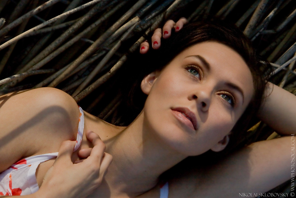
I like the last one, Tranquility, best Nik. The image captures the mood perfectly. I have questions, prompted only by curiosity, regarding the others. Why throw away the information on color in those particular pictures? What are your preferences, guidelines, rules (I'm grasping for the right term) that dictate color information to detract rather than add to an image?
Mike
Hi Mike,
thank you for your comments and, especially, your questions!
First of all, a very short and very sincere answer: "I just felt like doing it".
")
It was a very strong urge that felt and seemed right.
Now, I'll try to come out with some rationale
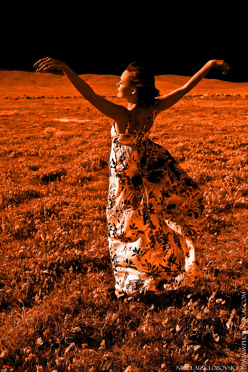
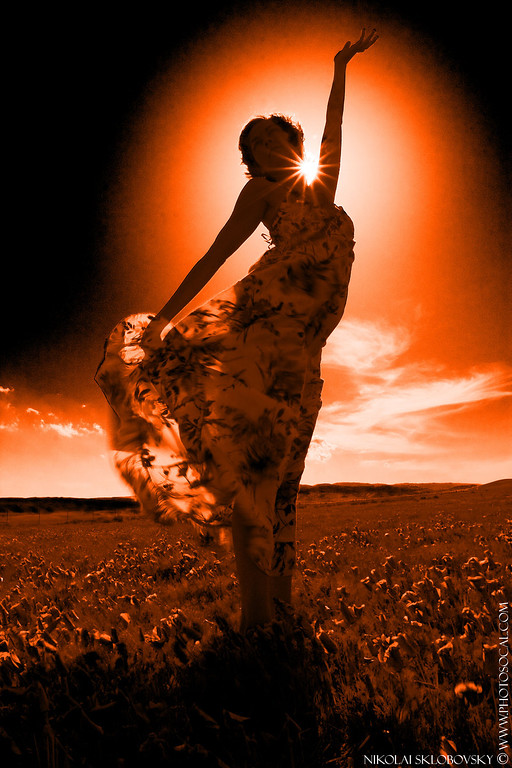
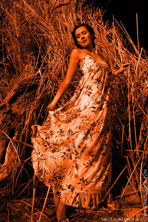
As it's easy to see, the original scene is very colorful and very saturated. I mean, I could easily desaturate/flatten it in a thousands of different ways in ACR/PS, but it was very colorful and saturated when I saw it with my own eyes, so it was a hard to ignore fact.
This would not (and was not) be a problem for the purely landscape/flower shots, like these:
http://nik.smugmug.com/gallery/4670792_ngoFz
However, this was a model shoot. I wanted to make my model an undisputed champion of each frame. And even though we had specifically chosen this particular surrounding and even dressed her accordingly, after looking at the results at my flatscreen I felt like the Mother Nature got really competitive and drew a lot of attention away from my primary subject. Hence my natural reaction was to restore the balance in some way. After trying a few different things the poppy-colored bold duotone seemed to do the trick (CS3 and its BW adjustment layer is a great tool for this). So I saved the preset and proceeded to apply it (with some thoughtful modifications) to the rest of the series.
That's about it. Hope it answers your questions.
Cheers!