Michel BRAUD
New member
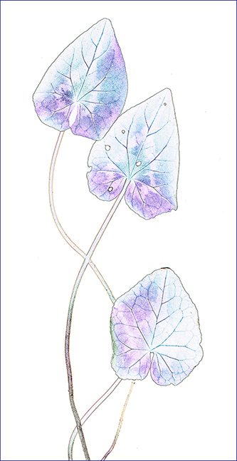
I made a long serie of this type of pictures, I started in B&W printing on ink-jet glossy paper.
At the time, few years ago, pure carbon pigments were far from ideal on this type of paper, showing glow differiential and bronzing.
Everyone wanted to get rid-off these "artifacts". But I found a real advantage on bronzing and tried to get as much as possible and obtained some lovely golden prints. To do that, I had to start from colour pictures and tweak them heavily in PS and find the worst paper I could find, the one giving the more bronzing possible.
The bad thing is this can be seen only on the prints, not on the screen.
Today this paper is no longer on sale so I decided to get back to my original files and work on them for colour, here they are.
Comments are welcome.