Tom Robbins
Member
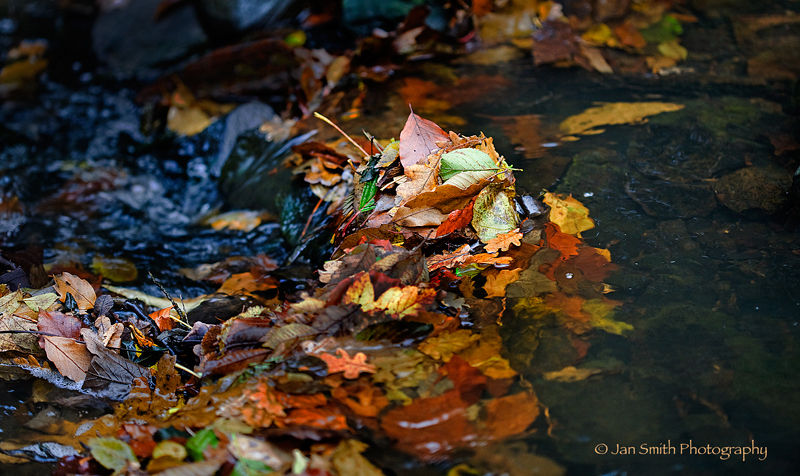
Critique Desired: Late Autumn Leaves
Light snow is in the forecast for tomorrow. After the rain and fog of the last few days, this will be a welcome change of pace. Nonetheless, last season's leaves still have some spunk.

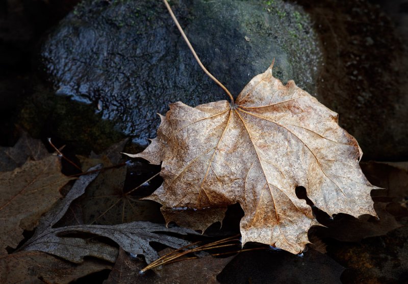
As Subject
Autumn leaves are usually photographed on the vine. The leaves here are just shy of compost, but still worthy of notice. Or maybe not. All thoughts and opinions are very welcome.
Light snow is in the forecast for tomorrow. After the rain and fog of the last few days, this will be a welcome change of pace. Nonetheless, last season's leaves still have some spunk.
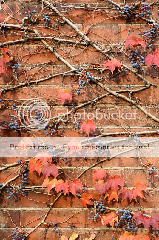
As Accoutrement
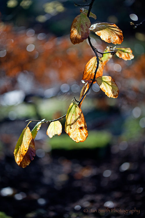
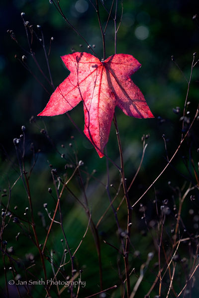
As Subject
Autumn leaves are usually photographed on the vine. The leaves here are just shy of compost, but still worthy of notice. Or maybe not. All thoughts and opinions are very welcome.


")