Hi Nathaniel,
Thanks for the explanation. I hope this is not turning into a blog by my part, but here goes. This is easy for me, I have no emotional attachment to the view location, (nor to your fireplace)
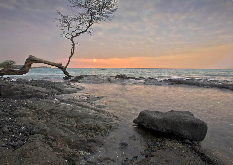
If I look at the original image on my screen, there are lots of white specks, obviously at a larger size, you will see they are pebbles, etc. Also, the original composition, is in my opinion unsuitable for anything smaller than full wall size. I think I would need to move things around a bit for anything smaller. There is absolutely no reason to think that anything in nature conforms to what I think is a pleasing composition, in particular when it comes to fitting it into a rectangular frame. No reason to think what I think is 'good composition should be what you think is good composition. So, what to do, in order to downsize this to 'over fireplace size'? Some time ago, in another thread which I can't locate, there was a link to a page where someone had collected together a selection of about a dozen 'compositional rules' and iirc related it to astrology or something. If I can find it, I'll repost a link.
It may seem, from what I'm saying, that you have done nothing right. That is not so. If I thought the image was not worthy of my time, I would have left it well alone. I like the tonality, the pastel shades, etc. I would alter the composition. Asher has exercised some fine surgical skills, my approach is more 'chainsaw like'. I have not viewed in detail what Asher has done, maybe we are on the same page. (It was you, Nathaniel, who mentioned cliché in the title ;-) - more is less.....
I have not deliberately altered any colours, I am concerned with cropping....
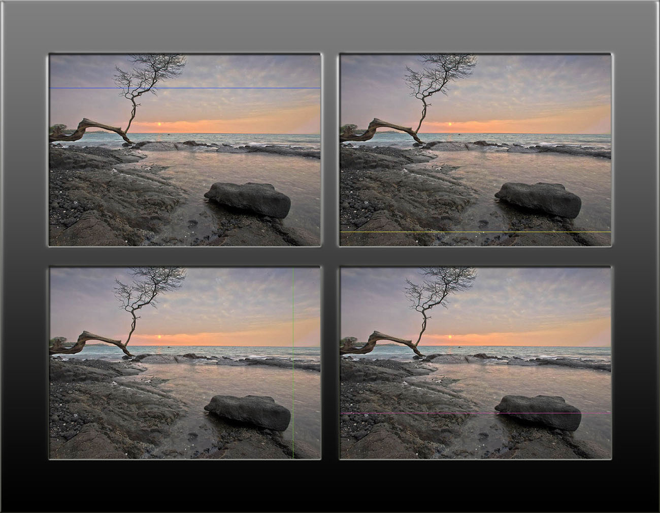
So, Image 1 below -
You chopped off the top of the tree. The top left hand of your image sky is cut off from the rest, an optical illusion makes the sky look smoother up there. There is boring sand/mud/gravel in front of the rock. I don't really know what to look at. Maybe the rock is too big/dark to balance the wispy tree branches. The sun/reflection and boat are virtually insignificant. At wall size, that is fine, I could walk up and down, looking at each detail as required, but taking it in in one glance, is not possible. So, remove the boring foreground, and the sky differences and the cut off branch - cut it off more. The sun and boat are now more prominent. the branch, and rock patterns lead in from the lhs pointing me to the rock, my eye is led more round the image. In the original, the large rock shadow leads me out again, now I notice the line of reflection towards the sun, etc.
Image 2 below -
Do we want that rock? It's a bit black, makes the image maybe a tad dismal. Here's more sky, more light
Image 3 below,
If you think the rh foreground is bland, stick back the rock, but make it glisten, or something interesting - I've not....
Image 4 below,
On the very left hand edge, there is a muddle between a broken branch and the background trees. I thought that it may be best to remove the background shoreline (dynamite?) but that leaves an awkward distraction of the broken tree branch. Cropping it is just as effective, and simpler.
Thanks for letting me play with these. All simply done by selecting and copying to layers, then turning 'em on and off to see the final effect. In general, I think I'd possibly make the tree a bit darker, you may then be able to balance it with the dark rock. Now, it maybe that you are of the belief that images should be as taken from the camera. That should be so, for forensic purposes, and for advertising (but it isn't). For pictures on the wall, the end justifies the means. I can't go back their to get the whole tree in, if I did, is it worthy? Does it matter -up to you. I hope, after you have it printed, you don't start thinking - 'if only.....
Get the L shaped bits of cardboard - even landscape painters use them. practice mentally cropping every image, every scene you see, try analysing your eye movements, learn to see. (The tree is too light, imy view). Finally, very carefully consider the location of the print - the wall colours, the rest of the room, the lighting, the frame, the matting, if any. I think this image could be nice, but you can make it 'stunning', if you want to.
It is all an illusion.
Best wishes,
Ray