
-
Please use real names.
Greetings to all who have registered to OPF and those guests taking a look around. Please use real names. Registrations with fictitious names will not be processed. REAL NAMES ONLY will be processed
Firstname Lastname
Register
We are a courteous and supportive community. No need to hide behind an alia. If you have a genuine need for privacy/secrecy then let me know! -
Welcome to the new site. Here's a thread about the update where you can post your feedback, ask questions or spot those nasty bugs!
You are using an out of date browser. It may not display this or other websites correctly.
You should upgrade or use an alternative browser.
You should upgrade or use an alternative browser.
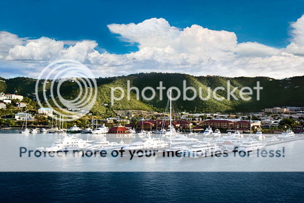
Challenge: Edit "Early morning St Thomas US Virgin Islands" to optimize the beauty!
- Thread starter Ron Morse
- Start date

Asher Kelman
OPF Owner/Editor-in-Chief
A picture being a unit of art.
I love that scene Ron! I wish I had one of those boats. Actually I'd like the onw on the left with the nice square windows! I wonder what that goes for? I imagine it sleeps 8 people.
I do have a criticism about this image relating to the clouds, but it's part of something more fundamental that I believe is true of art.
There's something about a good work of art to me that has a sense of being a whole thing, not part of it. So there is a value of being a "unit" of art, like a person is a unit of humanity.
Here the main cloud mass only really starts in the last 25% of the width of the image. Then it is abruptly cut off! So this makes as look beyond the pictures for more. Shooting harbors is always difficult as we have the problem of never getting enough of the landscape. The key is to decide what is important and to balance these copmponents.
So what to do? The challenge is to see what are the key elements of the picture. How should these be best shown? How might we edit the photograph to bring out the most from this image and deliver one compelling picture?
Asher
Last edited:
Aida BGAgraphix
pro member
This is really beautiful !
I love the contrast between the white and the dark water.
The clouds can be enhanced, also the hills. I'll try some painting with light .
I'm looking forward for the larger file.")
I love the contrast between the white and the dark water.
The clouds can be enhanced, also the hills. I'll try some painting with light .
I'm looking forward for the larger file.
Asher Kelman
OPF Owner/Editor-in-Chief
Here's the RAW file for download.
Good luck!
Asher
Good for 500 downloads and 14 days! After that, just ask!
Good luck!
Asher
Good for 500 downloads and 14 days! After that, just ask!
Peter Stacey
New member
Here is one interpretation of the RAW using Lightroom:

I'll post a different version later that has also been taken into Photoshop.
Regards,
Peter
I'll post a different version later that has also been taken into Photoshop.
Regards,
Peter
The raw file is from a canon 40d. You can not open it in adobe photoshop cs2, without some flaffing around, converting to dng/whatever.
You can get a converter here, afaik http://www.adobe.com/support/downloads/thankyou.jsp?ftpID=3732&fileID=3494
(Don't you just love this stuff ;-)
Best wishes,
Ray
You can get a converter here, afaik http://www.adobe.com/support/downloads/thankyou.jsp?ftpID=3732&fileID=3494
(Don't you just love this stuff ;-)
Best wishes,
Ray
Cem_Usakligil
Well-known member
Hi Ray,
As you rightfully have pointed out, one needs to install the ACR version 4.2 or newer.
For clarity's sake; one doesn't need to convert to DNG though. After installing the ACR 4.2+, the CR2 file of the 40D can be opened in CS2 directly.
(Please note: This statement is incorrect but is left intact for historical reasons, see the post by Stuart immediately below)
Yes, I do indeed love this stuff ;-)
Cheers,
Cem
Last edited:
Hi Cem,
Are you absolutely sure about that? As far as I can tell, CS2 doesn't support ACR 4.2 - you need to upgrade to CS3.
Regards,
Stuart
After installing the ACR 4.2+, the CR2 file of the 40D can be opened in CS2 directly.
Are you absolutely sure about that? As far as I can tell, CS2 doesn't support ACR 4.2 - you need to upgrade to CS3.
Regards,
Stuart
Cem_Usakligil
Well-known member
Hi Stuart, Ray,Hi Cem,
Are you absolutely sure about that? As far as I can tell, CS2 doesn't support ACR 4.2 - you need to upgrade to CS3.
Regards,
Stuart
My bad, I'm terribly sorry. Didn't pay attention to that little problem of compatibility between ACR 4+ and CS2, I'd forgotten all about it by now. Thanks for correcting me.
Coming back to Ray's original remark about the DNG conversion, it is indeed a necessary step, after all
.Cheers,
Cem
This is why I tend to use a telephoto lens, and plenty of cf cards. There are dozens of good compositions within this image, but overall, I think there are too many things going on, fighting for attention, almost all noise, with no theme tune, so to speak, within this one shot. Of course, unless you happen to own the shipping line, you have no control over positioning a cruise ship as it enters harbour , (and if you do own the ship, then you still need to keep check on the depth of the channel, whatever). It then becomes a question of 'pop' - purpose of photo. So, as a general view of the harbour, a reminder of where you were, then it's fine. As an image that I would hang on my wall, my never being there, then it needs something else for me.
I have done my usual cropping thing, in order to try and get some more interesting compositions, something I could think, 'ah, that looks better', but it is a question of time. My first attempt, selecting the rhs, the cloudy side, almost square crop, (leaving out Asher's boat ;-) ,looked much better. However, what I had cropped off, t'other side, that looked better still. I may even try printing a very severe crop - could be useful in comparing the iq of the 40d cf my 20d. This jury of one is still out.
I think it's the drab greenish hills that spoil it - could do with one of Nikolai's fires, I guess.
Best wishes,
Ray
OK here's the first effort, with my thinking behind the composition.

I wanted the clouds. The mast is the eye grabbing thing, against the hills. Needs to be more in 1/3 posn. the lhs, cropped away because it was messy. I like the octagonal building - sort of compliments the boat on the far right. Like the tiled roofs. Before cropping, I layered the image, selected the sky into its own layer, and fiddled with curves to blue the sea, and generally lightened it with the levels tool (Too much, blew the highlights). I left the sky alone. One or two odd things crept in (bot rh corner? missed a bit of sky, etc.) If it were my image, I'd do something re the hills - (Peter's effort wrt hills is not so drab), probably remove some buildings, maybe add a fish or two ;-) Still, squarish crop may not suit all.
Then, I saw what was left behind, so to speak

Which I think is better. I''ve cropped off the white 'blobby bits' from the extreme left hand side - boats/reflections/flare- and got the mast in a similar 1/3 position. The lesser sky detail pushes the foreground forwards.
I think an analogy may be starting with a neutral ph solution, and trying to extract a strong acid or alkaline liquid.
Possibly split the image into three, with overlaps, or maybe the centre image a zoomed in detail, a Triptych sort of thing.
Best wishes,
Ray
I wanted the clouds. The mast is the eye grabbing thing, against the hills. Needs to be more in 1/3 posn. the lhs, cropped away because it was messy. I like the octagonal building - sort of compliments the boat on the far right. Like the tiled roofs. Before cropping, I layered the image, selected the sky into its own layer, and fiddled with curves to blue the sea, and generally lightened it with the levels tool (Too much, blew the highlights). I left the sky alone. One or two odd things crept in (bot rh corner? missed a bit of sky, etc.) If it were my image, I'd do something re the hills - (Peter's effort wrt hills is not so drab), probably remove some buildings, maybe add a fish or two ;-) Still, squarish crop may not suit all.
Then, I saw what was left behind, so to speak
Which I think is better. I''ve cropped off the white 'blobby bits' from the extreme left hand side - boats/reflections/flare- and got the mast in a similar 1/3 position. The lesser sky detail pushes the foreground forwards.
I think an analogy may be starting with a neutral ph solution, and trying to extract a strong acid or alkaline liquid.
Possibly split the image into three, with overlaps, or maybe the centre image a zoomed in detail, a Triptych sort of thing.
Best wishes,
Ray
for others to try -
Mike Warren has a triptych action
http://mikedubu.smugmug.com/gallery/2517482_tjVSU/1/227360413
tricky to use, for what I wanted to show, but I have other things to do, so rushed it through - someone else have a go.

Now, what was the question......
Best wishes,
Ray
Mike Warren has a triptych action
http://mikedubu.smugmug.com/gallery/2517482_tjVSU/1/227360413
tricky to use, for what I wanted to show, but I have other things to do, so rushed it through - someone else have a go.
Now, what was the question......
Best wishes,
Ray
Aida BGAgraphix
pro member
Here is my version of it :
I've choosen not to crop it , but I added some clouds to try to make a balance.
I've choosen not to crop it , but I added some clouds to try to make a balance.
Last edited:
John_Nevill
New member
Here's my take of the scene, I started with a 16:9 crop, adjusted some the shadow detail and WB in LR, moved into CS3 and then selectively tweaked colours, local exposure and curves until it felt right, even added a selective warm filter. Then back into LR for the final tweaks on HSL before outputting to jpeg.

Peter Stacey
New member
Another version, cropped in a 10:4 panoramic ratio:

Regards,
Peter
Regards,
Peter
Michael Fontana
pro member
So here's another conversion, slightly brighter, and yes, a bit af sky crop would look better.

Submitted without any suggestion that it's a 'good' conversion, and without any artistic cropping, but as an alternative to the popular raw converters.
If you open a raw file with Photomatix Pro, it does a basic demosaic and then presents you with 'pseudo' HDR image, which you can tone map. There's no chance of any adjustment in the raw conversion. It seems to do a pretty good job, but it's horribly slow.

Regards,
Stuart
If you open a raw file with Photomatix Pro, it does a basic demosaic and then presents you with 'pseudo' HDR image, which you can tone map. There's no chance of any adjustment in the raw conversion. It seems to do a pretty good job, but it's horribly slow.
Regards,
Stuart
David Sommars
New member
Sorry to revive an old thread, but I love these challenges.
I wasnt able to download the raw file, but I worked from the jpg. Cannot get too much better theres a lot going on in the scene making it hard to go one way or the other....
might have gone overboard (no pun) a little on the blue, but its pretty right ?
original

redo

I wasnt able to download the raw file, but I worked from the jpg. Cannot get too much better theres a lot going on in the scene making it hard to go one way or the other....
might have gone overboard (no pun) a little on the blue, but its pretty right ?
original
redo