• Please use real names.

    Greetings to all who have registered to OPF and those guests taking a look around. Please use real names. Registrations with fictitious names will not be processed. REAL NAMES ONLY will be processed

    Firstname Lastname

    Register

    We are a courteous and supportive community. No need to hide behind an alia. If you have a genuine need for privacy/secrecy then let me know!
  • Welcome to the new site. Here's a thread about the update where you can post your feedback, ask questions or spot those nasty bugs!

What is it about........

this image that makes me like it ?

Or should I maybe not like it ?

Does it work for you ?

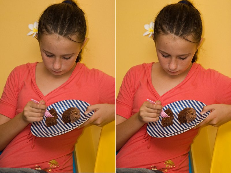
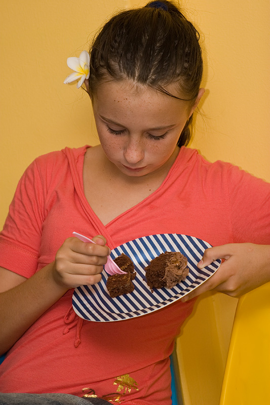
Quick grab at my son's 13th birthday party on Saturday.

20 teens having a ball, just stopping briefly for a snack, and then back to the dance floor.

Strangely she opted only for a small piece of cake, must be keeping an eye on the figure already !

112416249.jpg
 

Mike Shimwell

New member
Engagement - I love pictures of my children engaged in what they are doing. No smiles, just concentration. I like this, though I might give it a little more light and contrast - that's it.

Mike
 
Mike, may I ask a big favour here ?

I have done the PP on my laptop (new Toshiba) and need to get a feel for the way others see my images. Unfortunately my screens are not calibrated 100% - still need to invest in that department. At this stage I basically use a "print compared to screen" method to decide what I think is good.

Please copy this image, and then repost with your suggested changes. That will greatly assist me in assessing my own processing.

Thanks in advance.
 

Mike Shimwell

New member
Hi Johann

Very quickly, and just my thoughts...

Curve layer with points at 33,33 and 194,202 lightens and increases contrast. Set to 80% opacity, normal blending mode

Saturation layer - master saturation to plus 4, set to 60% opacity normal blending mode.

Original..........................................................................Curves only..............................................................Plus saturation

112416249.jpg
3522942871_0c34247070_o.jpg
3522924513_ce663ec93a_o.jpg


Hope this is helpful as I'm absolutely sure the saturation improves it now... - hopefully others will also comment. Also, internet explorer seems to do something different when dsiplaying compared to photoshop.

Mike
 
Thank Mike. Appreciated

But.......obviously my screens are simply not good enough to detect the difference, or, I don't know where to look.

Or

The changes are very subtle

Here are the two side by side - left (my shot), right (your edit)

This is so frustrating !

112418948.jpg
 
Oops.....

We're posting simultaneously.

I can see a slight change in the 3rd version, but must be honest, not as much as I thought.

If you had to put a value on it, what % would you say I was off by ?
 

Mike Shimwell

New member
Hi Johann

It's more obvious when in photoshop - presumably because it manages the screen colour better - but the difference is very small. I was aiming to slightly lift her face, as a percentage less than 5% (though without a scale that's hard to define) but didn't do any selective edits here, just applied the curve to the whole image.

There is also a slight increase in the saturation of the mid-tones because I used the normal blending mode which allows ocntrast increases to increase saturation.

I'm away to bed now as it's midnight in the UK, but will log on tomorrow.

Mike
 

Asher Kelman

OPF Owner/Editor-in-Chief
Mike,

Your delicate hand and good eye has brought vigor to the picture.


Johan,

I see that the changes have given the images more presence and richness. Notice these changes are indeed very slight, limited, disciplined and therefore subtle.

This is why I advocate making changes to the best level you can and then returning to that image later with the task of only using the smallest needed fraction of that layer.

You are right in not doing major color corrections without a calibrated monitor. A substitute for that is to punch up the colors slightly and use the camera's jpg as your output and PS only for cropping and cleaning up distractions or blurring darkening etc.

I do like your observation of this child .

Thanks for sharing.
 
Last edited:
Thanks Asher

This has been a valuable exercise. One often has to deal with comments re exposure, saturation, color accuracy etc, and without some reference I suppose the first reaction is always a bit negative. By having doe this exercise and getting feedback it is possible to at least determine whether your own experience (visually) is more or less on track, or way off the mark.

In this case we all seem to perceive the changes to be very slight, which leaves me to assume that maybe we are seeing close to the same thing. Is that a reasonable deduction, or am I nuts ?

Would be great to hear from others.
 
Top