
Asher Kelman
OPF Owner/Editor-in-Chief
The challenge on sunsets here has had me thinking about using the images of sunset in a different way. So here the original shot, itself, is just a primitive element to build a picture hopefully worth contemplating, but not surely not purely for sentimental or romantic reasons.
I plan to attempt a series. Here's the first.
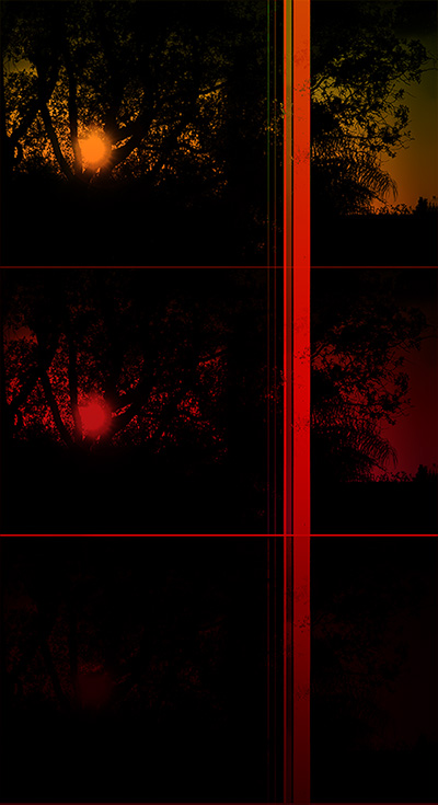
Asher Kelman: Sunset from a Primitive: #1
Look carefully at the lower unit of the triptych. It's not entirely black on the left. The color it is appreciated full size as a print. I hope you like it!
Asher
I plan to attempt a series. Here's the first.
Asher Kelman: Sunset from a Primitive: #1
Look carefully at the lower unit of the triptych. It's not entirely black on the left. The color it is appreciated full size as a print. I hope you like it!
Asher
")