• Please use real names.

    Greetings to all who have registered to OPF and those guests taking a look around. Please use real names. Registrations with fictitious names will not be processed. REAL NAMES ONLY will be processed

    Firstname Lastname

    Register

    We are a courteous and supportive community. No need to hide behind an alia. If you have a genuine need for privacy/secrecy then let me know!
  • Welcome to the new site. Here's a thread about the update where you can post your feedback, ask questions or spot those nasty bugs!

object-photography - beside the convention

Michael Fontana

pro member
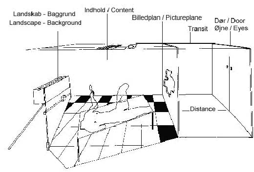
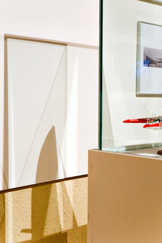
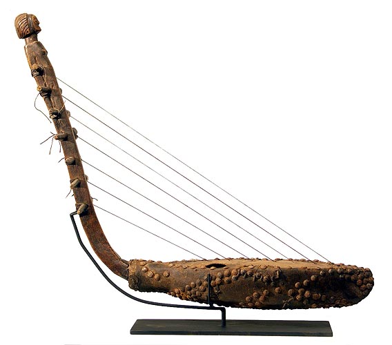
In the context of a new museum's collection catalogue we're discussing different ways of photographic representation of cult objects. They usually are represented in a pseudo - neutral, aka °scientific° context, tabletops as in this example:

SukumaHarp101r.jpg
Photograph © Tim Hamill

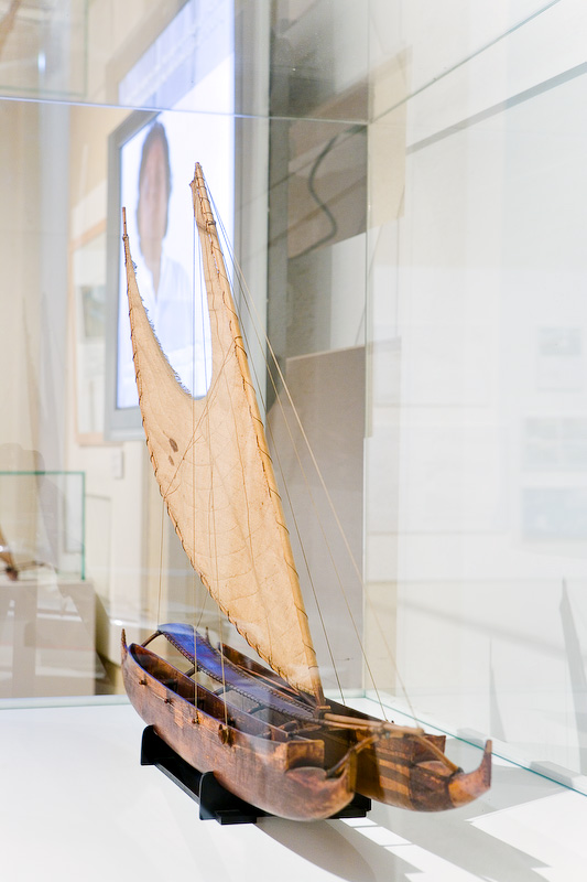
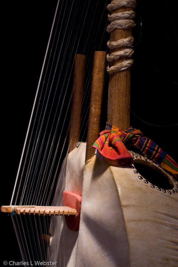
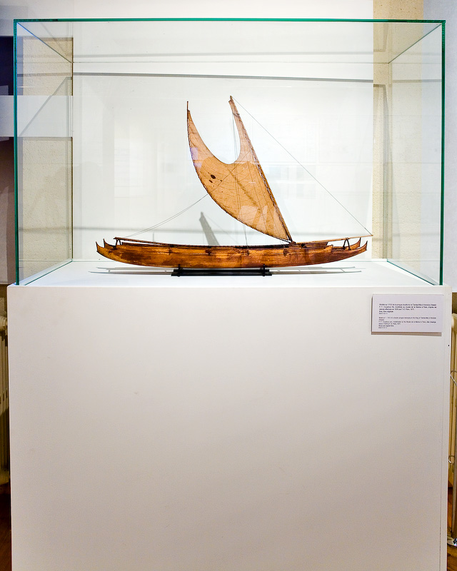
What do you think about the two following photos, I took as a study for a different photographic language?


harpe.jpg


harp_2.jpg


I know, its not exactly the same harp, but the difference of language is obvious, and the main interest, for now.

In some aspects, my studies - in a less documentarx style - are more documentary, than the documentary shots of the first example. When they - per example - better show how the string enters in the skin...
 

Asher Kelman

OPF Owner/Editor-in-Chief
Hi Michael,

This is a fine commission! What a treat for us!

In the first architectural style image, we a guaranteed to know the entire instrument from one end to the other and can deduce it's function. The second set while alluding to function does not allow definite specification as to what the object partially represented does. It has been disarticulated from its wholeness and the gestalt of its being. It takes on the nature of things it might appear to be like or its origins as animal skins and wood. While the latter evokes more feelings and imagination it is less informative of the actual nature of the object as an instrument and the nature of it as compared to other like objects.

So I would use both types of photographs. That will be your original gift to them!

Please keep us updated. :)

Asher
 

Michael Fontana

pro member
Hi Asher

thanks for your reply - off course - it's a challenge!

While the orthogonal viewpoint (architectural style) shows the entire object, having the perspective of a table-top, it's alwith a °distant look° into the raree show - the viewer alwith beeing outside. It reminds me the peep-aspect of °Etant donées° by M. Duchamp (today in Philadelphia)

lyotard1_big.jpg


Ethnologically spoken, it's the classical °scientific" look until the 80th of the last century - thinking the viewers position beeing neutral. But later on, they learnt, that a part of it is just reflecting themselfs, or a convention of the western world.

That said, the °architectural style° image might follow a boring convention only, just given by education and not following the object itself: round objects seen as a box only - not beeing the appropriate language, having the wrong expression....

We all know, that that the invention of the camera obscura brought us the perspective, not beeing known in the entire world before.
We know too, that some african tribes, when seeing a 20 cm large photo of a grasshopper didn't recognizes it as beeing their native grasshopper with 4 cm of size.

I'd like very much, if some of you could add your examples of type 2- photos:
not the distant-look table-top, like the classical "netherlands" still-lifes:

frozen_still_life_1.jpg


classical still-life, even it's with frozen fruit. A good example for a modernisation of a old image style/language: old wine in new bottles.
 

Michael Fontana

pro member
Now the tabletop-version of my harp:

Harp_conv.jpg

These are quick studies only; the light can certainly be better worked; I used in all examples one studio-torch only.
 

Michael Fontana

pro member
How about a stitch of 3 shots with a 100 mm on FF therefore quite a big OOF (Out of focus) beeing a double page in the cataloge?

Harp_stitch.jpg


obviously, it looks much different here on screen, than in big size.

Such a approach to stilllife needs to have the specific parth of the object to be enhanced. --> string+ resonance body are important for a harp.

a tabletop scenario shows all the different objects in a very similar way.
 

nicolas claris

OPF Co-founder/Administrator
Bonjour Michael
an interesting approach for sure!

Naturally I tend to agree with you on the more modern way to show, a more subtle but very fine way of indicating a direction instead of showing/proving.

Of course I've not missed the fact you said that these shots were studies, however I have to say that the strong/flat black background does disturb me a lot…

You ask for folk to post here some samples shot:
here is one I did for an assignement to shoot an expo about multihull boats history by VPLP (http://www.vplp.fr) 2 years ago.
I volontarly did keep the glass boxes on the models to keep in memory that this was shot during an exhibition -sous cloche en quelque sorte- and that BTW I liked the reflections…

_G8A8338Photo_N_Claris.jpg


Pseudo table top:

_G8A8329Photo_N_Claris.jpg


The rest of the gallery: http://clarisorganisation.free.fr/diapo/Diaporama_VPLP_DansleVent/index.htm
 

Michael Fontana

pro member
Thanks Nicolas for that input - and thanks too for pointing to the °strong° black background; I' ve been asking myself how another background would change the image:

the tools, instruments in use by humans, (which IMO would be fine for a culture, aka ethnologic museum) so we would - just a example - have the hands of the harp-player with the strings.... that would give the context of use vs the contex of museum, of collecting and preserving. That could be a polarity to work with.

That would also fit in a concept of a close relationsship with the object, to smell it, to hear it - vs the °neutral° and distant still-life. I don't know if the conservators will allow it.... but its much better than having some bamboo or similar in the background....

Your shots are a good example for contextualisation, you even added the glass boxes to point to the exhibition °character° of your images. Sous cloches - therefore distant as well. Did the visitor saw it with the glass as well? It's not really clear, as the glass fits perfectly on the pedestal.

Yes, I understand very well that you like the reflections, it enhances the context while adding a new layer - going away from the pureness of the fetish.

Would you use your images in a collection's book as well?

Question to the mods: if that thread is in the wrong board, please move it to the right one. I'm not sure if everybody can write in the actual board.
 

nicolas claris

OPF Co-founder/Administrator
Hi Michael
I think th edirection with the hands is interesting, however it shouldn't look "posed" which is not so easy, but it's worth the try…
I agree with you no bamboo bg! but maybe nice shadows on a very clear (why not white) bg?

I do like the fact to crop the instrument, it focuses on it's real soul… and let's the viewer imagine the rest, that I oftenly do with boats, which after all are also objects…

00_45R10103_CNB100_Chrisco_m.jpg


As for the model expo, I wanted to shoot it as the visitor did see it. The glass boxes were installed to protect from the cute little kids hands…*(and adult's too!)

There were no collection book made, a question of budget. The assignement was made for the memory…

---

I can move the thread wherever you think it should seat. In th epresent location everyone can read but only members registered as pro can post… up to you !
 

Michael Fontana

pro member
"I do like the fact to crop the instrument, it focuses on it's real soul… and let's the viewer imagine the rest, that I oftenly do with boats, which after all are also objects…"

it focuses on it's real soul… - well said, I like that.

At the moment, I tend to think about 3 - 4 different languages beeing applied:

First, not all objects will work in a good way together with the language x; a lance will probably require a different language than a music instrument; the idea of using a hand might not work with the lance but could do perfectly with the music instruments.

Then, close-ups could be a way to show the visitor a object very close, without glasses or alerts/alarms. Big point for/in a book...

Using all these languages together - in a appropriate sens - could make that book more than just a book with photos of objects.

Re: moving the thread:
I didn't knew where to put - at the first post. Then I didn't remembered, that this board here is not open to all. Your examples, Nicolas helped me a lot, therefore, I wouldn't mind having some additional examples.
 

nicolas claris

OPF Co-founder/Administrator
Re: moving the thread:
I didn't knew where to put - at the first post. Then I didn't remembered, that this board here is not open to all. Your examples, Nicolas helped me a lot, therefore, I wouldn't mind having some additional examples.

So here we are in the "Photography as Art" forum. no less ;-)

Good folk of OPF, no excuse now not to post your advices and samples!
I do remember some beautifull string instruments photos shown somewhere here in OPF…
 

Michael Fontana

pro member
Great Nicolas, and thanks for moving

I had been - due to work for the Art 40 (biggest Artshow opening tonight) - busy the days when Chas showed his instrument work - but there's more on his website.
Good stuff for studying his researches of stillifes as well.

If you know the Kora music, you understand why Charles enhanced the importance of the 21 strings, people who know, they say, that its difficult to play; actually the griots playing it are pro's!
 
Last edited:
Great Nicolas, and thanks for moving

I had been - due to work for the Art 40 (biggest Artshow opening tonight) - busy the days when Chats showed his instrument work - but there's more on his website.
Good stuff for studying his researches of stillifes as well.

If you know the Kora music, you understand why Charles enhanced the importance of the 21 strings, people who know, they say, that its difficult to play; actually the griots playing it are pro's!

I think this is the picture to which Michael refers.

IMG_5716.jpg


I was immediately struck by Michael's approach to his harp and the similarity to my approach to the Kora and stinged instruments in general. While I produce the documentary views of each instrument (I call them "mug shots"), my approach is to try to capture the unique intersections between music and light that make these instruments what they are. Each instrument sounds like it's shape, materials, and craft.
 

Michael Fontana

pro member
yes, Charles, that s one of the pictures in my mind.

I think, traditional music instruments work especially well with: "each instrument sounds like it's shape, materials, and craft." ...electric guitars p. e. don't need a resonance box, as this is added by eletronic.

We have here the °documentary° side versa °the instrument looks like it sounds°

As much as I understand (and use in my archishots) the orthogonal - °documentary language° - for its ability of making the reading of complex space-situation easier - bonjour Mr. Gehry - we have that different approach since a good while in photography - looking at Alexander Rodchenko's work beeing one of the most prominents in that regard.
 

Michael Fontana

pro member
Paris_6_09_A_31.jpg


Paris_6_09_A_39.jpg


Paris_6_09_A_40.jpg


Re/black background:
When I was there, last week, I had a look at the ethonologic museeum as well, and in the catalog, there's quite a lot of shots with black background. They like too the object beeing brighter than the background.
 
I connect much more strongly to the 2nd picture in the series. It engages me by proposing a "what am I?" question that I want to answer.

Nice work Michael
 

Michael Fontana

pro member
I connect much more strongly to the 2nd picture in the series. It engages me by proposing a "what am I?" question that I want to answer.

Nice work Michael

Good morning Charles

yes, in architecture shots it can work, too - it will not work with every building, but here within the structure-theme it works fine, and definatly allows to "speak" differently about a object.
The Eiffeltower-photos themselves are not elaborated, just snappy's straight out of the Rconverter, but as a example they' re fine.

Interesting that two ethnological museums of the same city show that "beside the convention" in their catalogs as well, with different success - a keypoint beeing the inspiration of the photographer/quality of photo. When going beside the convention, the photos need to be taken carefully plus the photographer has to know the function of the object's parth.
 
Last edited:
Top