• Please use real names.

    Greetings to all who have registered to OPF and those guests taking a look around. Please use real names. Registrations with fictitious names will not be processed. REAL NAMES ONLY will be processed

    Firstname Lastname

    Register

    We are a courteous and supportive community. No need to hide behind an alia. If you have a genuine need for privacy/secrecy then let me know!
  • Welcome to the new site. Here's a thread about the update where you can post your feedback, ask questions or spot those nasty bugs!

A work in process! 360 degree Pano and People Constructed Photograph

Asher Kelman

OPF Owner/Editor-in-Chief
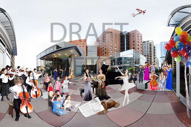
This is a picture i'm working on. It represents music students from the Colburn School, http://colburnschool.edu which is located next to the Museum of contemporary art and opposite to The Walt Disney concert Hall on Grand avenue, Los Angeles. This is unfinished and much will change. So consider it a draft.

Spring Celebration small.jpg


© Asher Kelman: Spring celebration

Sketch for tableaux, do not download

I'm interested in what impressions are so far and will try to respond to feedback. I have no idea whether I'd ever discover anything from this posting that might alter what I am working on, but the exercise is going to be a new experience for me. As the work is unfinished, how can I help but be influenced at least a little. That might be insignificant or perhaps very important. I'm open to your feelings although i'm not stuck in any way. Just that we're currently discussing critique and also 360 panos, so why not expose my work, as if you were looking over my shoulder.

The people are photographed separately from the building but the distances and angles are pretty accurate. No shadows have been added/removed as yet.

Asher :)
 
Asher,

For me when looking at a 360 panograph is the starting and ending point, I like the baloons on the right, but wish they were on the left also.

That is only a minor nick pick.

I do like it.
 

Andy brown

Well-known member
Asher, as a draft and therefore a starting point I think it looks great. It's alive with possibilities and the potential to cram it with action, movement and creativity which represent the full gamut of options for students at the school.

Are you looking to include more dancers?
Would you consider some cross discipline interaction?
What about some mild cheekiness or humour? (I think there may already be some of this but I'm having trouble with the detail, any chance of seeing it larger?)
 

Cem_Usakligil

Well-known member
Cody,

Asher,

For me when looking at a 360 panograph is the starting and ending point, I like the baloons on the right, but wish they were on the left also.

That is only a minor nick pick.

I do like it.
The starting and end points do not meet since this seems to be a 190-200 degrees fov pano contrary to the title. At least, that is my guess looking at the curvature of tiles. :)

Cheers,
 

Asher Kelman

OPF Owner/Editor-in-Chief
Cody,


The starting and end points do not meet since this seems to be a 190-200 degrees fov pano contrary to the title. At least, that is my guess looking at the curvature of tiles. :)

Cheers,

Cem,

Thanks for your comment. It's actually 360 degrees. I'm some 15-20 inches from the glass doors which are directly behind me. I have not shown some of left side in order to get to 6x9 just for a program booklet. I have the entire width to use for the final image at the full size.

Asher
 
Last edited:

Asher Kelman

OPF Owner/Editor-in-Chief
Asher, as a draft and therefore a starting point I think it looks great. It's alive with possibilities and the potential to cram it with action, movement and creativity which represent the full gamut of options for students at the school.

Thanks Andy!

That's exactly the idea. The issue is what one can get away with as far as space use given the need to have near figures so large in the projection. If one stands at the tripod position human eyes cannot take in such a view of the building ahead. One would have to sweep one's gaze through and rotate one's neck!

Are you looking to include more dancers?

I'll try! I had more dancers at first but not as well lt as they came from on stage performance in the very worse light from above.

Would you consider some cross discipline interaction?

Yes, for sure and would love ideas and use some for a second tableaux. I already plan to have a trombone on the roof and a ballerina sitting enjoying his serenade into the night.

What about some mild cheekiness or humour? (I think there may already be some of this but I'm having trouble with the detail, any chance of seeing it larger?)

I'd love to add more cheekiness. I call it "Rockwellian" humor. The boy has a ruler and an elastic band as a marker for a real slngshot to shoot down an annoying helicopter. The radio-controlled aircraft are part of "The Colburn Air Force". They will have the Coburn Air Force emblem added.

This will be printed 4-8 feet high so figures will be seen. I plan to bring the background figures in to make them larger and gain space by shifting the grand piano back a tad. Size changes very fast! so one will be able to see all the detail.

Thanks for looking at my work so closely and really being so helpful!

Asher
 

Asher Kelman

OPF Owner/Editor-in-Chief
Asher,

For me when looking at a 360 panograph is the starting and ending point, I like the baloons on the right, but wish they were on the left also.

That is only a minor nick pick.

I do like it.

Thanks Cody for your comments! appreciate the attention!

The balloons were a monster issue to photograph. It was so windy and no way one could do this outside. So these were photographed in doors and it was a job to extract them from the b.g. They wouldn't fit in my studio! I actually stitched a bunch of images to get the cluster against the wall in my hallway at home!

In the final image I will have redistribution of the weighting, left and right and there may indeed be room for balloons on the left somewhere.

Asher
 

Charlotte Thompson

Well-known member
Asher hey!

for me my first impression "circus of fun" a carnival" if you will-
it seems delightful a place that would carry many exciting things to do etc.
I thought of fish eye lens first-

Charlotte-
 

Asher Kelman

OPF Owner/Editor-in-Chief
Asher hey!

for me my first impression "circus of fun" a carnival" if you will-
it seems delightful a place that would carry many exciting things to do etc.
I thought of fish eye lens first-
Thanks for dropping by, Charlotte!

The challenge is to show such lightheartedness and community but still show a sense of individuals able to enhance their own standing within all the intense varied activity.

Asher
 

Rachel Foster

New member
Asher, I love the idea. However, at its present size I have a difficult time forming a more detailed impression. At the present size, I found myself wanting more contrast, but that may not be the case at all large.
 

fahim mohammed

Well-known member
Asher,

I am the least qualified to give critque, but some thoughts ( for what they are worth !). I know it represents the music students from the Colburn School.

Now, tell me why do you want to photographs the students this was? I know it shall be a huge print. But what is that supposed to convey to the viewer who meets this
image?

What do YOU want to convey to us when viewing this image? Do you want us to feel something? What is that ' something' ? About what? The students? The Music? The achievements of the School? The Vision of the School, the Students, The Teachers? Should the image reflect its proximity ( maybe influence ) of it internal/external surroundings? Is this the most appropriate way to present your vision? Have you explored the alternatives?

Might be stupid/dumb of me to ask, but why not a straight forward image of the students?
Maybe a collage.

Music is something ethereal, uplifting, even spiritual. It takes hard work, dedication, patience, comittment. There is success and failure. Yes it can be fun too.

I would want the image to impact me visually and emotionally in a grand way. In a way that does
justice to the school, teachers, students and its patrons.

How? Not my problem. It is thankfully yours.
 

Asher Kelman

OPF Owner/Editor-in-Chief
Asher,

I am the least qualified to give critque, but some thoughts ( for what they are worth !). I know it represents the music students from the Colburn School.

Your questions are welcome. Let me address them!

Now, tell me why do you want to photographs the students this was? I know it shall be a huge print. But what is that supposed to convey to the viewer who meets this image?

This image is built in the spirit of the work of Peter Brueghel the elder showing the impossible: what all the people do in a community, but at the same time. I've added to that the compressed, impossible to contemplate in one glance, the architectural environment within which they work. This is for the community of philanthropists, management, faculty, volunteers to see the broad community their work benefits and for the students to celebrate their own achievements in a group setting that could hardly ever happen.

Is this the most appropriate way to present your vision? Have you explored the alternatives?
Yes, but it's a work in progress, so the number of figures may well increase and the placement will be adjusted.

Might be stupid/dumb of me to ask, but why not a straight forward image of the students? Maybe a collage.

This really is a collage, but ordered and imaginary. The compressed presentation form of the architecture cannot be seen in real life in one view. This has been made the branding mage of the school. There will be other images for further exploration of other aspects of the school n greater focus.

Music is something ethereal, uplifting, even spiritual. It takes hard work, dedication, patience, comittment. There is success and failure. Yes it can be fun too.
The viewers know all that. Looking at the mage brings back all those good thoughts. It works!

For myself the overlay of humor is a reference to Norman Rockwell depiction of what really happens.

Asher
 
Last edited:

fahim mohammed

Well-known member
"The viewers know all that. Looking at the mage brings back all those good thoughts. It works!

Bravo. The job is done. No?
 

Asher Kelman

OPF Owner/Editor-in-Chief
"The viewers know all that. Looking at the mage brings back all those good thoughts. It works!

Bravo. The job is done. No?

Well, my friend, since we are currently discussing critique and art criticism of our own work, a good target would help get folk the opportunity to express reactions. My work is still under construction and I'm willing to take the risk of sharing at this early stage. No doubt there will be some unexpected but helpful feedback. It's instructive and all appreciated. The picture is a way of looking at the entire creative student body of individuals in a celebratory community where many disparate activities are gong on simultaneously, even the dog stealing the music and the boy shooting down the buzzing model plane. Any student, (even one not shown, one perhaps comes from private guitar lessons all on his own), can sense the breadth of the creativity of which they are part.

Asher
 
Last edited:

fahim mohammed

Well-known member
Sir, all that remains for me is to wish you and all those that are the subject, and/or participants, in this worthwhile work continued success.
 

Asher Kelman

OPF Owner/Editor-in-Chief
Explaining the Geometry

Spring Celebration small.jpg


© Asher Kelman: Spring celebration

Sketch for tableaux, do not download

There are different kinds of geometric compression in the architecture and the musicians. Very slight movements forward or backward in placement of people have a huge effect on size and therefore how much space to each side is made available or used up. So one cannot readily stage it all beforehand, even if one could get the folks together at the same time. Whereas the architecture is greatly distorted by a circular projection for my purposes, the musicians are not. Their forms are correct only in size to fit in with a rectilinear view of them in an artificially compressed deep space. I'll be posting updates.

Thanks for your feedback,

Asher
 
"Spring Celebration" defeats me, utterly.

Surely it is a witty, amusing, complex, evocative electronic file, and I guess it is Breugelesque in a benign way. And like Breugel's phantasmogorical paintings it explores an alternative universe that may mirror our world in eye-opening, mind-opening ways. Distilled down, the reasons for looking at "Spring Celebration" are the same as the reasons for looking at a drawing or a painting, Breugel's even.

A quality that is sharply absent is "photographic". I'd concede montage, collage, assemblage, confection, bricolage, and all well done too but none of these tropes carry within them the specific reasons one keeps in mind when choosing to look at a photograph as opposed to all other pictures.

A photograph has a unique relationship to its subject matter and offers a unique relationship to the clear-eyed viewer. "Spring Celebration", whatever its charm, offers other things and as a photograph it's not worth looking at. Even its presence on OPF, an ostensibly photographic forum, seems a trifle lenient.
 

Asher Kelman

OPF Owner/Editor-in-Chief
Of all the folk I respect, Maris, you are one to whom I'd be reticent to declare this work as primarily a photograph in the sense of your own darkroom generated prints. This picture has the image making process, lights and even subjects subservient to my imagination. I'm not even imaging something that "is". Rather using separate digital images as elements to serve lesser roles in a more complex social vision. Building pictures in this way is not new. Many photographers have made major bodies of work and each appears to be one picture exposed at one time.

My methodology does however attempt to go further and insert people into a world that's already compressed and altered.

"Spring Celebration" defeats me, utterly.

Surely it is a witty, amusing, complex, evocative electronic file, and I guess it is Breugelesque in a benign way. And like Breugel's phantasmogorical paintings it explores an alternative universe that may mirror our world in eye-opening, mind-opening ways. Distilled down, the reasons for looking at "Spring Celebration" are the same as the reasons for looking at a drawing or a painting, Breugel's even.

Maris,

These comments are generous for something that's so incomplete. I am gratified, if this is indeed, (at least in a small way), what you felt. You describe the very effects I intended to elicit in the viewer.

A quality that is sharply absent is "photographic".
There's no pretense here to mimic an original sliver gelatin masterpiece with its own unbeatable immediate truth. Those treasure stand on their own as unassailable.

I'd concede montage, collage, assemblage, confection, bricolage, and all well done too but none of these tropes carry within them the specific reasons one keeps in mind when choosing to look at a photograph as opposed to all other pictures.
That too is no problem for me. I am specific in exposing the step by step methodology of constructing a picture.

A photograph has a unique relationship to its subject matter and offers a unique relationship to the clear-eyed viewer.
That's acceptable as a truth. Forget the impossibility to view naturally the scene I present! Anyway, admit, if the picture is not made by light working on chemicals you won't allow even the use of the word "photograph" anyway. So digital photography is immediately excluded! So even a picture taken through a large format system with complex multiple lenses to achieve the same result, but the light landing on a Phase One back, would be considered something else, but not surely a "photograph".

"Spring Celebration", whatever its charm, offers other things and as a photograph it's not worth looking at. Even its presence on OPF, an ostensibly photographic forum, seems a trifle lenient.

Maris,

I hope that you may continue to be lenient with me! I make no pretense that digital can replaces light writing into a medium directly by chemical reactions. It's a new technique that appears to give analogous results to the non-expert eye. However, using the same lenses, manufacturers modified their cameras so that the same image landed on silicon instead of film! It seemed expedient and even natural to call this new method of storing photonic energy, "photography" as it appears to be about the same, (which of course, to those of us that know what's really gong on), is hardly correct.

At the end of it, I will be doing such constructions with just film. Even then, it will not pretend to be what it isn't, a simple photograph. Rather it's a construction. But would you then even allow the word photograph? :)

Asher
 
Last edited:

Jerome Marot

Well-known member
Having read how the architecture of the school is used as a symbol, I think that the presentation is a good idea and I understand that a montage is the only solution. Within these constraints, I think that the only choice remaining is the placement of the various models, which I find to be well chosen with, possibly, the exception of the dancer (maybe a bit too obvious) and the dog (which I find rather cheesy, but maybe he is a symbol of something?).

You may want to take another series of pictures of the panorama with someone at various places in the picture to help as a guide as to size and correct orientation of shades.
 

Asher Kelman

OPF Owner/Editor-in-Chief
Thanks Jerome for stopping by and viewing my picture!

Having read how the architecture of the school is used as a symbol, I think that the presentation is a good idea and I understand that a montage is the only solution. Within these constraints, I think that the only choice remaining is the placement of the various models,

That's where the work is being focused now!

which I find to be well chosen with,

Nice to hear that!

possibly, the exception of the dancer (maybe a bit too obvious)
..... yes, but so elegant. May move her to the right side!

and the dog (which I find rather cheesy, but maybe he is a symbol of something?).
Cheesy is a good word for Norman Rockwell humor, I expect. Would you consider that? I'll work with that! What happens in real life is that odd things occur. Dogs do come through and here's an excuse for someone not practicing. My dog stole my music! In any case, getting in disorder is important, to my way of thinking. However, I can see how some might be aghast at the informality!

You may want to take another series of pictures of the panorama with someone at various places in the picture to help as a guide as to size and correct orientation of shades.
I've done that! Some of the people were indeed photographed exactly to fit the pano, but not stitched into it automatically. The final sizing will be based on these folks a markers.

It would be great if one could freely move the people and then they would be resized automatically, but that magic is not available as yet that I know of!

What impresses me is that my initial panorama obtained using an 8mm circular fisheye when corrected for just size, will superimpose pretty well on a circular panorama made from pictures with the 50mm lens! So the 5mm fisheye is perfect for the initial sketch for planning and so easy to stitch. For many uses, it could be just up-ressed since great detail is not needed in the architecture, mostly color and texture.

Asher
 

Andy brown

Well-known member
"Spring Celebration" defeats me, utterly.

Surely it is a witty, amusing, complex, evocative electronic file, and I guess it is Breugelesque in a benign way. And like Breugel's phantasmogorical paintings it explores an alternative universe that may mirror our world in eye-opening, mind-opening ways. Distilled down, the reasons for looking at "Spring Celebration" are the same as the reasons for looking at a drawing or a painting, Breugel's even.

A quality that is sharply absent is "photographic". I'd concede montage, collage, assemblage, confection, bricolage, and all well done too but none of these tropes carry within them the specific reasons one keeps in mind when choosing to look at a photograph as opposed to all other pictures.

A photograph has a unique relationship to its subject matter and offers a unique relationship to the clear-eyed viewer. "Spring Celebration", whatever its charm, offers other things and as a photograph it's not worth looking at. Even its presence on OPF, an ostensibly photographic forum, seems a trifle lenient.

Maris, at the risk of upsetting Asher's guiding principle for OP, I think you're going off on a misguided tangent here.
The image Asher has proffered is only a sketch. It's a rough idea of the direction of his finished article. Photographic (and noting that your idea of photographic, as noble as it might be, is not exactly contemporary) quality, absent or not, it's not the end result.

There are plenty of images on Op which won't light everybody's fire and they don't all need to be caned as sub standard, poor quality or technologically deficient. Thank goodness, they're not.

What's bugging me here is that Asher, who is a complete and utter diplomat and goes above and beyond to encourage, and nurture not only the forum itself but any and all who care to contribute (and even plenty who don't) has thrown a personally important project to us for some positive ideas and input has had you come in with a poorly thought through shitcanning for reasons apparent presumably only to you.

Apologies if I'm out of line or being unnecessary but for someone who freely admits to not 'feeling' music I feel you have not felt where Asher's ideas are heading and you should have the knowledge of experience to know when to STFU.

Am I wearing my heart on my sleeve to show support to our illustrious chief? You bet!

There you go, I'll shut up now myself.
 
Last edited by a moderator:

Asher Kelman

OPF Owner/Editor-in-Chief
Hi Andy,

Thanks for you stalwart support! Actually I value Maris' B&W film photography so much that he earns more latitude than most! I was well-aware from the outset that a constructed image would receive tough critique and I did that to encourage others to take the same risks. Riskit! is that kind of place in OPF that's unique.

This work would be less challenging if it were possible to get all the people in position at one and the same time like on a film set. As it is, this was the largest scale work I have attempted and it's very satisfying that I'm still addressing issues and making choices and yet have all the resources in images made for this to complete the picture. It's an unreal world and i'm getting to know the rules by which folk move and change in a mixed set of projections: rectilinear for people and a distorted asymmetric sphere for the architecture.

Asher
 

Jerome Marot

Well-known member
Maybe this is a good example of the challenges of criticism, then. When discussing this picture, the question is not "would you do this kind of montage yourself?", but "considering the constraints of the work (it has to be a montage), is there anything which could be improved?".

Personally, I would not do this kind of picture. It has little appeal to me and I even understand Maris' objection that it isn't really a "photograph". OTOH, I know and understand that it appeals to some, possibly not the
author, but presumably the people of the school.

Under those constraints, I think that the panorama is a good idea because it is a montage: everything being artificial anyway, and the object being to show the whole of the school personnel, a panorama is an artificial way of showing the whole location. Both go hand in hand.

Once this is set up, the only variables to remain are where to put the individual people. I already gave my opinion on this part.

Last but not least, the technical execution remains. However, since this is not a final version, we can presume that the author will still improve on that: adding shadows where they belong, choosing pictures with the right light to go with the panorama, all the details which are essential for a montage. So no comment is really expected at this point (since it is not a final version). All we can do is share whatever technical knowledge we may have.
 
The only thing that hit my mind at that stage of the process (so I agree with Jerome for the technical issues so far), is that I would like to see it more as a whole instead of seeing it as a succession of figures that might have been taken in different times. Adding a "scene" that goes from the left to the right (or the other way round) and keeps the unity of time...eg: a bunch of boys at the right chases a dog in the middle that chases a sheet of music at the left... to make a long story short: continuity....
 

Asher Kelman

OPF Owner/Editor-in-Chief
Maybe this is a good example of the challenges of criticism, then. When discussing this picture, the question is not "would you do this kind of montage yourself?", but "considering the constraints of the work (it has to be a montage), is there anything which could be improved?".

A good approach, Jerome!

Let me share with you my feelings about the courtyard. It really is a high activity hub of comings and goings. Folk are really rushing to meet some deadline or get to a class, grab lunch or just get some fresh air. What I have attempted to do is imagine this as a sphere containing all the beautiful people giving overlapping performances of every possible kind. While this is happening, I have opened up the sphere to enjoy all the people I know. It's a very personal experience for me and hopefully for the musicians. Folk who have seen the sketch don't realize it's so distorted because the separate parts of the glass doors seem real and the buildings are as they have seen in print.

Actually, the glass doors on each side are one plane and directly behind the tripod by 18 inches. The space between the two sides is just a cheat to allow room for the artists.

Asher
 
Top