Cem,
I'm happy to disagree with everyone!
Of course it looks better in color. It comes out a a nicely composed architectural shot for the owner of a home for sale or for a rental property. It has a lot to say for the architecture and the good experience one would have there. Charming architecture, spacious drive and likely a great inside and probably grand lving space. Color does that! lipstick on a pretty girl is often sexy too.
The benefit of the original decision is that one does not depend on the easy shortcuts to fabulous by great color. The B&W works only with good tonality and boiled down composition where textures and shapes provide an anatomy for our mind to fill in all the blanks.
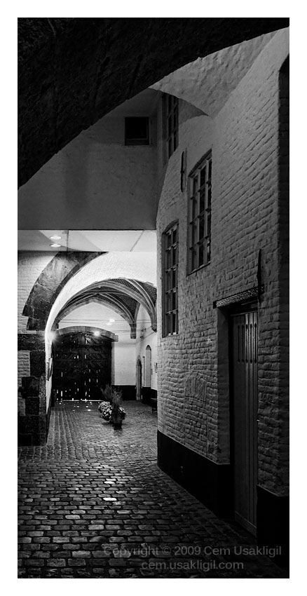
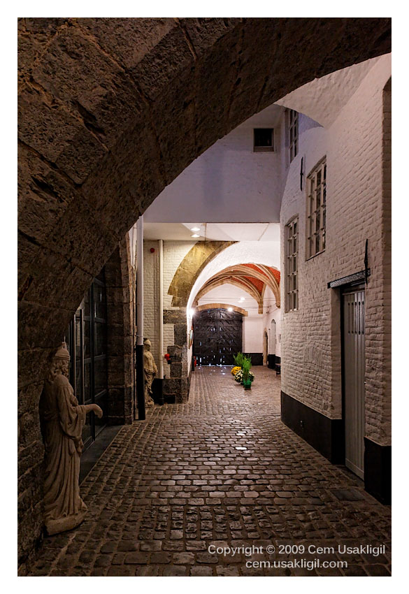
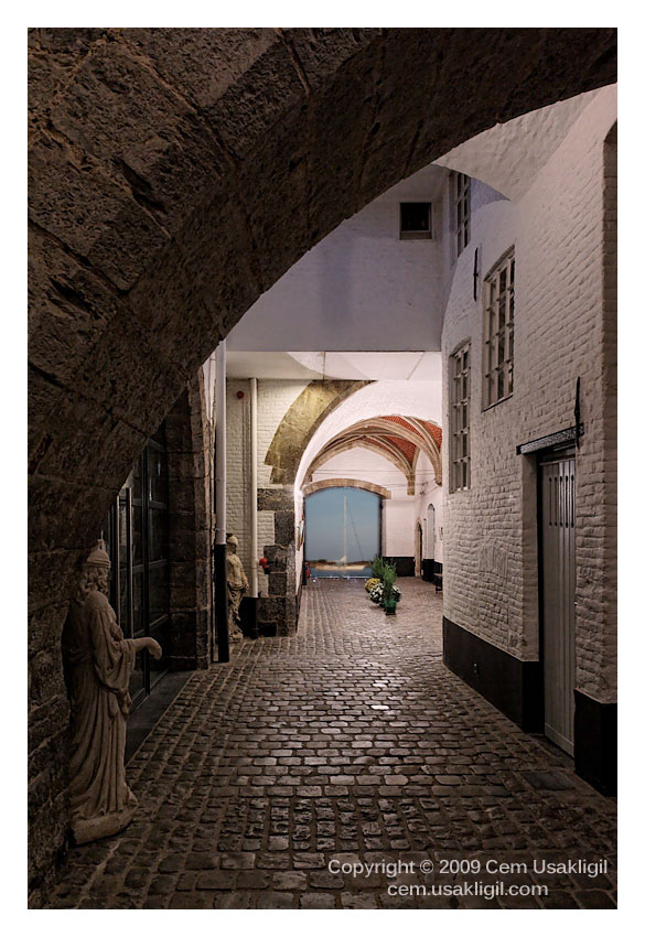
So how good is the original picture. Well, let me first place this in context. It's about repeated archways and at each one there is or isn't a gate. The key feature is a cobbled path that goes through the arches and then there's' something we can't quite make out, it could be a fountain, a sculpture, a bench, but it's intriguing.
The picture is a great idea. The issue is the form. The best way for me to try to reach an understanding is to refer to the work of Ben Rubinstein
here. In his struggle to find the right way to photograph the various stone structures of the old city Jewish Quarter, Yemin Moshe he came to the veritical "panorama" shape.
So how might this work here? Well the celebration is exacltly the stonework, repeated arch motifs and the windows. He spends a lot of effort just doing this and yes, there's a many, boy, cat occasionaly, but it's the stone work and the passageways that are the subject.
Now in your Covered Alley, the B&W tones are excellent. However, there's a lot of busy detail on left 45% of the image that does not pull its weight. It contributes little I can see to the value of the image n this form. The drama of the interesting alley is sidetracked by us being falsely lead to search for meaning in the left side and we come back empty-handed.
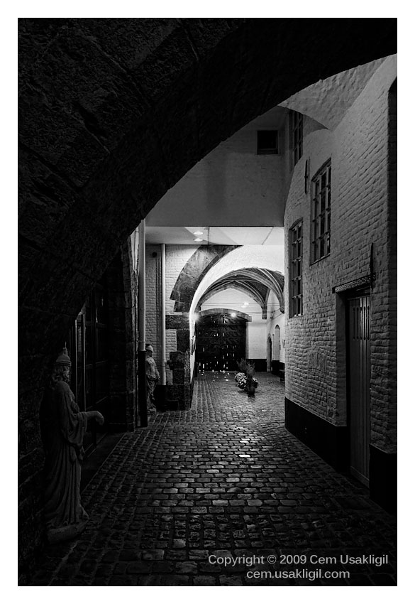
Now if the left side is cropped away entirely from the vertical line of the drainpipe or even further 1/3 into the left part of the dark bricks of the arch,
then we have a work that one can start to consider in a
new way. I have not cropped it. but that's something you might very well consider. I have a feeling that this, although seemingly extreme to me is a/the natural presentation of this picture. Why not give it a try? I really am devoted to your work on portals so humor me and give it a try! If it's not right, only then go and retake the picture with the idea that the shape is really controlled the the demands of the architecture to your, not the common fashion of 8x10 proportions. That's why Ben's pictures came to mind. It's not for you to turn you back on this as it still has life!
If you like it cropped, then maybe working the B&W conversion, (and your new choices for shading for this presentation), will finally give you the satisfaction that is eluding you.
It's there! It just has to be released.
Asher


") . Let's admit, if the picture doesn't have what it takes to start with, no amount post processing will help resurrect it.
. Let's admit, if the picture doesn't have what it takes to start with, no amount post processing will help resurrect it.