• Please use real names.

    Greetings to all who have registered to OPF and those guests taking a look around. Please use real names. Registrations with fictitious names will not be processed. REAL NAMES ONLY will be processed

    Firstname Lastname

    Register

    We are a courteous and supportive community. No need to hide behind an alia. If you have a genuine need for privacy/secrecy then let me know!
  • Welcome to the new site. Here's a thread about the update where you can post your feedback, ask questions or spot those nasty bugs!

Challenge: Ballroom dancing

Asher Kelman

OPF Owner/Editor-in-Chief
.....................
Submitting a less than very good shot on a site like this is quite daunting in the first place and those that do should be commended (this is why you will struggle to find much that I have done). .................
Fred,

I hope you are not inhibited! OPF is a process, a path not the destination. We'll add that later, LOL!

Let's not worry about being perfect, (women would never go out on a date!!), just post pictures you like or that have issues you want feedback on. :)

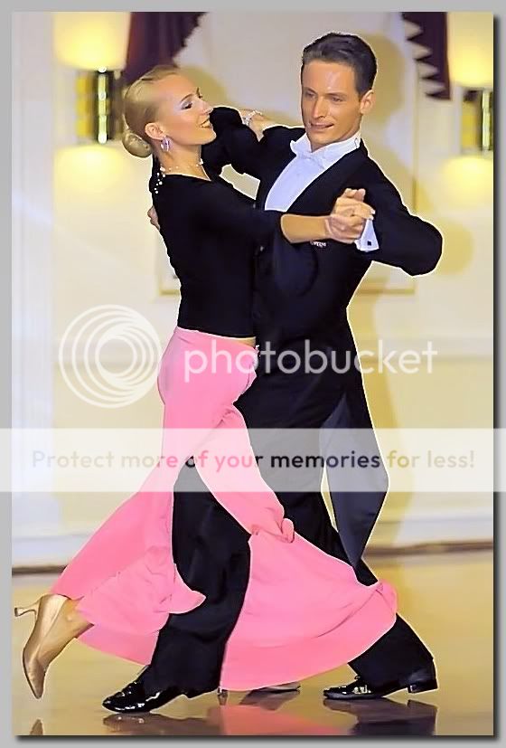
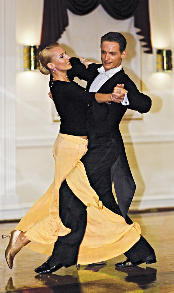
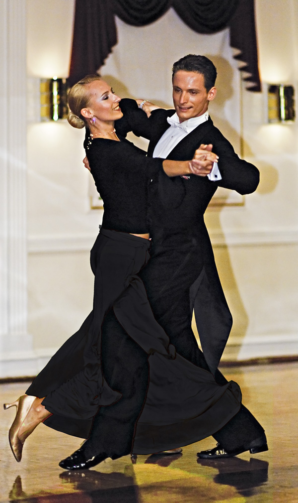
I don't have a problem with the lady's skirt. An important part of ballroom dancing is correct body contact (I watch Strictly Come Dancing so I'm an expert on this :) ) and this pose looks pretty good to me. It shows the interaction of the bodies and I think a sense of movement well captured.

Well Fred, this would be no issue except that the pants are dark with no shading or texture so that the pink fabric appears wrapped around a fleshless artificial limb of Heather McCartney!

If there was defnition of cloth in the man's pants, then for sure the picture is wonderful as is. For my taste, I'd wonder how the image would look by either carefully photoshopping fine texture to the dark cloth, (that's difficult) or else simply adding more pink width, shadow or some other opptical trick, as one would for a double chin or a scar or huge bags under the eyes!

Asher
 

Ray West

New member
There is some detail in the dark areas, but none of the existing versions here show that. As it is, on my screen, the blacks are crushed together in all versions shown, looks like Siamese twins. ;-) This adds to the confusion in exactly what is happening with the leg/dress, since not seeing the relative upper body positions.

Best wishes,

Ray
 

StuartRae

New member
There is some detail in the dark areas..........

Just a bit. There was more, but this is as much as I could recover without getting a lot of noise. You can at least see the stripe in his trousers, but his coat tails look a bit strange.

And if anyone says the door frame is blue I shall cry.

doreen-LM-lightened.jpg


Regards,

Stuart
 

Fred Spencer

New member
Better black?

Asher,

Good fun this. For you more detail in the black but less in the pink, which I actually think makes it look like the material is flowing more. The silk of the coat tail is also more distinct. Background looking better too I think. Still done in Picasa and FSIV but with a run through Noiseware as well.

opf_doreen_070608_181fs-4-800_fi-1.jpg
 

StuartRae

New member
I've just discovered that the original image that we've all been working from is tagged with Nikon's variant of aRGB, so to some extent we've been wasting our time trying to get it to look good when viewed in a web browser. See my post in the CM forum.

If I convert it to sRGB the dress looks much pinker and the faces look less yellow. It was the washed out colour that made me suspicious in the first place.

converted.jpg


Regards,

Stuart
 

Ray West

New member
Hi Stuart,

Looking good may not mean accurate colour rendition. The 'unassigned colour space' view in the browser is what we get. We can edit in whatever colour space we desire, except if we work in a wider space, then the srgb conversion can move the colours around (of course, even if you work in procolour, say, you can, on the normal monitors, only see an srgb interpretation of it, anyway, depending how you set things locally within your editing software, if possible).

The particular Nikon (or any other) colour space information (from the raw camera file) is not relevant if the viewing/editing software can not handle it. If you have colour aware software, then you can assign whatever colour space suits you, for editing, then convert it back to srgb for the web/non aware viewers. In this instance, the colour shift is very slight, and to make it look good, then you will move things around anyway when you edit. If you use non-colour aware editing software, then, what you see is what you get, and the embedded profile information may well be stripped off, never to be discovered by later colour aware software.

You know all this, except sometimes it gets overlooked, in particular if the colours are not pushing the boundaries, and you have no personal knowledge of the colours involved.

Best wishes,

Ray
 

StuartRae

New member
Hi Ray,

I'll discuss this with you in private - I'm not sure I entirely agree with you.


Here's my final version and the best I can do. Here's how:

1. Converting to sRGB lost some detail in the blacks, so I used the full size aRGB original with Shadow Illuminator. Save the file.

2. Open the saved file in Picture Window Pro and convert to sRGB. Save.

3. Back to PSE3. Lightening the shadows introduced quite a bit of noise, so I applied a dose of Noise Ninja.

3. Sampling down to 600px removed a bit more noise, but it still needed another shot of NN with a higher luminance setting.

4. Into Light Machine next to adjust colours a bit.

5. Straighten and crop.

opf_doreen_070608_181-SI-sRGB-LM.jpg


Regards,

Stuart
 

Asher Kelman

OPF Owner/Editor-in-Chief
Hi Stuart,

The clearly visible strip on the pants puts more emphasis on the pants. I'd put a few interrupted strips on the very lowest segment. The picture now is better.

I'm glad you are using sRGB.

Fred,

Could you do you work in sRGB too as you file is in plain generic RGB and we have no reference to make it appear properly in photoshop.

Everyone, always convert to sRGB before posting!

Asher
 

nicolas claris

OPF Co-founder/Administrator
Sorry guys and Madame, I don't like pink color… <:)

opf_doreen_070608_181_NC.jpg


Edited in LR 1.2 then a bit of light/shadow in CS2, then selection of pink color made layer applied hue/saturation to pink -> yellow
 

Asher Kelman

OPF Owner/Editor-in-Chief
For some reason, Nicolas you have it appears solved the optical problem. Red it appears layers in the mind forward of anything else. Yellow seems to get pushed back a bit and so black has a better chance of seeming to be in front of the billowing pants leg, which before seemed too thin and containing just an artificial elg!

Thanks for removing the torment! If the stripe were brought out in the pants leg, it would be perfect!

And, just for seeing what this would be like, the layering illusion, in gray scale, could you, this one special time, post a B&W version optimized to make the mans leg in the front!


Asher
 

nicolas claris

OPF Co-founder/Administrator
Hi Asher
seemed obvious to me (though I have no scientific clue for this) that the pink color was the problem… pink was/is too flashy, on the contrary yellow gets merged witht he rest of the tones… except black that comes now firts to the eye…

Yellow does also lesser the visional impact of the dancer's shadow…

So better seeing pant stripe:
opf_doreen_070608_181_NC2.jpg


and B&W thgough I don't see any improvement…?…
opf_doreen_070608_181_NC3.jpg
 

Asher Kelman

OPF Owner/Editor-in-Chief
Nicoals,

The black stripe on the man's pants is perfect! I love it now. Good job.

For hte B&W, the legs fail! If not for the legs, I'd have liked the picture of the couple, it gives a '50s look. However, with B&W the white trumps the black and the girsl legs are ruined again as they come forward!

So we learned something. Ignore the woman's legs when dancing, focus on her from the waist up!

Asher
 

ron_hiner

New member
A black dress that reflects yellow on the floor? Other than that, I like it.

It has always bothered me that the pink dress clashed with the gold shoes.

Ron
 

ron_hiner

New member
You guys are all geniuses! My posted picture was posted on a whim -- it was trash to me. And you all encouraged a nice shot from it. I'm inspired!

Just for grins... here is another shot I took of the same couple yesterday. C&C welcome.

opf_0436.jpg


My approach, partly based on this thread, and partly what they were serving at Starbucks yesterday morning... get better light, find an angle that doesn't have a bad background, get a least a few of the settings on the camera to be correct, and have some fun with it. (And pray the dancers don't trip over the legs of my ladder which have been cloned out of this picture!)

Shot at 1/200 f5. 12-24 f4 zoom at 14mm. post processing include some PS lens distortion correx. Somehow the sharpness was lost in the downsampling to web size.

The woman is (my guess) 5'9" tall -- my head was pressed firmly against the ceiling with is precisely 9'. So her face was about 3' from the lens. This is an off-center crop which means the wide angle distortion made his forehead grotesquely big. This is the first time I've ever used PS lens correction to repair this sort of thing. It worked out pretty well. Still looks a little funky on the distortion.

Ron
 

Asher Kelman

OPF Owner/Editor-in-Chief
Ron,

I love it! A perfect couple and the color at lost is fine. They have skin that is real. Great light!! What did you use 9" from the ceiling that you didn't cause a shadow? I especially appreciate that we all are learning from this excercise. This has led to a better and original image, which is what we all aim for. Photography is, after all, not a click of a shutter but a travail of the photgrapher! The head, to my ming is not distorted but correct for the point of view you chose.

BTW, apart from the slightly yellow reflection, Nicolas did cure the leg distraction in two ways. The overall picture must not be overpowered by abnormal color layering. Color has the power to pull one in locally and so disrupt the gestalt of the whole. One solution, yellow and the other black, work well.

In your new photograph, see how there is no distraction at all, just harmony, and that message, in color, form and content is fused together well.

Asher

BTW, I did not miss that you delivered your work in sRGB so that it carries through well to us all! CS2 shows the image well. Arc of communication perfect!
 

ron_hiner

New member
Ron,

Great light!! What did you use 9" from the ceiling that you didn't cause a shadow?

Asher... thanks for all the kind words.. It was me on the ceiling... all the lights were coming from the sides.

The light for this shot was a bit tricky... the easy part was a 7' octabank off camera left. On the floor off camera right is a SB-800 flash sitting on a bed of black fabric... The fabric was to keep the light on the shoes, but not let the light hit the floor. Then I had a few more SB-800s for edgelights, and I had my favorite westcott panel held by someone off camera right to give some fill by reflecting from the octabank.

I had to light a fairly large area -- not knowing where the dancers were going to go. Exposure with the octabank is tough because it has such dramatic light falloff.


Ron
 
Top