• Please use real names.

    Greetings to all who have registered to OPF and those guests taking a look around. Please use real names. Registrations with fictitious names will not be processed. REAL NAMES ONLY will be processed

    Firstname Lastname

    Register

    We are a courteous and supportive community. No need to hide behind an alia. If you have a genuine need for privacy/secrecy then let me know!
  • Welcome to the new site. Here's a thread about the update where you can post your feedback, ask questions or spot those nasty bugs!

Shattered II "Reticulated Vase"

Asher Kelman

OPF Owner/Editor-in-Chief
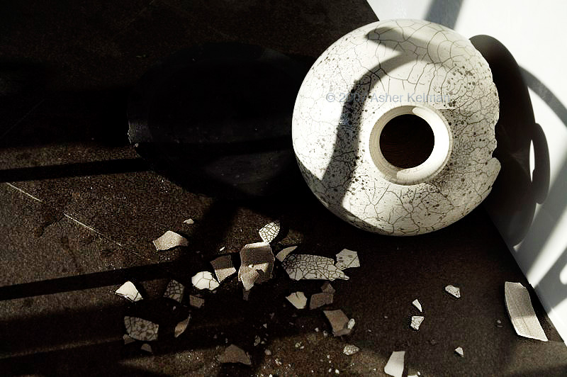
A guest at dinner, the worse for some of my good wine, let his chair fall backwards. Being steel, it crashed to the stone floor. My wife was stunned to see her precious vase flying into the air. It shattered of course!


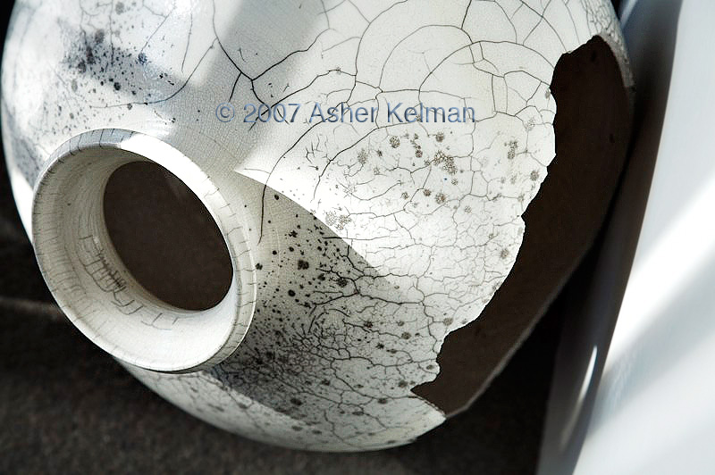
Reticulated _Vase_MG_5055.jpg


© 2007 Asher Kelman "Reticulated Vase 1" Canon 5D 24-105 IS L


Reticulated_Vase_MG_4869.jpg


© 2007 Asher Kelman "Reticulated Vase 2" Canon 5D 24-105 IS L


Asher


For Comment and critique but not download or edits :)
 
Last edited:
The first shows all the elements of the event. The shattered vase and the shadow of the chair (nice shot BTW) and so tells the story effectively. It would have been equally effective had Asher not told us the back story in advance.

The second explores the consequences of the event. A beautiful work of art, broken. The shapes and shadows define the remnants, there are no shards. It is as if the vase is broken by intent, not accident.

Excellent, strong, evocative pictures Asher, thank you for sharing. It must have been difficult convincing your wife to allow you to turn tragedy into art. "Don't sweep that up dear, I want to shoot it!"
 

Rachel Foster

New member
Kind of like a snake phobic suddenly confronted with a snake. Not being able to go backwards or forwards what should she do? Photograph it!

Random thought evoked by Chas' comment.
 

Asher Kelman

OPF Owner/Editor-in-Chief
Asher, I've been contemplating the arc of intent. When you shot this, what did you envision?

Hi Rachel,

You ask the question I expect of you and the one I ask myself. There is, I am discovering, an excitement at seeing something awesome. To me it can be a piece of bark peeling of a tree, a person or in this case part of the life cycle of things we deem important to us.

It just seemed to me in my rush of excitement that I had been rewarded by great fortune and I was given this unique vantage point to witness something beautiful and important. So at the initital stage, I had to defend my vase and fragments from the end my wife envisaged. I taped off the area like a crime scene and withstood the harangue that "This is not going be there for the next year!"

Although I hadn't worked out how this would finally appear, I knew I wanted to represent the pieces in such a way that the vase regained some dignity and purpose and maybe even might move people like it moved me.

I looked at the "debris" in it's natural setting not wanting to disturb anything, but the light of the early morning didn't bring back any life. So, after several days of study, I moved the pieces to the other side of the house to get the evening setting sun. Now the vase became handsome again and I had the responsibility, in a way like an attorney, to present the vase as best as I can. So I examined the vase from every direction and decided that the jagged open part was interesting and seemsd to represent the wounds we have to face, however elegant and prepared we are.

Just at this time, my friend Rodney who has throat cancer, (search in OPF) has had the news that the cancer may have come back, so I've been thinking of our fragility, and so this vase sort of stood for that!

I like to use just natural light and try to have the shading that which will not require much at all in processing. I use reflectors to balance the light. Nothing fancy, just white or black card leaning on a chair for example.

So this describes my intent. It is modified by my moving around, below and above the subject. As I look through the viewfinder or the LCD my ideas are changing and I'm excited, trying to get as many shots before the light fades or something else crashes!

Now I look at the images, I feel that they do indeed say something about the beauty and delicateness of life and also how even our remains can have some spiritual purpose.

So "intent" here is something that has been a conversation between me and the broken vase and the images. When I take the picture, I do know what I want at that instant. That is pretty fixed for that particular image. However, I may abandon that image when I feel I can do better or realize that I must have been delusional at the time!

Asher
 

Asher Kelman

OPF Owner/Editor-in-Chief
The first shows all the elements of the event. The shattered vase and the shadow of the chair (nice shot BTW) and so tells the story effectively. It would have been equally effective had Asher not told us the back story in advance.

The second explores the consequences of the event. A beautiful work of art, broken. The shapes and shadows define the remnants, there are no shards. It is as if the vase is broken by intent, not accident.

Excellent, strong, evocative pictures Asher, thank you for sharing. It must have been difficult convincing your wife to allow you to turn tragedy into art. "Don't sweep that up dear, I want to shoot it!"

Thanks Charles for the kind comments. You are also free to think about what you might find good or what detracts or maybe whether I have done better justice to the subject.

I will be posting more images as different aspects of this theme, trying to explore this further. Hmm, Rachel, you had to mention snakes.....

Asher
 

Rachel Foster

New member
Just at this time, my friend Rodney who has throat cancer, (search in OPF) has had the news that the cancer may have come back, so I've been thinking of our fragility, and so this vase sort of stood for that!

I think you've portrayed the roughness, the empty "broken-ness" of this well. Not much more need be said, does it?

Somehow, this also (now, for me) symbolizes how/why diseases like cancer render diseases like Parkinson's almost...trivial.

(Before anyone assumes I'm speaking thoughtlessly or cavalierly, I have Parkinson's.)
 

Asher Kelman

OPF Owner/Editor-in-Chief
Thanks for your comment on the roughness, "broken-ness". The point is that afterwards one might find something still extractable from life cycles and even when tragedy occurs.

Asher
 

Rachel Foster

New member
Yes, you make that point nicely.

Philosophy of photography to philosophy of art: To me -- and I'm only speaking for me -- "art" is that which touches emotions. Humans are never without emotions, many that are frightening in intensity. There would be adaptive value in anything that helped humans process/frame/or otherwise cope with emotion. Art-evoked emotion can/likely does just that.

The image of the vase itself is not what I'd classify as "beautiful" in a traditional sense. Give me a rose, a sunset, etc. What makes this photograph beautiful (to me) is the message it conveys: Life is fragile, precious, and destruction inevitable. And yet, we continue. It addresses the most fundamental existential anxieties and, for me, while it reminds us of death, it also comforts in it's....in our ability to "[extract] from life cycles even when tragedy occurs." The message makes the image beautiful.

Or something.
 

Greg Rogers

New member
This represents to me, a conundrum of photography (sort of). Looking at your photos, what I see is your wife's pain, (and your ability to see this as both opportunity AND and accident. I'd never had considered the former.....til now) , Asher. But how would I know this without having read your prologue? Hmm, perhaps this is where the value of a good title comes in. I'm learning. Never really thought about 'titles' from a perspective such as this.

I've always wondered why folks fuss so over an appropriate title. I think I'm getting closer to comprehending.

-Greg
 

Asher Kelman

OPF Owner/Editor-in-Chief
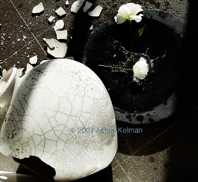
Here's a further image in this series: putting the clock back a second!


Reticulated_Vase_MG_5003.jpg


© 2007 Asher Kelman "Reticulated Vase 3" Canon 5D 24-105 IS L


I hope you like this! Please comment!


Asher

Your comments and critique are always welcome but do not download.
 
Last edited:

Greg Rogers

New member
Ah, but Greg....what if you didn't know? What emotion would that evoke? In other words, what would you bring to the situation?

I might think "Egads, some nutty photographer broke a perfectly lovely vase to take this picture"

I have a very dry sense of humour folks, if unsuitable, please advise and I shall refrain.

Your most recent shot is awesome, Asher. Rachel summed up my thoughts so no "me too" post.

-Greg
 

Jack_Flesher

New member
It's always amazing to me how two shots of the exact same subject in the exact same position with the exact same lighting, but shot from two different viewpoints can yield such diametric perceptual results!

I like the way the first image conveys the entire story of what happened, with the curved shadow on the vase the signature element.

On the second image, I like the tight crop, focusing us in not only on the break itself, but the duality of the crenellated surface as well.

I only have minor suggestions: On the first image, I would probably crop a bit off the left edge to bring the open neck of the vase closer to the golden mean intersection. I think bright edges tend to pull one's eyes off the edge of the image, so I would probably burn that edge down a bit. On the second image, I have the same white edge comment is all.

An unfortunate occurrence, though one with a serendipitous outcome :)

PS: #3 doesn't work well for me, it looks a bit too posed. I don't immediately see any main subject either; am I supposed to look at the flower splash, the static flower or the vase, and how are they all interconnected?

Cheers,
 
Last edited:

Alain Briot

pro member
#3 is my favorite because the image tells a story. I also like the echo of the two round shapes, one black one white, and the white roses in the black shape as well as the black hole in the white vase. There is inter-relation between the shapes and tones bringing the image together. One could even say that the splash of water echoes the cracks in the vase, creating a comparable pattern.
 

nicolas claris

OPF Co-founder/Administrator
Bonjour tout le monde!

I won't repeat what have been already said, but putting my litlle grain of salt, I would say that I like the first shot for the composition and the feel of the urgent need to shoot it…

But I do like the 3rd shot, for the same reasons as Alain, I would add that the straight 90° angled lines of pavement surely add to the drama…

Asher, I know that Wendy will yield at me, but it seems that you have a very good vision and Arc of Intent with broken fine objects! see there

Broken fine porcelaine and flowers on dark/black floor… hmmm time to see your psy? (kidding of course!)

Good job I like it! I almost "see" you turning and jumping around the crash with your 5D shooting 2500 pics in 1/2 hour (the time needed for Wendy to recover her mind and wipe it all!)

BTW, please, Asher, have your © in a corner and small and white font (Arial is easy and discrete!), it really destroy the image. This very important information (the ©) needs to be known but not right on the middle!-)
 

Alain Briot

pro member
Broken fine porcelaine and flowers on dark/black floor…

Its a good source of inspiration but it can get expensive in the long run ;-)

please, Asher, have your © in a corner and small and white font (Arial is easy and discrete!), it really destroy the image. This very important information (the ©) needs to be known but not right on the middle!-)

I agree. I also recommend using the website name like that if someone comes accross the photo in a different context they know where the photo is coming from :)
 

Asher Kelman

OPF Owner/Editor-in-Chief
Reticulated_Vase_MG_5003.jpg


© 2007 Asher Kelman "Reticulated Vase 3" Canon 5D 24-105 IS L


Bonjour tout le monde!

I won't repeat what have been already said, but putting my litlle grain of salt, I would say that I like the first shot for the composition and the feel of the urgent need to shoot it…

But I do like the 3rd shot, for the same reasons as Alain, I would add that the straight 90° angled lines of pavement surely add to the drama…

Asher, I know that Wendy will yield at me, but it seems that you have a very good vision and Arc of Intent with broken fine objects! see there

Broken fine porcelaine and flowers on dark/black floor… hmmm time to see your psy? (kidding of course!)

Good job I like it! I almost "see" you turning and jumping around the crash with your 5D shooting 2500 pics in 1/2 hour (the time needed for Wendy to recover her mind and wipe it all!)

BTW, please, Asher, have your © in a corner and small and white font (Arial is easy and discrete!), it really destroy the image. This very important information (the ©) needs to be known but not right on the middle!-)

Thanks Nicolas, Alain, Jack for your recent comments. It is instructive to me to hear your feelings and thoughts. I just realize I'm concerned with the fragility of life and beauty.

Things break around us all the time, I just react the way I do as I see tragedy that interviews me instead of just "mess" that needs to be removed from sight, like beggars at a wedding feast.

Why did I add a © and name in the center of my pictures? Well this is not something I do. I generally have added my name and © to one edge (unless I choose to use my signature as a component of the composition design which I have done once or twice)/

Here, the pictures are works in progress, but pretty well represent what I will do with the large files. These are for exhibition and I don't want to see them around before I'm ready! So I took the extra bad step of inserting a faded name in the center where it would not interfere with the thrust of the photograph. forgive me, I just became a little over protective this time of my babies!

Nicolas, "I would add that the straight 90° angled lines of pavement surely add to the drama…" yes, that's what I felt to. Glad it worked!

Alain and Jack, your criticisms are especially appreciated!

Regarding white borders and the "golden mean", yes I struggle with that too. I have already balanced those proportions against the limitations of the composition as it is and the possible ways the subject can be framed. Still I will do better next time. A large format camera would allow better composition for sure. As it is, I am on the floor, leaning over a white card and doing acrobatics so that a LF camera might be good for improving an image but the shot must be discovered first.

Alain Briot "#3 is my favorite because the image tells a story. I also like the echo of the two round shapes, one black one white, and the white roses in the black shape as well as the black hole in the white vase. There is inter-relation between the shapes and tones bringing the image together. One could even say that the splash of water echoes the cracks in the vase, creating a comparable pattern."] Right on the mark!

Jack Flesher "#3 doesn't work well for me, it looks a bit too posed. I don't immediately see any main subject either; am I supposed to look at the flower splash, the static flower or the vase, and how are they all interconnected?"


Jack, your comments are not out of place either! # 3 deals with the paradox of beauty and trying to put the clock back. One cannot! It is neither comfortable nor comforting. It's disjointed and yes an attempt at reconstitution of a portion of lost time. But then, that is why it can only be an echo of what was. If it appeared seemless and real, then it wouldn't be act of reconstruction, it would be as real as anything we call real. It seemed to me, therefore that what's disconcerting about the image is necessary, but then one has to also deal with one's conceit!

Asher
 
Last edited:

Jack_Flesher

New member
Jack, your comments are not out of place either! # 3 deals with the paradox of beauty and trying to put the clock back. One cannot! It is neither comfortable nor comforting. It's disjointed and yes an attempt at reconstitution of a portion of lost time. But then, that is why it can only be an echo of what was. If it appeared seemless and real, then it wouldn't be act of reconstruction, it would be as real as anything we call real. It seemed to me, therefore that what's disconcerting about the image is necessary, but then one has to also deal with one's conceit!

Asher

I guess the real issue I have is it is very clear the relatively small flowers could not possibly have been standing in that relatively large vase as it fell --- lest they were floating inside! Thus the "splash" of the one indicating it just fell is a paradox of logic my brain does not easily reconcile. Now, had the flower been already fallen and static on the water, and not caught in the midst of its splash, I think that would be more agreeable to me. Or if the flowers had been appropriately large for the vase, like say Calla Lilies, then perhaps the splash would not seem out of context either. But then that's just me :)

Cheers,
 

Jack_Flesher

New member
Hi Jack,

Have you been watching too much CSI ? ;-)

Hi Ray.

No, it's just the way my brain works. I am a very visual person and any logical inconsistencies always pop out at me and shout, "FABRICATION!" The minute that happens, it is all over for me visually as far as a photograph is concerned. I pretty much feel the same way towards any overly-cooked images. An example would be the new-ish processes of HDR and tone-mapping; some of the final results are so obviously cooked they just look too "fabricated" and I immediately lose interest in the image.

However, I have no such impediment to accepting and enjoying graphic or alternative art altered more purposely in an obvious fashion. When it is clear the artist has created something other than a photograph, I can appreciate it fully as a different medium of artistic expression. For example, I enjoy Jerry Uelsmann's work, but I would not call it "photography" even though he uses a camera in the process of creating it --- I'd instead call it "alternative art."

And again, that's just me.

Cheers,
 

Asher Kelman

OPF Owner/Editor-in-Chief
Jack,

I was truly concerned about the length of the flower stems. I had orignally bought them, (long stemmed) for my wife and then "bororowed' them for a pool shoot and then these were the rescued portions. To fit them back into the glass vase, I made then all the same short length!

Then I did this dropped flower shot but felt that the shortness would create a disruption of reality that I was trying to create! So that's what I tried! I now consider that there might need to be more interlectual conundra to make this both more more obviously impossible and puzzling!

Asher
 
Last edited:

Jack_Flesher

New member
Then I did this dropped flower shot but felt that the shortness would create a disruption of reality that I was trying to create! So that's what I tried!

Asher:

And you got the result you intended which is what's most important :) And while it doesn't work for me, it obviously works for others, so that's probably all you need to know LOLOLOL!

Cheers,
 

Kathy Rappaport

pro member
Coffee Cup Series...

Asher,

I love the series. It so fits with the coffee/teacup that broke a while back. I like the tonalities. The short stem on the rose, while not logical, works with the splash for me. Who said art needs logic?

Please send my condolences to Wendy. I think that you need a broom and dustpan to go with your photographic supplies!
 

Cem_Usakligil

Well-known member
Hi Asher,

I have not been able to reply to this since I kept on pondering on these pictures. Like Kathy I like the series. The last one with the rose is my favorite. I am not going to go into the CSI-like logical discussions since art is supposed to defy logic <smile>. Just think about the work of Escher and you know what I mean. The large water bowl/bassin makes me think of a "pensieve" much like in the Harry Potter books (where they put their heads into to see the recorded memories of someone else). Also, it is a bit like the "Galadriel's mirror": a water bassin which functions much like a crystal ball used by the enigmatic elf queen Galadriel in the Lord of the Rings. Last, but not least, it makes me think of black holes and time/dimension warps and the like. Maybe that is why the rose lookes smaller wrt the vase <wink>.

All in all, there is enough to ponder, methinks. And that must be the purpose of any piece of art. Thanks for sharing.

Cheers,
 
Last edited:
Asher,
first of all, sorry it took me so long to reply. Being between two very photo-intensive events and trying to catch up both on family and work does not leave much time for the rest;-)

Now, back to business...
I like the idea. Subjects is clearly delivered (something beautiful, that can be broken so easily, yet stays beautiful even after "death").
Now, execution-wise, I'm not so sure. Both, while obviously taken by an skilled photographer, lack some finess. Too much details on the floor in first shot (upper left corner in the shadows), pretty weak and dull highlights on top of the vase and totally distracting part of the wall (upper right corner) in the second one.
Nothing that 30 minutes in PS can't fix, but they both need those 30 minutes.
Purely MHO, of course:)
HTH
Thanks for sharing!
 

Will Thompson

Well Known Member
Asher, It's perfect. I would not change a single pixel. A true work of art in my opinion!

Here's a further image in this series: putting the clock back a second!

Reticulated_Vase_MG_5003.jpg


© 2007 Asher Kelman "Reticulated Vase 3" Canon 5D 24-105 IS L
 
Last edited by a moderator:

Asher Kelman

OPF Owner/Editor-in-Chief
Using Critique

Thanks for the comments to date. The feedback is so valued. The more the merrier!

Now I cannot "un-read" Nikolai's, Jack's or any other comments. They have to get weighed against my own values. So I have no idea as to the extent that they might change the final prints. By posting nascent images we purposely open our brains to the possibility of improving how we deliver our work.

Asher
 
Last edited:

Ivan Garcia

New member
Hi Asher.
I concur with Will´s assessment.
Sometimes we can get too warped up in the creation process, we like things to be perfect, and keep tweaking and changing different parameters; only to come back to the original idea. I would leave the image as it is, and move on to the next in the series.
My two pence.
 
Top