![]() |
|
HOME
FORUMS
NEWS
FAQ
SEARCH
|
|
#1
|
|||
|
|||
|
Cover me, partner....I'm going in!
Well, it feels that dramatic to me, anyway. I'm screwing up my courage, girding my loins, and armed with Photoshop for Dummies I'm giving it another shot. I started with this image. ![]() I love the rim lighting but his face is too dark. So, first i cropped out the other guy. Then I used magic wand to select his face. I tried using the Levels eyedroppers but that made it blue. So I went to Shadow/Highlight. I also did something with the histogram but I'm not sure what. So far, here is what I have. ![]() I'm going to regroup and attack again after some strategic study and rest. |
|
#2
|
|||
|
|||
|
That's a start!
Asher
__________________
Follow us on Twitter at @opfweb Our purpose is getting to an impressive photograph. So we encourage browsing and then feedback. Consider a link to your galleries annotated, C&C welcomed. Images posted within OPF are assumed to be for Comment & Critique, unless otherwise designated. |
|
#3
|
|||
|
|||
|
Rachel,
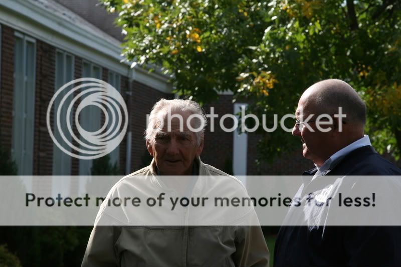
It's looking good! The thing that stands out to me is the jacket... using the soften tool should help to smooth out the strange coloring that is showing up there. I might also trying cropping in a bit more close.... say to, just under the shoulders... and do the sides and top in proportion to that. ~trudy |
|
#4
|
|||
|
|||
|
Quote:
You have a good eye. Yes the jacket is developed with a strange curve. Rachel, I was going to leave this one go. I seem to be doing too much editing these days. However I just want to demonstrate for you how easy the Shadow Highlight tool can be. I'm sort of perplexed and even annoyed that this easy tool of Photoshop is so rarely used by even experienced photographers. So let's look at that. Also your crop is damaging to your intent which is to reveal something of the man's aura as a special individual that people notice. Your version leaves him isolated and alone! This is one more example of the damage of the aphorism "Frame tight and crop closer!" Milieu and reactions of individuals are part of your storytelling! Don't throw them away! The gurus are great for teaching the hows but hardly ever the esthetics. Ask what work your photograph must do for you? What of the tools available can help bring this out and add a sense of beauty if that's what you wish. ![]() Then ask what is especially human about this gentleman? He's elderly, fragile perhaps yet remarkable and a treasure. So can we leave information in the picture to show this? But first isn't the background distorted in that the verticals are diverging? So we "select all" and correct in Edit, Transform, Perspective*. I admit the heads may be a little long, but that looks better to me! ![]() Crop to include the gentleman on the right as he defines your main subject by his attention and even respect. As always, duplicate this new layer. You always want an uncorrected version of each stage of your work. ![]() Now selectively blur the top copy. Next, erase a rim around the figures at 40% to let 40% of the edge underneath to show through. The center of the people are now erased totally. Maybe not all of the "watcher". The background detail is parsimoniously and selectively brought back by very gradual erasure (set erasor to 15%) of plants and flowers and a little more. Add local fine edits to taste** ![]() There's no sharpening. The rest of changes would be after a print. I think now you will appreciate a more community based subject not a lost elderly man. There is, I believe beauty and dignity. Asher * A tilt shift lens will prevent this. Read up about Schleimflug. ** For example, de-saturate a tint tad to skin redness on the watching mans left forehead and blur. Then add back a highlight by dodging a strip to continue the highlight higher up.
__________________
Follow us on Twitter at @opfweb Our purpose is getting to an impressive photograph. So we encourage browsing and then feedback. Consider a link to your galleries annotated, C&C welcomed. Images posted within OPF are assumed to be for Comment & Critique, unless otherwise designated. |
|
#5
|
|||
|
|||
|
Hi Rachel,
I though I'd show you the increased unity that a conversion to B&W can bring to a picture. The process yields a different relationship between parts of the picture. If chosen well, the assignments of hue information to tonalities of distinguishing brightness and shade or else the abandonment of color information can remove barriers to full enjoyment. But why? Color can damage non-natural beauty by covering up the inherent mysteries of form with razzmatazz immediacy of obvious color signals.
The real benefit and place for color in photography: Natural color and skilled choice of palettes can add all the richness of an orchestra to a magnificent concert hall. B&W has a more muted voice that makes us examine the labyrinths of composition, lighting form and tensions. The advantages of color are evident in natural scenes, as they have a color palette that is perfect to the human mind: landscapes and wild animals, children and lovely people. To this we can, of course, add fashion and beauty where palettes of color are carefully designed to work together and for the intent of the image. So let's see what a simple conversion of this picture to B&W by discarding the color information. ![]() So ask yourself, have we maintained the spirit of the image? Is there more unity? Is the picture more gentle now? Asher
__________________
Follow us on Twitter at @opfweb Our purpose is getting to an impressive photograph. So we encourage browsing and then feedback. Consider a link to your galleries annotated, C&C welcomed. Images posted within OPF are assumed to be for Comment & Critique, unless otherwise designated. |
|
#6
|
|||
|
|||
|
Thanks, Asher, but I agree---you do too much editing! I feel guilty at the time you've spent on this. Photoshop will be a long, slow, painful process for me. It might take me weeks to work through this lesson. Deeply appreciated, but please know this will not come quickly.
Thanks, also to Trudy! With such a team, how can I fail? |
|
#7
|
|||
|
|||
|
Asher, your point about including the man on the right makes a great deal of sense. I have been thinking about this and why I want to crop so closely.
What I wanted was just the man, no distractions. Since *I* didn't need external cues to appreciate how worthy of respect and admiration he is, I cropped from *my* perspective. The irony is that when I teach students how to write academic articles, I constantly harp ad nauseum on the need to include the background and even the obvious. Since their audience does not have the information they have, they MUST provide a complete and well-considered context. It seems when I'm left brain, this point is a (forgive me) no-brainer. When I go right brain (which is how I seem to shoot) I shoot from my own idiosyncratic perspective. I think it's time I bring a little more analytical approach to my photography. I need to stay right brain, but balance it with a little left-brain precision and approach. |
|
#8
|
|||
|
|||
|
I'm working on this now. Wish me luck.
|
|
#9
|
|||
|
|||
|
good luck!... can't wait to see the new results :)
|
|
#10
|
|||
|
|||
|
Hi Rachel,
I'm looking forward to your new work on this picture. Your choice of the subject is great. This task you have set yourself with this picture is extremely important. It represents the sphere of influence and holiness of one human being, one precious man that others have taken to appreciate. So he has to be celebrated, framed and exposed carefully. Consider it as a challenge and don't be put if if it seems hard. Asher
__________________
Follow us on Twitter at @opfweb Our purpose is getting to an impressive photograph. So we encourage browsing and then feedback. Consider a link to your galleries annotated, C&C welcomed. Images posted within OPF are assumed to be for Comment & Critique, unless otherwise designated. |
|
#11
|
|||
|
|||
|
I may have to come back to this again and again, but this one is important tom e.
|
|
#12
|
|||
|
|||
|
Asher said:
Crop to include the gentleman on the right as he defines your main subject by his attention and even respect. As always, duplicate this new layer. You always want an uncorrected version of each stage of your work. Now selectively blur the top copy. Next, erase a rim around the figures at 40% to let 40% of the edge underneath to show through. The center of the people are now erased totally. Maybe not all of the "watcher". The background detail is parsimoniously and selectively brought back by very gradual erasure (set erasor to 15%) of plants and flowers and a little more. Add local fine edits to taste** Ok, this is going to take me some time. I have NO CLUE how to do this layer stuff. I'm off to spend a while with my Dummies book. |
|
#13
|
|||
|
|||
|
I'll be back in a few days on this. I have none of the background to get to this point..YET.
|
|
#14
|
|||
|
|||
|
I like the first one (original)... Its so good with a rim light on both of the men... Love the shadows under the neck of the grey jacket man..! And also the hair very crispy
|
|
#15
|
|||
|
|||
|
I have CS4 on order. My plan is to spend some time with the Help section and go at this methodically, patiently, and master this.
The layers thing has me flummoxed. I need to step back and remember baby steps. The marathon will have to wait until I get the basics down. |
|
#16
|
|||
|
|||
|
Lets add a reflector and change the lens to a Zeiss model... LoL
![]() Many tips there, see the part 'Advanced CS3 Masking with Monsters! (The Series)' http://www.russellbrown.com/tips_tech.html Very good tutorial on masking http://www.mouseprints.net/old/dpr/ReplaceBG.html http://forums.dpreview.com/forums/re...ssage=24728122 Lens blur tuto http://www.creativepro.com/article/p...alpha-channels |
|
#17
|
|||
|
|||
|
This was done with your copy above. Could have been better with a full version. No photoshop.
|
|
#18
|
|||
|
|||
|
Bill,
You B&W version is certainly improved over Rachel's dark colored original. I like it. What interesting is that in the following color version by Luiz, the old chap looks more vigorous! Quote:
![]() Luiz, What a great job you have done! Awfully impressive. Why is it stronger than what we have all done before? Perhaps getting rid of the onlooker. I had thought he was needed to give recognition to our gentleman as been respected. Now, as you have shown it, he's on his own which makes him more energetic and independent. With a jacket over his shoulder, he could be a U.S. senator. What a good rendition! Kudos! Asher
__________________
Follow us on Twitter at @opfweb Our purpose is getting to an impressive photograph. So we encourage browsing and then feedback. Consider a link to your galleries annotated, C&C welcomed. Images posted within OPF are assumed to be for Comment & Critique, unless otherwise designated. |
|
#19
|
|||
|
|||
|
One thing I know...this man deserves to be done right! I only hope I can do it in time.
|
|
#20
|
|||
|
|||
|
Quote:
Very interesting thoughts/perspectives you got, I agree. Have to confess that I had none… I saw that the intention was to isolate/enhance the subject and so I did “mechanically” Hummm... I guess some “cogs” have fallen from the right brain :) |
|
#21
|
|||
|
|||
|
I would tend toward blurring and dimming the background, and adding a vignette so the image is all about that wonderful face.
|
|
#22
|
|||
|
|||
|
OH man, I like that!
|
|
#23
|
|||
|
|||
|
Quote:
I like your new contribution. Rachel, Have you presented any of these, so far to the organization for their publication. We'd love an update. Asher
__________________
Follow us on Twitter at @opfweb Our purpose is getting to an impressive photograph. So we encourage browsing and then feedback. Consider a link to your galleries annotated, C&C welcomed. Images posted within OPF are assumed to be for Comment & Critique, unless otherwise designated. |
|
#24
|
|||
|
|||
|
Thanks Rachel, Asher.
|
|
#25
|
|||
|
|||
|
This is so important to me I want to do it right. Right now, I'm taking baby steps.
|
|
#26
|
|||
|
|||
|
Thank you!
The latest news is that I've found someone to sit down with me and direct me step by step. My early experiences with photoshop have made me skittish enough that I frustrate way too easily. Last edited by Asher Kelman; December 22nd, 2008 at 02:07 PM. |
|
#27
|
|||
|
|||
|
Your latter compositions look nicer. I've always been a big fan of B&W/Sepia when you have a photo that you have to color correct.
One thing you could have done in the beginning is to lighten it up but make a layer and add a brightness/contrast or shadow/highlights (or whatever effect you wish to use) and then 'paint on' the areas that you want to lighten, while leaving the rest of the picture untouched (known as non-destructive editing). I've been rather 'in a nutshell' here but if your not sure what I'm talking about, then I'll submit another post in detail - step by step (yes I have a fair bit of patience :) P.S. I LOOOOVE Photoshop - been using it for the past 10+ years |
|
#28
|
|||
|
|||
|
Thank you, Carlin, but trust me -- I would try the patience of a saint!
|
|
#29
|
|||
|
|||
|
I just know the basics of ps..enough to fool myself!
here is a quick attempt from me. if the selection was contracted at the sides, we could get rid of the lightness arounf the borders. ![]() ![]() Regards. |
![]() |
| Bookmarks |
| Thread Tools | |
| Display Modes | |
|
|