Andrew Stannard
pro member
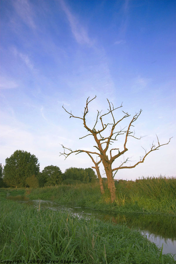
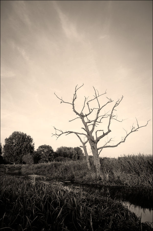
Hi,
I'd like to submit the following image as an 'Optimize This!' challenge. My own interpretation can be found in the Landscapes forum, and am interested to see what other people make from it.
No real preference, would love to see some B&W interpretations as well as color, also maybe some conversions that concentrate on the sky and use the landscape almost in silhouette. Anything really!
Although the sky looks bright the highlights aren't clipped, so there should be plenty of data to work with.
Please include a '© Andrew Stannard' with images, together with the steps performed. Would suggest a maximum post size of 600px across?
Thanks, Andy.


")