• Please use real names.

    Greetings to all who have registered to OPF and those guests taking a look around. Please use real names. Registrations with fictitious names will not be processed. REAL NAMES ONLY will be processed

    Firstname Lastname

    Register

    We are a courteous and supportive community. No need to hide behind an alia. If you have a genuine need for privacy/secrecy then let me know!
  • Welcome to the new site. Here's a thread about the update where you can post your feedback, ask questions or spot those nasty bugs!

First post

Mark Rohlf

New member
Hello all;

Just wanted to share a few images with you all, and welcome any and all critiques.

This image sort of served as a catalyst for me in thinking about why I do some of the things I do in photography.

I was sitting around one saturday morning ... nothing much to do, so I took the camera for a stroll. I happened along this railroad crossing sign that looked a bit unique, so I snapped off a few rounds.

here is an example of one of those images with no additional PP manipulation.


railroadxing1.jpg


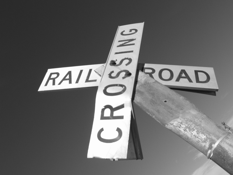
Mark Rohlf: Railroad Crossing 11 - Dickinson County, Kansas - 2007 Original

http://markrohlf.blogspot.com/2008/02/some-new-photographs.html

Then later, I got to browsing some of my old images and ran across this one. I then began to think about how I could make this just a bit more interesting to look at. So I opened it up in photoshop, and just started playing around with effects, filters, colors, brightness, etc.

With just the right combination of colors, and an application of the solarization process, I was happy with what I had found. Then I just sat there and stared at the image a while longer ... and then started messing with it again. This time I stumbled upon the "twirl" filter. The default value of 50 ... if memory serves. When I completed the twirl, I was very happy with the result.

I had achieved the goal of livening up this image. Here is what it looks like now.

railroadxing1-2.jpg


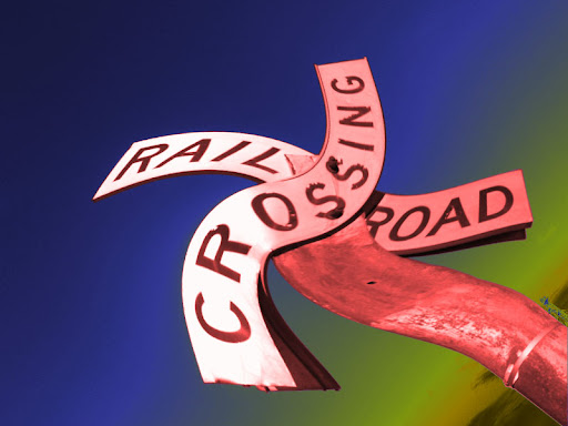
Mark Rohlf: Railroad Crossing 11 - Dickinson County, Kansas - 2007 Edited

http://picasaweb.google.com/markrohlf/DigitalArt#5362374061709944306

Well ... looks like the image didn't embed into my post ... so here are the urls

I look forward to hearing your comments and critiques
mr
 
Last edited by a moderator:

Rachel Foster

New member
Hello, Mark! I like the first far more than the second. I was curious about the tilt? And I look forward to seeing much more of your work.
 

Mark Rohlf

New member
Hello, Mark! I like the first far more than the second. I was curious about the tilt? And I look forward to seeing much more of your work.

The tilt was just an attempt to utilize lines and framing in a unique fashion. The end points of the two signs run almost parallel with the frame edges. Just a different way of framing the lines.
 

Asher Kelman

OPF Owner/Editor-in-Chief
Mark,

I do like the idea of exploring and just messing around sometimes to look for effects. Now that you have done that, what then? The original has the wood crossed so it there was some inherent meaning. Now with the whirl, what of it? Have you cut off the connection with the original concept? I'm not putting this out as a negative criticism of you colorful effect, but as a question on where does it place the art of making art? Do you now take what you have learned and go on with this, or was this just a candy for the moment? I ask as I'm interested as to how people position themselves for creative expression and is "fiddling" sufficient for you or now that you've done this it gives you a platform for new work?

Asher
 

Mark Rohlf

New member
Processes and Meaning

Mark,

I do like the idea of exploring and just messing around sometimes to look for effects. Now that you have done that, what then? The original has the wood crossed so it there was some inherent meaning. Now with the whirl, what of it? Have you cut off the connection with the original concept? I'm not putting this out as a negative criticism of you colorful effect, but as a question on where does it place the art of making art? Do you now take what you have learned and go on with this, or was this just a candy for the moment? I ask as I'm interested as to how people position themselves for creative expression and is "fiddling" sufficient for you or now that you've done this it gives you a platform for new work?

Asher

Great point Asher. And yes. As I said, this image, and the discovery process I used to come up with the new image has caused me to re-think my reason for creating images.

Throughout the year of 2009, I created several images in a similar vein as the one I accidentally stumbled upon with this railroad crossing sign.

All of them utilizing standard processes of color manipulation and bundled filters in photoshop. I am not a technician. I am an expressionist. I just love the idea of taking an image, and creating something new with it. Something unique.

Here is one example

http://picasaweb.google.com/lh/photo/KeQfPXiC0spWNRHTVFliTg?feat=directlink

The original was very standard. A straight color shot (during the final minutes before sunset) of a sunflower. The end result is something different.

Again ... with a similar process of playing with colors, and the solarization process to come up with some exciting colors. Then with this one, I applied a slight twist, which caused the storm cloud to bend up a bit.

http://picasaweb.google.com/lh/photo/tjszOMP3PvAmAV_5Zdslng?feat=directlink

As far as the meaning goes, it is my opinion that the artist does not have the responsibility of coming up with a "meaning". That is the idea of "Art is for everyone". In this line of thinking, it is the observer's responsibility to assign meaning to a work of art.

Asher, I must not know what I'm doing with the "insert image" function. I click the insert image button, I paste my url in. But when I submit the post, the images don't appear. What did you do, that I am not doing? In the meantime.. here are the urls.
 

John Angulat

pro member
Forgive me ... what is a triptych?

LOL! Not to worry Mark, it's a work of art divided into 3 sections.
Get used to some of the phrases we use, it'll certainly be a learning experience.
Someone once suggested (way back when) that one of my images shoud be a diptych.
Well, I thought they meant "dipstick".
...and where I come from, calling someone a dipstick...well, 'dems fighten' words!
Glad I re-read that post post before I replied!!!
 

Mark Rohlf

New member
LOL! Not to worry Mark, it's a work of art divided into 3 sections.
Get used to some of the phrases we use, it'll certainly be a learning experience.
Someone once suggested (way back when) that one of my images shoud be a diptych.
Well, I thought they meant "dipstick".
...and where I come from, calling someone a dipstick...well, 'dems fighten' words!
Glad I re-read that post post before I replied!!!

Ahh ... yea ... Ok ... I'm familiar with that. Hmm .... interesting idea. I will definitely keep that in mind. I hadn't thought about using that.
 
Top