• Please use real names.

    Greetings to all who have registered to OPF and those guests taking a look around. Please use real names. Registrations with fictitious names will not be processed. REAL NAMES ONLY will be processed

    Firstname Lastname

    Register

    We are a courteous and supportive community. No need to hide behind an alia. If you have a genuine need for privacy/secrecy then let me know!
  • Welcome to the new site. Here's a thread about the update where you can post your feedback, ask questions or spot those nasty bugs!

Anarchy Seduction : The Rebellion

Jericho Soh

New member
DSC_6581copycopycopy3copy.jpg


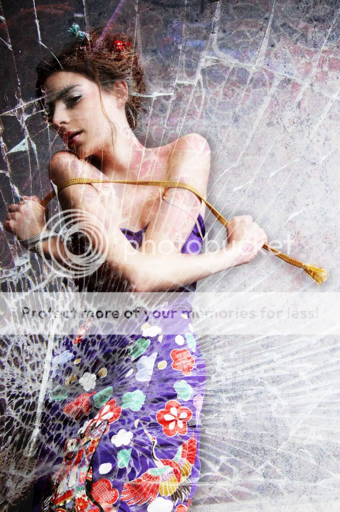
Jericho Soh: Anarchy Seduction : The Rebellion 1


DSC_6694copycopycopy.jpg


Jericho Soh: Anarchy Seduction : The Rebellion 2


Recreated.jpg


Jericho Soh: Jericho Soh: Anarchy Seduction : The Rebellion 3


DSC_6828copycopy.jpg


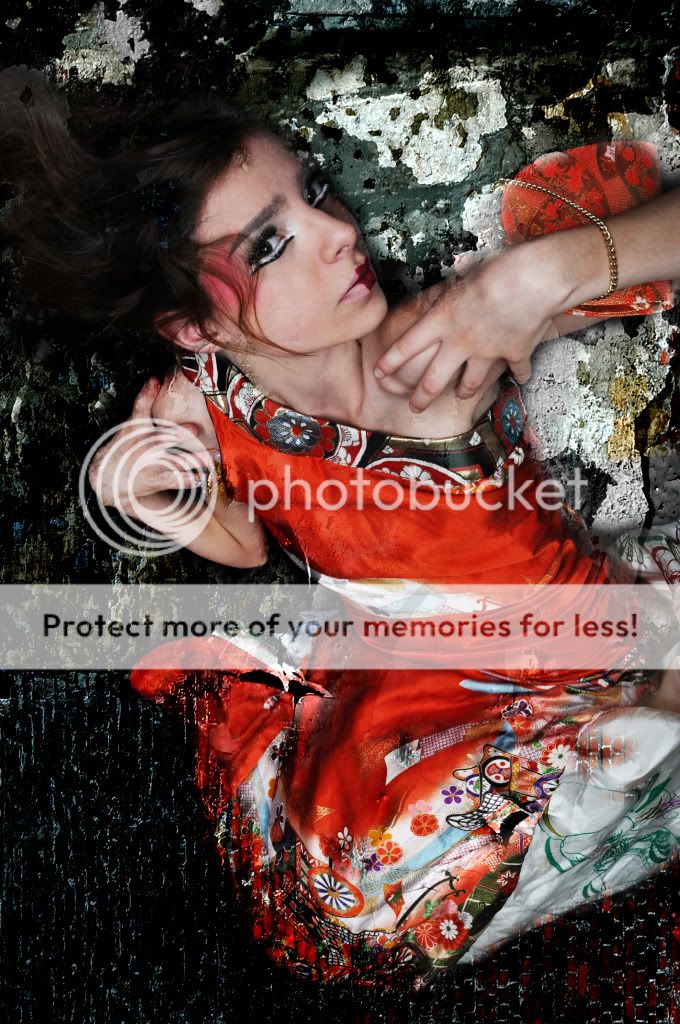
Anarchy Seduction : The Rebellion 4


More on www.jeriphoto.com/blog.
Feel free to give some critic so I can improve further .
Thanks and have a nice day!
 
Last edited by a moderator:

DanHostettler

pro member
Great Compositions

Hi Jericho, I love the composition, the colors, the esprit, the posing..all very fashionable! And very strong. Could be for an advertising in Vogue. Congrats!

Question Pic1: Are there just white eylashes under the eyes or did you turned some part of the eyes in PS upside/down?

Keep it up, Dan
 

Asher Kelman

OPF Owner/Editor-in-Chief
Hi Jericho, I love the composition, the colors, the esprit, the posing..all very fashionable! And very strong. Could be for an advertising in Vogue. Congrats!

Question Pic1: Are there just white eylashes under the eyes or did you turned some part of the eyes in PS upside/down?

Keep it up, Dan

Dan,

I'm glad you like these pictures too. I agree that they are impressive. I thought it likely that the eyelashes were part of the makeup as here we see the result of an entire professional team of designer, makeup artist, hairstylist and all. The effect is a unity that brings the work to a high level.

Therefore these pictures need to be displayed with the same care. I've added white space and titles. There should be no giant sign of the artist on the pictures at this level of signature work unless it fits into the design. These pictures are also worthy of being shown larger as, for example the makeup of the face and the clothes have detail we really want to see.

@ Jericho,

When you have larger images without the huge logos, I'll replace the posted images for you! I know you are out shooting today, so good luck!
 

Ashley Karyl

New member
Fashion is not my thing really, but looking at this as a working photographer, if this was intended as a set of images that should hang together as a group for publication in a magazine for example you might want to make sure that the skin tones from one image to another are a slightly closer match.
 
Top