Sorry for the delay in responding.
I realize now that I should not have started this series or, maybe, that I should have started it a year ago. The problem is that I am starting by the end: the first image will probably be the strongest, because it is the product of a long maturation. I looked at some of my pictures last week-end, and I realize that I had been toying unconsciously with the concept for some time. The problem was to recognize it.
So what is the "concept"? I think I have been influenced by the thread "reading the reading" at some point and the idea to play with the reader's reading, to provoke unease in the viewer. Mainstream photographs (using "mainstream" for the lack of a better word, I mean the kind of classical composition that is taught in beginners' courses) teach to create a "gentle" reading, letting the reader slowly explore the frame. That leads to put subjects at off center points (basically 1/3-2/3 or any close "golden" number) so that the photographer can find a balance and movement between them. Indeed the classical beginners' course teaches to avoid centered compositions, since they do not allow to play with the viewer's reading: the subject is just there and the gaze has nowhere to go. So you are right when you notice that the composition of the three images is similar, basically strongly centered and symmetric.
But then the question becomes: how do we escape from the problem that the centered composition is static?
At the same time, I have also be influenced by photographers like Stephen Shore, William Eggleston, the Becher couple, the "new topographics" school (there was a thread about the "altered landscape" here which referenced them) and a few other exhibitions I visited, which were interested in picturing the mundane, the trivial, the landscape or object next door. I played a bit with the idea of picturing uninteresting objects.
There is a way to escape the immobility of the centered composition, that is to put a subject that the viewer gaze will want to escape spot at the center. Indeed the effect that "The beach #1" is "almost frightening" as noted by Mark Hampton comes from the pole right at the center, which we don't really want to see there. Now, I don't pretend to have found the idea to put a distraction where the viewer is expecting the subject, I am pretty sure I have seen it somewhere else (*), but I know I have been toying with that idea the past year as the two examples below show. I have also be playing with depth of field as a way to blur the line between the subject and the distraction (for "The Beach #1" the subject would be the landscape and the distraction would be the pole), but that may not be a great idea: "The beach #1" works because everything is sharp.
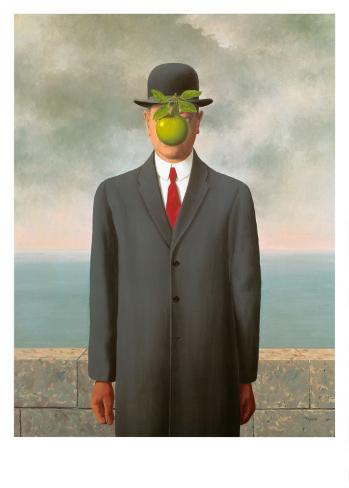
(*) I am not sure where I have seen the idea in a photograph, but René Magritte used it in some paintings, e.g. "Le fils de l'homme" (see image bottom).
Unfortunately, now that I have analyzed this composition system (because it is a "system", a "trick"), I realize that it is a dead end. If I go and take 100 landscape pictures with a silly object smack at the middle, the trick will be pretty obvious. So now I have to find a way to go beyond that. That may take a while so please be patient.
In the mean time, other members are welcome to add more pictures to the thread if they wish so.
René Magritte: Le fils de l'homme.


")