
Robert Schillinger
New member
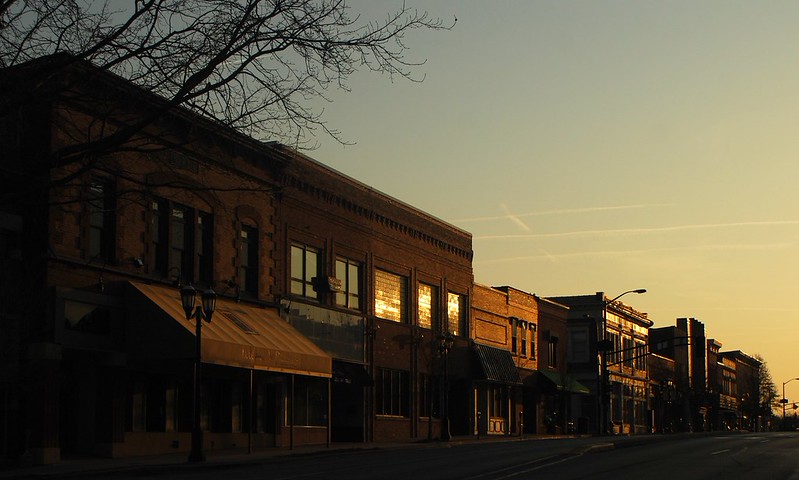
I like this one and so do a few other people, but it still seems lacking something. I'm trying to capture the high contrast of the sunlight reflected in the windows against the dark buildings. I like the warm highlights, deep shadows and all, but it's just not quite there somehow.
I can return to this spot easily to re-shoot although by now there are leaves on the trees, so it will have a bit more green, but that's not the main point. It's those striking highlights in the glass and stone.
Anyone have any input, suggestions, whatever?
Last edited by a moderator: