• Please use real names.

    Greetings to all who have registered to OPF and those guests taking a look around. Please use real names. Registrations with fictitious names will not be processed. REAL NAMES ONLY will be processed

    Firstname Lastname

    Register

    We are a courteous and supportive community. No need to hide behind an alia. If you have a genuine need for privacy/secrecy then let me know!
  • Welcome to the new site. Here's a thread about the update where you can post your feedback, ask questions or spot those nasty bugs!

Two studies of abandoned automobiles

Right in the eyes
right_in_the_eyes_by_philosomatographer-d5tp7b1.jpg


Unregal
unregal_by_philosomatographer-d5tpa6u.jpg

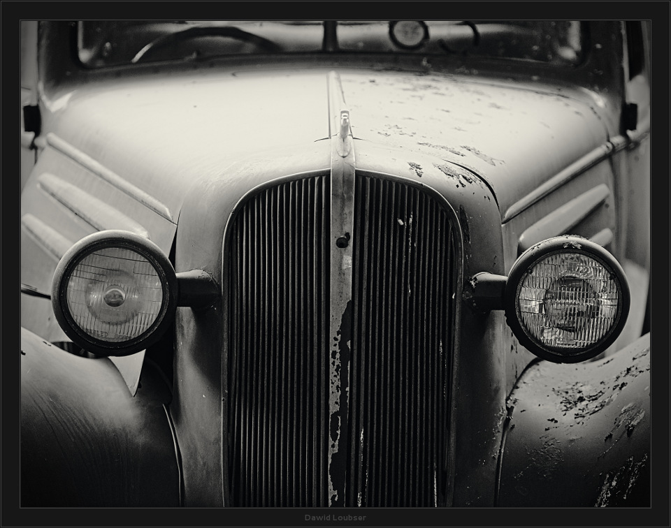
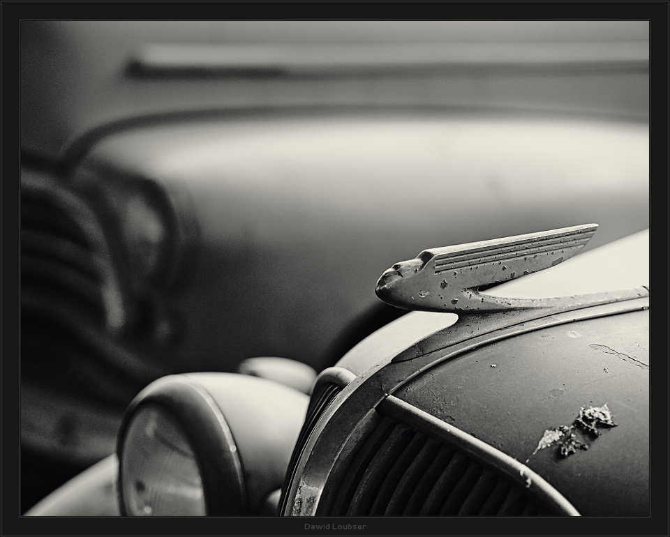
Old automobiles are a clichéd subject for sure, but I wanted to share my exploration of two such examples that we found this weekend. The lighting together with the dusty, matte bodywork was too sublime to not make some detail studies of.

I made about six such studies, but these two are my favourites, and the only two that I wanted to share here. I enjoy the irony of the second one, where we are forced to deal with the beautiful forms and curves, together with the humiliating bird droppings. A sort of antithesis to similar images that depict pristine, collectable automobiles, the light which could never play so softly across their shiny, polished bodywork like it does with these.

In a world filled with this clichéd subject, do these two appeal to you? Why? I must admit to not being able to wait to print them really large, I suspect they may come into their own then.

Thanks for looking :)
 
I especially like the second one, Unregal, Dawid. I was struck first by the curves, but the bumpy texture of the hood ornament held my attention and spoke of the passage of time. I'm sure both will print well.
 

Sam Hames

New member

To answer your question:
These are interesting - I like the control of tones and the careful attention to the details and the decay present without going overboard. Overall I think they're aesthetically pleasing and can definitely feel the impact they will have when printed large. You'd be crazy not to print them they're so nice.

But about what you said I'm not so sure:

I enjoy the irony of the second one, where we are forced to deal with the beautiful forms and curves, together with the humiliating bird droppings. A sort of antithesis to similar images that depict pristine, collectable automobiles, the light which could never play so softly across their shiny, polished bodywork like it does with these.


I don't think this is antithetical to the shiny photographs at all - while you certainly show more care and intimacy as well as skipping the glamour, these still end up as a glorification of the object. A little dilapidated, faded and rusted, but still glorious --- for the bird droppings to be humiliating requires that we personify the car as having pride to begin with. Both compositions are very careful and controlled - I feel a reverence here, the same as I would with those other photos you talk of.

To my mind a true antithesis would require a very different approach.​
 
I don't think this is antithetical to the shiny photographs at all - while you certainly show more care and intimacy as well as skipping the glamour, these still end up as a glorification of the object. A little dilapidated, faded and rusted, but still glorious --- for the bird droppings to be humiliating requires that we personify the car as having pride to begin with. Both compositions are very careful and controlled - I feel a reverence here, the same as I would with those other photos you talk of.

To my mind a true antithesis would require a very different approach.

Thank you for the insight, Sam. I can't disagree with your reasoning whatsoever.
 

Chris Calohan

Well-known member
I like the first one but would be tempted to crop at the windscreen. the hood and lights are the main subject and obsfucating these with addition non-information doesn't add anything, but rather subtracts, I think.

In the second one, there is also too much non-information which I believe holds back the full impact of the hood ornament. Because of the very narrow depth of field, I don't think a crop would help. For me, it needs a reshoot if possible. Even if the rest of the hood and some of the grill is still OOF, with more of that information available, my eyes can make a better connection to the ornament.

Thanks for your insights, Chris. I am absolutely perfectly happy with the composition of "Unregal" - and the carefully-chosen depth of field to echo the motorcar behind it. There is nothing I would, or could, change about the composition - the hood ornament is not the "only: subject.

I could agree with your cropping suggestion of the first one, but it would make the image just a bit too abstract for me, and lose the depth of the out-of-focus interiour of the car. I agree that the impact could be greater if cropped out, but I liked to see it in the image.

thanks for looking!
Dawid
 

Asher Kelman

OPF Owner/Editor-in-Chief
Affirmation!

These two interchanges sum up great feedback to a photograph.


I like the first one but would be tempted to crop at the windscreen. the hood and lights are the main subject and obsfucating these with addition non-information doesn't add anything, but rather subtracts, I think.

In the second one, there is also too much non-information which I believe holds back the full impact of the hood ornament. Because of the very narrow depth of field, I don't think a crop would help. For me, it needs a reshoot if possible. Even if the rest of the hood and some of the grill is still OOF, with more of that information available, my eyes can make a better connection to the ornament.


Thanks for your insights, Chris. I am absolutely perfectly happy with the composition of "Unregal" - and the carefully-chosen depth of field to echo the motorcar behind it. There is nothing I would, or could, change about the composition - the hood ornament is not the "only: subject.

I could agree with your cropping suggestion of the first one, but it would make the image just a bit too abstract for me, and lose the depth of the out-of-focus interiour of the car. I agree that the impact could be greater if cropped out, but I liked to see it in the image.

thanks for looking!
Dawid


In the first case, Chris penetrates the world of the picture and deals with fundamentals of its construction and presentation to us. In the response, Dawid acknowledges much objective validity of the comments but defends his artistic vision. We can use this as a model.

Asher
 
Top