• Please use real names.

    Greetings to all who have registered to OPF and those guests taking a look around. Please use real names. Registrations with fictitious names will not be processed. REAL NAMES ONLY will be processed

    Firstname Lastname

    Register

    We are a courteous and supportive community. No need to hide behind an alia. If you have a genuine need for privacy/secrecy then let me know!
  • Welcome to the new site. Here's a thread about the update where you can post your feedback, ask questions or spot those nasty bugs!

The White Horsemen (ocean landscape)

Hi, this is not strictly a "landscape" but it does not fit anywhere else, so I wanted to share it here.

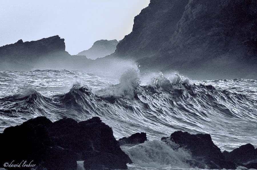
"The White Horsemen"

Taken hand-held at "the point" in Mossel Bay, South Africa. Though it was summer (which is why there was enough available light at 19:50 in the evening) it was a cold, wet, windy sunset with a certain ominous feeling to it. Sometimes you stand next to the see, and feel it whispering things to you that you cannot understand.

In a fairly asymmetrical, unsightly environment of rocks and cliffs, I spotted this wave rolling in. It seemed personified, purposeful, and arranged - like a group of horsemen; agitated and hasty.

The camera so often does not make a difference, but here, if it was not for the instantaneous response of the 1D, nor the capability to zoom the 28-300L lens to 300mm in an instant (push/pull), I would not have been able to capture this moment spontaneously. It would not have bothered me (to have missed it), but in retrospect I keep on coming back to this image, tweaking the RAW here and there. I thought against making any structural / blurring / vignetting changes, as to me it is only though the contrast with the otherwise ordinary surroundings that this wave is interesting, and "different". I know the monochrome rendering may be unusual for this type of image, but only when the colour is gone does this image take me back to that moment.

I'm not looking for critique or posted altered versions, but if you have any thoughts around my photograph, I'd be interested to know what they are.
The_White_Horsemen_by_philosomatographer.jpg

(300mm, f/5.6, ISO1600)
 
Dawid

It is a fantastic image, and your text ads to it. I was thinking about the non fiction accounts of sale ship pilots and the trouble they had to endure with exactly this type of conditions. I think that the winds get stronger the more you get closer to north or south poles.

I would just try one thing with the image and that see how it looks as a duo or trio-tone.

leonardo
 

Asher Kelman

OPF Owner/Editor-in-Chief
Hi, this is not strictly a "landscape" but it does not fit anywhere else, so I wanted to share it here.

"The White Horsemen"

Taken hand-held at "the point" in Mossel Bay, South Africa. Though it was summer (which is why there was enough available light at 19:50 in the evening) it was a cold, wet, windy sunset with a certain ominous feeling to it. Sometimes you stand next to the see, and feel it whispering things to you that you cannot understand.

In a fairly asymmetrical, unsightly environment of rocks and cliffs, I spotted this wave rolling in. It seemed personified, purposeful, and arranged - like a group of horsemen; agitated and hasty.

The camera so often does not make a difference, but here, if it was not for the instantaneous response of the 1D, nor the capability to zoom the 28-300L lens to 300mm in an instant (push/pull), I would not have been able to capture this moment spontaneously.
Again I hear great things about this lens. Previously someone praised the 28-300mm L for work on the "Catwalk"as one has to react instantly from wide angle to zoom or miss the moment the girls hit a peak of beauty, attitude and panache! The 70-200 does not do it! The 24-105 is no good either!

So this underused lens seems important!

.....I know the monochrome rendering may be unusual for this type of image, but only when the colour is gone does this image take me back to that moment.
I have felt that with portraits. Only the B&W brings me back to my own recollections of what I saw in the moment of image making.


I'm not looking for critique or posted altered versions, but if you have any thoughts around my photograph, I'd be interested to know what they are.

How could we possibly even start to make altered versions without the original! No way. Of course, I'd love to explore that world from the RAW, but that's your call :)

My feelings are that there's a great noise of the incoming waves crashing down and that the water is jettisoned forward, hurling between the foreground rocks and pushing at us an endless rushing of foaming water.

I'd love to see the foreground white water lightened, if that would be something you might try.

The is a magnificent, awe-inspiring and humbling picture.

Asher
 
Last edited:
Asher,

The lightening of the foreground (out of focus) water is an interesting idea, but in this image, I'm not sure I want to detract from the solid-looking water in the center. The rest of the image only serves as a kind of nondescript context, the wave is everything here. I'd like to know what the lightening would achieve for you, though?

I think if the foreground water was in focus (which was impossible in this bad lighting condition, as I was at ISO1600 already) it might be more effective.

And you know... I think, if in this image, I specifically wanted to discuss my technique and improve my skill (which of course can do with a great deal of improvement), as per the purpose of my Sands of a Feather post, I'd be happy to share the RAW file, but in this case, I'm not sure that's what I want.

I also didn't want to post this just to feel good about myself, I wanted to see whether your people (whose critical eyes I respect a great deal) also thought this is an interesting image, and to share my experience (and, lastly, why my camera/lens combination made this image possible for me in this case. Sure, a 300L could do this even better [I'd love to isolate the wave even more] but that could never be used as a walk-around lens).
 

Asher Kelman

OPF Owner/Editor-in-Chief
Dawid, the picture is doing things. The center of the image is coming to life as I look at it more. All I did was leave for several hours and now the large high waves seem more alive and full of energy, so I understand it a little better. This is a dynamic image you have made which gives more as I look further.

The white in in foreground is the part of the water coming towards us, as if it is forerunner waters that might overcome the rocks and flood the land at the whim of of the sea. I wondered if making it brighter, without over powering the stunning middle of the image, would add power.

This picture, I believe needs to be printed before you can finish it. This is a tough job and I believe you will have to keep making changes to get it to be everything you want as this is a very powerful but subtle and complex image.

You have developed a great internal concept of what you experienced and ultimately you have to satisfy yourself that you are indeed getting everything to to appear as you imagine and remember it.

You do not need to give out the RAW image for this!

Still, I'm interested in the extent that the picture could hold or even improve its meaning should you provide more dimensionality to the forground and bacground. These areas could take a long time to optimize and what I see is not what you will print.

I'm impressed by this picture and hope you have more in this series to show.

Asher
 
Last edited:
My next challenge will indeed be to print this, and I am going to work at it. You have piqued my curiosity regarding the slight brightening of the foreground, and I may give this a try.

I unfortunately do not have a series, this was the only image I took that had this kind of interest and energy - the few other I took that day (of different scenes in the same location) are long gone (deleted).

I do luckily have the chance to revisit this location from time to time, but this image is everything I wanted it to be, now all the remains is to perfect it for printing, and then it is done. I have in the past made one print of this, and (as you said) it needs a lot of work to look impressive on physical medium, for now, it looks nice on a computer screen.

Thank you for your insight, Asher
 

Ray West

New member
Hi Dawid,

I have to say that I do not like this picture, because it is taking too much of my time - looking, pondering, see if I can get it into something better, and I can't - and as Asher said, when you come back to it it is better again, so I keep coming back.

Anyway, if I can find something to say, then I can get on with the rest of my life, so here goes:-

If you crop off the bottom, to just above you signature, and the top by about twice that amount, then the dark rocks in the background are a diagonal mirror image of the foreground. I think I would maybe try and get some white somewhere in the horses, but sombre is good. The longer landscape format gives more emphasis on the line of breakers, I reckon.

There, I've said it. Off to celebrate with coffee.

Best wishes,

Ray
 
Hi Ray,

I must say, you have a point with the landscape cropping - I like the diagonal symmetry it causes. I would not have thought of that, you must have spent quite a bit of time watching to come up with that one!!

When I play around with the exposure a bit too, I may post a new version, incorporating your suggested cropping.
 

Asher Kelman

OPF Owner/Editor-in-Chief
Dawid,

Normally I'd want to obey your insrtuctions, and here too! However, your picture is like a georgeous woman one has taken on a date and one wants to keep dancing with all until the club closes. I don't blame Nicolas wants to join in. I know his work with the sea, (after all, it's his life and love after his family, and before liberty I expect), that he will have ideas and technic that are likely to be valuable for you and all of us.

I'd even hope you might consider sending him a RAW image and for sure it's safe with Nicolas!

Ray! Yes, the picture asks us to come back and we wonder about the upper and lower borders. The upper area I cannot argue with but would require looking at prints on the wall. However, in the lower border, any crop to the level of Dawid's signature, will remove the foaming waters pouring through the gaps between the rocks. That component is to me important to the life of the picture.

Asher
 

nicolas claris

OPF Co-founder/Administrator
Normally I'd want to obey your insrtuctions, and here too! However, your picture is like a georgeous woman one has taken on a date and one wants to keep dancing with all until the club closes. I don't blame Nicolas wants to join in. I know his work with the sea, (after all, it's his life and love after his family, and before liberty I expect), that he will have ideas and technic that are likely to be valuable for you and all of us.

I'd even hope you might consider sending him a RAW image and for sure it's safe with Nicolas!

I do completely understand and respect Dawid's wish to keep his raw, my proposal is just a tonal, color and sharp work than can be shown with the low resolution.

I'll PM this version to Dawid for him to decide, nothing fundamental though!

This is my interpretation of Liberty that is far much deeper than what you think!
 
Nicholas,

Thanks for your private message, I actually don't have any problem with you making an altered version (my image is not sacred or anything, otherwise I would not share it here), here is the one you sent me (if you don't mind me posting it):
The_White_Horsemen_by_philo.jpg


From what I've seen of your work, I respect your ability, but I personally do not at all agree with your interpretation of my image, it is not how I "see" it. To me, the appeal of this image is that it is dark, ominous, and above all, subtle. Your "harsher"/"more dramatic" rendering causes me to look at it, take it all in, and move on. The subtler version, to me, is what makes you come back for a second look. Other people's interpretation may vary. I am usually one for "pushing" the contrast in an image, but this is one where I do not think it adds. rather, it subtracts. But thanks for sharing your vision...

Asher, your comparison of my photograph and the gorgeous woman on a date is the most meaningful compliment one of my images has ever received, thank you for making my day!

Ray, as Asher said, the material you linked to is very evocative, and it describes exactly what I feel here!Though, I feel my image is a bit more subtle - instead of powerful, crashing horses, it rather reminds of of something that is about to become something powerful and crashing.
 

Cem_Usakligil

Well-known member
...To me, the appeal of this image is that it is dark, ominous, and above all, subtle. Your "harsher"/"more dramatic" rendering causes me to look at it, take it all in, and move on. The subtler version, to me, is what makes you come back for a second look. Other people's interpretation may vary. ..
FWIW, I personally like the original image of Dawid better. Mostly due to the reasons mentioned by Dawid above.

Cheers,
 

nicolas claris

OPF Co-founder/Administrator
Nicholas,
… but I personally do not at all agree with your interpretation of my image, it is not how I "see" it.

Bonsoir Dawid

This is exactly why I didn't want to post myself this version, I'm not even sure I do prefer it to the original!
It's a just try and hopefully helps, at least, to appreciate the original…
 

Asher Kelman

OPF Owner/Editor-in-Chief
Lighting on natural objects more readily evokes mood than on geometrical forms.

Dawid,

I appreciate so much that you have allowed Nicolas Claris' version. He, after all thinks, sees, imagines water, waves, light reflections and the sky. That's his world (except for on-land stationary images of structure of boats, exterior and interiors), he deals with living water.

If I can be so bold, I'd say that his leaning is towards a positive mood. That's what all his work has to be to make it work. I magine if one showed images of a boat for sale in a depressing overcast storm, who would want a boat in danger of being Jonah's fated vessel?

Nicolas' edits, shown above, change of mood from Dawid's pensive reflective, sobering more somber feelings to the dramatic vibrance of, perhaps, "a great surfing day", (further up the coast :) ). This is achieved by change in lighting alone, not form, not composition nor subject. It's a good rendition as I'd expect and many would prefer this more positive version.

This is what I was referring to when I discussed elsewhere my assertion that

There's often a far greater effect of light on natural subjects, trees, mountains and here water as compared to the clean-cut geometrical forms of modern buildings.

Asher
 
Last edited:

Asher Kelman

OPF Owner/Editor-in-Chief
IMO the first,original is better, like I said it portrays that Dark Shadows vibe ,moody ,dark and mysterious .
Don

Now the challenge is the print: how to express the tonalities we can observe on our backlit screens. I'd like to know how the printing goes!

Asher
 

Don Ferguson Jr.

Well-known member
Yea I bet printing some thing with tonalities like that is difficult to get the black and grey correct . Does it require what is it called RIP ? Out of my league right now but I will someday have an Epson 2400.
Don
 

Tim Armes

New member
Hi Dawid,

This is a great photo, however I think that it can be improved with a little post processing. My main problem with the image is that the constrast is too low - it needs a little boost to see the full majesty of the sea. Nothing excesive.

I've send you my interpretation by private message. Free free to post it if you wish. I've tried to keep close to your vision by keeping the same feeling. The modifications were minor:

Adjust levels and lighten a little.
Increase the local constrast to add more drama (unsharp mask, high radius low amount)
Lighten the wave crests with a curves layer and an appropriate mask.

I feel that the result adds a little more drama without going as far as Nicolas took it. Opinions may vary.

Tim
 

Cem_Usakligil

Well-known member
Yea I bet printing some thing with tonalities like that is difficult to get the black and grey correct . Does it require what is it called RIP ? Out of my league right now but I will someday have an Epson 2400.
Don
Hi Don,

A RIP (raster image processor) is used for separating the colors into CMYK components and for creating the appropriate dots and screens in order to print them on a real CMYK printer. IIRC, the Epson 2400 is an RGB printer so a RIP would be of little use there. I realize that there are some RIP programs out there that also have drivers for RGB printers, but this is not something RIP was originally meant to be.

Regards,
 
Top