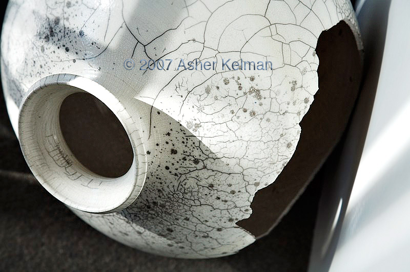
© 2007 Asher Kelman "Reticulated Vase 3"
Canon 5D 24-105 IS L
Bonjour tout le monde!
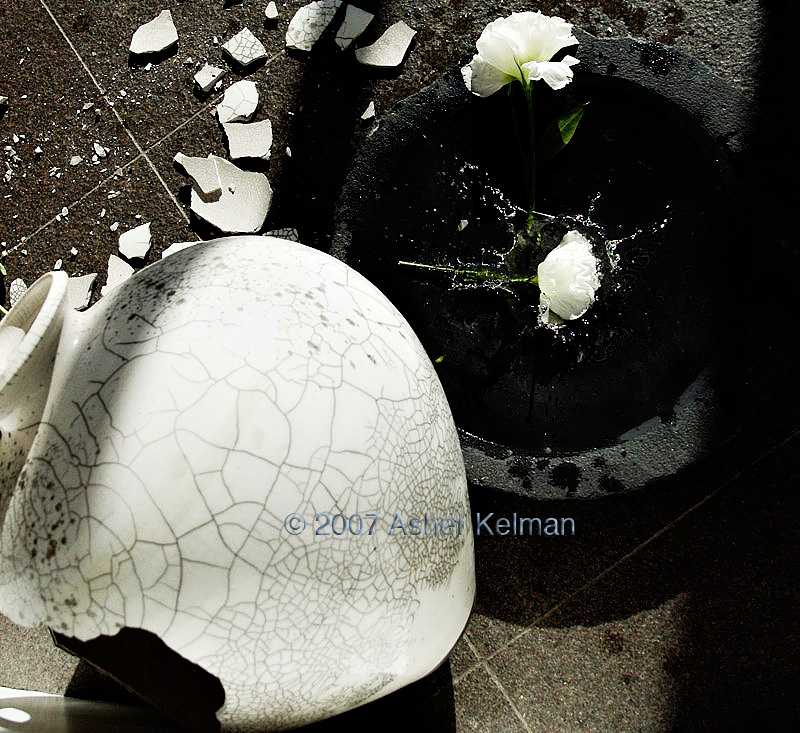
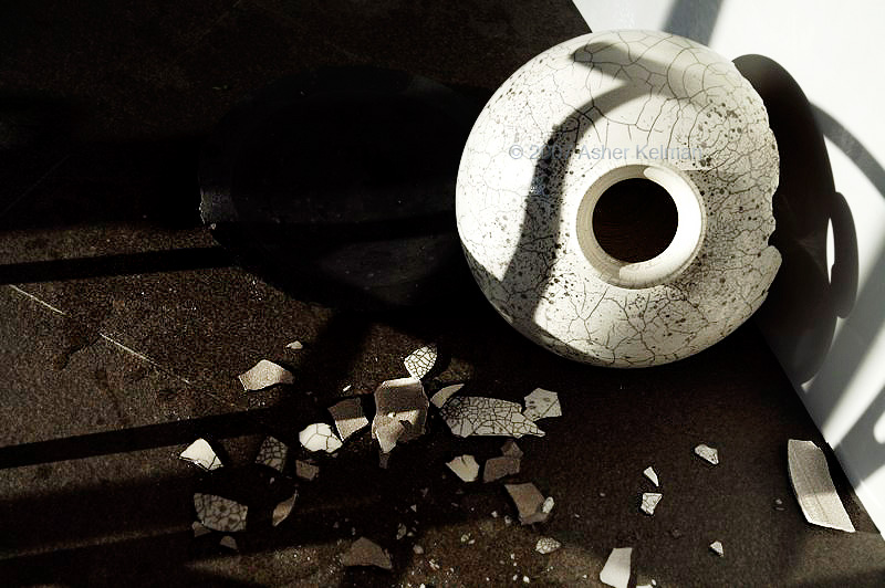
I won't repeat what have been already said, but putting my litlle grain of salt, I would say that I like the first shot for the composition and the feel of the urgent need to shoot it…
But I do like the 3rd shot, for the same reasons as Alain, I would add that the
straight 90°
angled lines of pavement surely add to the drama…
Asher, I know that Wendy will yield at me, but it seems that you have a very good vision and Arc of Intent with broken fine objects!
see there
Broken fine porcelaine and flowers on dark/black floor… hmmm time to see your psy? (kidding of course!)
Good job I like it! I almost "see" you turning and jumping around the crash with your 5D shooting 2500 pics in 1/2 hour (the time needed for Wendy to recover her mind and wipe it all!)
BTW, please, Asher, have your © in a corner and small and white font (Arial is easy and discrete!), it really destroy the image. This very important information (the ©) needs to be known but not right on the middle!-)
Thanks Nicolas, Alain, Jack for your recent comments. It is instructive to me to hear your feelings and thoughts. I just realize I'm concerned with the fragility of life and beauty.
Things break around us all the time, I just react the way I do as I see tragedy that interviews me instead of just "mess" that needs to be removed from sight, like beggars at a wedding feast.
Why did I add a © and name in the center of my pictures? Well this is not something I do. I generally have added my name and © to one edge (unless I choose to use my signature as a component of the composition design which I have done once or twice)/
Here, the pictures are works in progress, but pretty well represent what I will do with the large files. These are for exhibition and I don't want to see them around before I'm ready! So I took the extra bad step of inserting a faded name in the center where it would not interfere with the thrust of the photograph. forgive me, I just became a little over protective this time of my babies!
Nicolas, "I would add that the
straight 90° angled lines of pavement surely add to the drama…" yes, that's what I felt to. Glad it worked!
Alain and Jack, your criticisms are especially appreciated!
Regarding white borders and the "golden mean", yes I struggle with that too. I have already balanced those proportions against the limitations of the composition as it is and the possible ways the subject can be framed. Still I will do better next time. A large format camera would allow better composition for sure. As it is, I am on the floor, leaning over a white card and doing acrobatics so that a LF camera might be good for improving an image but the shot must be discovered first.
Alain Briot "
#3 is my favorite because the image tells a story. I also like the echo of the two round shapes, one black one white, and the white roses in the black shape as well as the black hole in the white vase. There is
inter-relation between the shapes and tones bringing the image together. One could even say that the splash of water echoes the cracks in the vase, creating a comparable pattern."] Right on the mark!
Jack Flesher "#3 doesn't work well for me,
it looks a bit too posed.
I don't immediately see any main subject either; am I supposed to look at the flower splash, the static flower or the vase, and how are they all interconnected?"
Jack, your comments are not out of place either!
# 3 deals with the paradox of beauty and trying to put the clock back. One cannot! It is neither comfortable nor comforting. It's disjointed and yes an attempt at reconstitution of a portion of lost time. But then, that is why it can only be an echo of what was. If it appeared seemless and real, then it wouldn't be act of reconstruction, it would be as real as anything we call real. It seemed to me, therefore that
what's disconcerting about the image is necessary, but then one has to also deal with one's conceit!
Asher

")