• Please use real names.

    Greetings to all who have registered to OPF and those guests taking a look around. Please use real names. Registrations with fictitious names will not be processed. REAL NAMES ONLY will be processed

    Firstname Lastname

    Register

    We are a courteous and supportive community. No need to hide behind an alia. If you have a genuine need for privacy/secrecy then let me know!
  • Welcome to the new site. Here's a thread about the update where you can post your feedback, ask questions or spot those nasty bugs!

Life

Ok, another attempt to awake people ;oP

vueducimetire03150008bipk5.jpg


Made with Minox 35 GT-E and Fuji Velvia 50. Very hard to scan with my low-cost equipment...

Several steps, from foreground to background : sun and leisure, death and rest (cemetery), and - maybe - recycling (thermal power plant).
It's my humour ;o)
 

Charlotte Thompson

Well-known member
Cedric

I do like what your work represents and always I seem to find a cross in them-an underlying theme? maybe not on purpose but here it is again- do you see it just beyond the men- so very interesting! what a great theme for you or series- metaphor for humanity-

Charlotte
 

Asher Kelman

OPF Owner/Editor-in-Chief
Cedric,

The theme is interesting and a great long term project. In this particular picture, I'd look for another photo from this shoot to perhaps add back the full details of the man lying down. If not I'd consider cloning him out altogether so as to leave the one man, representing all of us, to contemplate on our behalf.

Asher
 
Last edited:

Rachel Foster

New member
Cedric, I hesitate to say this, but tough love is the mantra.

I can't find a focal point in this image. What am I to look at? My eyes dart all around. Give my poor, tired old eyes something to settle on........

Because of the focal point thing, it may be easy to overlook the richness of the various components, the lovely colors, etc.

Feel free to dismiss out of hand my comments. It's the photographer's vision that matters in the long run.
 

doug anderson

New member
Cedric: if the man were in the lower left or right hand corner, I would experience this something like I experience dynastic Chinese painting where the landscape is the subject and the human being a humble addition -- very Taoist. But with the guy in the center, I don't quite know what I'm supposed to look at first.

I love the skyline, by the way. There's something heroic about this lone character against it.
 

Dierk Haasis

pro member
I rarely do this but I was in a mood. I could only do two things since I worked with the JPEG above: crop and retouch out a speck in the sky. I'd have liked to work contrats, colour, possibly use a b/w rendition.

OPF3rdcrop.jpg
 

Asher Kelman

OPF Owner/Editor-in-Chief
Cedric,

Pay them no mind! I like the image just double the sky!

Remove the other guy.

Asher

Also from a friend in Boulder Co


A lot of the trees low contrast, dominates the picture. The key areas are not strong. There are a few elements that reminds me of a Japanese woodcut artist,

arayu-shiobara.jpg

Arayu Hot Springs in Shiobara by Kawase Hasui, 1920 Source.

So as you see, the composition is wonderful and well thought out. Your picture implies that this is the kind of journey you work might take. So if that is true, you might consider making the picture narrower and add sky so that the image is vertical.

Norman Kpren
 
Last edited:

doug anderson

New member
I rarely do this but I was in a mood. I could only do two things since I worked with the JPEG above: crop and retouch out a speck in the sky. I'd have liked to work contrats, colour, possibly use a b/w rendition.

OPF3rdcrop.jpg

Dierk:

That's more like it. Unfortunately, it leaves out part of the intimidating cityscape. It demonstrates the compositional point though.

D
 

Dierk Haasis

pro member
Since Cedric told us his intent, you have the rare opportunity to read my opinion on other peoples pics. As I wrote earlier - and to two members in private on different occasions - I am not a great fan of "critiqueing". Not least because photographers, like film makers [i.e. Lee vs. Eastwood] and writers, just take their view and declare it better than the other one's. Usually in polite wording.

To Cedric's intention and photo. The basic problem is, as several of us pointed out, the composition, which does not help the viewer to get a grip. Is it meant to be a Voyages du Vie? Or a sarcastic look on landscape as humans transform it? Could also be a celebration of how humans conquered the world. Or an Etude on Eastern Asian art. Is it about tranquility, in which case the original crop is better than mine, or shall it show an area of conflict, stress, some kind of tension?

Doug likes the cityline though that wasn't mentioned by Cedric, who stressed the factory-like structure. Equally lessening the impact is that we need to take Cedric's word on the cemetery; I cannot, for the life of me, discern this edifice as a cemetery. The sitting human's small size, OTOH, I like a lot, as it puts Homo sapiens within a context he rarely likes: humbled by the environment.

Not sure about the second guy. Whenever I take him out of the picture I want to put him back in, then take out the sitting man. All three possibilities do work. Contrary to the air perspective, the slight blue haze in the background lowers colour contrast for the artificial landscape considerably, sucking it out of the picture, dwarfing it behind the overwhelming greens of the shrubs.

The firs and shrubbery are overwhelming even with my crop, not in a good way. They just burden the image without having any point to them, they aren't a symbol, nothing metaphorical. They are just there. It definitely cries out for a b/w rendition, most probably with high contrast - and I don't say that because I've lately started a b/w "series" within 366Foto.

One last point on the composition, it's hard to get it right after the fact, as Doug's criticism of my crop shows. The three main structures, as intended by Cedric, are in a straeight vertical line. Regardless of where you crop out vegetation , where you position the humans [left or right], you will invariable end up with a non-stress pic. Not necessarily a bad thing, tranquility is used too sparingly in photography since the Spanish Civil War.
 

Asher Kelman

OPF Owner/Editor-in-Chief
And there you have it! It's so subjective, this "art" thing, that the artist must stay true to his/her own vision.

Subjective? Not good enough, Rachel. This is a sort of cop out. I think that although we ask the right questions we just may not know the answers. That's not the same as it all being subjective.

We just do not have enough objective information and Cedric is as yet still working on his intent and how to express it.

Asher
 

Dierk Haasis

pro member
Asher, that's nonsense. Cedric told us of his intent, the [re-]cycle of life. In his comments, he expressly pointed us to the three things in the image he wanted to connect. Which is why I was able and willing to come up with my take on the picture.

Clearly art is subjective. In the first step it is about the subjective view an artist has, then it comes to the viewer, who likes a piece or not. Totally subjective. Third step is trying to find out why one likes or dislikes a piece. Fourth step is to find out why something one likes does not work - or the other way round, why don't I like it it though it seems to work. Hence, the adage, 'Art is in the Eye of the Beholder.'

In this specific case we do have all the necessary information to help Cedric out so he can try it again.
 
Well, i'm glad to see all these reactions about my picture. Very interesting comments, a lot of sense-full questions...

However, if i had to take this photo again, i would shot exactly the same ! In fact, i tried many things about this place which is near my office : BW pictures, classical composition using thirds, etc. But this one is the best attempt i made to express my vision.

Charlotte is true, as i have a more global project for several months, which talk about human condition in cities and relationships with our environment and nature.

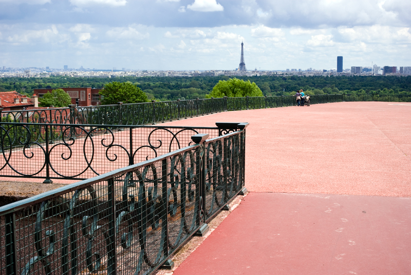
For instance, this is another picture linked to this project :

esplanade-de-sure...-print-a4-3632dc.jpg


You can retrieve same themas and global composition in this second one.

Concerning the first image, "Life", my choices were the following :
- colour to produce saturated and artificial landscape (thanks Velvia 50 !), and to evoke poor urban environment where we live
- horizontal layers and entirely sharp image, without focus point, with "diving view", to produce a flat and undimensional view, as flemish painters did (Brueghel Elder ie)
- very small man, overhelmed by majestic and quite threatening vegetation (another example below)
- centered man, cemetery (which hard to discern on this small-sized web picture) and plant, to create geometrical effect and malaise

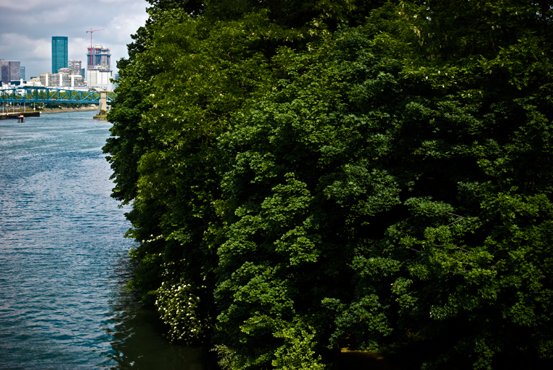
This is another picture about presence of nature in urban environment and the ambiguous feeling we have about it (we like nature but we struggle against it for millenaries) :

le-bosquet-a4-3afa94.jpg


I also used artificial colours, but i am not satisfied yet with this version... Too much blue buildings i think...

Finally, i have still months to work before te be able to finalize my project...
 
Last edited:

Rachel Foster

New member
And there you go! Subjective in that the viewer --- each viewer --- and the artist will have different perceptions. I find the third by far the most compelling and "like" it a great deal. I like the composition because it "pleases" me. Does it convey the photographer's "message?" Likely not...but I "like" it.

The artist/photographer must please him/herself first. That's what I've learned since my venture into the world of "art." The artist/photographer may never become "good" in the eyes of others (this does NOT apply to you, Cedric, this is generic in the broadest sense of the word) but if the artist doesn't follow that inner vision, s/he becomes more and more like a xerox machine.

(So saith the New Kid on the Block!)
 

Michael Fontana

pro member
Cedric

isn't there a bit a intention of a second look/vision?

To show the cities "on their own", its urbanisme, the "absence" of human in these huge humanbuild structures, by bypassing the viewers expectation to see the Eiffel tower from le champs de Mars, and making other things, like a tree, more prominent?

I get that feeling from the first and third pict.

Talking about art: Kinda Jeff Wall, whithout the arrangement of people?
 
isn't there a bit a intention of a second look/vision?

Hum, i don't really understand your question... Do you tell this about differences between my first explanations (joke about life cycle) and my final ones (urbanistic project) ?

Talking about art: Kinda Jeff Wall, whithout the arrangement of people?

Indeed, i really like Jeff Wall's vision. I remember a fantastic photograph by him, i think it's called "the arrest" or something like that, which shows a large suburb picture, taken from the top of a hill, and where you can see in the middle a very little character who is being fighting policemen who are coming to arrest him. When you first look at this picture, you only see a nice urban landscape with a wonderful light, but, suddenly, you find this very little detail which gave the picture all its sense.
 
I like the composition because it "pleases" me. Does it convey the photographer's "message?" Likely not...but I "like" it.

By the way, i think there's not one truth in art : author wants to express something and sometimes viewers are feeling something else, totally different but as deep as original idea. That's what's magic in art ! ;)

I think quality of a picture is sometimes to have richness enough to deliver various "messages" to people.
 

Rachel Foster

New member
Yes, Cedric, I agree with that. I think a work of "art" will mean many things to many people and that, for me, is part of its magic.
 

Michael Fontana

pro member
Hum, i don't really understand your question... Do you tell this about differences between my first explanations (joke about life cycle) and my final ones (urbanistic project) ?

No, just looking at the pictures (I don't like to read about images but to look at them, but that's another story) and found it sort of °deuxieme regard°:

Pointing at the underpart, so not the arc de Defense, etc, but a rubbish bin in front of it might have the same importance... so not the classical hierarchie of the main object...

Indeed, i really like Jeff Wall's vision. I remember a fantastic photograph by him, i think it's called "the arrest" or something like that, which shows a large suburb picture, taken from the top of a hill, and where you can see in the middle a very little character who is being fighting policemen who are coming to arrest him. When you first look at this picture, you only see a nice urban landscape with a wonderful light, but, suddenly, you find this very little detail which gave the picture all its sense.

Yes, the eye floates in these images; Jeff Walls' images are highly casted, whithout looking so.
And they have examples - des modèles - in art history.
 

Michael Fontana

pro member
Yes, Cedric, I agree with that. I think a work of "art" will mean many things to many people and that, for me, is part of its magic.

That's the case, when the piece of art is still "open" to the viewer - his sensitivity and understanding, etc.

The opposite would be overcoded, or didactic, e.g. using a non-visual language.
Then, the magic is gone.
 
Michael,

I am very pleased of your remarks because i effectively aim to have this double meaning and "regard décalé" in my pictures and it is not easy to get. Thank you.
 

Michael Fontana

pro member
Cedric

interesting: the "regard décalé" was much easier to see in the picture, than to translate it in words ;-)

Edit:
Off course the "regard décalé" shows up better in a serie, than a single image. In a single image, it might look like beeing a coincidence, but the serie makes it clear.


So the first image is better uncropped, because it has this ambiguity.
 

Charlotte Thompson

Well-known member
Cedric

ah a lot of replies so your art is making one think-excellent
I think chopping the picture in half does absolutely nothing for the expansive meaning you have going on-
I like it full picture with regards to its meaning- and series
keep on going with your metaphor life series- I like the perspective

Charlotte
 

Rachel Foster

New member
I was just thinking about how many "what is art" threads I have seen....and how this image has sparked a discussion that is better and more fruitful than many of those.

Well done!
 

Michael Fontana

pro member
Rachel, you' re correct, making only big theories on art is boring.

Therefore, some images to understand better how J. W. works:

Here's what seen in the galerie/museum: Man with a rifle, 2000, 226 x 289 cm.


J_Wall.jpg


Somehow instaneous, spontaneous-looking, it was composed from 8 shots, 4/5'; just showing 4 of them for better comparison:

JF_slides.jpg


I hope its ok, to have it reproduced from "Jeff Wall, Catalogue Raisonée, 1978 - 2004, and Camera Austria, 82/2003 - Asher?

Jeff Wall states about that work : ......if you look at the pieces that were assembled to make "Man with Rifle" I think its clear, that all of them are instances of straight photography - except the performance of the riflemen ...... A blend of the accidental and and the non accidental"......

Cedric has a very different approach, as he uses no composing; straight and with that blend - I presume - to, but all in one shot.

To make it clear: I'm not saying, Cedric is copying J. W.
This thread made me looking at the J. W's catalog again, and working out a bit the difference between the two - apart from the work's price ;-)
 

Asher Kelman

OPF Owner/Editor-in-Chief
Asher, that's nonsense. Cedric told us of his intent, the [re-]cycle of life. In his comments, he expressly pointed us to the three things in the image he wanted to connect. Which is why I was able and willing to come up with my take on the picture.

You already wrote something more detailed than "the [re]cycle of life"!

To Cedric's intention and photo. The basic problem is, as several of us pointed out, the composition, which does not help the viewer to get a grip. Is it meant to be a Voyages du Vie? Or a sarcastic look on landscape as humans transform it? Could also be a celebration of how humans conquered the world. Or an Etude on Eastern Asian art. Is it about tranquility, in which case the original crop is better than mine, or shall it show an area of conflict, stress, some kind of tension?

The nature of his vision are to us not subjective. We do just not have any of these facts! We believe that cedric did/does indeed have a set of ideas and imperatives that informed him in making this image. So likely one or more of the purposes you proposed (or even other one's we have not as yet imagined, are objective as long as he can truly provide them. These and the details of the photograph are all facts. In that case, what he presents is an objective package of components.

From there we can then have both objective and subjective comments.

Clearly art is subjective.

My comment is that that common statement is in itself and alone insufficient to describe art and, in particular, Cedric's work.

There are many additional facts at play that we do not have information of at present.

So while the statement "Art appreciation is objective" is likely always false, so is the opposite. Yes both would be nonsense!

Here's an easy example of objectivity embedded in our appreciation of art. Discovering, appreciating and disclosing the fact that one artists work is an homage to a previous work is objective but requires the knowledge to fit the things together in a pattern of lineage. That "inheritance" is a fact whether disclosed, recognized or understood or not. In a critique, pointing this relationship out is not merely subjective. That is simplistic and dismissive of one important component of our evaluation of art and establishing relevance and value. The problem here is that we do not as yet know all the rules and references we find in common to be embedded in what we choose to do. Of course only some works of art have reference to know or even hidden motifs, lineage or innate symbols. Still, the recognition of elements and patterns is not merely subjective.

Asher
 
Top