PDA

View Full Version : Approaching the flower with a dark background: how it might work?


Asher Kelman
July 23rd, 2008, 01:24 PM
We slipped into this subject by chance in the popular thread of "Flowers By The Wayside".

http://i183.photobucket.com/albums/x153/annieblues/opf/hfwmpn.jpg

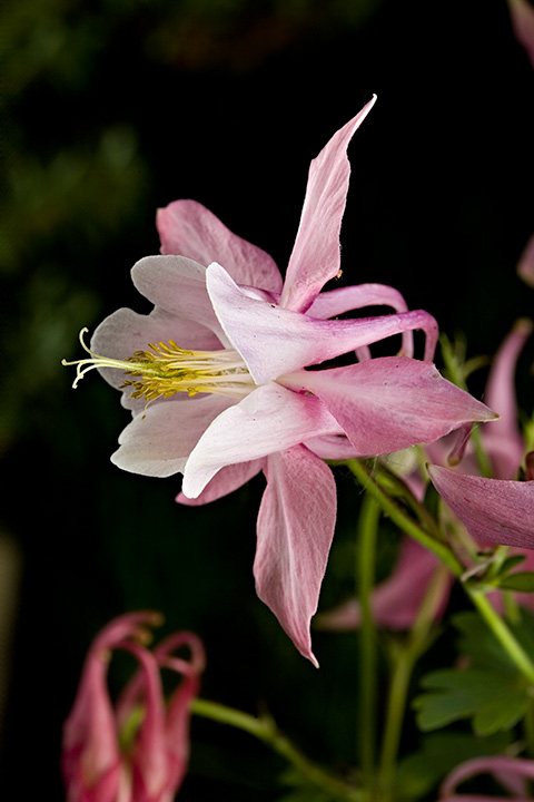
Hard working and dedicated Rachel Foster presented this well taken picture for critique. I had major reservations about the stark black background. She is sporting and tolerates even my harshest feedback. She has voiced no complaint at all neither publicly or privately, at least not to me, LOL)! Still, was I correct or just blasting off with an opinion unanchored in any sound values?

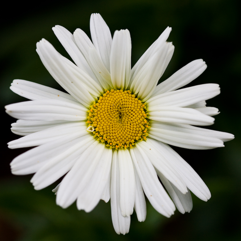
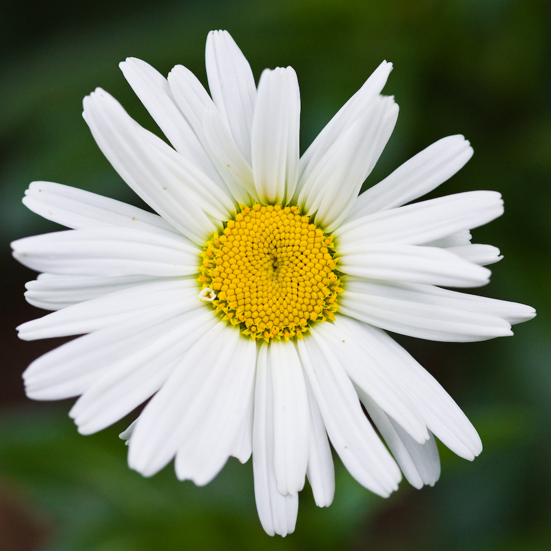
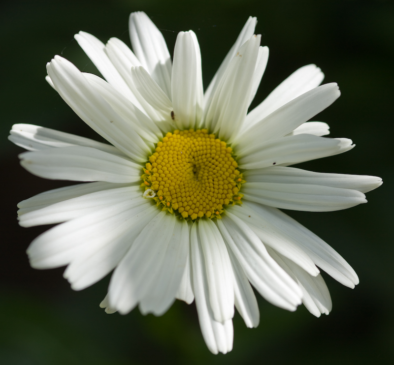
Well there followed a number of other flowers with such black or very dark backgrounds and now both Michael and Nathaniel have asked for further feedback. Remember, this evaluation is for me as much an enquiry as a set of opinions. Having said that let's go!

Asher

Asher Kelman
July 23rd, 2008, 01:26 PM
I looked back at James Newman's pictures in post # 62 and did not have an answer as to why Rachel's photograph seemed wrong to me. In what way were James' flowers working better for me?

Then came Mike Shimwell's single white flower on a black b.g.

http://farm4.static.flickr.com/3039/2664794683_d057092d1a_o.jpg

At first look I found the picture attractive but it failed to move me beyond that. Then the same photo was presented brightened. i

http://farm4.static.flickr.com/3050/2669169936_941b73e9db_o.jpg

It came alive.

Well what happened? With irony, I must now admit that the original rendering of the flower had an extra feature that only is revealed to me on further inspection. It's subtle. There's one extra folded petal, albeit tiny on the left lower edge of the yellow central round platform. This one tiny asymmetry makes the eyes lock on the flower and appreciate the outstretched petals, as outstretched arms welcoming the visitor.

The extra brightness of the lighter version makes the distinguishing small little petal discernible. The 2cd version is more impressive and now with this information going back to thew original with the blacker background, it has become more important!

I must admit my hypothesis that brightening the flower alone, leaving the b.g. black and locally sharpening the extra tiny white petal might be even more impressive.

If you follow my critique and concur, we can see that blackness alone for the background does not, in itself, ruin an otherwise compelling photograph!

Asher

Asher Kelman
July 23rd, 2008, 02:02 PM
Asher,

Here is another one with a black background. Perhaps you would be so kind as to crtique this one too. Perhaps you can expand your thoughts on the black background by comparing with the original of Mike Shimwell. In this case, I was trying for a black background, expecting that it would be a good choice by enhancing the contrast and lighting.

http://www.bytephoto.com/photopost/data/500/1328IMG_8660-Edit.jpg

Hi Nat, Mike, Rachel and James,

So what is the significance of a very dark to black background. The dark does allow the mind to create possible presence using signals from the rest of the picture or collection of images presented to the viewer.

Using pure black(or white) as a background for flowers serves well for catalogs of flowers. Also for stock photography, the image can be more easily used in composites with little editing.

So how are things working here with your picture Nat?

This one is exceptional since there are so many extras. The illumination from behind adds a zing of life to start us off. The movement of the flower from the right and presentation almost as an invitation, the mouth of the flower, the asymmetric powerful position of the insect, and the path to the pollinating center of the flower all add strong symbols which reverberate with many innate and cultural imperatives and preferences as well as a body of art.

The black b.g.? It is shrugged of as dark space behind a picture of mother earth! It cannot harm this powerful picture. Further, there is little that could be added in the b.g. that would improve and not degrade the picture's impact.

The black background is the infinite milieu of less importance in which this magnificent flower celebrates so many things.

A lot of superlatives, yes I admit it's a bit overboard. Still, even dividing my excitement by a power of 10, it still comes out as impressive despite the black background which, here, INMH, make the picture work and help recruit our attention to everything happening in fornt.

Asher

janet Smith
July 24th, 2008, 12:38 AM
http://i196.photobucket.com/albums/aa318/JanGlenelg/IMG_0033ss.jpg

This was taken outside with a very dark hedge as a background, I think it works...

Asher Kelman
July 24th, 2008, 01:23 AM
Yes it does, Jan!

It works very well, but why? It has one thing in common with Nat's flower. It has movement coming in from the side. Its swept back petals, albeit rather dried, add to this sense of movement. A little more of the pollinating platform pointing towards us might perhaps be even stronger.

These extra features add parameters that do not truly belong to the flower. It does not present itself to us as might a female primate in heat to the male. Still, our mind subconsciously can find a boost from such a connection or perhaps in this case of a witch flying past on a broomstick. The sense of position, textures and movement allows us to exercise our imagination. so the photograph of just a flower can become more than a semblance of the subject. It can be a framework to play with our own fantasies.

By contrast, a still drab flower against a black background falls back into the page and is rather inconsequential and we might pay no great attention at all.

So black, when it works as it does here, replaces nothing as nothing is needed. Black might also work in other ways by hiding things and this raising questions, but not here! We do not ask "What's missing?" or else "What else is hiding out there? Rather we want to know more about the "flower" or what it might represent. Often the questions relate to the dominant metaphor of all life and destiny: "What is it doing?", "Where is it going", "Where did it come from" and What happened before it came here to fly past us?"

When a picture makes us ask such questions, art has arrived too and the image breathes at us like a dragon with fire from its nostrils! Art lives and I believe that is an essence common to all art. Art inspires an interview, an intercourse with us and perhaps a long time bonding.

Asher

janet Smith
July 24th, 2008, 02:28 AM
So black, when it works as it does here, replaces nothing as nothing is needed. Black might also work in other ways by hiding things and this raising questions, but not here!

Hi Asher

I agree with everything you've said, so eloquently as always.

This shot loses nothing by the lack of background, but I agree strongly with you that black can often be used as a way of hiding things, and is something I am mindful of. Interestingly I was informed by an agency specialising in flower photography, that black/dark backgrounds don't sell as well. As a consequence I used white backgrounds on some and will be doing some more, once I've finished processing all the landscapes I brought back from the Hebrides!

Thanks for your thought provoking comments Asher, very much appreciated.

Nathaniel Alpert
July 24th, 2008, 07:53 AM
Hi Nat, Mike, Rachel and James,

So what is the significance of a very dark to black background. The dark does allow the mind to create possible presence using signals from the rest of the picture or collection of images presented to the viewer.

Using pure black(or white) as a background for flowers serves well for catalogs of flowers. Also for stock photography, the image can be more easily used in composites with little editing.

So how are things working here with your picture Nat?

This one is exceptional since there are so many extras. The illumination from behind adds a zing of life to start us off. The movement of the flower from the right and presentation almost as an invitation, the mouth of the flower, the asymmetric powerful position of the insect, and the path to the pollinating center of the flower all add strong symbols which reverberate with many innate and cultural imperatives and preferences as well as a body of art.

The black b.g.? It is shrugged of as dark space behind a picture of mother earth! It cannot harm this powerful picture. Further, there is little that could be added in the b.g. that would improve and not degrade the picture's impact.

The black background is the infinite milieu of less importance in which this magnificent flower celebrates so many things.

A lot of superlatives, yes I admit it's a bit overboard. Still, even dividing my excitement by a power of 10, it still comes out as impressive despite the black background which, here, INMH, make the picture work and help recruit our attention to everything happening in fornt.

Asher

Asher,

I am not sure I am following you in your analysis, in general, of why a black background supports or detracts from the subject. In the specific case of my submission, I am not convinced that any other approach will work as well. It simplifies the design and concentrates our attention; it is not distracting. The image as captured had distracting elements which I cloned out in photoshop and I darkened the background further to yield the image shown here. I used the transmitted light as an animating element. You seem to be saying that the black background works in this case, but it is the exception that proves the rule. There must be a more comprehensive overview of this sort of composition that could guide us, more than black is not usually a good way to go.

-Nat

Asher Kelman
July 24th, 2008, 08:38 AM
Asher,

I am not sure I am following you in your analysis, in general, of why a black background supports or detracts from the subject. In the specific case of my submission, I am not convinced that any other approach will work as well.
As an artist, Nat, you recognized all the properties of the flower which gave it life. Given that power, you knew instinctively you had a winner.

It simplifies the design and concentrates our attention; it is not distracting.

That's what I wrote. But only after saying what it did not do.

The image as captured had distracting elements which I cloned out in photoshop and I darkened the background further to yield the image shown here.
That reinforces my idea that you knew that the flower itself was the entire balanced object, needing no other element to make it work.

I used the transmitted light as an animating element.

That I recognized in the very first comment.

This one is exceptional (meaning as a picture of a flower, not an exception to any function of blackness of b.g.) since there are so many extras. The illumination from behind adds a zing of life to start us off. The movement of the flower from the right and presentation almost as an invitation, the mouth of the flower, the asymmetric powerful position of the insect, and the path to the pollinating center of the flower all add strong symbols which reverberate with many innate and cultural imperatives and preferences as well as a body of art.

The black b.g.? It is shrugged of as dark space behind a picture of mother earth! It cannot harm this powerful picture. Further, there is little that could be added in the b.g. that would improve and not degrade the picture's impact.

The black background as the "infinite" milieu is not at play here. Black just serves to remove distractions, isolate his magnificent flower that celebrates life with so many powerful features that no other elements are needed.

You seem to be saying that the black background works in this case, but it is the exception that proves the rule.

Nat, the word exceptional was used as your flower is exceptional as in "remarkably unique" not as an exception to what commonly occurs! Rules? We have no rules as yet, we are exploring case by case where we can see that black works.

There must be a more comprehensive overview of this sort of composition that could guide us, more than black is not usually a good way to go.


That Nat, I'd love to see!

Asher

Mike Shimwell
July 24th, 2008, 03:38 PM
I'm enjoying following this and looking through my set - which doesn't really bear comparison to Nat and Janet's work I think - I preferred the last one I posted. This had brighter petals and retained a fairly dark background that is the tresult of a dark hedge behind the flower. It is of course a different frame and one petal is differently placed too:

http://farm4.static.flickr.com/3072/2668350711_2a930d100a_o.jpg

This has the brighter petals, but not so much that the 'curl' is lost and a lovely softness as the focus slips away. Any thoughts are welcome:)

Just to add another with a dark background, this next one is over a year old when I first picked up the 100. There was a lot of PS work on this to darken the background and bring out some texture in the petals etc, though this may not be the final print version...

http://farm4.static.flickr.com/3149/2699911722_3f6e90b901_o.jpg

Again, I will be interested in your analyses.

Janet, great stuff. My wife thinks it great too.

Mike

janet Smith
July 24th, 2008, 11:49 PM
Janet, great stuff. My wife thinks it great too

Hi Mike

Thank you and your wife too, here's an Aquilegia of mine, looks like the same variety as yours I think.

http://i196.photobucket.com/albums/aa318/JanGlenelg/IMG_0034SSA.jpg

Bart_van_der_Wolf
July 25th, 2008, 04:27 AM
Hi Mike

Thank you and your wife too, here's an Aquilegia of mine, looks like the same variety as yours I think.

Great shot, the lighting makes the difference. You might want to clone out the flower in the background, it pulls the attention away (and out of the image since it is cropped by the edge of the image). Can the highlights be salvaged?

Bart

janet Smith
July 25th, 2008, 07:42 AM
Hi Bart

I did wonder about cloning out the flower in the background, but decided to leave it, in retrospect I think you could be right, I might have a go later...... yes the highlights should be OK.

Thanks for commenting, I always appreciate feedback.

Nathaniel Alpert
July 25th, 2008, 11:48 AM
Hi Jan,

I agree with Bart about cloning out the ones in the background. And doesn't that take us closer to the black background? On another point, and I think this goes back to another thread where we discussed the lighting of these shots. While no doubt that this is a good shot, I think the high contrast and the petals trailing back, on the left side, draw attention away from the central part of the subject. Nothing to do about it, other than having the pleasure of trying once again :-).

-Nat

Asher Kelman
July 25th, 2008, 12:44 PM
Just to add another with a dark background, this next one is over a year old when I first picked up the 100. There was a lot of PS work on this to darken the background and bring out some texture in the petals etc, though this may not be the final print version...

http://farm4.static.flickr.com/3149/2699911722_3f6e90b901_o.jpg

Again, I will be interested in your analyses.

Thanks for permission to mess with your flower and identifying it for us. So it's an aquilegia. Maybe Janet can add more to that? :) I have removed the distracting elements and replaced them with black for the examples below dealing with black backgrounds.


Nathaniel,

You ask for a more comprehensive work on dark backgrounds. So far, I merely have my own thoughts to share and these are still being field tested!

Blackness in the b.g. has been a subject I'm now thinking more of. At present I am seeing how important no information can be. I have assembled my current general ideas about black space. These thoughts are not limited or unique to flowers. Some possibilities might more easily apply to scenes with humans or animals or machines.

It's application here to making our pictures of flowers more or less impressive is to provoke additional ideas and points of view.

So far I see the following 3 overlapping but clearly different possibilities so far.

In general, the amount, shape and position of darkness in relation to the flower might move our thoughts far beyond the idea of a flower the likes of which the picture shows. So is the picture just about the flower. This is what the black as lack of distraction, emptiness, cloaking of possibilities and more might do to our photographs of what is after all just one flower we happen to have given attention to.


The darkness merely isolates the flower: There are no distractions. However, the flower must now function on its own. The darkness itself draws only minor attention to itself. Rather, the presence of the flower is enhanced and the bloom appears more 3 dimensional.

http://opfora.com/2007_OPF_AK/Mike_Shimwell/2699911722_flower_close.jpg
© Mike Shimwell


The proportion of darkness is so great that it is noticeable, is a key design element in itself: The blackness is not merely a "case" to surround the flower. The empty space itself has become a new un-ignorable compositional element. This now contributes. In fact the flower alone with less around it, might be less impressive.

The configuration of the negative space might provide "graphic design" balance, an opposing thematic subject or set of evoked responses which the viewer has to reconcile with the image of the flower. Maybe it cloaks another matter or an impending action or suggests qualifications of how we think of the flower. These possibilities depend on the placement, color, posture, lighting, display and identity of its presentation.

http://opfora.com/2007_OPF_AK/Mike_Shimwell/2699911722_Large black.jpg
© Mike Shimwell


The shape of the darkness creates a possible viewing portal: Thus we are encouraged to look beyond the flower and imagine what's around and beyond it.

Asher Kelman
July 25th, 2008, 02:10 PM
The extent of blackness can have a profound effect on the image:

First the original:

http://farm4.static.flickr.com/3149/2699911722_3f6e90b901_o.jpg
© Mike Shimwell


http://openphotographyforums.com/2007_OPF_AK/Mike_Shimwell/2699911722_3f6e90b901_o_limited crop.jpg
© Mike Shimwell

Then the limited increase in empty space; enough to isolate and put attention to the blooms on the right. Here we are still left with a sense of a tangled group of individuals. Imagine, perhaps "gang associates" or "friends" of the main bloom!

Evaluate the more complete clean up of distractions. Is it as effective?

http://openphotographyforums.com/2007_OPF_AK/Mike_Shimwell/2699911722_flower_close.jpg
© Mike Shimwell

In this instance, to me at least, the careful removal of everything distracting from the principle subject degrades the interest of the picture. After all, we would like the work to draw us back and then we can have a fresh experience since we never found all the answers the first time.

So it might be that for pictures like this, more than a certain amount of emptiness boils the subject down to a less rich form.

Asher

Nathaniel Alpert
July 25th, 2008, 06:56 PM
Hi Asher,

You have provided an interesting exercise in the psychoanalysis of a picture and its background. Though it may not be optimal, rendering the background black, seems to make a profound difference. Though the major elements are the same, my responce is quite different. With black, I am aware of seeing the blossom more clearly.

I was particulalrly interested in my responce to the negative space,


I'm still having trouble formulating a "rule of thumb."

-Nat

Asher Kelman
July 25th, 2008, 08:17 PM
Hi Asher,

You have provided an interesting exercise in the psychoanalysis of a picture and its background.
Thanks, Nat!

We have to identify even more possibilities and constraints!

Though it may not be optimal, rendering the background black, seems to make a profound difference. Though the major elements are the same, my responce is quite different. With black, I am aware of seeing the blossom more clearly.
Try more than one flower, then you might start to get interesting conditions.

I was particulalrly interested in my responce to the negative space, Your response to negative spaces of different size or importance relative to the main subject?

Asher

Asher Kelman
July 25th, 2008, 08:18 PM
I'm still having trouble formulating a "rule of thumb."

It would be this.

1. There are 4 kinds of negative space: infinitely void, a portal to possibilities in that space, a portal to possibilities elsewhere and lastly solid!


The infinite void: If an object is photography with good dimensionality and there is a lot of interest, color, texture shapes and more to make the eyes keep moving and finding more, then a scant black background will add power. The black signifies emptiness, nothing at all and does not call attention to itself.

http://farm4.static.flickr.com/3039/2664794683_d057092d1a_o.jpg
© Mike Shimwell

Here the black is empty and one could fall through it and couldn't strike it with a hammer.


A portal to occult or latent possibilities in that space: Simply put, the lights are out. The space is not necessarily empty at all. Rather it could contain whatever one's imagination might allow in the presence of the lit subject of the picture. Activity could be past, current or pending, good or bad, deserved or not, random or with design.


A portal to possibilities elsewhere: A portal to any or some set of time or space and possibility. A typical example would be the alluring shadow between the partially covered breast. This cleavage is considered "sexy" and mysterious. But what's going on. If we examined the area with a flashlight one would be disappointed at the lack of any thing revealed, just ordinary skin. With the area in deep shadow, however, some magical portal is created which could lead to some fantastic, exhilarating sensual experience.


Solid: Especially if the lighting on the subject is flat and the image is not so demanding, black may work by providing another design element. So the black emptiness is filled with a black substance and so becomes an "entity", it's not just "unimportant emptyness". The empty space becomes positive space as if one could bang a hammer on its surface.


Because of these conflicting functions of black, one should think about what one want: a coating of nothingness, a treasure, pile of bills or danger hidden by the dark or a just a solid block of carbon?

2. Black should not be over-used.

http://opfora.com/2007_OPF_AK/Mike_Shimwell/2699911722_3f6e90b901_o_limited crop.jpg
© Mike Shimwell

For some flowers there may be sufficient interest and innate activity that the more one removes beyond the flower, the clearer the subject will appear to be. The identity is reinforced. However, for this particular photograph that might be a problem. Notice this photograph has not been made devoid of relationships and presence of life. Beware that continuing to remove all secondary "distracting" objects might make the flower you love appear to stark and dead.

3. Add streaks or other elements of color to the black space to contrast with or complement* the flower.

http://farm4.static.flickr.com/3054/2680136661_7c820a0272_o.jpg[
© Allen Maestas "New Mexico Wildflower"

* Bart's wrote post #91 here (http://openphotographyforums.com/forums/showthread.php?t=2498). "excellent use of complementary colors"


Asher

Bart_van_der_Wolf
July 26th, 2008, 08:06 AM
* Bart's wrote post #91 here (http://openphotographyforums.com/forums/showthread.php?t=2498). "excellent use of complementary colors"

Yes, in fact I said a bit more ("You've made excellent use of complementary colors in your composition"). The color which is already a compositional element by itself, and the (golden section) placement are carefully combined into something more, synergy! The fact that there is some structure in the background augments the shape of the flower at the chosen angle.

Black alone loses one potentially important element of a composition, leaving only shape/position. That could be enough, but is probably not as powerful as it can be.

Bart

Asher Kelman
July 26th, 2008, 08:40 AM
Yes, in fact I said a bit more ("You've made excellent use of complementary colors in your composition"). The color which is already a compositional element by itself, and the (golden section) placement are carefully combined into something more, synergy! The fact that there is some structure in the background augments the shape of the flower at the chosen angle.

Black alone loses one potentially important element of a composition, leaving only shape/position. That could be enough, but is probably not as powerful as it can be.

Bart
Bat,

Thank,s once again, for joining the ideas on black to the well examined classical framework of the total composition. Interestingly, the addition of color to the extensive black background in Allen Maestas "New Mexico Wildflower", still maintains the feeling of infinite space. The flower, and its powerful position creates a sense of beauty and the dark holds no fear for us, perhaps just mystery.

So there is still much more to think about black backgrounds and the signals that might make it risky or even solid. Here there is perhaps, because of the creative use of color, a diffusion of the positive mood through all reaches of the negative space.

Asher

Bart_van_der_Wolf
July 26th, 2008, 08:59 AM
..., here's an Aquilegia of mine, looks like the same variety as yours I think.

http://i196.photobucket.com/albums/aa318/JanGlenelg/IMG_0034SSA.jpg

So there is still much more to think about black backgrounds and the signals that might make it risky or even solid.

That's why (in addition to the non-frontal lighting) I like the basis of Jan's above image. After cloning out the distracting background flower, there is a number of green 'rays' seemingly emanating from, or directing attention to, the main subject. The background is functionally dark, not black. That strengthens a centrally placed composition. That's also why the highlights need to be recovered, nothing should distract.

Bart

Michael_Stones
July 26th, 2008, 04:42 PM
I looked back at James Newman's pictures in post # 62 and did not have an answer as to why Rachel's photograph seemed wrong to me. In what way were James' flowers working better for me?

Then came Mike Shimwell's single white flower on a black b.g.

http://farm4.static.flickr.com/3039/2664794683_d057092d1a_o.jpg

At first look I found the picture attractive but it failed to move me beyond that. Then the same photo was presented brightened. i

http://farm4.static.flickr.com/3050/2669169936_941b73e9db_o.jpg

It came alive.

Well what happened? With irony, I must now admit that the original rendering of the flower had an extra feature that only is revealed to me on further inspection. It's subtle. There's one extra folded petal, albeit tiny on the left lower edge of the yellow central round platform. This one tiny asymmetry makes the eyes lock on the flower and appreciate the outstretched petals, as outstretched arms welcoming the visitor.

The extra brightness of the lighter version makes the distinguishing small little petal discernible. The 2cd version is more impressive and now with this information going back to thew original with the blacker background, it has become more important!

I must admit my hypothesis that brightening the flower alone, leaving the b.g. black and locally sharpening the extra tiny white petal might be even more impressive.

If you follow my critique and concur, we can see that blackness alone for the background does not, in itself, ruin an otherwise compelling photograph!

Asher

Very quick comment because I'm away on a trip. Lightening the second picture also lightened the background. On a LAB luminosity scale, average blurring with the first picture gives a background value of 5 and a flower value of 79; with the second picture, the corresponding values are 20 and 87. Maybe the second picture looks more alive because (a) the flower is brighter, (b) the background is brighter, (c) the contrast in luminosity between flower and background is more pleasing.

When information theory ruled in the psychology of evaluation, researchers found that ratios for liking/disliking contrasts tended to accord with phi, the "golden ratio" (i.e., .38 to .62). Using log base 2 (i.e., the information theory metric), the values for the second picture are background=4.31 and flower=6.43, with the background 65% along the luminosity scale and the flower 97% along that scale. According to information theory, the most pleasing contrast would occur with a background value a bit lower, but not very much lower. So maybe the better luminosity contrast made the second picture come to life.

Michael_Stones
July 26th, 2008, 07:39 PM
So sorry this comment will be brief - a few stolen minutes while on the road .... If the underexplained reasoning in the preceding post is correct, the photos of Rachel, Nathanial & Janet would be more pleasing to more people if the background were white rather than black. Why? Because the mean luminosity of the flowers looks dark rather than light. I haven't checked this with these photos but it's easy to do. Contrast would therefore be closer to a theoretical optimal with a white rather than black ground. Mike's first photo is more light than dark, and therefore benefits from a black ground.

Bart referred to the golden section with respect to spatial structure. Information theory researchers in the 1970s-1980s era applied phi ratios to all kinds of human evaluative judgment - frequencies of people liked and disliked, frequencies of pleasant and unpleasant experiences during a day, level of happiness; you name it, they probably researched it. Mean levels across research participants approximated phi proportions regardless of judgment domain. There was variation, of course; some people are like Pollyanna, some miserable much of the time; others having a good or bad day. But the mean levels showed a consistent trend. If phi is akin to an optimal level for evaluative discrimination in multiple domains, it should surely generalize to luminosity, too.

Cheers for now
Mike

Asher Kelman
July 27th, 2008, 12:28 AM
Michael,

I'm not sure that white conveys a sense of infinite depth as black can. Likewise, a the idea that things are lurking in darkness and could be discovered by switch on a light, does not apply to a white background. So I'm not sure that these numbers given applies when these values of blackness are important to an image.

Asher

Michael_Stones
July 27th, 2008, 06:55 AM
Michael,

I'm not sure that white conveys a since of infinite depth as black can. Likewise, a the idea that things are lurking in darkness and could be discovered by switch on a light, does not apply to a white background. So I'm not sure that these numbers given applies when these values of blackness are important to an image.

Asher
Hi Asher

Black and white have different symbolic attributes, as you point out. Don't forget, though, that bright light is commonly used by interrogators to blot out background information and heighten feelings of fear and isolation.

What I'm offering is an alternative interpretation of your reactions to the photos; namely, 'what works' or 'doesn't work' (i.e., is pleasing or less pleasing) may have less to do with higher level symbolic value (e.g., things lurking in darkness) than basic contrast ratios. In the picture of Mike Shimwell's that 'came alive' for you, the ratio is close to a theoretically optimal level based on luminosity, whereas the unbrightened version you liked less has a suboptimal ratio. Maybe this is coincidence, but given the pervasiveness of phi in human evaluative judgment maybe it's not. A contrast ratio hypothesis is certainly testable because it leads to specific predictions not only of whether a black or white background will be more or less pleasing against different foregrounds, but also of the requisite contrast to optimize that pleasure.

I commented on your reactions Mike Shimwell's fine photos because luminosity provides such a clear differentiation between the flower and ground. Other photos in this thread added more color to the composition, which complicates matters (as does spatial composition, but that's another story). My own aesthetic reactions to the colored photos against a blackish ground were not so favorable. I'm guessing that this is because the luminosity values of the flowers are lower in those photos, the luminosity contrasts are suboptimal, and luminosity takes precedence over color in evaluative judgment; however, this guesswork might be a bridge too far. But inferences from that reasoning are again testable.

Pitting symbolic against psychophysical interpretations of aesthetic reactions to photographs is definitely intriguing. Maybe a topic for research if anyone's interested....

Cheers
Mike

Asher Kelman
July 27th, 2008, 08:45 AM
Hi Asher

Black and white have different symbolic attributes, as you point out. Don't forget, though, that bright light is commonly used by interrogators to blot out background information and heighten feelings of fear and isolation.
Yes that's true. We need examples of that in a photograph that we could walk next to in a gallery or find on the web. I have one painting I will photograph. However, the white light here is a blast of light from heaven and not a background.

What I'm offering is an alternative interpretation of your reactions to the photos; namely, 'what works' or 'doesn't work' (i.e., is pleasing or less pleasing) may have less to do with higher level symbolic value (e.g., things lurking in darkness) than basic contrast ratios. In the picture of Mike Shimwell's that 'came alive' for you, the ratio is close to a theoretically optimal level based on luminosity, whereas the unbrightened version you liked less has a suboptimal ratio. Maybe this is coincidence, but given the pervasiveness of phi in human evaluative judgment maybe it's not. A contrast ratio hypothesis is certainly testable because it leads to specific predictions not only of whether a black or white background will be more or less pleasing against different foregrounds, but also of the requisite contrast to optimize that pleasure.

I commented on your reactions Mike Shimwell's fine photos because luminosity provides such a clear differentiation between the flower and ground.
This concept of phi being a qualifying measure we use is certainly intriguing. I'd like to learn more and see if there is some debate on this or whether or not it's now a settled subject. In any case if we accept that, and it's plausible to do so, then it merely adds to my framework. what makes the flower more impressive still leaves the black either infinite, hiding occult things or potential activity, leads us elsewhere in time and space or is solid.

The phi component, like Bart's pointing to the addition of areas of color, only seem to be further elements that build our total impressions of the flower and mood, not the 4 "physical" features of the blackness.

We need to add a 5th possibility for blackness of a background.

5. The silhouette: , the silhouette, like a skyline or a crowd. Here we are sure of the physicality of the blackness space:buildings, a crane or people. We do not think of infinite depth in that space, lurking possibilities, a portal to somewhere else or an amorphous black material.

Thanks for helping us understand how phi contrast might contribute to and calibrate for us the rank of the subject it surrounds.

Asher

Nathaniel Alpert
July 28th, 2008, 07:34 PM
Is it appropriate to compare the psychological effects of a pastel vs the black background? We have discussed black and white backgrounds and this might give some further insight. If so, this thread (http://www.openphotographyforums.com/forums/showthread.php?p=54556#post54556) provides some examples. I think the first one best makes the point.

Rachel Foster
July 30th, 2008, 10:54 AM
I don't want anyone to think I'm neglecting this thread....I plan on giving it serious study. I'm just up to my eyebrows in work at the moment, plus a house guest for the next 3 weeks.....but I'll be back asap!

James Newman
August 8th, 2008, 08:26 PM
I've been following this thread and trying to figure out for myself what I like and don't like as far as backgrounds go when photographing flowers and just why that is. Honestly, the initial shot of my Iris blooms with the dark background was just the way the image happened to turn out. I did not really think about the background when taking that shot. My subject was just the flowers and it came out the way it did just by happenstance. At that time I did not even consider what a different background might have done for my image. After reading the comments and other people's ideas and thoughts on the subject I started doing some experimenting and trying to see for myself what a little variation in the background could do. Here are a couple that you can look at and give me any thoughts you might have concerning this topic. The background in both shots is a grey background paper. The first shot is without any flash, using my 105mm macro lens at
f/8.0 1/13 sec ISO 200. The second shot was with my good old 50mm lens, again at f/8.0 but with 1/60 sec exposure while using a softbox, a reflecting umbrella, and two small flashes with colored gels facing the background. I like them both but they definitely have very different feels to them. It was a fun and educational experiment that gave me a number of different and equally pleasing results with just a small variation in the technique. Here they are for what it's worth.

http://i99.photobucket.com/albums/l319/jnewmanco1/0808_5051.jpg

http://i99.photobucket.com/albums/l319/jnewmanco1/0808_5066.jpg

and a look at the setup just for kicks.

http://i99.photobucket.com/albums/l319/jnewmanco1/0808_5070.jpg

Nathaniel Alpert
August 9th, 2008, 01:50 PM
James,

Thanks for this interesting comparison. The 2nd example has a more three-dimensional feel to it. I like it. But I am not sure that the result is soley due to the background. I am wondering if the change in lighting may have been the determining factor?

-Nat

Asher Kelman
August 9th, 2008, 02:38 PM
James,

I'm perhaps just missing seeing them, but where have you placed the colored gels?

Asher

James Newman
August 9th, 2008, 02:56 PM
Nathanial you make a very good point. I am quite sure a lot of the difference comes from the different lighting in each but I also think the colored gels on the background help a lot in separating the flowers from that background giving it more of that pop.

Asher, the gels are on my two small Nikon SB-R200 Speedlights. The blue gel is actually sitting right on top of my table, to the right of the flowers. The light with the red gel is on a small light stand that is positioned on the floor behind the table on the left side. All 4 of the flashes are being triggered by the SU-800 Speedlight Commander that is in the hot shoe of my D3.

Rachel Foster
November 23rd, 2008, 01:50 PM
OH, I've missed this thread! Will catch up and post soon. Apologies! I discovered it a while ago and overlooked it.

RoyVarley
December 7th, 2008, 09:03 PM
Ok. Here's my attempt with this theme. My wife brought some of her roses in from the garden...

http://farm4.static.flickr.com/3296/2973609482_f2c42b6085_o.jpg

Single monobloc with snoot. Piece of black card. White reflector underneath. Squirt of water from spray. 180mm macro.

I quite like it but it's not very popular on flickr.

Asher Kelman
December 7th, 2008, 09:53 PM
James,

I had to come back to these. I would have always thought I'd go for the natural light. However the second picture is so well drawn. Nathaniel has mentioned the 3D look. This really shows how good it is to use extra lighting well.

http://i99.photobucket.com/albums/l319/jnewmanco1/0808_5051.jpg

However, I really don't like the colored background but I'm so impressed with the form of the flowers.

http://i99.photobucket.com/albums/l319/jnewmanco1/0808_5066.jpg

and a look at the setup just for kicks.

http://i99.photobucket.com/albums/l319/jnewmanco1/0808_5070.jpg

The last picture, I actually like. It has some human value. Thanks!

Asher Kelman
December 7th, 2008, 10:19 PM
Ok. Here's my attempt with this theme. My wife brought some of her roses in from the garden...

http://farm4.static.flickr.com/3296/2973609482_f2c42b6085_o.jpg

Single monobloc with snoot. Piece of black card. White reflector underneath. Squirt of water from spray. 180mm macro.

I quite like it but it's not very popular on flickr.


Hi Ron,

Of course I like your picture. I wonder if you have more of the stem of the rose. Stems on roses are part of the romance! Did you print it? If so what kind of paper and how did it come out?

How big was the snoot? How far away was the light? I'm thinking that a larger light source would build the softer form of the flower in a gentle set of overlapping curves. What is the thinking behind using a narrow light beam? Where you trying for a harder look?

Or did you use natural light, too?

Asher

RoyVarley
December 7th, 2008, 10:33 PM
I liked the veining in the petals and wanted to show that structure. The flower is beautiful but also intricate - I liked that. Snoot around 10cm. About 80cm away. No natural light - but emulating direct sunlight.

Oh, and yes I did print it on premium lustre at 60cm x 90cm. Looks lovely.

charlotte thompson
December 8th, 2008, 06:29 AM
My contribution- morning glory taken mid morning-


http://i283.photobucket.com/albums/kk288/redfiregold/DSC_1130.jpg

James Newman
January 21st, 2009, 06:49 PM
I did another along these lines tonight as my photo a day subject. My lovely wife brought ME flowers this time! I had my white background paper setup for something else and it's there, you just can't tell it in this photo. I was experimenting again with my off camera flash. I actually handheld the flash unit, trying different positions and angles until I came across something I thought worked pretty well. I like this one with its shadows and also the textures I can see in the new bloom. Taken with the Nikon D3 and my 105mm macro lens on a tripod with SB-600 flash.
ISO 200 f/22 1/60 sec

http://i99.photobucket.com/albums/l319/jnewmanco1/01-21-09.jpg

Asher Kelman
January 22nd, 2009, 04:21 AM
I did another along these lines tonight as my photo a day subject. My lovely wife brought ME flowers this time! I had my white background paper setup for something else and it's there, you just can't tell it in this photo. I was experimenting again with my off camera flash. I actually handheld the flash unit, trying different positions and angles until I came across something I thought worked pretty well. I like this one with its shadows and also the textures I can see in the new bloom. Taken with the Nikon D3 and my 105mm macro lens on a tripod with SB-600 flash.
ISO 200 f/22 1/60 sec


This is a really interesting flower. It's simple and elegant. It gently transforms from a clean stem with subtle markings to a white elengated bloom wrapped on itself. I felt it could be enhanced by using a series of brightened images and masking each layer to reveal more of the darker center.


http://i99.photobucket.com/albums/l319/jnewmanco1/01-21-09.jpg http://www.openphotographyforums.com/2007_OPF_AK/James_Newman/01-21-09.jpg

© James Newman Original and Treated Picture (A.K.)


I hope you like my version of your elegant flower!


Asher

I'll fix the left hand lower corner later!

Cem_Usakligil
January 22nd, 2009, 04:32 AM
This is a really interesting flower. It's simple and elegant. It gently transforms from a clean stem with subtle markings to a white elengated bloom wrapped on itself. I felt it could be enhanced by using a series of brightened images and masking each layer to reveal more of the darker center.


I hope you like my version of your elegant flower!


Asher

I'll fix the left hand lower corner later!
Hi Asher,

I understand your intentions with the version you've done and I praise them. The execution of it, however, is less successful unfortunately. You might want to check the calibration of your monitor. In your version, the mid tone and highlight details are almost wiped out. The vein structure of the flower is much less visible. Local contrast (clarity) is greatly reduced. And finally, the blacks have become lighter with a lot of noise (although this is easily repairable by masking the black background and filling it solid black).

I hope you don't mind me pointing these problems out? :-)

Cheers,

Asher Kelman
January 22nd, 2009, 04:47 AM
Hi Asher,

I understand your intentions with the version you've done and I praise them. The execution of it, however, is less successful unfortunately. You might want to check the calibration of your monitor. In your version, the mid tone and highlight details are almost wiped out. The vein structure of the flower is much less visible. Local contrast (clarity) is greatly reduced. And finally, the blacks have become lighter with a lot of noise (although this is easily repariable by masking the black background and filling it solid black).

I hope you don't mind me pointing these problems out? :-)

Great that there's someone here to stand up to me for the safeguard of fine technical detail. We want to do the best. You are correct in this, I assume, as I can't see this on my 17" Macbook Pro laptop. I'll recheck later when I wake up, LOL! If this was in b&W, then the points you have made, are likely inescapably damaging to the look of the flower. There we have nothing but tone and fine details to dress to the shape of the flower and enthrall us.

In color, however, the impact of this flower to the ordinary person would I posit, be much more powerful and agreeable in the new version I have presented. The esthetic experience would lead to more enjoyment. On that basis it works. But that's just my opinion for now and I'm open to further opinions and doing better.

Still, if your are indeed correct, then I could make an improved version using my G5 with the Eizo monitor which will give me the ability to recognize the finest details and then preserve and even enhance them. I did no sharpening nor curves so it there's a lot of room for improvement. furthermore, my corrections were done on a rather small 8 BIT jpg so the robustness of the file to any alterations is limited by the mathematics anyway.

At the end of the day, it's the gestalt of the image. I can see for you, it falls short. We'll have to work harder!

Asher

James Newman
January 22nd, 2009, 07:45 PM
Asher, I must agree with Cem on this one. Your treatment looks a little like your antihistamines were still at work:) That's ok though. At least I know your heart is in the right place even if your eyes may not have been. Although I am a bit down tonight I was still able to take one more photo that does not convey the same feelings that I am experiencing. These were some daffodils that my sweet wife brought home for me to work with. It is good to be able to sink myself into something distracting if only for a little while. Tomorrow promises to be a better day.
Thanks to those that answered my other post concerning my layoff today. I will answer those replies more fully tomorrow after a good night's rest.
James Newman

http://i99.photobucket.com/albums/l319/jnewmanco1/01-22-09.jpg

Duke Beattie
January 22nd, 2009, 08:37 PM
In all this discussion about black backgrounds for flowers no body has pointed to Joyce Tenneson's book "Intimacy-The Sensual Essence of Flowers". Great photos of flowers with black backgrounds. anyway here is a shot I did a couple of years ago.. not dead black background, but................
http://www.pbase.com/dcbeattie/image/16163160.jpg

James Newman
January 25th, 2009, 11:51 AM
Thanks Duke for the book suggestion. It looks like a very interesting read. Your photo is very pleasing too. I like the softness and texture of what had to be a very tender bloom.

This is one more from my recent study of the Calla Lillies my wife brought me. Of course you can't see much of the dark background here either but it's there and I liked the feel of the final crop. The lighting was from a small pen light behind and shining up through the blossom.

James Newman

http://i99.photobucket.com/albums/l319/jnewmanco1/_DSC3216.jpg

Asher Kelman
January 25th, 2009, 12:00 PM
James,

This is very special and so intimate and impressive. As you have cropped, the flower itself opened up for us. Did Dukes picture or his reference to Joyce Tenneson's book "Intimacy-The Sensual Essence of Flowers" influence you here? Did you find the book or the referenced pictures?

Asher

James Newman
January 25th, 2009, 01:44 PM
Thanks for looking and responding Asher. This is one of my favorite threads. I was already aware of and very interested in the sensual side of certain flowers and plants and have dabbled at trying to capture it in some of my photos. This type of flower lends itself wonderfully to this study. Duke's post did indeed make me go look up this particular book by Joyce Tenneson because I was until now, unfamiliar with her work. I have not seen the book, only the front cover, and I can only imagine what wonders are inside the covers. I may have to make a run to the bookstore and see if I can find it if only to leaf through the pages and look for more inspiration. I have a few other things I want to try with these particular lillies before they lose all of their beauty to old age.
James Newman

Duke Beattie
January 25th, 2009, 02:23 PM
James.. The black background is implied and evident in you shot. I like the crop. Very nice.
Joyce Tenneson also has another flower book. "Flower Portraits, The Life Cycle of Beauty". The photos in it also have all black backgrounds, but the images are all brown/sepia. You can see some of the images at
http://www.tenneson.com
If you look under 'Books' and in the 'Galleries' section, you can see some of her work.

James Newman
January 25th, 2009, 05:11 PM
Thank you Duke for opening my eyes to something or someone new (to me) and exciting. I looked at her work and loved it all. She is obviously so very talented. I will be asking for her new book as a birthday gift so that I can see all of the images and not just the few select ones on her site. I can't wait.

She inspired me so much I had to go give my lily another try. The poor things are now wilting pretty badly, turning brown around the edges, and basically losing the battle. They gave their all however and their life was definitely not in vain. As long as my hard drives and disk backups remain, so shall they.

This first one was a tad different for me in that I altered the hue and coloration a little but all else, along with the second, normal colored shot, was basically the same setup as others recently shot...Nikon D3, 105mm macro lens, three external flashes this time.
James Newman

http://i99.photobucket.com/albums/l319/jnewmanco1/01-25-09.jpg http://i99.photobucket.com/albums/l319/jnewmanco1/01-25-09B.jpg

Duke Beattie
January 25th, 2009, 11:25 PM
Oh... I like both of these. I might crop the one one the right so it goes more with the series you are creating.
I like the Intimacy series better that the ones in Flower Portraits. But both books are good. Seems like the black background thing goes in and out of fashion. But I like them.

James Newman
January 26th, 2009, 11:03 AM
Thanks again Duke for the input. I do like the full image of the last one but, as you said, if I am working on a series it may be more fitting to crop it a bit like the others. I have this one more attempt at that to see what you think. I hope I have not digressed within this thread too much. It is still a flower with a black background but I have gotten a little off track and possibly my portion would be better moved somewhere else. I am sure Asher, Cem or someone else will let me know if that is the case.
James Newman

http://i99.photobucket.com/albums/l319/jnewmanco1/_DSC3263.jpg

Asher Kelman
January 26th, 2009, 11:07 AM
Thanks James for concern but no worry, this is exactly what we should be doing, exploring. If it ever gets to become a separate entity, we'll make it a separate thread.

Asher

Rachel Foster
May 10th, 2009, 04:45 PM
Thanks to Mike Shimwell for posting a link back to this. There is a lot here I missed.

Asher Kelman
September 23rd, 2009, 12:44 PM
This is a beautiful thread we should update! Any takers?

Ken Jackson
September 23rd, 2009, 01:51 PM
This is a beautiful thread we should update! Any takers?
Asher I shot this last spring in Woodburn OR at the Mall. Every month or so, they change the movable gardens and this spring they had Fuscias and more Fuscias. I saw thes in a corner of a display and they sort of leaped out and grabbed me. Again this is on the black background thingey.... I hope you like it

Twins http://mah.smugmug.com/photos/658890009_56BG7-L.jpg

ErikJonas
September 23rd, 2009, 10:11 PM
I have some awesome macro flower shots...When the forum gets to where i can directly upload them i will =) Nice pictures in this thread already though......

William Blackford
September 24th, 2009, 05:41 AM
http://blackfords.smugmug.com/photos/658643630_Z3R3u-XL.jpg

Mike Shimwell
September 24th, 2009, 06:28 AM
This is a beautiful thread we should update! Any takers?

Ok, a couple from our SoFoBoMo project - maybe not really dark backgrounds, but darker than the principal subject anyway. Interestingly, both are nicer in the paper book than on screen...

Mike


http://farm3.static.flickr.com/2609/3950675042_38967e7de3_o.jpg http://farm4.static.flickr.com/3483/3950675140_4cb66b315a_o.jpg

Asher Kelman
September 24th, 2009, 09:48 AM
Ken,

That's unusual, the fuscias look like decorations of a Christmas tree as they are very saturated. Is this film? I looked at your file and there is no IPTC code or EXIF info. Always a good idea to add your © info there! Hopefully a huge rich company will steal it!

Mike,

Very cleanly imaged flowers. What do you think of cropping ech to lose the top 35-40%? In each case it keeps asymmetry. With the image on the right, one also gets a pleasing gradient of background lighting from left to right. Thats a great idea for us to think of. Here, even though the flowers end up centrally placed, the b.g. lighting makes the picture work in the crop I suggest.

Asher

Could you name them, by the way.

Asher Kelman
September 24th, 2009, 10:01 AM
http://blackfords.smugmug.com/photos/658643630_Z3R3u-XL.jpg

William Blackford Light

William,

This picture, (copied from your original posting here (http://www.openphotographyforums.com/forums/showthread.php?t=9873)), adds a lot to this thread. The title "Light" is apt as the illumination of the bloom is key to making it impressive. How was it lit? Also how did it appear in color?

The vein structure is shown well in the lighting going through the petals. The bloom is like a generous offering. It might be an idea to consider adding 0.5 inches of black at the top.

Asher

Mike Shimwell
October 4th, 2009, 03:17 PM
Mike,

Very cleanly imaged flowers. What do you think of cropping ech to lose the top 35-40%? In each case it keeps asymmetry. With the image on the right, one also gets a pleasing gradient of background lighting from left to right. Thats a great idea for us to think of. Here, even though the flowers end up centrally placed, the b.g. lighting makes the picture work in the crop I suggest.

Asher

Could you name them, by the way.

Hi Asher

Sorry for the delayed response. I hadn't considered your suggested crop before - in part because I shot them to be placed on oposing pages in the book. The tighter crop works better as a standalone image in my view, and I'd lose the oof blue one.

The yellow flower is a poppy and the blue one a forget-me-not. Interestingly, poppies (red or yellow or even the big blousy orange ones) are almost impossible to get rid of once you have them as the tiny seeds can lie dormant in the ground with only a small proportion germinating each year. Some will wait for 20 years before they germinate and produce more flowers and seeds. The forget-me-nots just creep around our house in the bits of soil that lie twixt wall and path. Again, they don't seem to be going anywhere.

Mike

Dawid Loubser
October 8th, 2009, 10:30 AM
My personal opinion, is that for something as stark and simple as a flower, it is very rare that a black background works. One needs a truly exceptional subject for that, and I am not sure that most (any?) flower provides that? What I do like, is a very dark background featuring soft hints of shapes, and (when doing work in colour) complimentary colours.

This is a recent flower photograph I took, very boring, but I took it because of the tonality, and yet another attempt to see if very shallow depth of field can "work" for a shot like this, without being too distracting:

http://fc07.deviantart.com/fs51/f/2009/280/b/9/Steely_Petals_by_philosomatographer.jpg
(Hand-held, Olympus OM-2n, Zuiko 90mm Macro at f/2.0, Ilford FP4+, self-developed in D76)

P.S. Willam, that is an awesome image, very powerful, very clean. Unlike my snapshot-esque image taken on grainy 35mm film :-)