Cem_Usakligil
Well-known member
... as seen from the Glacier Point, Yosemite National Park.

Cheers,
Cheers,
Last edited:

Hi Mike,Cem,
Nice shot.
Yosemite Falls is not in your picture, but Ilouette falls is on the right side of your picture, amidst the trees.
Hi Nathaniel,May I be the first to congratulate you on this loverly image. How about some technical details. Is this a pano?
Best,
-Nat


... of the same theme. Well, I had to have a go at a B&W of the Half Dome, hadn't I? ;-)
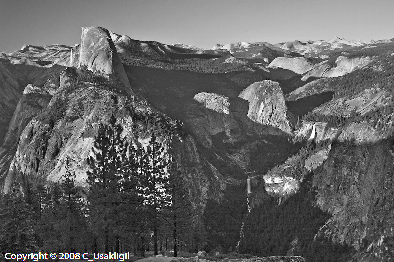
I am afraid that it is a cliche and worth nothing
Hi Asher,I have opened up the darker areas and tweaked the contrast.
You will do much better working from the RAW files.
Anyway, you have made a splendid image and I'm so looking forward to more!
Asher
Hi Cedric,Hi Cem,
You could see your work as a tribute to Ansel Adams, the great master of Yosemite views... I like very much your B&W picture which approachs AA's ones.
Regards,
Cedric.
Thx Kathy. The golden rays were there for about 20 seconds, when I wanted to take some other pictures with a similar composition they were gone. So I am glad that I could at least get this one.Love the golden tone of the setting sun, aided of course by a few flames in No California....well captured.
Thanks Nicolas. As you know, I am usually in agreement with you re. color vs B&W. But in this case, my youth inspiration (as I wrote to Cedric above) must be clouding my objectivity and perception. I seem to be aspiring to producing something similar to those silver gelatin prints of AA. Of course, it will never happen, shall it? ;-)Hi Cem
keep-up the good (excellent!) work in color! ;-)
Cem,Okay, I'm the stick in the mud here. #1 ... don't like. It comes close, I appreciate the light/shadow on the rock ... but it just doesn't carry it off. Had the shadow been closer to the base so that most/all of the granite was in light ...now your beginning to have something .... but, (the big but), your image is competing against images from so many great photogs, photogs which actually lived in Yosemite waiting for the perfect light ... that it is hard to judge the image on a stand alone basis.
Additionally, I find that image to lack pop. No blacks, no whites, all-in-all pretty muddy. Punch up the contrast, enhance the light hitting Half Dome ... try darkening the shadow area to increase the tension/drama between dark and light.
I see that image as a start not a finish.
... of the same theme. Well, I had to have a go at a B&W of the Half Dome, hadn't I? ;-)
Cheers,
Hi Asher,
Thanks for the suggestion, it is certainly a good idea to play with. Nevertheless, the image was made from the RAW file, I never work with jpg anyway. The dark areas in the picture are like that since it was my intention to have deep shadows which contain endless details but can only be seen if one looks carefully at a good print of some A3+ size or bigger. Otherwise, I have some other exposures of the same scene which can give me a picture much like the one you've tweaked. When I get back home, I'll print various versions and see what is better.
Cheers,
Hi Gary,Okay, I'm the stick in the mud here. #1 ... don't like. It comes close, I appreciate the light/shadow on the rock ... but it just doesn't carry it off. Had the shadow been closer to the base so that most/all of the granite was in light ...now your beginning to have something .... but, (the big but), your image is competing against images from so many great photogs, photogs which actually lived in Yosemite waiting for the perfect light ... that it is hard to judge the image on a stand alone basis.
Additionally, I find that image to lack pop. No blacks, no whites, all-in-all pretty muddy. Punch up the contrast, enhance the light hitting Half Dome ... try darkening the shadow area to increase the tension/drama between dark and light.
I see that image as a start not a finish.
Gary
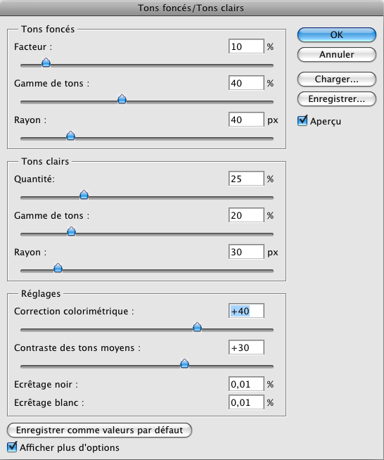
Hi Nicolas,Cem
If I may… on the very 1st photo posted in color, try some midtone contrasts…
You could play around these settings :
...
So you'll keep your shadows (even lighter) and boost midtones contrasts…
just my 2 cents of Euro, that every one knows is worth than $…
")
Such as this one:...I have other versions in which the whole of the rock is lighted or darker blacks at the base. I did not show them, maybe I should....
