• Please use real names.

    Greetings to all who have registered to OPF and those guests taking a look around. Please use real names. Registrations with fictitious names will not be processed. REAL NAMES ONLY will be processed

    Firstname Lastname

    Register

    We are a courteous and supportive community. No need to hide behind an alia. If you have a genuine need for privacy/secrecy then let me know!
  • Welcome to the new site. Here's a thread about the update where you can post your feedback, ask questions or spot those nasty bugs!

Reflected in a glass

Luciano Sassi

New member
The light of sunset reflected in a glass, while I was on vacation in Formentera Balearic Islands.
What think about dear photographers?
Thank you

bicchiere-tramonto2.jpg


BICCHIERE3.jpg


bicchiere_-_tramonto1.jpg


For other pictures on my watch Fotoblog
http://superlucius.blogspot.com/
 
Last edited by a moderator:

Cem_Usakligil

Well-known member
Hi Luciano,

I am glad to see that you've been experimenting with different kinds of photography besides the travel and landscapes pictures we usually get to see from you ;-).

I like the idea, although the execution could have been a bit better. If you don't mind me saying so, here is my C&C:

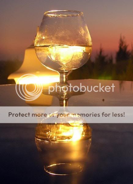
1) Nice colours, nice glass and water/ice in the glass. Also the setting sun makes it feel good. Pity it is then that the lamp behind the glass totally disturbs the composition. If you'd have moved your camera just 30 cm to the left, I guess you could have taken an uncluttered picture.
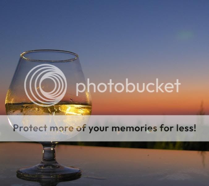
2) Again, nice colours. I think that the left side is cropped too tight. A bit wider would be better, like in picture 3.
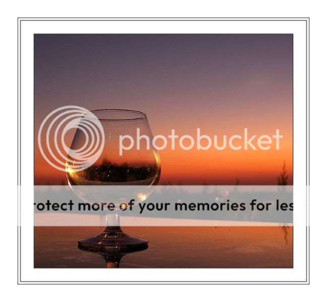
3) Composition wise, the best of the three. What I miss is some highlight on the glass to attract attention to it. And it is empty, which can be interpreted differently by some people.

All together, a very nice start. I'd suggest working on it a bit more to have some other variations. You can then compare and see what works and what doesn't.

Thanks for showing.

Cheers,
 

Asher Kelman

OPF Owner/Editor-in-Chief
Hi Luciano,

I looked at your blog and the compositions are really good to greet the eye. I like us to show things just like that being selective. They are all interesting. The first seems to me cluttered. Too many things.

The last however is simple and has an easier route, to me at least for adding soime more sense of design. We want the glass and the reflections inside to be the feature of interest and be drawn in to that. So let's forget about the rules of placement which ask us to avoid central placement. Here balance goes with the perfect shape of the glass.

bicchiere_-_tramonto1.jpg


© 2008 Luciano Sassi "Reflected in a Glass"


Thanks for permission to edit one of your pictures. This one I like best but I'n troubled by several things. First the glass is at an angle but that soes not help the composition. Next, the angle of the table or ledge is not dramatic enough to extend laterally. So I tried a number of approaches and a vertical composition centered on the glass itself appears more significant and considered. I straightened the glass but you could do better. A tad of sharpening just for more sparkle!


bicchiere_-_tramonto1_AK.jpg


© 2008 Luciano Sassi "Reflected in a Glass" edited by A.K


Photography is so much more than taking a picture of beauty. Rather it's a means to express aspects of the scene and perhaps even to imply passions not even present. That requires work and considering possibilities and discarding what is not excellent. We only need sufficient of all that is there. I hope my crop is in that sense pleasing to you.
 

Asher Kelman

OPF Owner/Editor-in-Chief
Luciano,

Having spent my time on the last photograph, I must admit and worry that the subject here is too "Kitsch". Yes it has balance now and I think it's better, but it's still not as good as the idea can be executed. I should have worked on the first one, Cem's pick, as that is fresh! However, I didn't want to spend the extra time cloning away the other light!

Asher
 
Luciano,

Having spent my time on the last photograph, I must admit and worry that the subject here is too "Kitsch". Yes it has balance now and I think it's better, but it's still not as good as the idea can be executed.

Hi Asher,

There's not that much wrong IMHO. Luciano's crop was a bit too unbalanced (and distracting at the right hand edge), your interpretation is a bit too much balanced. A golden section crop would leave just enough tension, while maintaining harmony.

BTW, I hate the 'rule of thirds' moniker, because it is not a rule but rather an observation about harmony one finds in nature. If one seeks harmony, the golden section offers a useful guideline. If one doesn't seek harmony, then one should avoid a golden section placement.

Bart
 
Top