• Please use real names.

    Greetings to all who have registered to OPF and those guests taking a look around. Please use real names. Registrations with fictitious names will not be processed. REAL NAMES ONLY will be processed

    Firstname Lastname

    Register

    We are a courteous and supportive community. No need to hide behind an alia. If you have a genuine need for privacy/secrecy then let me know!
  • Welcome to the new site. Here's a thread about the update where you can post your feedback, ask questions or spot those nasty bugs!

Compositional Elements in Scenics

Rachel Foster

New member
This is a continuation of my exploration of what makes a scenic shot work. In another thread I finally "got" that the image must contain explicit symbols that communicate something to the viewer. Lovely colors at sunset are not enough. There must be more. I've been going back through images and looking for shots that "say something."

In this thread, with the Forum's permission, I'm going to post a few images (one at a time) that I think might be getting a little closer to that communication I'm seeking. My question is...do any of these do it?

The first one was shot on 2-10-2009. ISO 250, f/4.0, 24mm, 1/1250. I like the light on the pathway and the framing of the trees.

small16052-10-20094-50-45PM.jpg
 

Mike Shimwell

New member
Hi Rachel

Yes, this is showing some promise, but I would prefer if you had more height in the image as a result of cropping some of the foreground and right hand side of the picture. This gives more sense of space. I would also lighten the mid tones a bit and slightly increase the saturation, bringing out the warmth of the light on the path. I tried to upload the result of my playing with your picture to flickr, but can't do it at present.

One thing that is interesting about this shot is that it doesn't look as wide as 24mm - was it shot with the 5D? I have a similar shot from the other week that seems much wider.

Mike
 

Doug Earle

New member
what is promising and beutiful in this photo is the light falling on the road and snow. I think the trees and sky are superflous===-try cropping down to the skyline just above the distant hills and the light seems to pop. Personally , i like the foreground leading us in. I played with a couple of crops, leaving just a scoop of sky and then eliminating sky altogether, and actually prefer the latter.
 

Asher Kelman

OPF Owner/Editor-in-Chief
Rachel,

These are great suggestions. There's the dark patterns of the tree branches against the sky as one major motif. Then there's the light playing on the road and snow as another. The shadow of one major tree on the glistening road is a bold element that might be useful in balancing or counterbalancing the upper forms, but it doesn't quite do it.

So I think there are really three forms of image from your photograph. The road is the strongest form. The trees although cluttered, are quite powerful in themselves and come second while the obvious meeting of the road with the trees works in a more ordinary fashion.

Asher
 

Rod Witten

pro member
Rachel,

These are great suggestions. There's the dark patterns of the tree branches against the sky as one major motif. Then there's the light playing on the road and snow as another. The shadow of one major tree on the glistening road is a bold element that might be useful in balancing or counterbalancing the upper forms, but it doesn't quite do it.

So I think there are really three forms of image from your photograph. The road is the strongest form. The trees although cluttered, are quite powerful in themselves and come second while the obvious meeting of the road with the trees works in a more ordinary fashion.

Asher

It's also a plus to have a properly lit feature entering the scene from the left.
 

Asher Kelman

OPF Owner/Editor-in-Chief
It's also a plus to have a properly lit feature entering the scene from the left.
Rod,

That's intriguing. I know you know what you are talking about and it seems right. Can you give examples from your work or anyone else's? I am interested in where this works and what might limit this. From the left is in the Western tradition of reading and so that's fine, but many images are just anchored on the right.

In general, I'm not sure it applies to paths going vertically.

Asher
 

Ken Tanaka

pro member
This is a continuation of my exploration of what makes a scenic shot work. In another thread I finally "got" that the image must contain explicit symbols that communicate something to the viewer. Lovely colors at sunset are not enough. There must be more. I've been going back through images and looking for shots that "say something."

Rachel; Embedded in your open question are the embryos of the answers. Work. Communicate. Lovely colors at sunset are not enough.

The image you've presented is purely documentary. That is, it records a point of view at a point on the planet at a point in time. Yes, it features some emotive elements but they're presented in a cliché neutral manner. Compositionally you've rather deadened the scene by dividing it into nearly perfect quarters.

If you want an image to "communicate" you have to start with a message, a point of view. The reason this image doesn't "work" is because it's not ben given anything to do.
 

Rachel Foster

New member
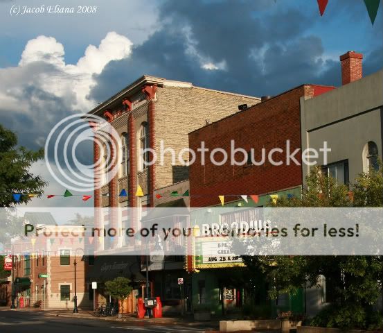
"Something to do" is the sticking point I think. This next image, for example, I like far less but I think it comes closer to something to do..or does it?

Shot with the Rebel last summer, ISO 400, f/5.6, 1/1600 (I'd lower the ISO now).

bdwytheatre0348.jpg


Ken, does this get at the something to do issue? (Seen larger here.)

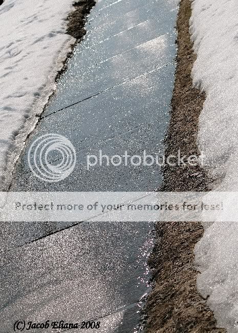
Even this one gives more emotive impact. Unfortunately the barren grass next to the sidewalk throws it off.

smallsidewalkinwinter.jpg


Downsizing this make it grainy. I'm not sure quite why. Seen larger here.
 

Doug Kerr

Well-known member
Hi, Rachel,

This is a continuation of my exploration of what makes a scenic shot work. In another thread I finally "got" that the image must contain explicit symbols that communicate something to the viewer. Lovely colors at sunset are not enough. There must be more. I've been going back through images and looking for shots that "say something."
A worthwhile quest.

I remain curious about the copyright slug on your pictures: "(c) Jacob Eliana 2009".

Is Jacob Eliana your real name? Or is that someone to whom you have ceded all rights to your images (perhaps under a "shop rights" concept)?

And of course "(c)" is a questionable synonym for "©" (or the word "copyright", although there is of course a distinction with regard to international rights).

Just curious.
 

Rachel Foster

New member
My husband owns a fledgling business named Jacob Eliana Photography. It really hasn't "done anything" yet, but I have given him all rights to whatever images I produce for whatever he'd like to do with them.
 

Rod Witten

pro member
Rod,

That's intriguing. I know you know what you are talking about and it seems right. Can you give examples from your work or anyone else's? I am interested in where this works and what might limit this. From the left is in the Western tradition of reading and so that's fine, but many images are just anchored on the right.

In general, I'm not sure it applies to paths going vertically.

Asher

Asher,

I just heading out the door for several days into the field for an assignment, but here is a brief response to your question.

Leading light from the left is a "rule of thumb" that I obtained years ago from a source long muddled in memory. However, when I get back in the shop, I'll try to accomodate your request for an academic reference with examples.

As to your point about the the vertical path, we can use Ansel's "Moonrise" as a discussion image. The ambient light on the clouds stretching from the left margin sets the mood and introduces the scene to the viewer's eye in a natural manner. I would agree however, that the effect isn't as compelling as a diagonal souce from the lower left. Yet the image appears awkward to me when I envision the cloud strecthing from the right edge or completely across the horizon. (I do not have, or know of, any evidence that he supported this concept in this image or any of his works.)

Rod
 

Doug Kerr

Well-known member
Hi, Rachel,

My husband owns a fledgling business named Jacob Eliana Photography. It really hasn't "done anything" yet, but I have given him all rights to whatever images I produce for whatever he'd like to do with them.
Thanks.

Best regards,

Doug
 

Doug Kerr

Well-known member
Hi, Asher,
Rod,

That's intriguing. I know you know what you are talking about and it seems right. Can you give examples from your work or anyone else's? I am interested in where this works and what might limit this. From the left is in the Western tradition of reading and so that's fine, but many images are just anchored on the right.

As I'm sure you know, there is a fascinating parallel with regard to the interpretation of images with shadows and the like. Evidently, for those brought up in "Western cultures" (does that mean west of the eastern terminus of US 180?), absent any strong cues to the contrary, we interpret images with shadows as if the light arrived from the "upper left".

In aerial photo analysis, I have heard that if, for example, we have a photo of a newly-installed telephone pole line, with little mounds of soil (called "spoil") still present around the base of each pole, and if we examine the photo oriented so that the direction of the original light source is to the lower right, the little mounds will look to the observer like little craters.

I had a powerful personal experience with that. Many years ago, I bought a Kodak Instamatic 50 110-film camera. It was almost the top of the line, and had an elaborate automatic exposure mechanism. After a little over a year, that mechanism started to malfunction.

I was fortunate in having in my files the Popular Photography review of the camera, which included detailed photographs of its innards. Armed with that, I decided to disassemble the camera. I decided to do it at the office.

One of my colleagues, a very capable mechanism engineer, joined be when I did it, sitting across my wide office table from me.

As we got down to the guts, we were attempting to correlate what we saw with the photo. At one point I was interested in a little lever, which had a stiffening rib along its length. I was looking at the mechanism itself, and my colleague worked the magazine photo.

At one point I said, "now here we have a little hockey-stick shaped lever, with a stiffening rib arising upward from it". My colleague said, well, I must have the camera the other way up from the photo, since he saw in the photo a hockey-stick shaped lever but with a stiffening rib downwards.

We tried to rationalize what we saw, and it wouldn't come together. Finally, I moved to his side of the work table to get a better look at the magazine photo (the magazine was "right side up" from my side of the table, but I couldn't really see the image from there).

Son-of-a-gun, from his vantage point, the lever appear to have its stiffening rib downward. I turned the magazine photo around, and now the lever looked to both of us as if the stiffening rib was upward, as it was on the actual part.

I've heard that this assumed direction of the light source is not the same as that experienced by people from other cultures, but I don't recall the details of the various studies of the phenomenon.

Best regards,

Doug
 

Ken Tanaka

pro member
"Something to do" is the sticking point I think. This next image, for example, I like far less but I think it comes closer to something to do..or does it?

Shot with the Rebel last summer, ISO 400, f/5.6, 1/1600 (I'd lower the ISO now).

bdwytheatre0348.jpg


Ken, does this get at the something to do issue?

Personally I enjoy "main street" scenes from Yourtown, USA. They can be rich with suggestion (of an America that never really existed) and can be delightful time capsules (i.e. theater marquees, store signs, cars, attire and hair styles of pedestrians, etc.)

Unfortunately this doesn't really work, at least for me. You've identified the right location but the wrong point of view. You've managed to foil and avoid nearly every aspect that might have made this really interesting. Then it appears that at the last second you decided that the clouds were more interesting than the street (!?) and inadvertently snagged the tips of those flags as a further distraction in the upper right. This may represent a nice memory for you, but I've seen -so much- of this type of work done so doggone well that I won't even think about trying such images.

Even this one gives more emotive impact. Unfortunately the barren grass next to the sidewalk throws it off.

smallsidewalkinwinter.jpg


Downsizing this make it grainy. I'm not sure quite why. Seen larger here.

No, doesn't work at any level. It might have potential as a conceptual/abstract but at a different time of day and different composition. Your (apparent) idea of using the wet sidewalk as a mirror (for clouds?) has potential for an interesting snap but needs work.

ADDENDUM
I invite you to look at some of David Plowden's work, especially some of his small town series (it's an auto-play slide show). David is now well into his 70's, but I don't think that anyone captured "lost", quaint America better than he did.
 
Last edited:

Asher Kelman

OPF Owner/Editor-in-Chief
Personally I enjoy "main street" scenes from Yourtown, USA. They can be rich with suggestion (of an America that never really existed) and can be delightful time capsules (i.e. theater marquees, store signs, cars, attire and hair styles of pedestrians, etc.)

Ken,

I enjoy very much your comments here. I would be not at all bored by this location and idea exploited to the fullest. It has not been exhausted if one can execute the theme with ones own finger prints.


Rachel,

I'd love to see this done, but superbly. Just make notes reflecting the above pointers and then think about how you might approach this in your own way. After you have worked on the plan and time of day, photograph, print and mark up the picture yourself with a bold marker as to where it fell short. This picture is very doable for you. Even after the 20th successful photograph, you'll still have to work hard on the next one.

Asher
 

Rachel Foster

New member
Edited and changed after viewing the Plowden images.

Ken, they don't work for me. The reason for that....whatever it is, is probably what is preventing me from making images that are "superb." I'm wondering if my own view is so vastly different that I may be incapable of scenics. I'll need to consider that. On the other hand, many shots here on OPF DO work for me, scenic wise.

I've got more studying to do, obviously.
 

Ken Tanaka

pro member
Edited and changed after viewing the Plowden images.

Ken, they don't work for me. The reason for that....whatever it is, is probably what is preventing me from making images that are "superb." I'm wondering if my own view is so vastly different that I may be incapable of scenics. I'll need to consider that. On the other hand, many shots here on OPF DO work for me, scenic wise.

I've got more studying to do, obviously.
That's cool, Rachel. I pointed out Plowden's work because it immediately jumped to my mind. But there are many other views. Look, for example, at some of Stephen Shore's work. Shore is not really one my favorites but he has a definitely different point of view on this type of scene.

El-Paso-Street_a.jpg

"El Paso Street"

shore1.JPG

"Second Street, Ashland, Wisconsin", 1979

"Superb" needs only be defined by you. But I believe that improving your skill at satisfying yourself depends heavily on accounting for what you've captured and capturing what your mind's eye sees. Some people are very talented at doing that almost immediately. It takes the rest of us a great deal of practice and self appraisal...every day...all day.
 

Rachel Foster

New member
Thanks...Ken, your comments provoked me to go back and identify a few scenics here on OPF that "grabbed" me. I wish I could find the wonderful Paris scene (river bank?) that i was so taken with but I can't remember enough about it. I'm posting the urls to some of those OPF posts and I'll be studying them to find the commonalities. You pointed out one that is immediately apparent: Clouds.

Here, second shot.

Here and here(second shot) and here (first shot), here and here, here, and here.


Wide angled lens might be a tiny factor, but the success comes from the combination of eye and ability to use the equipment, not the equipment.
 

Rachel Foster

New member
Well, immediately obvious to me is that each of those images conveys a strong emotion to me. But I can't break it down to how the compositional elements work together to do that. Yet, anyway.
 

Rachel Foster

New member
I snapped this on March 16. Looking at Cedric's Dead Water it occurred to me to try this in B&W. I think I like it better B&W, but its the elements I'm wondering about. I suspect this is closer to what's desired but I'm not at all certain. I do wish I'd gotten the top of the tree in this shot.

ISO 100, f/6.3, 1/640, 24mm.


3517bw.jpg
 
Last edited by a moderator:

Asher Kelman

OPF Owner/Editor-in-Chief
I snapped this on March 16. Looking at Cedric's Dead Water it occurred to me to try this in B&W. I think I like it better B&W, but its the elements I'm wondering about. I suspect this is closer to what's desired but I'm not at all certain. I do wish I'd gotten the top of the tree in this shot.

ISO 100, f/6.3, 1/640, 24mm.


3517bw.jpg
Rachel,

You have drive, a passionate interest in trees and scenics. It takes time and observation to get ideas for positioning yourself such that from this observation point, the landscape works in your frame as "one thing". Don't feel bad that getting to that unity is hard to accomplish. If it was, then we'd be surrounded by 20 millions Landscape photographers of the stature of Ansel Adams. However, few people have enough drive and persistence past repeated failure, to go on to find their viewing skill is sufficient to make from a pastoral scene a work that cannot be passed by.

There is nothing in my mind but continued effort and insight needed to get very wonderful pictures from your efforts. Is it harder for you than anyone else? I doubt it. However, it does take not just photography, but quiet and brutal corrections with a pencil to a print. Only a print can force one to go back and redo a picture and make it better. Other methods can work, but not as well.

So with this picture, print it 8x10 and stick it on the wall. Use photocopies to mark up your picture. Go and look at similar subjects in books and in galleries. Ask visitors about your picture. Then go back and re shoot this tree, this time with the changes you thought of.

Here's what you might find. some of the new ideas are not practical but some are. Things are never as good as one hopes nor as bad as one fears. Still, we do our best and come home and work on the new picture.

At this stage you might add or subtract elements to simplify or balance what's There. God is not lighting every part of the landscape just for us to come along and get a winning picture with one snap. Likely you will have to alter the way clouds appear or remove the tree coming in from the left. Whatever it takes, do it. Do your best and now print it 8x10 post it on your wall and mark up photocopies.

When you have reached your limit, find another favorite tree and start again. Eventually, you will know what elements in a scene you like and those which seem to deflate your enthusiasm for what seems exciting at first. Thus, on the basis of your increasing experience, you'll now the visual vocabulary that not only moves your feelings but also which you can use in a successful image.

This is not something that you can simple discover and walk away with. You must stay engaged without expecting lucidity to come in any flash as Paul's hit from heaven!

Asher
 
Last edited:

Rachel Foster

New member
Asher, I've tried to do the pencil mark up but I'm just not sure *how* to do it. What I've done that has worked somewhat for me was to cut a mat in half and use it to "crop" down various elements in an image. That has some limited success but I think I'm missing some very basic premise. I see images others post and immediately think, "yes!" But I also see images here that are well received by most that leave me very much in the "eh!" response mode. I know there are individual differences in artistic taste, but I think there MUST be some basic principle or understanding that continues to elude me. What worries me is that this understanding may be something one either "has" or does not have and possibly cannot be taught.

Portraits and still lifes, those I am on far more secure footing. In fact, I'm even slightly confident that I know a good one when I see it. I sometimes even compose a near-hit.

So, I'm continuing to put together collages of images that work for me. So far, I've discovered that the first set of images I'm studying as a group have no extraneous elements in them. Everything in the image complements the rest. So far, so good. Now I have to learn to recognize that when I go out with my camera.

Since I've launched this most recent attack on scenics (partly in response to the helpful critiques on the sunset image, particularly the comments by you and Ken), I've found when I go out to shoot now....there is nothing to shoot! I'm finding very little that merits even a half-hearted shutter snap. That must be progress!

This artistic endeavor is not easy, nor is it for the uncommitted. That may be what has me so determined to try to master it.
 

Rachel Foster

New member
I've been sketching a lot lately and I've learned two things. First, sketching does increase awareness of elements in composition. Two, my sketching stinks! HA!
 

Rachel Foster

New member
My latest offering in my search for scenics: a lake at Interlochen, Michigan. My goal was to shoot a scenic with decent composition, one that is interesting as well as appealing. How close did I come?

ISO 125, f/5.6, 1/1000.

smallintlake1.jpg
 

Asher Kelman

OPF Owner/Editor-in-Chief
Hi Rachel,

I can answer based on what you believe. Is having "two of everything" critical for you. If so, then I'll look at the picture de novo from that perspective. Or could it be that you experienced a moving sky and its reflection and allowed your camera to record it all and then came home to make the artistic decisions. If it's the latter, then I'll be able to offer my view of what might work for me.

I know most teachers want choices to be made in the field, not later. However, this is possible only with experience. It's also not necessary when you have a Canon 5DII and a good computer screen. I like that you have recorded a wide scene as it maintains options,

Asher
 

Rachel Foster

New member
Two of everything, not so much. I liked the reflection in the water, loved the clouds, but am a bit bothered by the black specks (the bouys or whatever they are).
 

Asher Kelman

OPF Owner/Editor-in-Chief
Composition based on artist's intent!

Two of everything, not so much. I liked the reflection in the water, loved the clouds, but am a bit bothered by the black specks (the bouys or whatever they are).
Hi Rachel,

Then we must work with your intent or else it would be my picture. If we do that, then we can ask the "Ma nishtana?" question. When we look at the water, we can ask, In what way is this water different from all other waters. In what way is this reflection of the clouds different from the clouds they seem to represent?

The water has the geometric line of buoys which provides one distinction.
The cloud representation in the water is abstracted, kind of impressionistic.

So these are two possible characteristics that would differentiate the top and lower halves of your reflected sky. Would you like to look at these points and decide if you agree and then perhaps consider making them important?

Would you like to strengthen the sky somehow and release the land from some darkness?

Let's go back to the trees above. could you remove the tree on the left.

Rachel, if you don't move to get things isolated, you have photoshop to be able to clean up. Here you have to decide your philosophy. Are you

  1. Documenting what was there?
  2. Reproducing a sense you experienced?
  3. Building for us the esthetics of what is possible?

Just like the first question of what you wanted, double of everything or a some clever pleasing composition, now you could decide "How much I can alter of what my camera recorded when I "aimed" at what I liked

Kind wishes,

Asher
 
Top