One post, one theme/subject/motif unless one is comparing and/or contrasting!
Jan,
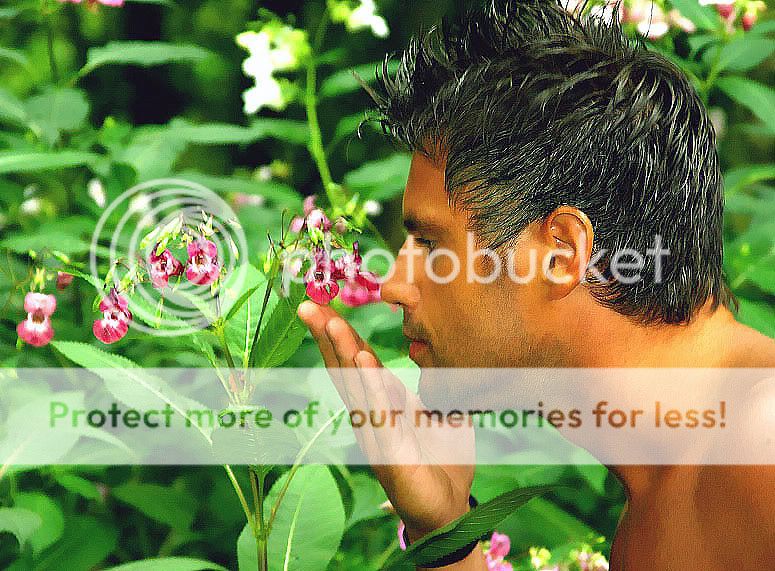
This is
the one picture that, I, IMHO, believe should go with your title, nothing else.
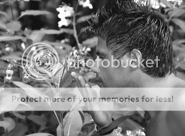
Alternative process, BTW, is not giving two version of the same image, rather using exotic processing such as Platinum, Gold, Albumin or Gum Bichromate, for example.
See how it's clearly presented and titled. You might add what's the purpose of the image.
The color is needed, IMHO, so the B&W version is absolutely redundant, (unless there was some inherent difference you want to bring out.
You, alone, yourself, must define
one theme/motif/subject matter so we can all discuss it. A scattering of ideas in one post makes it hard to focus on anything!
Kind wishes,
Asher