The problem of Nicolas is / but now judging from his last mail hopefully was, as I understood, that it seems that his RGB prints come out fine luminosity wise but the CMYK not.
99 times out of 100, that's due to the incorrect CMYK output profile for the process.
For a lot of people including me a 5000K calibrated screen looks much darker, and more yellowish then a 6500K screen that runs more into the blue and looks therefore subjectively brighter to the human eye, even if both are set to the same luniosity.
On most CRTs 5000K does look darker and most certainly warmer. The reason it looks dingy is due to the fact it can't crank out the required luminance when physically set to something close to 5000K. LCDs don't suffer the issue with luminance but you can't set them to 5000K (you can't set them to anything but the native white point and then apply a correction via a look up table). The only adjustment you have on a CCFL(Fluorescent) LCD is the intensity of the backlit lighting.
So if you have calibrated your montitor in another way then your printer who prints the CMYK for you, you will get bad results.
Depends on the display type, the output profile and how you view your prints. Is everyone using a 5000K Fluorescent light box? Do they have dimmers that control the intensity while maintaining the CCT 5000K?
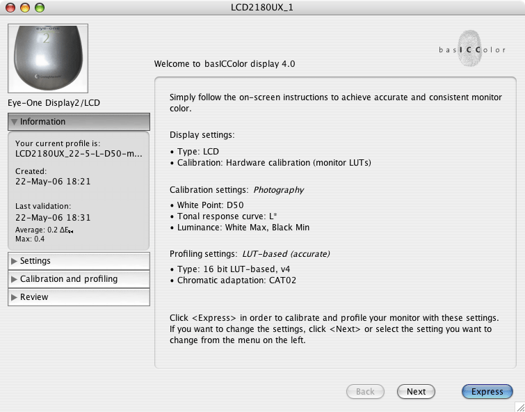
As i have seen over the years there are plenty of different suggestions from the different manufacturers of calibrating devices. Gretag Mac Beth: a luminosity of 80/100/120 depending on Monitor Type and version of the program. Gretag Mac Beth suggestions leans more to a calibration of 5000K as standard and a lower luminosity.
The luminosity of all displays should be set based on the ambient lighting around the display. The display should be the brightest and darkest item you view while editing the image. Unfortunately the ISO 3664 spec is in serious need of updating otherwise you can start to use it as a guide.
From Eizo I have seen different suggestions between 120 and 140 for the luminosity settings.
Which you should ask them and when would you use 120 cd/m2 versus 140?
In principal I made the observation that Color calibrating device manufacturers that lean more to the 5000K standard have a lower lumnosity standard setting then a manufacturer who has accepted 6500K as a viable option (some years ago the only option was to calibrate for 5000k)these tend to have higher luminosity suggestions/settings.
Again, it's nearly impossible to get a CRT to CCT 5000K and get a luminance anywhere above 95 cd/m2. Maybe new out of the box (if you can even find any). But they will certainly not last very long when you crank up the luminance to the maximum. An LCD can do 120 cd/m2 without getting up a sweat.
The problem in my eyes is here that a real standard which luminosity setting is right is missing and as Nicolas problem is/was the luminosity, I wanted to point out that the problem might be here.
He should investigate the CMYK profile first. His print to screen matching sounds effective with RGB (is that ALL RGB profiles?). As soon as a CMYK file come into the mix and doesn't soft proof correctly, I suspect the output profile first.
It would be very nice if you could tell me which settings therefore are
"right" or accepted standards for the luminosity.(5000K/6500K/LCD/CRT...) And since when the 1.8 Mac / 2.2 PC Gamma Settings are outdated? I believe you without a doubt, but I have read this so often in different books and sources that I wonder how this, as Asher has said, Urban legend, has become so popular?
For White Point, there is no correct setting although on a CRT I'd start with 6500K and see how it goes based on the papers used. As I said, with some substrates, you may need 5000K or even something between the two and you may need to switch based on the job. On an LCD, I'd use Native White Point as it's usually closer to 6500K and there's nothing to adjust anyway. Let the adjustment happen in the profile within ICC aware applications.
For Gamma, 2.2 is better for both Mac and PC users because this is much closer to the native TRC gamma of all displays (well actually LCDs don't have a true gamma but they are made to mimic the behavior of CRTs so 2.2 is fine). The 1.8 assumption by the Mac dates back to 1984 and the LaswerWriter and that is still the assumption with a Mac you buy today. But the gamma of a display is a physical attribute of the unit, not the OS and again, since the native behavior is far, far closer to 2.2 than 1.8, 1.8 isn't a good target value. Outside of ICC aware applications, on the Mac, a 2.2 gamma will produce somewhat dark appearing previews. You have to live with that. The best gamma target is native gamma. Now you apply NO adjustments in the LUT and just measure and record the exact gamma of your display.
Luminance is totally dependant on the environmental conditions under which your display lives and how you view your prints. The better products allow you to measure both the color of light of a viewing booth and the intensity to set all this in the target calibration.
Frankly I'm not sure what languages besides English the book is published in. I know it's about to go into a 2nd printing.

")